Colour Collab: Max Warren
In this series brought to you by Resene, Max Warren of North Canterbury-based architecture practice Max Warren Architect discusses his approach to designing simple, honest projects, with an engaging mix of practicality and playfulness.


What was your journey to becoming an architect?
Max Warren (MW): When I was a kid, my parents had a small bungalow relocated to a bare paddock in Ohoka. For the next 20-plus years, the house was renovated and added to, time and time again (in fact, the process is ongoing). I guess I grew up being quite involved in, and enjoying, these projects, whether it was helping to build or adding my opinion to various elements of the house. I was also fortunate to be able to appreciate and spend time in various Miles Warren buildings during my school years, as well as to visit him occasionally at Ōhinetahi. These were great experiences that pushed me in this direction.
Aside from Sir Miles Warren, are there any other architects who have had an influence on you?
MW: During university, I had the opportunity to take a design paper tutored by Dave Strachan and Marshall Cook, for which we designed and built a small house for charity. During that semester, I really began to appreciate the way these two approached New Zealand architecture and this had a big influence on my own way of approaching buildings — refined, honest buildings with no waste.
What role does colour play in your work?
MW: I enjoy using colour as an element of surprise, or adding a bright, vivid colour to a space which is otherwise for a mundane day-to-day task, like a laundry, or to feature something which is purely functional, such as an exposed structure. My own house, Sandhill House, recently won a Resene Colour Award and it features Resene Bright Spark yellow on the garage floor and throughout the whole laundry. It’s my go-to bright colour.
What was your thinking behind this collab?

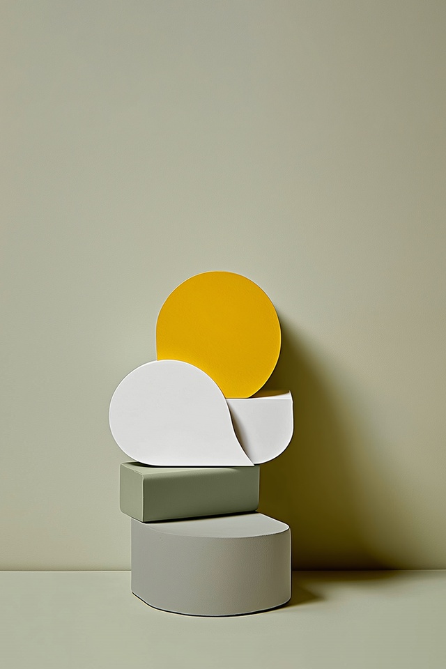
MW: My inspiration for this collab was, oddly enough, my car. It’s a rare BMW E30 Touring that’s as loud and as old as I am; I’ve owned it since university days. In many ways, it reflects my work — it’s uncomplicated but, at the same time, quite raw. Aesthetically, it’s all straight lines and assertive, simple geometric forms. Right now, the majority of my clients are younger people and families who, typically, have budget constraints. So, to make the buildings and spaces engaging and enjoyable but also meet a budget, the architecture needs to be uncomplicated and unfussy. The fun and adventure lies in the playful use of space and colour.
How did your colour choices come about?
MW: Resene Black White is a soft white, which I predominantly use for wider-than-usual hallways so they can then double as gallery spaces. The green of Resene Finch reminds me of the West Coast, where I spend a lot of time — it’s a subtle, natural colour, perfect for moody spaces. Meanwhile, Resene Aspiring provides a calming vibe and pairs well with a sharp white. I find the grey of Resene Silver Chalice pairs extremely well with a number of materials, including timber. Finally, how could I go past Resene Bright Spark? It makes such a sunny, cheerful statement that I jazz up all manner of spaces with it.
See more from the Resene Colour Collab series here.
ArchitectureNow works with a range of partners in the A&D supply sector to source appropriate content for the site. This article has been supported by Resene.


