You’ve been friended
Tracey Ingram explores a few interiors that highlight the importance of designing communal spaces in the age of social media.
We’ve reached a social stalemate. Thanks to those little devices we hold in the palms of our hands – or those like the one I’m typing on right now – we’re more connected than ever before. We rely on the likes of Facebook to help us keep up to date with our ‘friends’, while apps such as Happn hook us up with strangers who’ve crossed our paths – people we may never have otherwise met.
But, paradoxically, we’re apparently lonelier than we ever were – and the platforms we use to associate with one another may be part of the problem. ‘Is Social Media Making You Lonely?’, a 2018 article published by Psychology Today, references a survey by the American Journal of Preventive Medicine exploring social-media patterns. The study found that “individuals who spend more time on social media every day felt lonelier than those who spent less time engaged in social media. Additionally, those who spent more time on social media in a given week felt more isolated than those who checked their social media less.”
Loneliness is associated with an alarming list of health issues, including a drastically increased risk of heart disease and stroke. In fact, researchers at Brigham Young University concluded that loneliness is just as likely as is smoking to lead to early death.
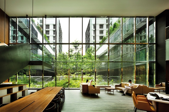
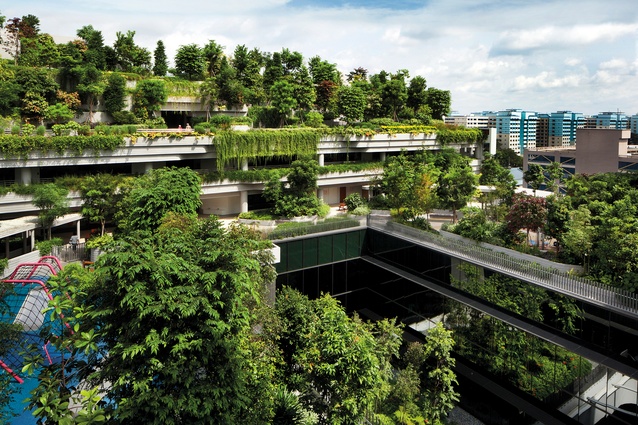
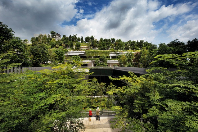
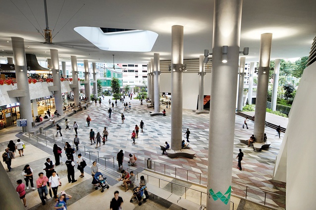
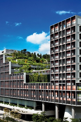
The epidemic is more extreme in the elderly population: a vulnerable group that often struggles with social segregation. It’s this demographic that WOHA architectural practice addresses in Singapore’s Kampung Admiralty. The complex goes beyond the brief of typical senior-citizen housing, featuring not only apartments but also a medical centre, a pharmacy, retail, F&B establishments, a public park and plaza, an outdoor gym, a children’s playground and an urban farm. There’s also onsite care for both seniors and children.

“Kampung Admiralty is designed to draw in the whole neighbourhood – to make a lively space for people of all ages and enable connection and inter-generational bonding,” says WOHA co-founder Richard Hassell. “And to help seniors feel integrated into their community, rather than isolated and alienated, the development is conveniently connected to public transport.”
Despite the expanse of the complex, which was named World Building of the Year at the 2018 World Architecture Festival, WOHA designed it with the idea of a village in mind. It’s an approach the studio also employed for SkyVille @ Dawson, a public-housing project completed in 2015. The Singapore building boasts a whopping 960 apartments but “doesn’t feel that huge at all,” says Hassell.
“It’s broken down into clusters of 80 households, like small villages in the sky. Within 80 households, the chances are that you’ll find at least one person with a similar hobby – or perhaps kids the same ages as yours.”
The challenge of connecting a community is perhaps even greater in schools and universities, since much of our learning now happens with the aid of digital devices. Four years ago, already, Stuff reported on a survey that counted approximately one device per student in schools. There are many questions surrounding the growing reliance on technology.
A few years ago, The Guardian published findings by the Massachusetts Institute of Technology, claiming students banned from using laptops or digital devices in lectures and seminars performed better in exams than did those with free access to computers and the internet.
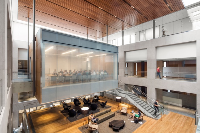
Toronto-based KPMB Architects is taking the topic to heart, as illustrated by a number of recent projects in the US. The firm reduces rigidity in its institutional designs, suggesting that informality and congeniality go hand in hand. KPMB’s scheme for a Princeton University building, for example, features living room-style seating, while the Ronald O. Perelman Center for Political Science and Economics at the University of Pennsylvania includes a two-storeyed lounge for students, faculty and visitors. The project in Pennsylvania involved the renovation of the historic West Philadelphia Title and Trust Company building from the late 1920s, and a new addition to the north of the same area.

The Perelman Center features an aperture-rich façade to attract passers-by. “The transparency of the base connects the heart of the new academic community with public life, while the upper levels afford dramatic views to the city and campus skylines,” says Shirley Blumberg, partner-in-charge for KPMB Architects.
“The resonant conversation between old and new creates interconnectivity and spaces for collaboration and a vibrant animated ground floor for undergraduate student services.”
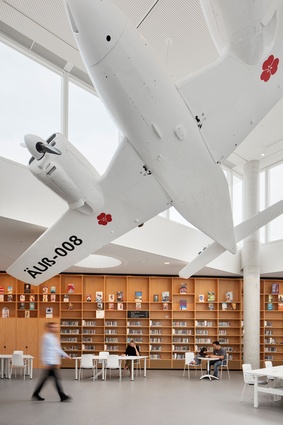
The desire to facilitate face-to-face interactions to counteract our online-oriented social behaviour may explain the recent resurgence in public libraries. “Free communal spaces such as libraries cater to a wide variety of users and uses,” says Matthias Hollenstein, director of Sydney-based architecture and urban-design studio Stewart Hollenstein. “Everyone feels a sense of ownership. This overlap has the potential to be a hotbed for social interactions, particularly incidental encounters that are at the heart of expanding one’s personal network.”

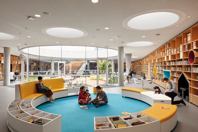
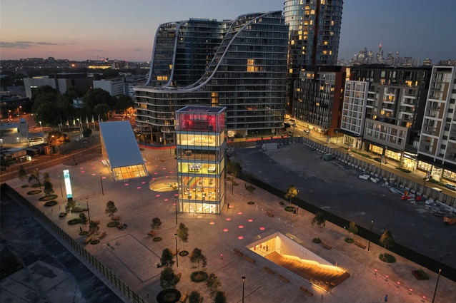
The firm’s design for Sydney’s Green Square Library and Plaza is, therefore, “designed to be intentionally informal,” says Hollenstein, who refers to the project as an “urban living room”: an extension of the locals’ homes. “This informality is intended to foster serendipitous observations and interactions between members of the community.”
What’s surprising, though, is that the library portion is actually underground – not the typical location for a social catalyst. It’s the plaza above that pulls people in, their attention directed towards glazed rises or recesses that puncture the ground-level plane to offer glimpses of life within.
“The dilemma of designing for social interaction is trying to work out how to get strangers to sit or stand in closer proximity without them feeling uncomfortable,” says Hollenstein. For Green Square, the architects carefully considered the scale of the library’s spaces and furniture arrangements, hoping to encourage visitors to observe what’s going on nearby or plonk themselves down next to one another – all while making each of them feel as though they have their own space. “Therein lies the ergonomic and anthropological challenge.”
This article first appeared in Interior magazine.


