Wobbly, like the natural earth
Bill McKay explores the Hundertwasser Art Centre in Whangārei by Friedensreich Hundertwasser, in collaboration with HB Architecture, Springmann Architektur and the Hundertwasser Non Profit Foundation, and asks whether it’s outsider art or a challenge to the way architecture is made.
As a boy at a typical 1970s’ school-uniform-wearing, single-sex, sports-mad, culturally ignorant high school, in a then typically insular region that was happily demolishing its art deco heritage, I visited a touring exhibition by Austrian artist Friedensreich Hundertwasser.1 His work, like the art room haven I was discovering at school, was full of light, colour and energy. Hundertwasser’s work and that art room2 were both retreats from the reality of our dreary built environment and windows into a wider world of what could be. We all dreamed of fabulous possibilities in our youth but, of course, a lot of that is beaten out of us by schools and practice and life in general as we become human resource units in the service of capitalism. But I still have a copy of the small, black-jacketed book3 that accompanied the exhibition, the interior of which opened up a world of freedom and possibility.
Hundertwasser lived here in Aotearoa from the 1970s onwards, after arriving on his boat Regentag (Rainy Day) to check on the touring exhibition. He pretty much stayed, although continuing to travel back and forth and around the world, working on his art and his building proposals until his death in 2000. He is buried and happily composting the whenua he bought near Kawakawa. A foundation based in Vienna has continued his work and there are more than 30 Hundertwasser buildings on the planet. Until recently, his most well-known works here were the marvellous public toilets in Kawakawa and his design for a flag utilising a koru motif. He didn’t like straight lines – “the straight line leads to hell”4 – and that’s what bothers me about that flag: the big bisecting diagonal.
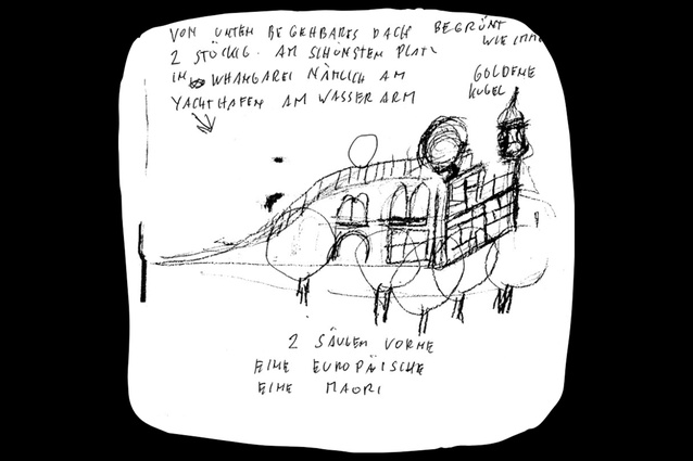
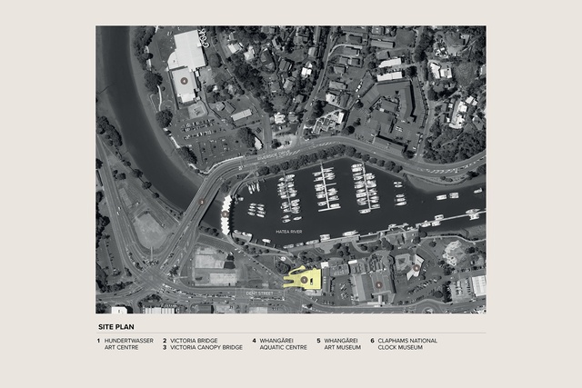
Now, finally, a small 1993 sketch he made proposing a new art gallery in Whangārei has come to fruition on the shore of the Hātea awa. This is also the site of Whangārei’s yacht haven and an increasingly popular waterfront precinct with shops, galleries and restaurants. It is somewhat Parnell-ised in my opinion – architecturally, you can’t tell what timber buildings were original, which have been transplanted, or to what extent they have been fancified with timber frills, decks, verandahs and so on. You also need to search pretty hard for any sign of tangata whenua. So, a typical New Zealand town these days.
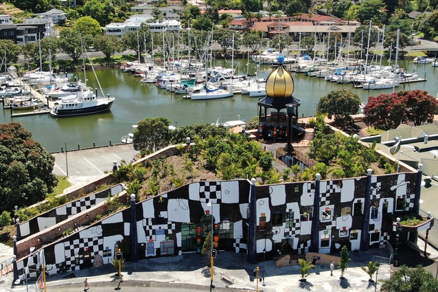
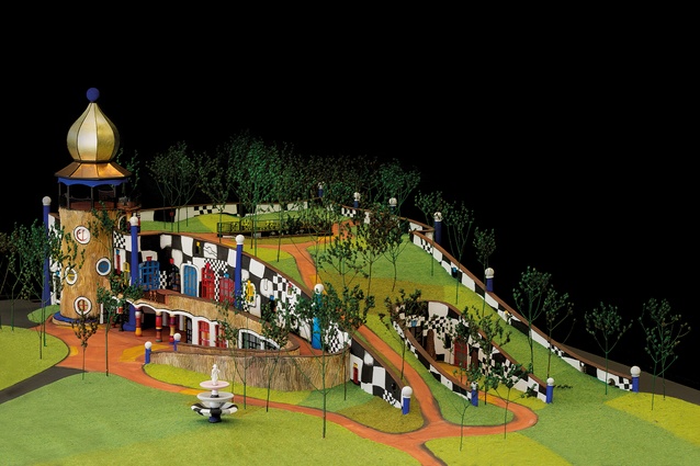
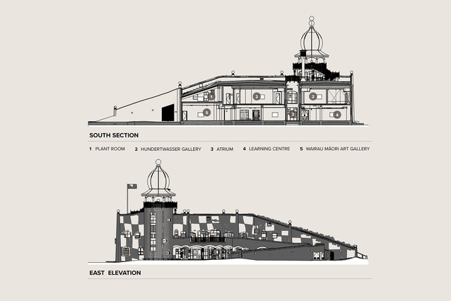
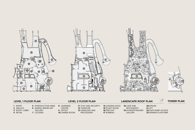
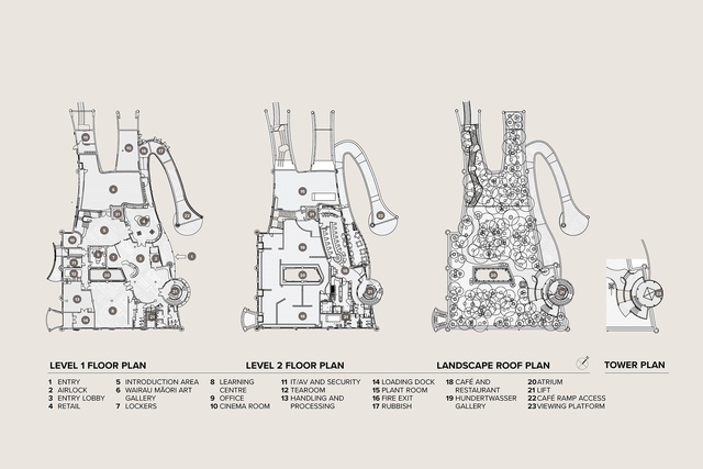
The new Hundertwasser Art Centre has two storeys and two huge ramps accessing a café/restaurant and a fabulous forested roof. Inside, there are all the usual gallery behind-the-scenes stuff, shop, and so on. Notably, and in line with part of Hundertwasser’s original vision, it has two galleries, one devoted to Māori: Wairau Māori Art Gallery. The other will house the only permanent collection of Hundertwasser artworks outside Vienna – fitting, since Aotearoa was his adopted home. But I don’t want to give you the usual guided tour; that is not the big issue here. Architect Grant Harris, in the context of talking about Building Code compliance, described the building as essentially a waterproof concrete box, with a skin of tiles, bricks and stucco. And a lot of you will say: yes, a cake with too much icing or a decorated shed.

Harris was modestly understating his role and the architectural achievement here. For an architectural audience, in a somewhat constrained, conventional and conservative era of New Zealand architecture, the primary debate will be an aesthetic one focused on the exterior. Is it a hippie pipedream exposed to the cold, hard light of day? Or is it a Disney-esque addition to a Parnell-ised, cutely dressed but essentially commercial precinct? I bet its reception by the architectural community will be similar to that when Roger Walker and Ian Athfield’s first works were disparaged as “Noddy houses”.5
Hundertwasser’s artworks were abstract expressionist and wildly popular. This building will be popular, too, but in the art world (and in politics) being populist is pejorative. Readers of this architectural journal will have their own particular difficult-to-articulate sense of what is, or isn’t, good architecture based on their age, their education (or indoctrination) and their experience – the ‘real life’ – of clients, briefs, budgets, councils and builders, that has cemented in a particular attitude to their personal, architectural, professional and social values. Many will dismiss this building as “outsider art” by an artist doing architecture: a naïve version of architecture, like a child’s drawing built. When NZIA awards and academic history-making roll around, I wonder what our discipline will think. Does it count as New Zealand architecture? Is it in the canon or not? And, of course, is it any good?
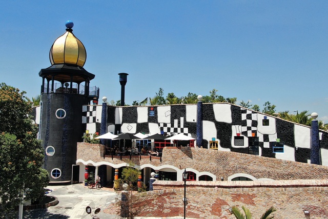
I can report a few things. It is a triumph in terms of what can be achieved in an era of risk-adverse codes and consenting processes that restrict experimentation. The people involved in it (mostly) loved working on it, particularly the tradies or, as I should say, the craftspeople. The design and finishing processes were quite different from the standard job we do and quite possibly better. Also, the community and tourists seem to like it, especially the young. I think they are on their way to loving it. For me, getting to know this building and how it has come to be, raises serious questions about the nature of architecture and how we do it, and our profession’s concerns and values, compared to, or versus, the public’s.
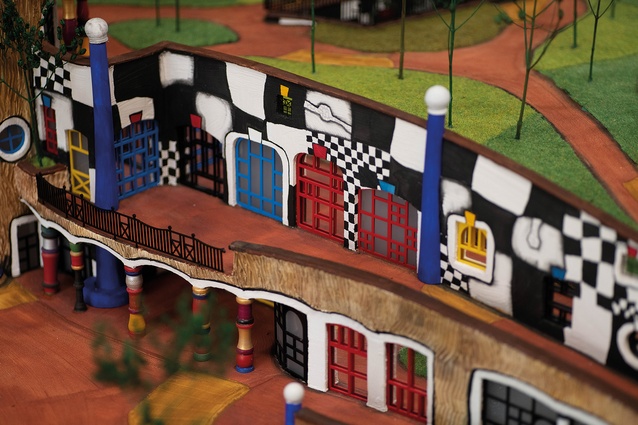
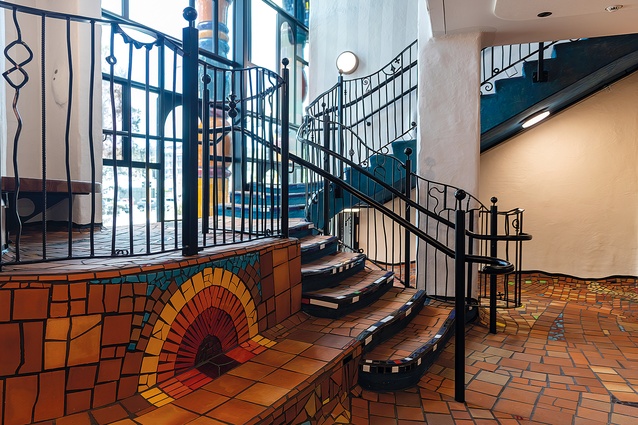
Harris explained that he was part of a long chain in the realisation of this building. Hundertwasser’s intentions were interpreted by the Foundation and a 1:50 model was sent from Vienna. Harris’ office turned that into the design and documentation required for consent and construction. Architects can play a fun game when visiting: detecting how the free-form undulating levels, ramps and balustrades comply with the Building Code. Harris makes the point (I suspect because Council was one of the clients) that consenting officers were helpful in shepherding this building through the processes. All along the way, stakeholders, and especially the Foundation in Vienna, had to vet and approve all changes, issues and decisions. Many cooks have been involved in the creation of this broth: multiple funders, supporters, advocates, stakeholders, clients, potential users and so on.
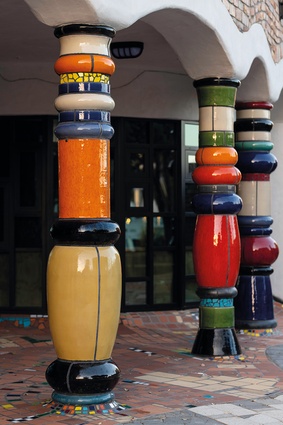
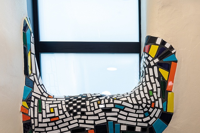
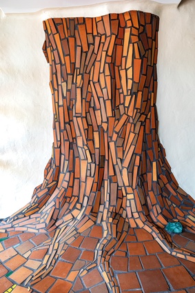
But the next bit is marvellous; the craftspeople on the job, particularly the tilers, brickies, plasterers and metalworkers, were encouraged to be creative in their work. A small structure nearby, Te Kākano, The Seed, also served as a model for the desired application and appearance of materials. Harris points out one of the first sections of brickwork where the brickies found it hard to loosen up; it looks crazy and chaotic. But, as they shook off years of training and relaxed, they found their rhythm and their work became a part of the lovely organic, handmade vibe of the place. Personal details have been incorporated, such as a couple of toy cars embedded at child height.
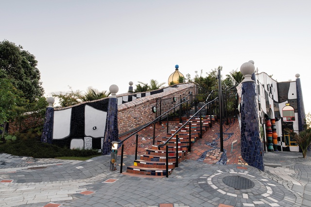
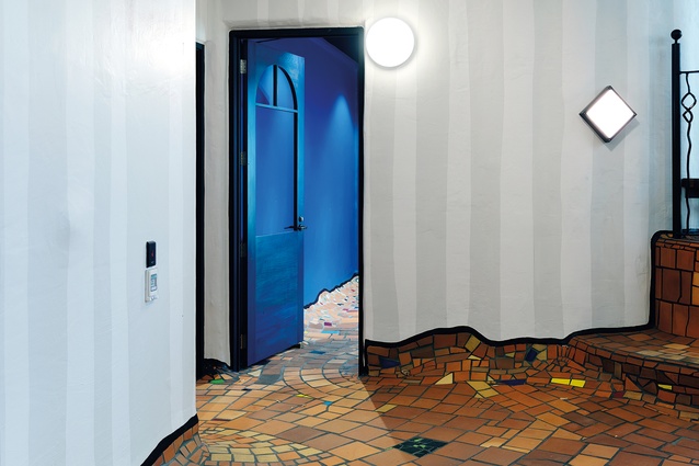
Most new buildings have razed the earth they are on. So much is consigned to landfill through demolition, construction offcuts and waste. We strive to make everything brand new and immaculate. Here, there is much reuse of materials such as timber, floorboards and bricks, as well as locally made materials such as tiles. The deliberate creation of patina and the appearance of wear, tear and age, such as the subtle scalloping of each stair tread, also contribute to a comfortable ambience rather than the stiffness of the new. You are walking through something organic rather than artificial: a bush track rather than a brand-new box.
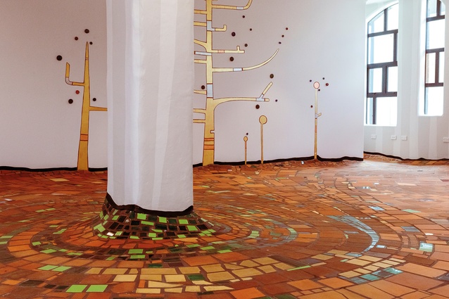
Despite the materiality and craft being essential aspects of the holistic nature of this building, the overriding question is: what is the architectural, formal and spatial experience like? It’s great. Go there. The ground floor isn’t flat; it’s wobbly, like the natural earth, and its galleries aren’t the black or white boxes of the contemporary gallery. However, I must register slight disappointment with the fun stopping at the institutionally sensible ceilings and lighting. How does it work functionally? Yet to be tested but I’d say parts of it are exceptional and, like a vintage car or clothes, some of it will be awkward. The accommodation of spaces for tangata whenua and art, its presence in the townscape, its publicly accessible forested roof, and the excitement that families and young children feel around it all provide a playful-yet-serious subversion of the status quo and business as usual. It raises questions about our aesthetic and other values. It’s not a cartoon building; it’s a slap in the face of how we do things and it’s a challenge. As Georgia O’Keeffe said, “there’s only one thing that matters… is it interesting?”6

From my vantage point, closer to the end of my life than its beginning, everything is cyclic. On a generational scale, a roughly 20–25-year cycle sees our interests and concerns wax and wane from one aspect of a spectrum to another: from organic to artificial and back again, from prog rock to punk, from humanism in architecture to the retro-modern. That forested roof and its eclectic mix of flora (from apple trees to extremely rare specimens) will probably be the most significant thing about this building, as we head into the hot house of the Anthropocene through man-made (gender intentional) climate change and the tidal Hāwea starts lapping more frequently at the doors of this precinct. Probably the biggest green roof in the hemisphere, it is an exemplar of what we should be doing to reduce heat island effects, utilise rain and sun and add green space and fauna habitat to cities.
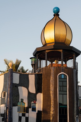
I went for one last lap around the Hundertwasser Art Centre and decided the street side was my favourite. That façade seemed to merge with the footpath and street furniture, the painted pedestrian instructions, the yellow poles, the blinking traffic lights: stop/go, walk/don’t walk, think/don’t think. The whole ensemble became a sort of silly symphony presided over by that koru flag, fluttering in the breeze on the asymmetrical summit of the Hundertwasser: the achievement of so many people, something extraordinary in a typically ordinary New Zealand town. Like our neighbours’ Opera House in Sydney, another vision of another famous foreigner, completed by locals, will this building become an icon of our country, like Hundertwasser’s flag design?
Aesthetically, the Hundertwasser Art Centre may or may not be to your taste but one thing is for sure, it shows what is possible. Sometimes it takes new arrivals to make us realise what is possible here in Aotearoa. It has survived local politics, it has relied on fund-raising, it has depended on the service and sacrifice of those supporters, stakeholders and workers who have nursed it through all the local dissent and institutional consent over the past decades. To me, any building that makes you think about the nature of architecture, and the ways in which we accomplish it, is great architecture.

