Winners: Waikato and Bay of Plenty Architecture Awards 2023
Twenty-one architecture projects have been awarded Te Kāhui Whaihanga New Zealand Institute of Architects Awards. The winners were announced at an event at — one of this year’s winners — Rotorua’s Sir Howard Morrison Centre, on June 14.
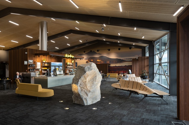
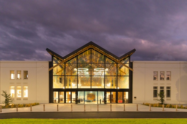
Important public buildings were recognised across the region, including Hamilton Zoo’s artful new entrance by Edwards White Architects, the Sir Howard Morrison Centre by Shand Shelton and First Light Studio for its thoughtful refurbishment and seismic strengthening of the category one heritage theatre, and the Taupō airport terminal, a winner in the Commercial category for Shelter Architects.
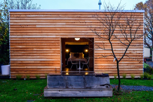
At the other end of the scale, winners in the Small Project Architecture category show that architecture doesn’t have to be large in scale to be impactful. The Urban Tramping Hut, a minimalist studio by Bellbird Architect inspired by bush huts, was celebrated for its experimental approach; Beach Hut by Strachan Group Architects proved that a prefabricated micro-dwelling can be award winning; and Deep Cover cricket pavilion, sited on a residential section in Tamahere, was praised by the judges for being both intelligent and whimsical.
Edwards White Architects won an impressive six awards across Commercial, Housing, Housing—Multi Unit and Small Project categories. The studio’s awards include Panorama, a floating cedar home atop a stone base in the Coromandel.
“There were some lovely moments of delight, playfulness and human spirit in the winning projects,” says Megan Scott, jury convenor. “They varied in scale, complexity and budget, and were all so different, but we were impressed by the way the architects overcame the material issues and difficulties related to Covid, connected with their clients, and collaborated to create architecture that lifts the human spirit. They created architecture that connects with human emotions and we were moved by them.”
Convenor Megan Scott of Megan Scott Architect was joined on the jury by Brendon Gordon of Brendon Gordon Architects, Daniel Barrington of Klein, and architectural graduate Courtney Smith-Frank.
The winning projects are:
Housing
Ranch Puke by Architecture Bureau
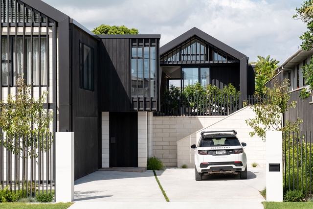
Ranch Puke showcases carefully considered spatial planning to fulfil the client’s brief and provide a unique and relaxed family home that exceeds expectations. It makes the most of the site, capturing views while also providing privacy with comfortable, flexible living spaces. The scale and proportion of the spaces within the traditional gable forms and split levels are clever and thoughtful. The detailing is meticulously designed and executed, resulting in a cohesive and impressive finished product.
Panorama by Edwards White Architects
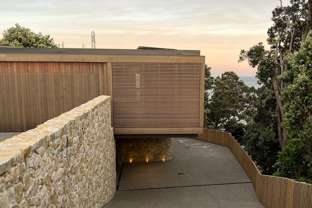
This multi-generational holiday home is a considered response to the needs of its inhabitants and the spectacular site overlooking Maramaratotara and Mercury Bays. The challenge of the site’s steep terrain, established pōhutukawa and native vegetation, called for sensitivity during the design and construction process. The result is a floating cedar box atop a stone base embedded into the cliff face. It provides varying levels of enclosure, exposure to the natural elements and – importantly — strong connection to its beachside location.
Screened Gables by Edwards White Architects
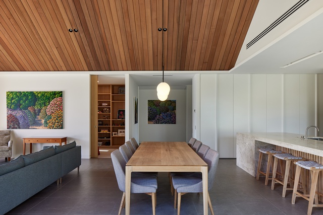
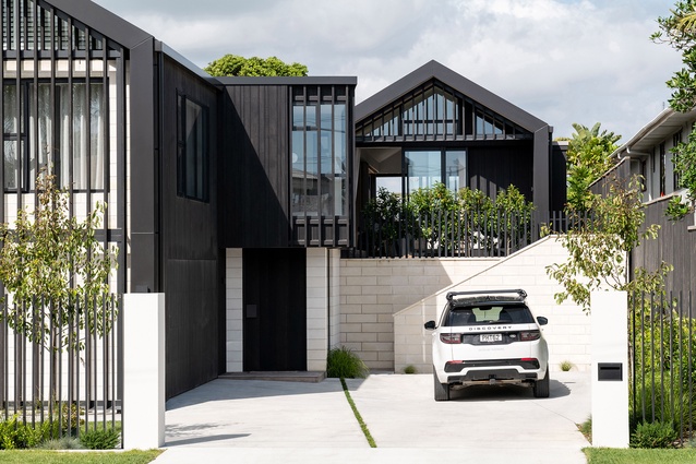
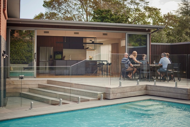
The design of this new home in an established Hamilton suburb was based on the client’s request for a family sanctuary, a retreat from their busy life in the city. The building’s clean lines and elemental forms challenge the traditional approach to entry and street appeal. The cedar rainscreen offers a critique of these challenges, while providing protection and privacy to interior spaces. The tonal distinction between the two gables represents a separation of public and private realms. The interior design features a carefully considered material palette of timber, stone, tile and rendered plaster, creating a timeless sense of warmth and permanency. The landscaping and pool were planned to maximise the site and generate a protected courtyard retreat. The building’s apparent scale conforms to its context, and the topography provides a challenge to entry and engagement with the street.
Coastal Retreat by Mercer and Mercer Architects
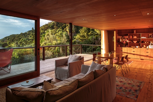
Coastal Retreat is a case-study house that represents years of exploring the Kiwi vernacular. Delivering on the client’s vision to live (comfortably) off-grid in the bush, it showcases the beauty of sustainable and thoughtful design. The intensity of spaces is cleverly contrasted with sun-soaked living areas and a-light filled bathroom open to a view of the bush, balanced with darker, enveloping spaces giving a winter cosiness. The incorporation of the Japanese concept of ‘washitsu’ or anteroom, creates areas of calm and opportunity to appreciate the fine level of craftmanship expressed in the building.
Slide House by Mercer and Mercer Architects

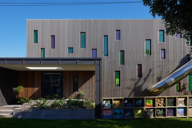
Pip had a vision for a home with a sense of humour and a slide for her children and grandchildren to enjoy, Adam Mercer made it happen with a quirky house that reflects her personality. Elevated above the flood plain, the two-storey home sits tightly along the street front separating the public realm from the private internal spaces and sheltered northern courtyard beyond. The cedar batten rainscreen façade is punctuated with windows of varying size and colour, and a large-scale mural by a local artist features at the building’s street edge. By day pōhutukawa cast ever-changing shadows on the façade, while ethereal dappled light through coloured windows adds to the theatrical experience of the entry, stair and living spaces. By night the home becomes a whimsical colourful lantern. This delightful architectural response encourages curiosity, intrigue and playfulness, exudes positivity and promotes community and conversation.
Resene Colour Award
This courageous display of colour reads as an expression of joy and delight, not only for the owner and her family but in its generous extension to the community through coloured glazing and artwork. Against the exterior and interior timber backdrop, the use of colour is judicious and considered, conveying fun and an element of surprise, rather than overwhelming.
G House by Parsonson Architects

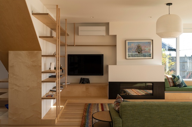
Situated on a Taupō lakefront, G House is a contemporary holiday getaway with a nod to disappearing mid-century modernist baches of our past. True to the early bach era, there is no front fence and a grassed driveway leads to a boatshed at the back. Generous morning and afternoon decks, a built-in barbecue area, expansive lawns and bay window seats provide a relaxed and comfortable atmosphere. Bespoke custom kitchen and bathroom cabinetry, ply and dowel open shelving and stair balustrades feature alongside a playful use of colour. With artistic flair and a touch of humour, G House is a masterpiece of Kiwi bach vernacular architecture and has become a landmark cherished by owners and locals alike.
Resene Colour Award
Shades of pastel to the street align with the architect’s riff on modernism, are highly evocative of times gone by and reinforce this home’s public persona in the lakeside setting. Within the home’s private settings, colour deftly defines personality and encourages the sense of calm established by the natural environment.
Tent House by SGA - Strachan Group Architects
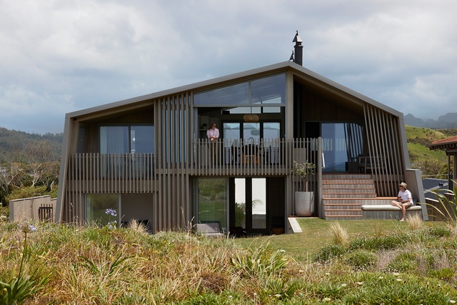
The simplicity of the Tent House form belies a masterful response to a constrained site, while clearly evoking a beachside vernacular in its form. Expertly resolved levels create effortless circulation horizontally and vertically throughout the home, interfacing with site in a myriad of considered ways. Openings and decks are uniquely articulated based on use, views, shelter and privacy. Externally, material selection, its usage and detailing, are determined by robustness, spatial orientation and building concept. A predominant colour palette of whitewashed timber, powdered blues and sandstone grey is refined and restrained yet sophisticated throughout. An example of leading-edge architectural thought and execution.
Resene Colour Award
This beachside retreat is a masterstroke in respecting its beachside location among the dunes, both in its form and muted tones. The sandy grey exterior of the home’s base to the street beds it into the surrounds and supports the sun-bleached timber palette. Inside, colour plays a supporting role to the tent-like form, particularly in a snug lounge where timber lining wraps a soothing blue wall above a bench seat.
Commercial Architecture
Rabobank Tower, Union Square by Chow: Hill Architects
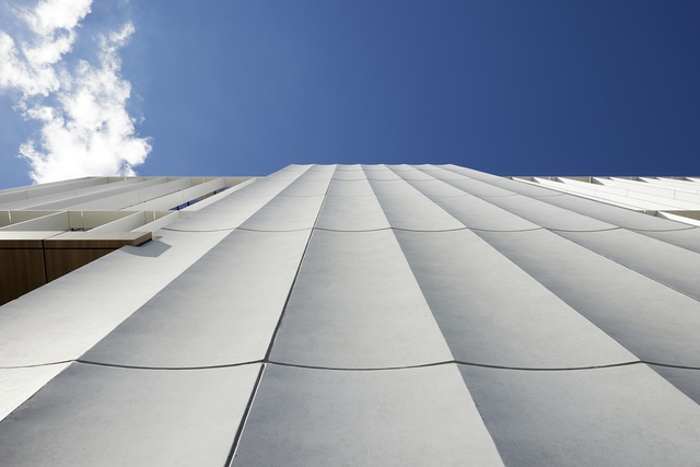
The Rabobank Tower in Hamilton’s CBD is the first building of five to become Union Square, a commercial precinct aimed at fostering ongoing commercial success and community as an entertainment, retail and hospitality hub. The tower features a five-storey office building design that boasts a construction-efficient and seismic steel frame, a prefabricated curtain-wall façade, and fluted concave precast concrete panels that provide construction speed and durability. The building’s lobby serves as an important pedestrian link to the future precinct and has a café and quality seating areas in a palette of natural materials. The Rabobank Tower is an example of a collaborative process and a precursor to the reset of Hamilton’s CBD.
Vantage by Edwards White Architects

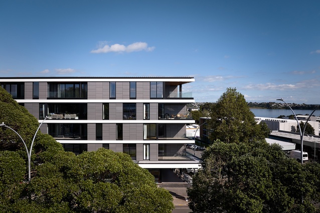
Vantage Apartments is a new addition to Tauranga’s urban landscape, raising the bar for apartments as a good example of high-density living. Located on the main arterial route of Cameron Road, the building shows good urban design practice, offering generous public space at street level with a café and outdoor dining. The apartment’s layout is designed with interlocking modules nested together, creating a hierarchy of spaces, offset by staggered intertenancy walls and full-height sliding doors to open up spaces to create natural light and viewshafts. Elevated decks provide stunning views of the Tauranga harbour entrance between Matakana Island and Mauao.
Taupō Airport Terminal by Shelter Architects

The Taupo Airport Terminal is a simple shed form, located parallel to the runway for practicality and visual connection. But it has a twist — its roof ridge alignment that links the terminal to the landscape. Beneath this form, the terminal boasts generous raking eaves, full-height glazing and an efficient, functional layout. The building also houses a well-appointed boardroom and meeting room. At each end of the terminal, mural-scale photos by a local photographer inform visitors of their natural surrounds, while artwork tells the story of the volcanic region, and substantial rimu trunks offer a tactile connection to place. The success of the project is attributed to community engagement and collaboration with local iwi, artists and vested parties.
Te Kura o Te Whānau a Apanui by DCA Architects of Transformation and MOAA Architects in association
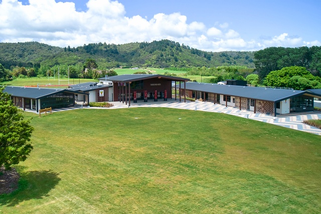
One end of this extensive elevated ātea overlooks a corner of East Cape’s unspoiled natural splendour. At the other, three large gable silhouettes mimic the ranges beyond. Generous verandahs allow views to the maunga, urupā and other sites that the buildings are orientated toward. Four carved pou, tīpuna of Te Whānau a Apanui, stand prominent and powerful, brought to the fore of daily activity to allow continuous spiritual connection. The building façades illustrate local mythology in illusory brickwork that appears liquid with movement, while batten detailing invokes carving unique to mana whenua. This project embodies the deepest sense of manaakitanga for its inhabitants, is rich in meaning and powerfully connected to place.
Te Wharekura o Ngā Purapura o Te Aroha by MOAA Architects
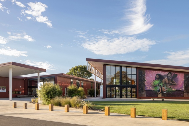
Te Wharekura o Ngā Purapura o Te Aroha is a greenfields small kura designed with a traditional whare of a simple gable and four pou. The pou represent kura pedagogy and values, and ground the students in tikanga. The school features a central circulation spine that metaphorically represents the meandering Waikato River and its ever-changing riverbanks. The building has large overhanging roofs, creating sheltered breakout exterior spaces. The success of this special project is in curating the master planning and its design/build, which included consultation hui with advisors and kura community engagement. The result is a unique, specific and meaningful design.
Housing—Alterations & Additions
Terrace Red by Architecture Bureau
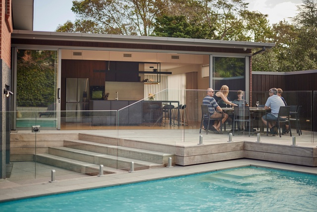
The alterations and additions to this split-level 1960s house are artfully composed using materials that are respectful, and sometimes indistinguishable, to the building’s original mid-century heritage — a key client objective. An astute interior plan and level choices maximise the relationship with a refurbished private yard and existing pool. Natural light floods larger spaces of white and timber, while darker tones highlight smaller spaces. Detailing throughout – inspired by mid-century aesthetics — is crafted and refined. A more contemporary carport intervention integrates into the modernised landscape, providing privacy and increased utility.
Housing—Multi Unit
Cambridge Townhouses by Christopher Beer Architects
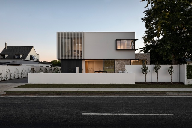
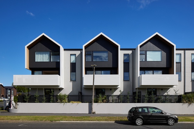
A composition of volume, plane and screen, dynamic material textures, and a restrained two-tone palette provide a repertoire of architectural juxtapositions. Landscape and building elements are similarly expressed, and equality utilised in creating an engaging street frontage, concealing party walls, and defining public and private spaces. A sense of engagement and community is evident in the development ethos where kitchens convert to alfresco bar serveries for informal interactions and differing kitchen fitouts provide neighbourly interest. With diversity of accommodation across five townhouses, this development is a significant example of high quality, community minded, medium density housing in New Zealand.
Manning Street by Edwards White Architects

Manning Street is a multi-housing complex in Hamilton city that not only looks great, with its well-articulated building forms, but also provides comfortable living spaces for its residents. While working within a tight budget, astute decisions were made to ensure quality and functionality throughout. The design team focused on creating generous spaces and thoughtful detailing, exemplified by the rainscreen that conceals gutters and downpipes. The client is highly satisfied with the outcome, and the Manning Street complex stands as an impressive addition to the city’s architectural landscape.
Public Architecture
Hamilton Zoo and Waiwhakareke Natural Heritage Park Entry Precinct by Edwards White Architects
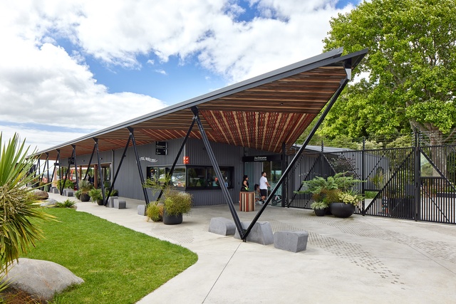
The Waiwhakareke Entry Precinct project in Hamilton provides a remarkable venue that connects the Hamilton Zoo and the Waiwhakareke Natural Heritage Park. The integration of architecture, landscape and interiors creates a seamless flow between the two destinations and showcases successful collaboration between disciplines. The Kākā and Niho Taniwha stories have been used as inspiration for the design, with the colours of the Kākā referenced in the canopy. Visitors can also enjoy an unparalled 360-degree view over Hamilton surrounds from the observation tower. The Waiwhakareke Entry Precinct is an excellent example of how good design can create a unique and memorable experience for visitors.
Cambridge Police Base by PAUA Architects

This project, a partnership between iwi and the New Zealand Police, represents a paradigm shift for the delivery of civic architecture. A myriad of design intentions has created a built form that is a layered, creative and a playful tapestry of architectonics. Formed between two pavilions, the building entry opens to the public, offering full-height windows for transparency and disguising security elements in garden ornamentation. This creates an inviting and welcoming public presence that reflects a new approach to policing. Iwi narratives, artwork and a varied material palette (including recycled materials from previous buildings on site) are at the forefront of the architectural execution. They soften the institutional functionality of the building, further enabling community engagement and wellbeing, and help resolve a contentious site with a complex history.
Sir Howard Morrison Centre by Shand Shelton and First Light Studio
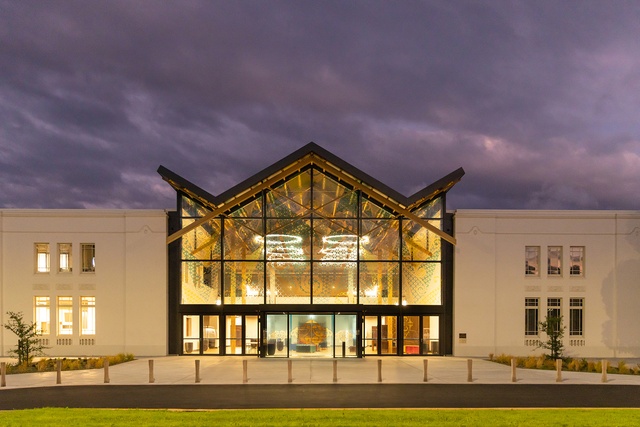
The Sir Howard Morrison Centre is a cultural hub, the puumanawatanga (beating heart) where Māori and Pakeha culture, manaakitanga and toi whakaari are woven together. The original Municipal Building (1938), with Spanish Mission influences, served as Rotorua’s civic centre and was converted into a Convention Centre in 1995. It became a performing arts venue in 2014, then closed to the public in 2017 for earthquake strengthening and refurbishing. The brief required a focus on venue flexibility, heritage of the building and Ngāti Whakaue, and Sir Howard Morrison’s legacy. The solution involved peeling back the 1995 addition, revealing the original heritage wings, and inserting a standalone foyer structure enriched with Te Arawa/Ngāti Whakaue design ideologies. A challenging collaborative project, meticulously considered and masterly crafted.
Small Project Architecture
The Urban Tramping Hut by Bellbird Architect

The hut embodies a playful and experimental approach to architecture. Inspired by quintessential tramping huts, it features self-built components and celebrates imperfection and thrifting. The discreet and unassuming exterior gives way to a well-considered layout suitable for a variety of uses and proving that even with limited space, a building can still be full of character and charm. The project explores what can be achieved on a tight site, while still providing a close connection to the outdoors and achieving a feeling of seclusion within a suburban context.
Deep Cover by Edwards White Architects
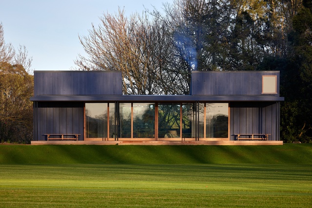
Deep Cover cricket pavilion in Tamahere is a playful response to the multifaceted needs of its owners: a functional space to share outside their main dwelling, sympathetic to the natural environment, while celebrating a perfectly manicured lawn. The design of this low and lean singular form pays close attention to symmetry. A deep verandah area inspired by the ‘drinks break’ in cricket connects the two opposing team spaces, extending an invitation to stay and play while watching a long game. Close attention is paid to crafting the spaces, yet materials are robust to handle large social gatherings.
Beach Hut by SGA - Strachan Group Architects
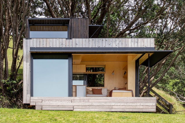
This 17m2 ‘tiny home’ exemplifies the architects’ expertise in prefabricated and transportable micro-dwellings. Serving as supplementary accommodation at a picturesque beachfront locale, the structure opens effortlessly to site and is spatially dynamic internally, framing views and allowing multi-faceted inhabitation and use. While the technical achievements of portability are inherent, its formal gestures are architecturally dynamic and refined. Material curation and detail further distinguish the building as a laudable, human-centred structure that is intimately connected to its surroundings, rather than a mere functional unit on wheels.
The NZIA Architecture Awards programme is supported by Resene and APL.

