Winners revealed: Wellington Architecture Awards 2023
A monastery, a church and a store in which stylish Wellingtonians come to pray to the Fashion Gods have been awarded top honours in the Wellington region’s Te Kāhui Whaihanga New Zealand Institute of Architecture Awards.
Thirty-two outstanding projects took home prizes across 10 categories at an awards ceremony held at the St James Theatre on May 18. The winners showcase the exceptional talent of architects in a wide range of categories, including Commercial Architecture, Heritage, Hospitality, Housing, Interior Architecture, and Small Projects.
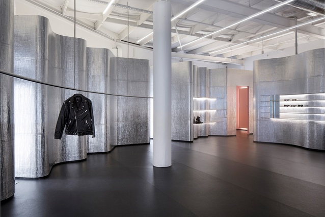
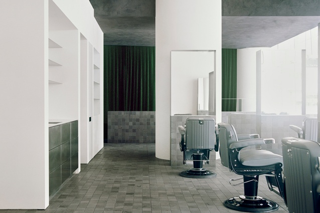
Stolen Girlfriends Club’s sexy, shimmering flagship store scored an Interior Architecture award for Jasmax, as did Stravinskij, a chic hair salon created by Seear-Budd Ross.
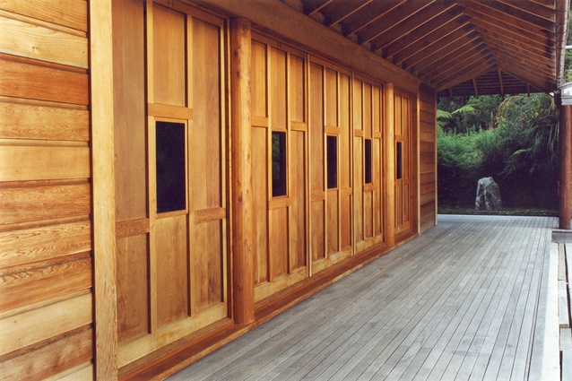
Ata Rangi’s timber wine-tasting room in Martinborough, by Wellington studio Makers of Architecture, is a winner in the Hospitality category. Tennent Brown Architects’ Bodhinyanarama Monastery, another serene wooden building, was recognised with an Enduring Architecture award. The religious building, which was created in 1992, has served as a spiritual anchor for Wellington’s South-East Asian Buddhist community for more than 30 years.
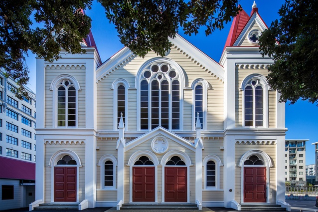
Other iconic buildings to receive awards include the St James Theatre refurbishment by Shand Shelton in the Heritage category, and 8 Willis Street, the bustling corner site on Willis Street, which won an award for architecture+ in the Commercial Architecture category. The renovation and seismic strengthening of the 19th century Wesley Church in Te Aro meant a second award for architecture+, who collaborated on the project with heritage architect Paul Cummack.
‘In the Housing categories, winners run the gamut from a small in size, big on intent tiny home of around 30m2 by Bonnifait + Giesen Architects, to Seaborne by Herriot Melhuish O’Neill Architects, a multi-unit townhouse development on the Petone foreshore.’
There was even a winner from the Chatham Islands: Kelp, a sculptural house by Bull O’Sullivan Architecture was included and named a Housing category winner, because consenting for the island is executed by Wellington City Council.
Jury convenor Karl Wipatene of a.k.a Architecture praised the standard of this year’s entries, saying, “We saw a number of established practices that continue to produce top quality architecture, but also emerging younger practices, particularly in the residential space, who are making their presence felt.”
“We were impressed with the ways in which we saw architects as problem solvers. Each of these projects had challenges with the brief, planning rules, budget and other considerations, and we saw innovative and creative ways of overcoming those challenges in the finished projects. It reminded the jury that, actually, architects are problem solvers, and that design challenges provide opportunities as well,” adds Wipatene.
The panel of judges also included David Melling of Melling Architects, Linda Wong of Wong Workshop, and Rohan Collett of Rohan Collett Architects.
The winning projects are:
Housing
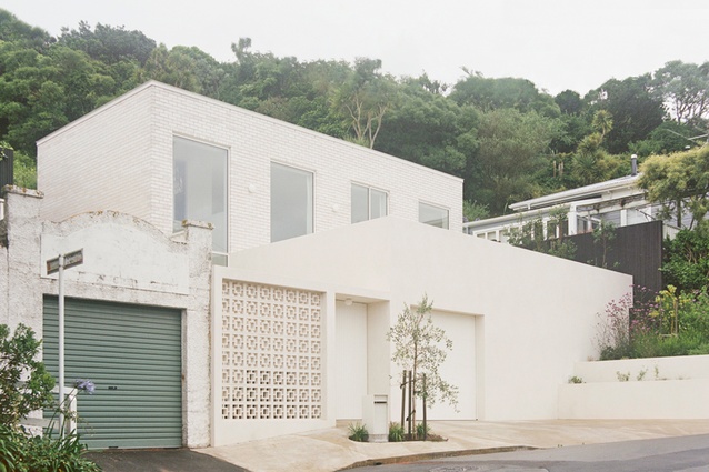
White House by Andrew Sexton Architecture

A client with a clear vision, plus a joining of minds with her architect, has led to this spectacular
collaboration. A clever layering of forms and space define the home’s public and private areas, while allowing views to the city from multiple aspects. The exquisite refinement of details and material palette demonstrate the difficult made simple. The original villa has gone and in its place is a Parisian-style apartment in the hills of Wellington.
Resene Colour Award
A statement to remind us of the brilliance of white. The project is the ultimate commitment to a single shade and explores the subtleties of its range through texture, pattern and variation. The whiteness is the perfect backdrop, successfully accentuating the owner’s beautiful collections.
Kelp by Bull O’Sullivan Architecture (Chatham Islands)
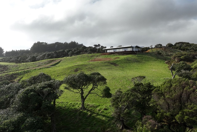
Taking on an enticing brief, the architect has married functional and logistical challenges with a sculpturally distinctive house to accommodate island life and lashings of weather. This project’s realisation and level of architectural detail is remarkable considering the island’s isolation and lack of relevant resources.
The client’s trust in the architect has resulted in the implementation of innovative ideas and experimentation, while allowing for the future adaption of this inter-generational house by its occupants.
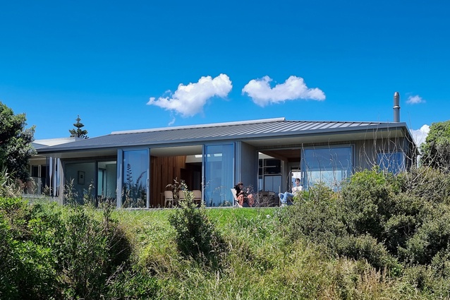
Waikanae Beach House by Lovell & O’Connell Architects

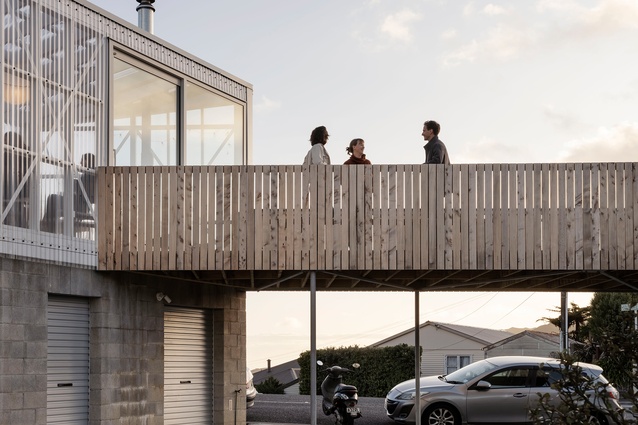
A beautiful setting overlooking the intersection of the Waikanae River and the beach with Kāpiti Island directly beyond. The external forms and materials of this simple two-bedroom house above a garage blend effortlessly with the sand dunes. A generous stair and front deck lead you into the transparent interior where you feel very much connected to the dune setting.
A central skylight runs through the ridge of the house, providing fantastic volume and diffused light from the kitchen to the ensuite. A macrocarpa ceiling, cedar wall panelling with integrated doors, timber joinery elements, exposed trusses in the main bedroom – all carefully considered and expertly finished – add warmth and quality to create an outstanding living environment.
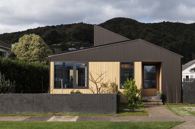
Flock House by Pico Studio Architects

This project is packed full of high-performance credibility, clever tech and sustainable nice-to-haves, complimented by the careful selection of material and colour, and prioritising of architectural detail. The raking ceilings, maximising of natural light, and central deck all provide generosity to the small footprint.
The house balances the relationship to the street with the need for privacy, which is often difficult to achieve on small properties. A well-designed first architectural home with plenty of eco-bling that should inspire many a first-home buyer or builder.
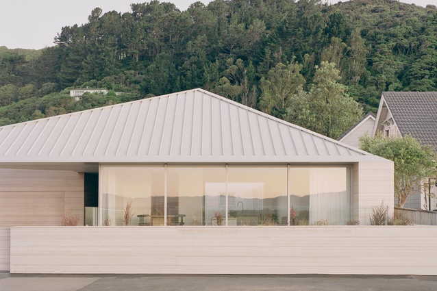
RK Residence by Seear-Budd Ross

This five-bedroom home sets a new bar for a prime harbour-front location. Well-organised planning places a single-storey main living space at the front and two levels of bedrooms to the rear, linked by a glazed corridor and courtyard. The living form has a low-slung asymmetrical gabled roof, exquisitely articulated with a blade-like edge where the roof meets the wall. The roof/wall junction is a datum that runs through the house and is slavishly controlled through material modules.
Macrocarpa rafters and sarking achieve a cathedral-like feel, further enhanced by skylight panels over the dining area. This house is a finely tuned piece of modern design and detailing, which demonstrates that the builder’s craftsmanship and planning are more than up to the task.
See-saw home by Upoko Architects
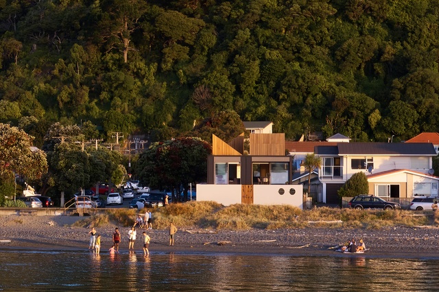
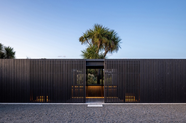
Elevated on a sand dune, the compact form of this beachside home hovers over an outdoor courtyard perimeter wall. From the main courtyard, playful opening portholes encourage engagement with the public promenade beyond. Nautical references extend to periscope-like timber-clad roof lights oriented in different directions to bring natural light and volume deep into the compact upper living level.
Materials and details are thoughtfully selected and designed for the challenges of the oceanside environment. Side courtyards on both levels provide compact, private exterior living spaces, artfully screened with timber battens.
Housing - Alterations & Additions
Glenmorven Studios by architecture +

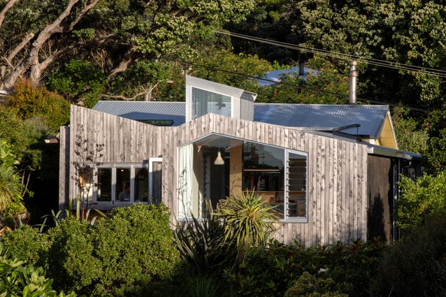
This addition continues a 30-year-plus collaboration between client and architect at this stunning site. A move from temporary to permanent occupation, the new building pays homage t
o the original summer home, and is sited separately to have its own presence, orientation and identity.
The dark exterior contrasts with the lightness and warmth of interior spaces. Further craft and masterful detailing can be found in a Japanese-inspired bathroom. Outdoor circulation links the two elements of habitation, effectively creating a sense of camping.
The architect’s keen skills are again present in the sensitive siting of the building within the natural landscape, the crafted detailing of building elements and the creation of space between built elements.
House of G by Bonnifait + Giesen Architects

This house is a display of architectural experimentation that rejuvenates the original house to suit modern family life. The west extension elevates the main bedroom as the benefactor of sunset and sea views. The choice of macrocarpa as the rain screen to the garden extension contrasts nicely with the painted street-front formality of the house.
The addition of the pop-up clerestory to the rear living room adds much-needed sunlight and height, guiding the eye sea-ward. Extensive glazing to the hall adjacent to the deck transforms this into a light-filled gallery space.
The changes have transformed this traditional light-starved bungalow into a bright, modern family home at one in its natural setting.
Mt Victoria Villa Alteration by Lovell and O’Connell Architects
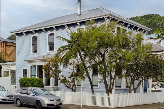
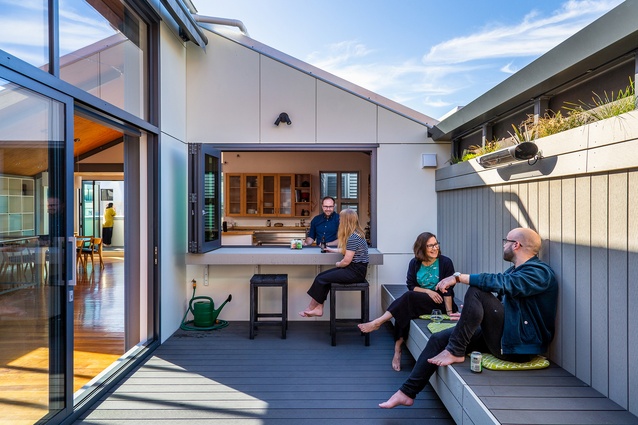
This modern adaption and extension is designed to sympathetically blend into the existing villa. Considered material selection and creative detailing result in the seamless integration of the new, contemporary bathroom areas and rejuvenation of existing rooms. The quality of this design ensures the beautiful villa remains relevant to modern family life and therefore preserves the original architecture. The design of the outdoor living spaces is well-considered for entertaining and the boisterous rigours of play.
Chaffers Dock Apartment by Makers of Architecture
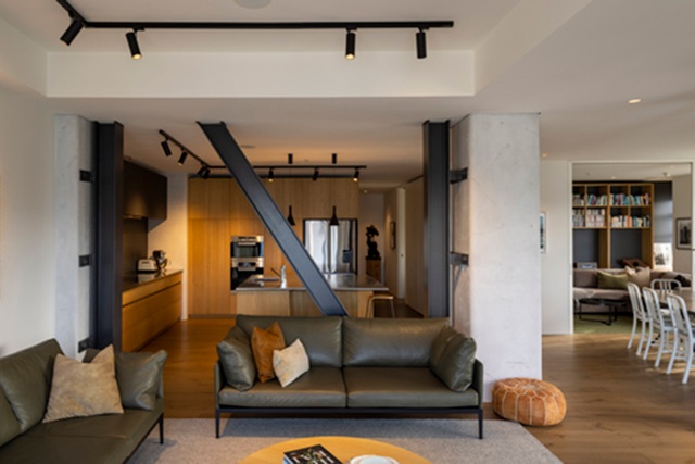
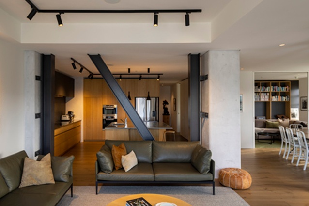
With this fresh apartment makeover, the architects have found the perfect balance between retention of old and insertion of new. The result has transformed a slightly dated interior into a contemporary modern home that exudes warmth and character. New oak joinery throughout the project acts to unify the new elements while complimenting the retained features. Changes to the apartment layout are subtle yet impactful in improving flow between and within spaces.
Kelburn Villa Alterations by Mary Daish Architect
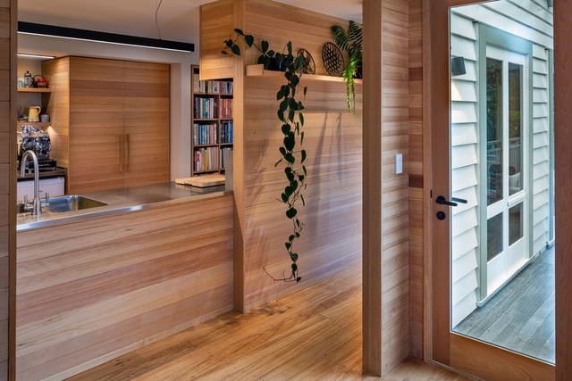
The architect has sprinkled her magic in a beautiful and sensitive way to infuse a strong sense of homeliness in this grand villa. The new integrates seamlessly with the existing. New timber joinery works in harmony with subtle pastel colours to create calm and inviting spaces. Beautifully detailed and crafted, this project builds on the style and character of the existing dwelling, elevating it to a whole new level.
Resene Colour Award
Like a skilled artist, the architect has been discrete and controlled with the use of colour. Applying just the right shades, in the right amount, in the right place, makes this artwork complete. Subtle pastel hues work in harmony with other material selections, creating a peaceful and intimate environment.
The Screen House by McKenzie Higham Architects

The street-façade proportions of this multi-level urban house have been subtly rearranged and renewed to increase privacy, while also enriching the texture and materiality of its central city streetscape. Subtle but successful exterior changes included raising the sill height of the top-level living-room window and adding a randomised-pattern metal-screen breezeway along the main bedroom façade, creating mosaic-like sunlight effects on the first-level interior spaces. Inclusion of a catamaran net strung over the double-height entry volume provides a playful opportunity to inhabit air space.
Sar Street Alterations by Parsonson Architects
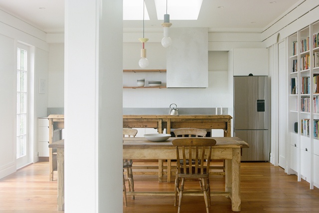
Thoughtful replanning of the interior of an existing character home incorporates the owner’s heirloom furniture and features the subtle re-introduction of ornamentation, which was removed in a previous project.
Surface details are considered with practicality and consistency through cabinetry features, trims and motifs. Removal of a wall in the living area, and new skylights over the kitchen bring additional light and volume into an inviting and connected family living space.
Housing - Multi Unit
Erskine by Common
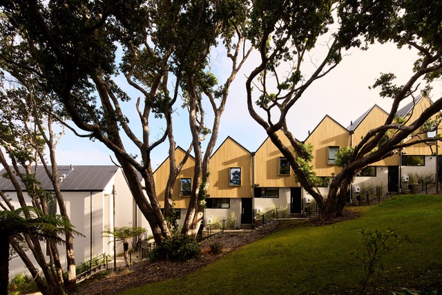
The former site of Erskine College and Chapel has been developed into 96 individual dwellings, connecting roads, car parking, stairs and paths, open space and landscaping. Dwellings are grouped together into bite-sized terraced blocks on the west-facing hill leading to the top of the site. Each block expresses individuality in differing roof forms, dwelling types and materiality.
There is a generous amount of open space between the dwellings, and view shafts between buildings provide visual connection to the site and Island Bay beyond. Dwellings are well-planned and living spaces benefit from the outlook. The scale feels very domestic, is nicely broken up, and creates a comfortable living environment.
Seaborne Development by Herriot Melhuish O’Neill Architects
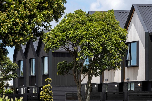
Adjacent to the Petone foreshore, this multi-unit townhouse development addresses its prominent street frontage with low-fenced courtyards and considered façade articulation, while also providing a desirable combination of multiple private outdoor spaces and spacious interior living amenities.
Accentuated gable-end details and window shrouds are deployed across a range of typologies, successfully creating depth and unique façade compositions, while subtle stepping between the forms differentiates individual units. The spacious interiors feel very liveable and private. Entry to each unit directly from the street or central car parking courtyard further connects this new development to the surrounding streetscape.
Block Party by Spacecraft Architects
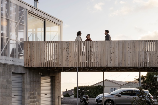
This triumph of out-of-the-box ideas and collaboration carefully curated by the architect is one-part urban design, one-part innovative architecture. Achieved on a modest budget, every design decision responds well to the brief: spatial order, paring back of materials, and the inclusion of intermediary spaces (decks and porches) to convey a generosity of space. The inclusion of a loft, accessed via a side stair, and the clients’ choice of colour, paid dividends. An appealing offering for prospective first-home buyers.
Interior Architecture
Stolen Girlfriends Club Wellington Flagship Store by Jasmax

A bold retail concept is clearly executed through a pared-back selection of materials, colours and forms. Sinuous and shimmery foil-clad walls provide a backdrop to constantly changing clothing and accessories collections.
A provocation and reflection on the retail experience, the denial of the view between the elevated, theatrical interior and prominently glazed exterior invites curiosity and exploration. The whimsical lack of permanence is reminiscent of fleeting fashion collections.
Stravinskij by Seear-Budd Ross

Considered planning organises space in this hair studio into three distinct zones – entry and retail, cutting floor and spa room. Materials, including stone tiles, steel and glass, are all carefully composed to give an overriding feel of quality and consideration.
The design successfully incorporates what were previously two retail spaces into a single tenancy. Although reasonably compact in floor area, the space feels generous and each cutting station is cleverly arranged to provide a sense of privacy for customers. Materiality, finishing and attention to detail make this a quality retail space.
Chapman Tripp Wellington Fitout by Studio of Pacific Architecture
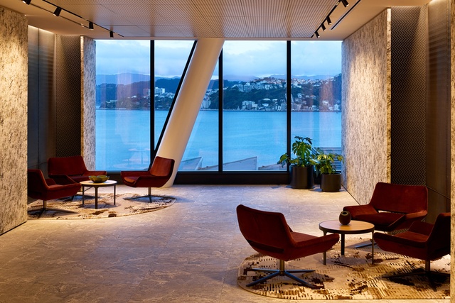
A fantastic setting over two floors in the middle of the recently completed Deloitte building on Customhouse Quay maximises views over the harbour to the eastern hills. The selection of finishes from spaces at the back to the front create a legible narrative that relates to the layered hills seen in the evening light.
Advantage was taken of a hole between the two floors made during construction and the result is a triumphant open stair with a double-height wall of books – a centrepiece that links both floors. Carefully considered lighting of stair treads and books adds significant impact. Materials, furniture and lighting come together to create an environment of exceptional quality.
Generator 30 Waring Taylor by Warren and Mahoney Architects

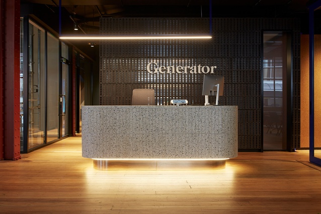
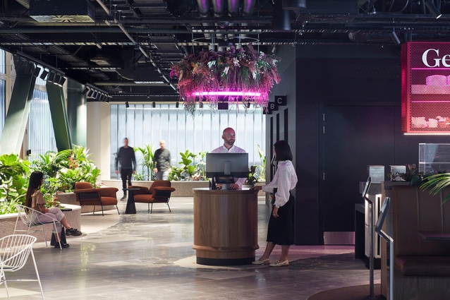
This unique shared workplace accommodates growing businesses and government departments alike. The central communal space and stairwell feature a bold use of coloured neon that lends an energetic feel, suited to both morning espresso meetings and launch parties. Generous and flexible multipurpose spaces provide infrastructure for members to hold in-person or online events. A thematic colour palette, creative use of reflection, lighting and planting provide an inclusive and nimble working environment.
Generator Bowen Campus by Warren and Mahoney Architects
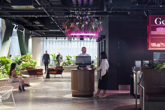
A kaleidoscope of colours and materials are intertwined with the existing 1920s building fabric, reflective of the target market: diverse, young professionals. Well-considered spatial planning and the addition of a central light-filled atrium enhances the user experience.
Resene Colour Award
The extensive use of colour as a key design tool is fundamental to the success of this design. Colour is used to define a variety of spaces, generate interest and highlight key elements (K-braces). Together with thoughtful lighting design, the defined spaces are well suited for their intended use.
Public Architecture
Wellington Children’s Hospital by Studio Design + Architecture
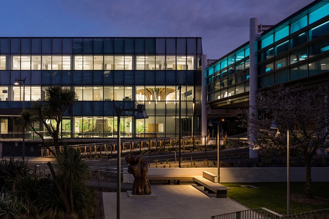
Made possible through public funding and a significant donation from philanthropist Mark Dunajtschik, Te Wao Nui is a unique healthcare facility with a welcoming, calm and child-focused environment.
The building’s rigorous technical, programmatic and seismic resilience requirements have been met. Also provided are generosity of space, daylight and views throughout, while innovations from overall building services distribution, patient-room cabinetry design and whanau facilities have been creatively incorporated.
Moments of discovery and playfulness have been incorporated seamlessly into the building fabric, from the warmth of interior finishes to frit patterns on glazing. Landscape and playscape areas are inviting, with extensive green foliage softening public-access areas and buffering the building from the surrounding car park.
Resene Colour Award
An engaging way-finding colour scheme changes progressively on each level, encompassing the forest floor through to the sky. The articulated glazed façade incorporates a gradient of translucent coloured-glass fins, accentuated in the light at different times of day. Calm and welcoming individual room colours benefit patients, whanau and staff.
Small Project Architecture
Brooklyn MINI-FAB by Bonnifait + Giesen Architects

Clarity of idea, simplicity of form, considered planning and crisp detailing make this a model for efficient living. An asymmetric form creates a contrast of compressed space adjacent to the higher volume. As a result, the interior feels surprisingly generous given the size restraints. Add a degree of self-build and a touch of colour, and no space is wasted. Small in size, big on intent, the ‘mini’ is a series of compact, affordable living studies.
Upper Watt Residence by Seear-Budd Ross

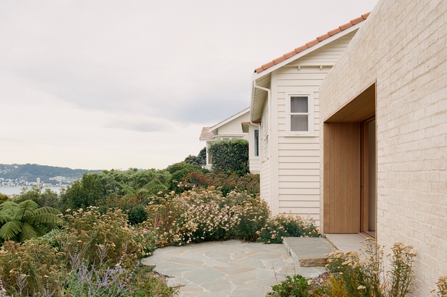
Disguised as a solid brick plinth in muted tones sympathetic to the existing house, this addition cleverly appears as a landscape intervention. A refined material palette and crisp detailing create a calm, atmospheric interior space; an ideal setting away from busy family life as guest accommodation or for work. Limited access must have made implementing this project a challenge.
Commercial Architecture
8 Willis Street by architecture +
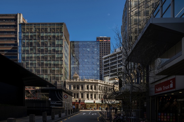
Architecture+ has seamlessly woven a new, textured high-rise into Wellington’s urban fabric. Decorative shading screens above street level respect and pay homage to the adjacent heritage façades. Offsetting the tower with variations to the façade treatment individualises each building element, adding richness to the cityscape.
The site created a number of three-dimensional challenges, which have been expertly and elegantly resolved. The targeted 6-star Greenstar, 5-star NabersNZ and super-structure reuse is exceptional and shows what can be achieved by a committed building owner and talented project team.
Site 9 Kumutoto by Athfield Architects

The commercial potential of this constricted site has been maximised by cantilevering office space over the public space at ground level. Earthquake dampeners located at first-floor level support the building’s seismic resilience and continuity in a 1-in-500-year event. Maximum height restrictions and avoiding sea-level intrusion to the harbour-side site added complexity to the brief. The architectural response pays homage to the working-port location and neighbouring historic sheds in its scale, modern form, and use of similar materials and colours.
Heritage
8 Willis Street by architecture +
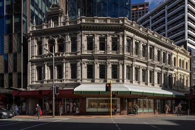
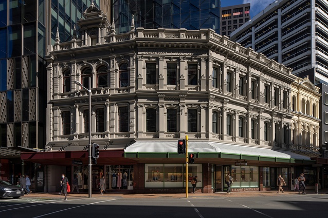
The heritage building accommodating Stewart Dawsons retail store is a prominent and much-loved Wellington landmark. Architecture+ and heritage architect Ian Bowman have breathed new life into this Historic Places Trust category-II listed building. New building elements have been respectfully integrated with the old.
Care and attention to detail, intensive research, preservation and re-creation of the heritage façade and roof features restore this special building to its former glory. It has never looked better and is once again casting its ageless charm on passers-by and continuing its role as a cherished capital-city icon.
Wesley Church seismic strengthening and refurbishment by architecture + and Paul Cummack, Heritage Architect in association

Other than the renewal of the lean-to link/lobby on the north side of the church, which has an attractive modern aluminium and glass curtain wall and replanned internal space, it is difficult to discern what work has been undertaken here. Design skill cleverly conceals new elements.
To ensure their reuse, all weatherboards and timber trim were carefully removed from the external buttresses, as was the internal match lining. The new steel structure was installed within the buttress cavity and connected to a new concrete torsion beam in the ground. Together, they provide the main lateral stiffness for seismic strengthening. With the timber carefully reinstated, and repainting and reroofing in heritage colours, the church has been given a new lease on life.
St James Theatre restrengthening and conservation by Shand Shelton
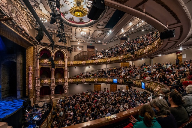
The rejuvenation of a magnificent historic theatre is based on original concept drawings by architect Henry White. The technical resolution of structural seismic upgrades and complex backstage requirements are seamlessly interwoven with existing and recreated character details.
Fastidious attention was paid to uplifting the original interior, including restoration of all existing decorative plasterwork, reinstating the original chandelier, and the completion of a complex decorative emblem over the stage, as intended in the original drawings.
The success of this project is due to the commitment of the design team, artisans and contractor to realise an enhanced vision of the St James Theatre.
Resene Colour Award
The three-dimensional forms of starbursts, cherubs and a myriad of mythical creatures in decorative plasterwork are rendered in the original, lively colour palette. The artisans’ painstakingly detailed hand-painted work brings these heritage details back to life. Additionally, restoration of the plasterwork was completed in challenging conditions under localised construction lighting, while the original theatre lighting was being upgraded.
Hospitality
Nga Waka Cellar Door by Aspect Architecture
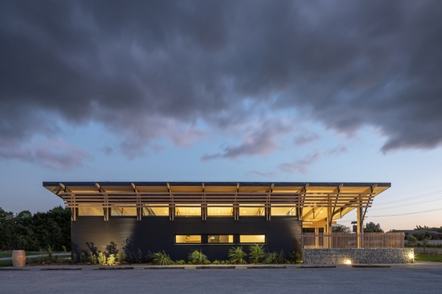
The project is a wonderful collaboration between local architects, artisans, and the client. The building form and final orientation draws inspiration from the legend of Ngā Waka ō Kupe (the canoes of Kupe) and the surrounding landscape. Comfortable in its rural setting, the building is designed to provide shelter inside and outside.
The horizontal rhythm has been successfully derived from the patterns of geographical features and vineyard rows. Planting and gabion rock walls integrate the building into the landscape. This multi-functional design continues a rich history of architecture on the site.
Ata Rangi Tasting Room by Makers of Architecture
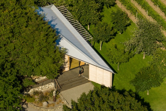
‘Wow’ is all we could think when we entered this space. The acute dart-shaped structure designed for Ata Rangi wine tastings and functions is set amid a grove of trees overlooking the vineyard. The tip of the dart, with a cantilevered front and steps, serves as the entrance. Except for a solid wall to the east, all other walls are glazed to provide a sense of immersion within the landscape. Sun filters into the space through trees and a timber brise soleil.
Extensive use of Lawson cypress internally combined with the raked gable ceiling creates a light and natural interior. Overall, the result is truly inspired, and a triumph for all those involved, including client, architect and builder.
Enduring Architecture
Bodhinyanarama Buddhist Monastery (1992) by Tennent Brown Architects
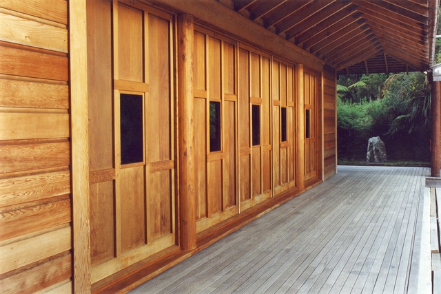
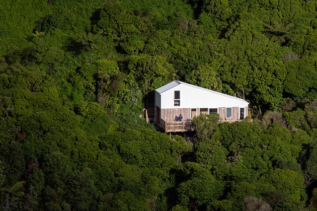
Sitting quietly within a beautiful bush setting on the hills of Stokes Valley, the Bodhinyanarama monastery has served as a spiritual focus for Wellington’s South-East Asian Buddhist community for more than 30 years.
A generosity of spirit – architect as designer and builder, with a dedicated team lending skill, love and an old-school No.8-wire attitude – created this building. The blending of vernaculars fuses influences of Thai forest monasteries with Japanese jointing, and local native timbers with common construction methodology. The building is a layered series of enclosures leading to the shrine, encouraging peace and mindfulness. The physical procession supports and symbolises the spiritual journey.
An enduring relationship between the architect and this special place has resulted in enduring architecture.
The NZIA Architecture Awards programme is supported by Resene and APL.

