Winners revealed: Auckland Architecture Awards 2024
The winning projects receiving a Te Kāhui Whaihanga New Zealand Institute of Architects Local Award from this region were announced at an event at the Viaduct Events Centre on 15 May.
Forty-three architectural projects have been deemed the very best in the Auckland region. The winners span 12 categories and a geographical region that extends from South Auckland to Northland.
Te Iwitahi — Whangārei Civic Centre has received a Commercial Architecture award for TEAM Architects Auckland. The local Council hub was designed according to biophilic principles, features two green-walled stairways and a four-storey atrium, and was commended by the jury for its “universal multi-cultural themes and a strong tikanga Māori narrative”.
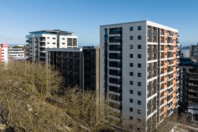
In Auckland’s CBD, Te Mātāwai by MODE has been recognised in the Planning & Urban Design category for reinventing public housing on Greys Ave. An innovative mixed-use project that includes 276 homes operated by Kāinga Ora, its design plan includes medical services, a Homestar 7 rating, and warm, dry residences for the previously unhoused.
“Clever, thoughtful architectural intervention can create a building that delivers so much more than the client’s expectations,” says jury convenor, architect Wendy Shacklock, of this year’s recipients. “We were pleased to see a diverse range of exceptional multi-unit housing projects come to fruition and some exquisitely detailed interiors, both commercial and residential.”
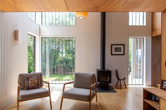
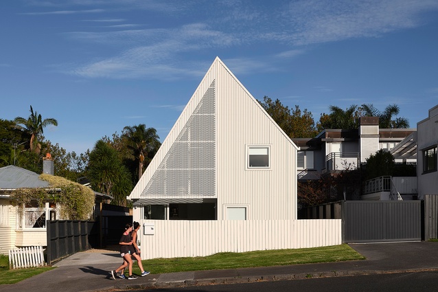
In the Housing categories, six new homes will be awarded, along with three renovations. Paper House by Crosson Architects, a dwelling that is small on square metres but large on personality has received a Small Project Architecture award, with the jury commending its “clever design response… the house is playful and the compact plan exudes spatial generosity by virtue of a north-facing, double-height living space.”
A mechanic’s garage transformed into a chic photographer’s studio by Pac Studio is also a Small Project Architecture winner.
“Bigger budgets don’t always mean better,” says Shacklock, who was joined on the jury by Nick Barratt-Boyes of Studio Pacific Architecture, Gabrielle Luong of Malcolm Walker Architects, Professor Anthony Hoete of University of Auckland and landscape architect Bridget Gilbert.
The winning projects are:
Housing
Bird/Seed House by Vaughn McQuarrie

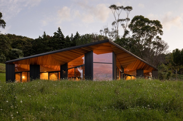
This house is modest in size but ambitious in expression. Testament to a trusting and collaborative relationship between architect and client, the house takes the generative idea of a bird in flight and marries it with the compass form of the pōhutukawa seed. The result is a home that feels simultaneously warm and inviting, yet open and connected to its surrounds. A heroic timber ceiling cloaks the north-facing rooms, which draw the eye out to the pōhutukawas and estuary beyond.
Ōwairaka House by Athfield Architects

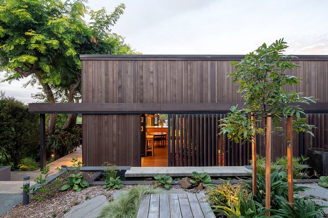
This is a response to the realities of multigenerational living, downsizing and the desire to stay connected to a beloved family property. Where the suburbs are increasingly intensifying, the client’s brief was for “neighbourly infill”. The form ensures the front property loses none of its original privacy or amenity, and a new shared garden and common material palette connect the neighbours rather than defining property borders. Internally and externally, thoughtful placement of sliding screens, doors and walls allows control for engagement and privacy, without compromising natural light. The interior reveals the client’s interest in natural and simple materials and detailing. Deep colours and textures frame the open expanse of the farm beyond. A simple roof form offers a generous volume to the living areas. The plan works hard, consolidating circulation and services to make the most of a small footprint, enabling different amenities to be used without impeding on other spaces.
Dorset House by Guy Tarrant Architects
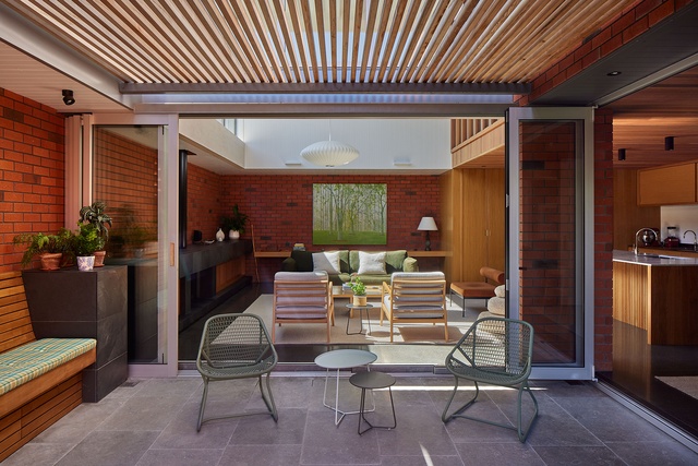
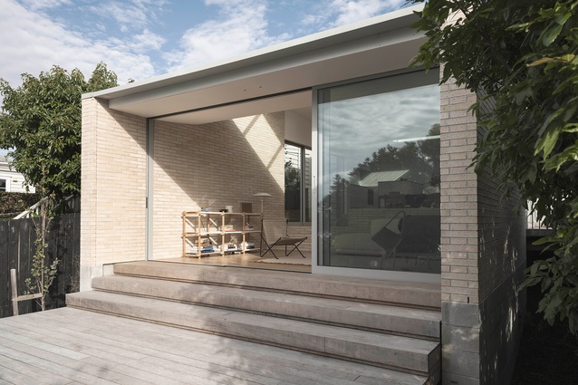
Unassuming, this beautifully crafted brick home sits tightly on its narrow site, while deftly sharing a resplendent garden with the street. Light-drenched bricks are set against crisp-white textured walls. Brick screens and shutters add interest, dapple light and ventilate. A double-height volume captures sun, adding warmth and changing patterns of light to the living area. Through a carefully considered plan and calmly composed details, the house is testimony to the architect’s ability to rise above budget constraints and site limitations.
Daniels Reef Lookout by Matter
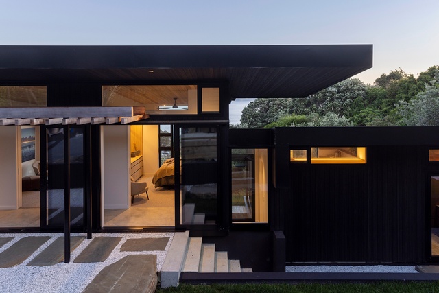
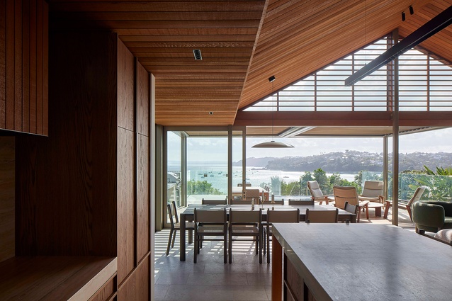
Nestled into a steep site, this engaging house embraces its dense bush setting. Visitors are greeted with a sneak preview into the coastal greenery below. Each wing on either side of the entry curates a sequenced reveal of magnificent coastal views, some framed, some shuttered, and culminating at the ends with places for unreservedly open vistas. The house steps with the land and, along with restrained use of high-quality materials, results in a twisting form that integrates with the native landscape. The visitor is invited to journey through the house and continue down to the Leigh Cliff Walkway.
Parirau by Megan Edwards Architects
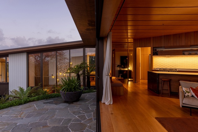
Nestled into a rocky garden high on the slopes of Ōhinerau Mt Hobson, the pin-wheel plan steps down the hill capturing sun and distant views across the eastern suburbs. Diminishing volumes distinguish the room hierarchy under the large parirau/wing of the house. A distinctive ceiling of lapped ply references bird feathers. Meticulous timber detailing to cabinetry, doorways and floors navigates through the stepped levels. Well-constructed with astute attention to detail.
Glider by Studio John Irving

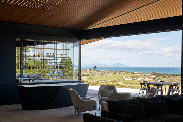
A reimagined A-frame house, the Glider defies its size by rescaling perspective. This simple form is splayed and anchored at four points in the sand dunes of Tara Iti Golf Club. A timber-clad roof deftly disguises a large skylight to the central living space and is peeled back from the sides to reveal a bedroom suite either side. Exquisite detailing combined with cleverly proportioned spaces ensures this house is handsome, expansive and confident, its serene tone achieved by the controlled use of limited materials. The sweeping form of the timber roof unites it all with technical adroitness.
Housing – Alterations & Additions
Ridge House by Keshaw McArthur

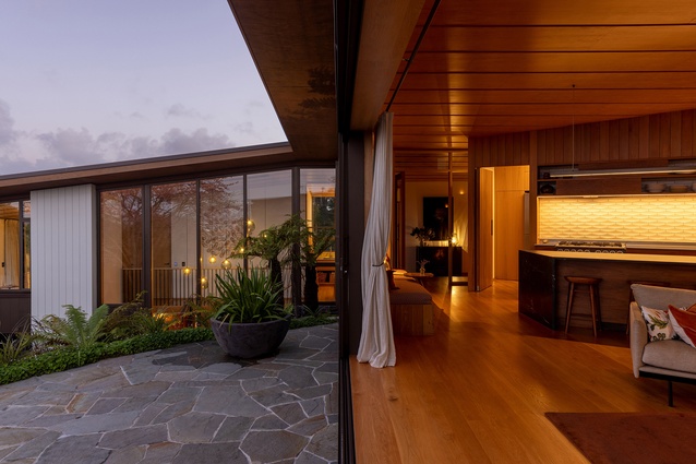
This serene addition to a compact worker’s cottage utilises a sequence of cascading spaces to provide much-needed space for a young family and establish connection to the rear garden. Glazing is strategically placed to create connections along both axes with the near and distant views. Openings in the side elevations embrace the density of the surrounding urban fabric, harnessing the potential of the narrow side yards for eastern and western light and outdoor extension of the dining space. Stepping down into living space, flanking brick walls anchor the extension, providing privacy and refuge.
Kororā Retreat by SGA – Strachan Group Architects

Rationalisation of historic additions to a kitset bach has resulted in an elegant, warm and inviting home. This house now provides a relaxed, adaptable coastal retreat for a couple and their extended family and friends. Artfully detailed, ply insertions hover within a crisply textured white interior, extending the upper floor plate. Opening into an enclosed verandah, the sea vista is now enjoyed from within the house while maintaining privacy from the coastal walk. Materials sympathetic to the context have been used for the exterior, while being contemporary in their use.
Little Shoal Bay by Studio John Irving
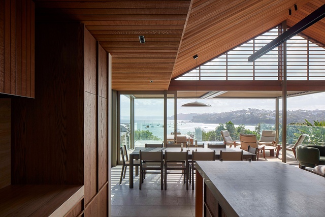
Behind the doors of an unassuming villa in Northcote Point, the hall of this existing family home is stripped back to its pure form and bathed in natural light. The existing rooms are revived with bold colours and natural textures, while an elegant gabled extension brings a sense of coastal retreat to the everyday experience. Warm timber ceilings and beautifully crafted cabinetry envelope the space, which is grounded by natural stone floors. Expansive glazing opens to stunning views of the bush and harbour.
Housing – Multi Unit
Boathouse Bay by Crosson Architects

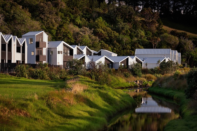
A series of housing typologies creates a high-amenity coastal community, referencing both the vernacular of boatsheds and the nearby sandspit campground buildings. In the interstices of native bush and sand dunes, this is unique to medium-density developments in Aotearoa.
The arrangement of single and two-storey building forms is punctuated by frequent openings to the beach and bush context, creating shared outdoor spaces. The integration of carefully scaled tower elements add spatial interest and signal the entrance to the heart of the development and connection to the beach.The development is firmly grounded in its high-value, natural-landscape setting and celebrates the benefits of a democratic approach to ‘borrowed’ landscape.
Kōtuitui Terraces by Crosson Architects
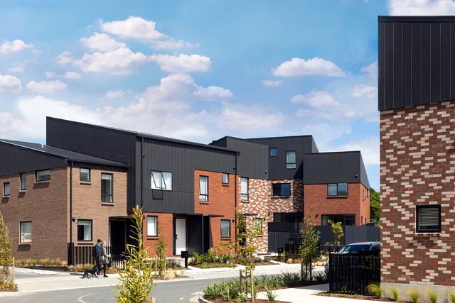
A well-crafted, medium-density urban community adjacent to Manukau city centre, with strong connections into the existing neighbourhood. A simple material palette unifies the blocks without losing individuality across the two- to three-storey houses. The absence of garages offers welcoming thresholds, creating a streetscape defined by lush landscaping and a diversity of screening. Raising the units above ground level aids privacy to the street and stays within the bounds of NZS3604 for cost-effective construction. The developer’s pursuit of quality and an empowered approach to community building coupled with an Iwi partnership is evident.
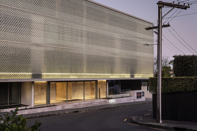
Edition by Monk MacKenzie

A strong, uncompromising form straddles the suburban and commercial edge of Parnell. Views are freed up from street level via a powerful floating upper form that hovers bravely over the plinth. The intricate glass-brick street façade foils views into interior spaces yet offers glimpses back through to the street. The scale of the building is deceiving as it steps down a steep slope with multiple residential levels and hidden basement carparking. A refined palette defines the 19 apartment interiors. Well-lit interior spaces with high studs offer spectacular views out across the valley.
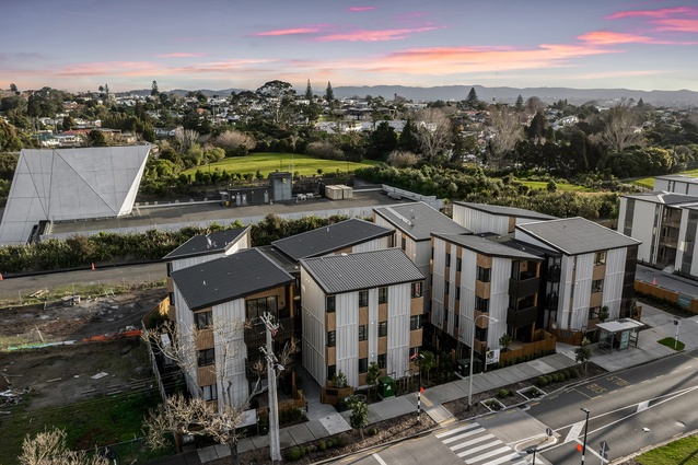
The Ōwairaka Collection by Stevens Lawson Architects
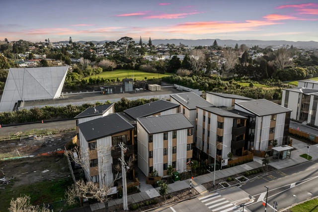
This innovative approach uses mass timber technology to stack houses one on top of another, up to three storeys and, potentially, five. The modular approach speeds up construction and celebrates timber structural systems for vertical living. The housing stacks are interconnected via stairways and access platforms, which are playful, engender social engagement and offer moments to linger. The use of simple forms, well-articulated façades and crafted detailing defines the architecture. The timber structure is expressed inside, which adds character and warmth. The passionate developer-contractor is clearly looking for new ways of working.
Planning & Urban Design
Puriri Park Road by Architectus
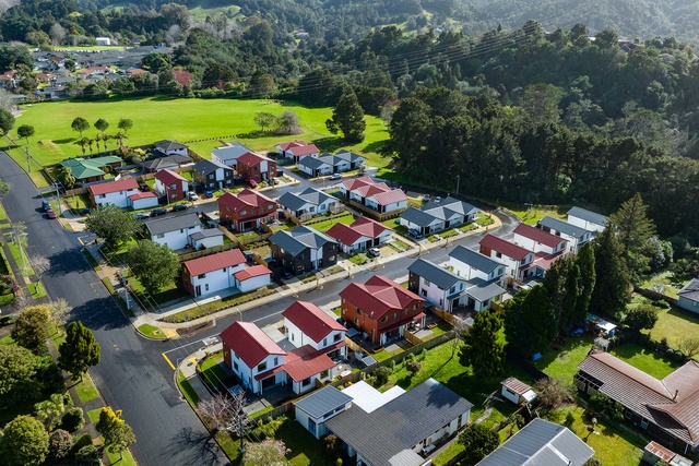
This well-planned housing community is carefully stitched and integrated into its existing neighbourhood. The masterplan for Kāinga Ora provides much-needed new homes for vulnerable members of the community in the Northland region. Incorporation of the existing recreational open space, retention of mature trees on the street frontage and access to the adjacent puriri forest make a unique backdrop to the houses. A small community hub offers space to bring residents together.
Hayman Park Playground: Playtower & Kiosk by Athfield Architects and Wraight + Associates (Wā)
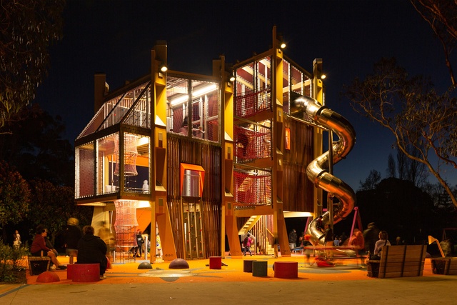
Acting as an urban marker that’s visible from the city centre, the vertical arrangement is striking and inherently playful. At any one time it resembles a tower, a castle or a tree house. The parents’ stair winding up through the centre doesn’t dominate and the sense of adventure and opportunities to climb up the levels or cross between towers have been cleverly integrated. Safety and adventure are counterbalanced. The mix of colourful, tactile materials and the diverse scale of play elements in the tower and adjacent landscape offer accessibility to all ages.
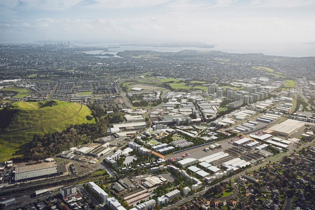
Tāmaki Employment Precinct Masterplan by Isthmus Group and Furlong Kain in association

Of all the award categories, urban planning is the most difficult for architects to assess. Conversations are less about bricks and mortar, negative detailing and delightful material juxtapositions. Instead, the jury has to envisage the actionable masterplan. In the case of the Tāmaki Employment Precinct, this is a 20-year-long view. It is with some relief then, that this plan establishes concrete actions and tangible social, economic and environmental implementation. The plan looks flexible, involves community and stakeholders from the start, and yields a legitimate base so that it all may come to fruition. Bonus points for manaaki and mātauranga.
Te Mātāwai by MODE
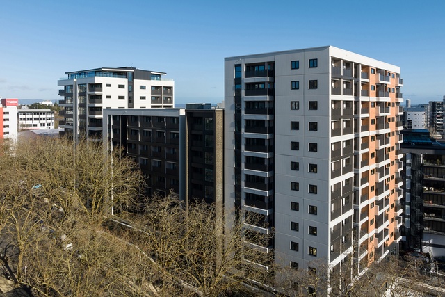
Good architecture is often the product of good clients. Te Mātāwai is Kāinga Ora’s first single-site supported housing development in Aotearoa. It provides 276 much-needed, warm, dry homes in three buildings that are between nine and 13 storeys high. The complex has a mixed tenure with 30 percent market rentals and 70 percent public housing. The development achieves a Homestar 7 rating and provides on-site 24/7 medical support. More housing, less houses please!
Interior Architecture
Te Tihi – Aurecon Auckland by Warren and Mahoney Architects

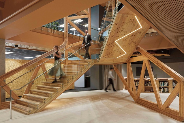
Set over two floors around an open light-filled atrium, this workplace exudes warmth and creativity. The strong cultural narrative from Ngāti Whātua Ōrākei is woven into the design, creating a sense of place and providing connections to the neighbouring community and key isthmus landmarks. The use of simple and honest construction materials to define spaces celebrates an engineering ethos. Collaborative spaces are prioritised, meeting and congregating spaces are diverse and desk-based work areas are flexible. Clustering circulation and workspaces around the atrium with a bespoke, carved timber interconnectivity stair forms a sense of cohesion and inclusivity.
Te Arikinui Pullman Auckland Airport Hotel by Warren and Mahoney Architects and Space Studio in association

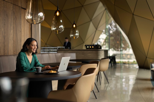
The dynamic curvilinear plan of the building provides a backbone for the 311-room 5-star hotel. Soft, finely detailed timber pods encapsulating back-of house facilities on the hotel floors optimise the triangular planning. The room palette is subdued with moments of luxury and elements of bespoke artwork. The ground floor lobby is generous with striking and sweeping curvilinear, arched and panelised forms. The upper-level sky lounge affords views across the runway and to the surrounding landforms. Natural materials, subdued tones and well-crafted details define the fitout. The cultural narrative weaves it way through the work, breathing life and vitality.
Greenwood Roche by Wingate Architects

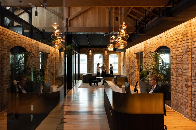
Occupying the sixth floor of two refurbished heritage buildings in Britomart, this tenancy is packed with drama and embraces a supportive workplace culture. Extending the base-build philosophy of differentiating between existing and new elements, the interventions lightly touch the brick walls, timber floors and exposed trusses. Beautifully crafted cabinetry and complimentary lighting impart an atmosphere of luxury and calm, in harmony with the building fabric of raw materials. A palette of rich colours and textures and eye-level planting adds sophistication. Acoustic challenges have been overcome with quiet spaces under the trusses. A discrete kitchen area delineates the public-private divide, while a rooftop bar allows for privacy and further opportunities for collegiality.
Anthony Harper by Wingate Architects

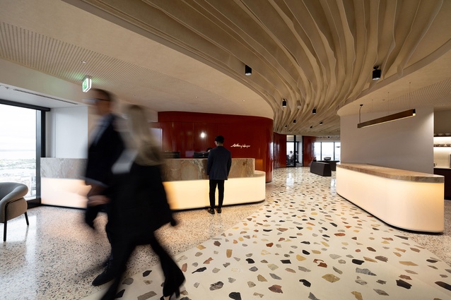
The design works with, rather than against the curved envelope of the ANZ building, and materials have been used creatively to great effect. Undulating Autex fulfils dual roles of acoustic dampening and dynamic wayfinding to vibrant flexible meeting spaces and a well-framed view. Curvilinear forms continue in the elevated central platform, which integrates and conceals services, democratising the deep floorplate and benefitting all with comfort and view. This collaborative, non-hierarchical space supports the diverse team of Anthony Harper.
Resene Colour Award
This project integrates the legal firm’s brand colours, deftly carrying them through to a variety of materials that distinguish and define zones and communicate movement and connection between spaces.
Public Architecture
Kaipātiki Eco Hub by Athfield Architect
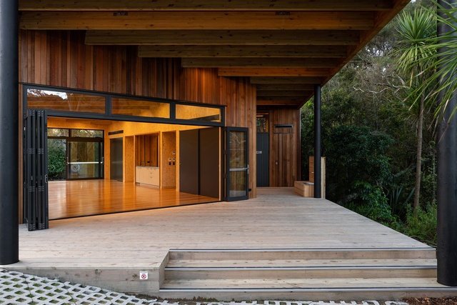
Evocative of the welcoming and democratic refuge of a sophisticated tramping hut, this red beacon serves as a flexible office, classroom and community gathering space. Nestled into a rich and plentiful landscape, the modest form belies the complexity of thought underpinning the design and construction, which incorporates five of the seven Living Building Challenge Petals. This treasured and thriving space speaks with authenticity to the environmental imperatives of the community it serves.
Small Project Architecture
Paper House by Crosson Architects

A pocket site generates a clever design response, offering a young couple the opportunity to build a standalone home for themselves in an established neighbourhood. Working directly with the contractor for concept and design advice has been, in this instance, a very successful model. Planning parameters have helped generate the primary form, recessive to the rear and side boundaries and ascendant to the street, creating a memorable asymmetrical gable end to the frontage. Dipped in white, the house is playful and the compact plan exudes spatial generosity by virtue of a north-facing, double-height living space.
The Boat House by Michael Cooper Architects
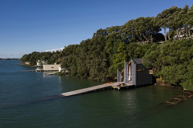
Sitting at the base of a pōhutukawa-lined cliff, this project brings a new level of sophistication to the concept of boat shed. Housing a small power boat and a fully rigged Laser dinghy, the tall volume also contains a mezzanine office and storage for boat paraphernalia. Lined in Meranti ply, the pragmatic timber structure glows with nautical reference and romance. Asymmetrical full-height doors clad in translucent corrugate open to set the house to ‘full sail’. Constraints of the marine environment and regulatory processes speak to the dedication of both client and architect, resulting in a delicate and delightful intervention in the harbour.
Common Space Studio by Pac Studio
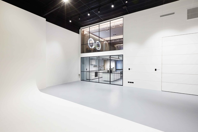
Architecture privileges the visual, whether in building or representation. Yet here is an architect and a speculative portfolio of work that is constantly challenging our ways of seeing. At Common Space Studio, beneath a perfunctory, black-painted ceiling — all cabled services and ducting — stands an infinity cyclorama which, as a white-out, instantly renders a visitor blind to the horizon. Spin your head 180 degrees and you see a trompe-l’oeil — an architectural trick of the eye — where the inner workings of the two-level commercial spaces appear flattened onto postcard windows. Superlatively, dazzling and dizzying.
Resene Colour Award
At Common Space, to move from a double-height monochromatic studio into the single-height office and kitchen spaces is not just a scenographic shift in scale, it is also a tinted transition into a world of muted colour. For example, in the makeup room, where colour is at the heart of cosmetics, the coral tonal accent of the steelwork was also given a delicate powder brush and blush treatment.
Commercial Architecture
Kā Uri, Awanui by Glamuzina Architects
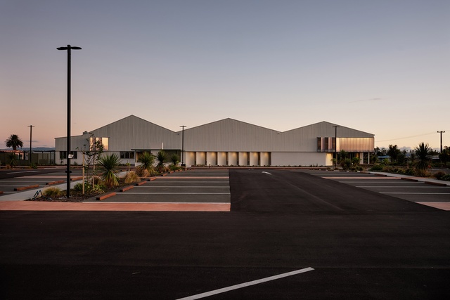
As a symbolic and physical gateway to Te Hiku o Te Ika, Kā Uri comprises a repurposed building that welcomes visitors, hosts events, provides local employment opportunities, supports community programmes and accommodates a waka school. Collectively, Kā Uri embodies a successful and important step in the commitment of Ngāti Kuri to build community resilience, shared prosperity and mana motuhake for its people across the region. Artfully reclad in simple materials atop a new concrete plinth, the arrival façade now presents as an elegant shed. A rhythm of polycarbonate signals entry to the double-height clerestory exhibition space, passing under a beautifully abstracted kauri forest canopy. Details are finely executed and speak to a meaningful relationship between architect and client.
Tāwharau Lane Development by JWA Architects

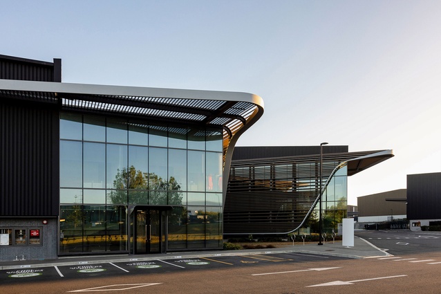
Compelling ESD credentials and innovative design demonstrate how large-footprint industrial buildings can contribute positively to carbon reduction and sustainability. Achieving a 6-star Green Star rating as built, this is a first for a development in the Highbrook Business Estate and sets a new benchmark for the client’s future builds. Simple, well-crafted architectural gestures animate and articulate the outer shell of a cluster of warehouses. The ensemble of buildings forms a cohesive masterplan in a regenerating landscape with connections to the neighbourhood.
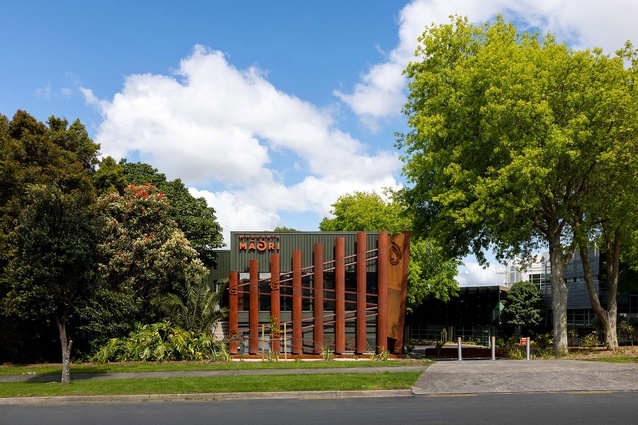
Hawaikirangi by RCG and Studio Pasifika

What separates Māori architecture from Western architecture today is the cultural imperative for narrative. And so, Māori architecture has emerged as a narrative-based media and, like Whakaata Māori television, shares a responsibility to communicate local stories through the indigenous lens. With Hawaikirangi, the new production and training facility for Whakaata Māori Studios, this lens is literal. The stories inspired by the ancestral homeland are visually expressed in toi art motifs hewn by Carin Wilson and decorate not just entry into the black-boxed world of the studio but also into te ao Māori.
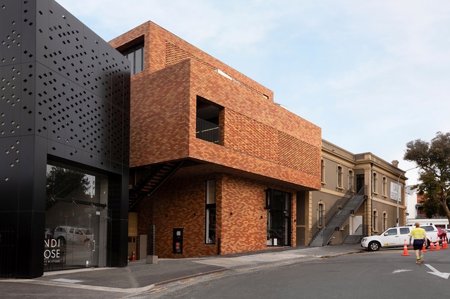
New Bricks on the Block by RTA Studio

This delightful intervention on a tight city plot brings Ponsonby Road character around the corner to activate the side street. The assemblage of forms relates to the scale and proportion of the adjacent heritage building and gains additional volume by stepping back and cantilevering over the carpark entry. The negative space on top is cleverly regained by the addition of a glazed box. Brick screening adds pattern to the streetscape while filtering light within. Care and attention to detail bring value and charm to the neighbourhood.
The Suites by Studio John Irving and JWA Architects in association
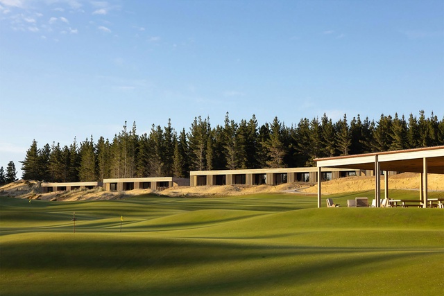
These deceptively simple forms scattered along the dunes of Te Arai Links Golf Course belie the attention to detail that has gone into the well-appointed hotel rooms. A meandering path is interspersed with timber boardwalks connecting each bank of suites to a services block. The banded roof stretches out as deep overhangs and verandahs, offering shade and shelter. Alignments and junctions are considered. Vertical cedar rainscreens enclose both volumes, concealing all services to maintain a purity of form. These give way to slatted screening, offering both light and privacy to the occupants. Selected to weather naturally, the rainscreens echo the verticality of the pine trees behind them and the dune’s sandy tones.
Te Iwitahi – Whangārei Civic Centre by TEAM Architects
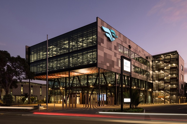
This ambitious civic building places the community, council staff and principles of placemaking at the very heart of the design approach. Disparate functions have now been centralised in the Knowledge Hub precinct of Whangārei. Liaison with local hapu, a rōpū kaumātua, has resulted in a building that reflects universal multi-cultural themes and a strong tikanga Māori narrative.
The transparent form engages the public in democratic processes and functions. A strong axial plan connects the pōhutakawa-fringed forecourt to customer services, community theatre and council chambers. A logical and coherent internal programme above the public area sees workstations and shared staff spaces configured around a light-filled four-storey atrium. An attractive, collegial and comfortable working environment, the centre is highly popular with the community and staff.
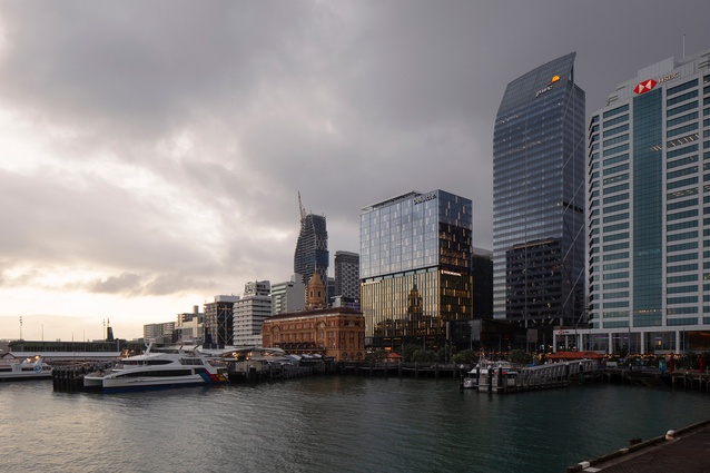
Deloitte Centre – Te Kaha by Warren and Mahoney Architects

A well-articulated adaptive reuse of an existing downtown waterfront structure. The mixed-use aspect of the base build project is highly legible, defining ground floor uses from the hotel and upper-floor corporate offices. Thoughtfully integrated into the existing Commercial Bay retail centre, it offers a high degree of permeability. Extending the floor plate beyond the column line cleverly optimises the area and yields an interesting spatial dimension to the interior spaces. Reglazing and removing the existing spandrels from the former façade reframe extensive harbour views from the hotel amenity spaces, the hotel rooms and offices.
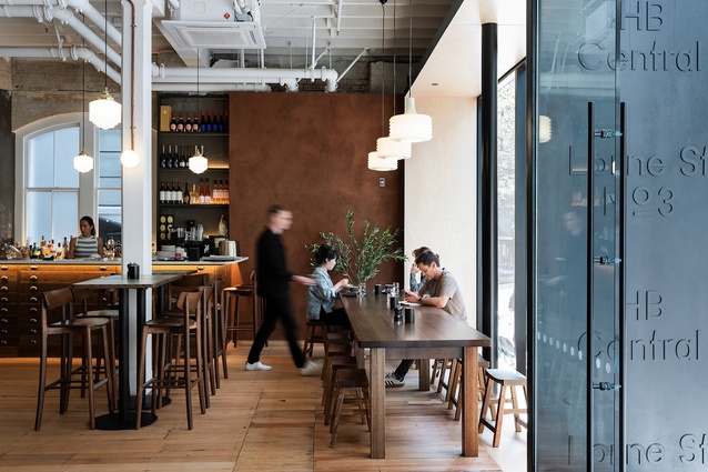
HB Central by Warren and Mahoney Architects
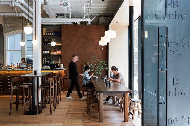
A thoughtful design supporting an effective programme, the repositioning of two historic linked structures results in desirable turnkey boutique commercial spaces that contribute to the much-needed revitalisation of Midtown. New interventions are juxtaposed against the now-revealed existing fabric. Entering from Lorne Street, the social space of Paname Social leads you into a crisp-white, light-filled atrium. The suspended central stair knits the two buildings together, a counterpoint to the raw textures of the existing walls and floors. Glimpses through original openings create connectivity between the tenancies. Each space is entered through a steel pod, allowing for efficient installation of the requisite modern amenities. These century-old buildings set a benchmark in achieving a 5-star Green Star rating, demonstrating the viability, cultural and commercial value of repurposing significant buildings in Auckland’s CBD.
Te Arikinui Pullman Auckland Airport Hotel by Warren and Mahoney Architects
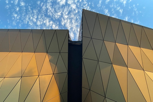
Going to the airport for fun is becoming a trend. Where once you could have a cheap night out at the Koru lounge, today airport culture is really going places, even if we aren’t. Enter Te Arikinui Pullman, a plush 5-star, 311-room, nine-floor destination 100 metres from the international terminal. Splurge out at the top in the luxurious Te Kaahu Bar. Every aspect of your stay at this hotel has been designed to inspire and nourish the senses. For the long-haul visitor, air travel has been grounded through a lobby imbued with Māori culture and where the New Zealand landscape, from sea to sky, is infused in form and fabric.
Education
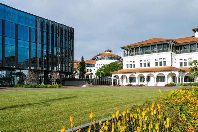
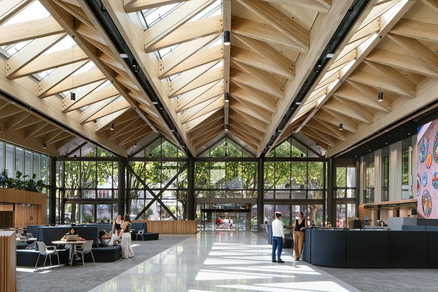
Massey Innovation Complex by Athfield Architects

Envisioned as a multi-disciplinary learning and research facility, this is the culmination of a long-term plan to relocate the Massey science community into purpose-built, state-of-the-art facilities. The strategically sited ‘Lab Box’ defines a new gateway and plaza. Following the existing contours of the campus, a strategy of internal and external terraces promotes connectivity within and to other buildings. Mass timber columns and floor and ceiling elements exude a warmth and tactile quality that permeates the circulation and collaborative zones.
The philosophy of vertical integration is promoted with breakout areas incorporated into stairways and display windows to the laboratories, where steel and concrete were chosen for their control of vibration in these critical spaces. The result is a highly ambitious, successful and intensive programme in an energising and inspiring building.
Bear Park Early Learning Centre, Hobsonville by Dave Pearson Architects
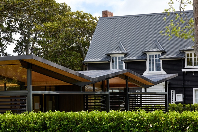
This elegant pavilion among the trees is a counterpoint to the adjacent historic house, which together accommodate the childcare centre. While not referencing the former Mill House, it is a respectful juxtaposition that sits lightly in the grounds bordering Te Ara Manawa coastal walk, under a protected liquidambar tree. With its deep verandahs, flush thresholds and transparency, this glazed shelter responds to the centre’s pedagogical philosophy of embracing nature by using tactile experiences and outdoor play for learning.
University of Auckland B201 Building by Jasmax

Of the many architectural attributes that this 100-word citation tries to bestow on B201, such as New Zealand’s highest six-star green rating, the most important is how a repurposed structure has elevated the mana of the adjoining Waipapa Marae and Fale Pasifika, and recentred the Ngāti Whatu whenua on which the university stands. Once hidden from view by the blocked hulk that was the former School of Social Sciences, B201 brings the university’s key indigenous spaces into view. The Ranginui stairwell unites fale, whare and museum in a single post-colonial vista. To cite Professor Marsh’s poem from the opening:
Our B201 landing ramp
Forged in Waipapa’s back-yard,
Flows to our Marae and our Fale
Linking Symonds Street to Wyn-yard
Onehunga Primary School by Jasmax
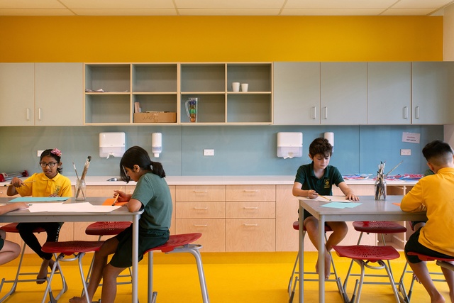
In Aotearoa, primary schools are neither supposed to be open nor vertical. The post-war Dominic Basic Plan was based on the premise that pupils remained in their own classrooms, all day. Corridors were redundant. Like a naughty child, Onehunga Primary School breaks these two rules. In doing so, it teaches us how far education has evolved. Onehunga is yet another masterful demonstration of the architects’ ongoing legacy of schools as class-configurable, acoustically spatialised, wide-stacked learning corridors. While some parents might distrust these modern learning environments, it was clear to the jury that those who teach in them are unequivocally supportive of classrooms designed towards self-directed learning. Top marks, team. Let’s hope this award is transformative and helps solicit phase-two funding.
Ngākōroa School by Jasmax
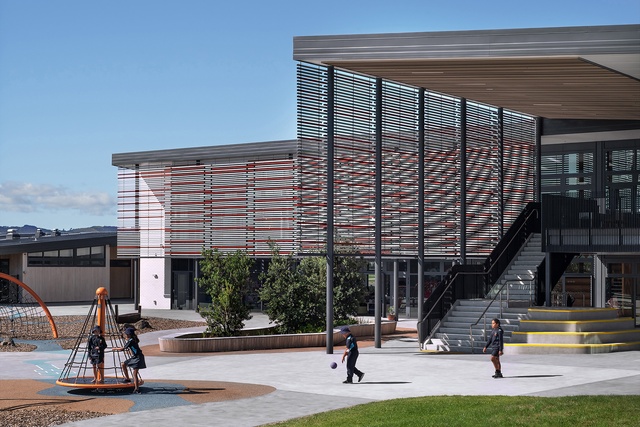
The buildings wrap informally around a courtyard, engendering a strong sense of place. Empathy for the ‘long fingers’ of the awa flowing conceptually through the site is evident in the landscape, galvanising the greenfields school within its surroundings and cultural heritage. Input from Ngāti Tamaoho has been valuable. A palette of soft timber, brick and finely detailed screens gives a domestic scale and intimacy to the structures. Inclusivity and safety are emphasised. Empowered by the senior teaching staff, the school reflects their energy and intensity for pedagogy. Flexible learning spaces combined with specialised spaces create a friendly and welcoming environment.
Enduring Architecture
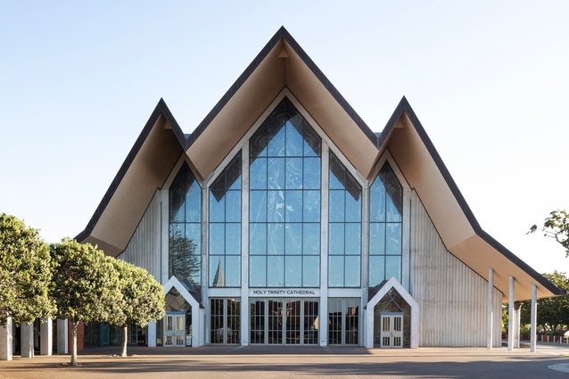
Cathedral Nave | Holy Trinity Cathedral Auckland (1995) by Professor Richard Toy
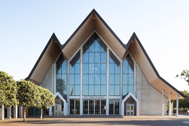
Professor Richard Toy’s 1995 contemporary addition to the Holy Trinity Cathedral transformed the original Chancel into an inward and outward-focused cathedral, responding to the changing aspirations of the church. An iconic Auckland building, it embraces and welcomes the city.
The addition can be seen as a porch or entry to the original Chancel. With its expansive timber ceiling, it also speaks to the marae. Large expanses of stained glass flood the volume with light. Glass doors along each side give the roof the appearance of floating unsupported. Professor Toy’s vision for the nave was to facilitate “the potential for human place and connectedness and for fundamental social and psychological satisfaction”. The nave has been undoubtedly successful in its use as a multi-purpose venue for the community, as well as for worship.
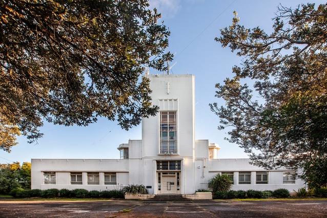
Musick Point Memorial Radio Station (1942) by Public Works Department

This iconic Publics Works building was supervised by government architect John T Mair, but specifically credited to John Blake-Kelly, who later became a government architect.
Named after aviation pioneer Captain Edwin G Musick, the building has served as an aviation and maritime radio communications hub, notably as a key facility during WWII. The building has also been enjoyed by the public for more than 80 years. The aviation connection is reflected in plan and siting; the building was not only to be experienced from the ground but also from the sky. The design encompasses the formal landscaping to create the impression of a flying boat and its jetstream or landing wake. With its central tower, curved two-storey projection and single-storey podium, its stripped-back form is an early and well-preserved example of the Modernist or Functionalist style in Auckland.
Heritage
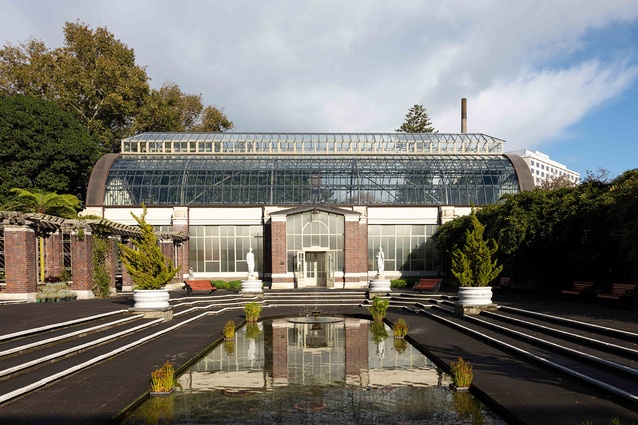
Auckland Domain Wintergarden Restoration and Seismic Upgrade by Salmond Reed Architects

Salmond Reed has breathed new life into this cherished landmark, a Heritage New Zealand Pouhere Taonga Category 1 building and Category A scheduled historic heritage place.
One of the finest botanical structures in Aotearoa New Zealand, it has been repaired with traditional materials and meticulously researched sympathetic new materials to reduce maintenance and enhance sustainability credentials. Its faithful restoration will ensure an important part of the city’s architectural heritage will continue to delight for generations to come.
Hospitality
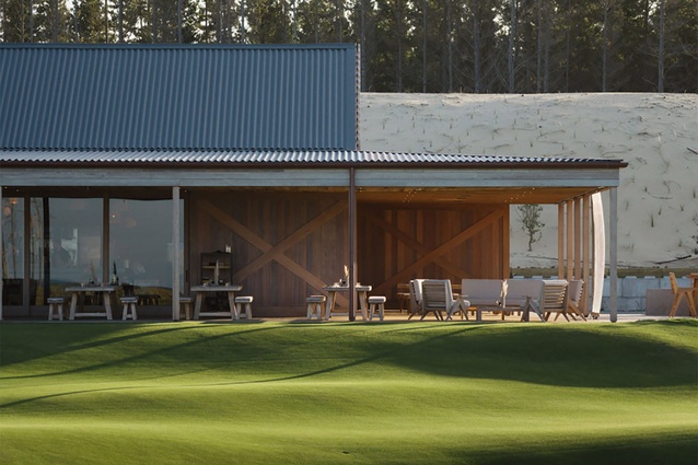
Ric’s by Studio John Irving

Quietly unassuming under a corrugate mantle, Ric’s café is a treat. Strong and simple timber construction and details evoke a contemporary coastal-rural vernacular. Carefully sited in the dunes adjacent to Te Arai Links golf course, the café overlooks the 12-hole putting green, beyond the beach to Taranga and Marotiri Islands. This is quintessential New Zealand, but beautifully elevated. Irving has created a facility at once rugged and sophisticated, with his use of exquisitely detailed oversized elements: cedar barn doors, six-metre-deep verandahs, steel bar and copper pizza oven. The polished concrete floor reads as large-format tiles. Befitting the development’s ethos, the café optimises the highly attractive coastal setting without overpowering the natural landscape character.
The NZIA Architecture Awards programme is supported by Resene and APL.

