Winners announced: 2021 Auckland Architecture Awards
The last, but not least, region to announce their Local Awards winners saw the Auckland branch of Te Kāhui Whaihanga New Zealand Institute of Architects honour projects that included sustainable developments, social housing, old and new homes and many more.
This year’s jury was led by convenor Aaron Paterson of Pac Studio, who was joined by Ben Mitchell-Anyon of Patchwork Architecture, Maggie Carroll of Bureaux, Christina van Bohemen of Sills van Bohemen Architects and lay juror Dr Karamia Müller.
Paterson said, “One of our main criteria was to ask: does this building uplift the human spirit? The winners all achieved this lofty goal; we felt the heart in the stories behind projects, and the trials and tribulations that were endured to get this architecture built.” He was also heartened by a common thread of collaboration among practitioners across and within industries in winning projects. “Architecture is at its best when it is collaborative – it was nice to see architects acknowledging their role in bringing people together with a common purpose.”
See the full list of winners below with jury citations.
Housing
First Avenue by Architectus

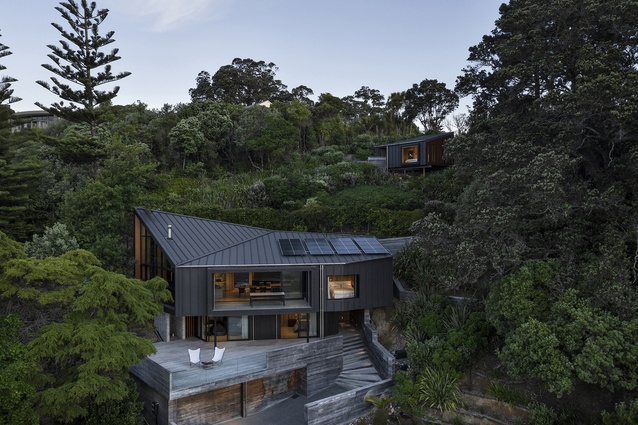
Zig-zagging up its site, this home’s connection with the landscape is impeccable, and First Avenue feels like it has been here forever. The simple yet interesting roof form flicks up at one end to create a cathedral-like interior height. Bach-like planning creates living possibilities for two or 10 people, and the house expands and contracts as required. The exquisite timber-lined surfaces throughout are all sustainably sourced.
House on Takapuna Beach by CAAHT Studio Architects
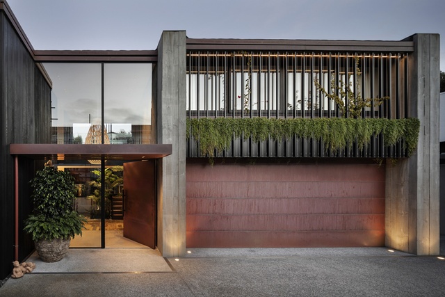
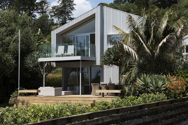
A floating mass amid two pōhutukawa, this house sensitively takes up residence on the shore of Takapuna Beach. With a seamless facade that intelligently tucks the building into its site, this home is expertly crafted and constructed, with a variety of spaces to suit different hours and weather conditions. Sharp detailing, robust materials and an outstanding, sun-drenched bathroom make this a home that will only grow more beautiful with time.
Awaawaroa Bay by Cheshire Architects
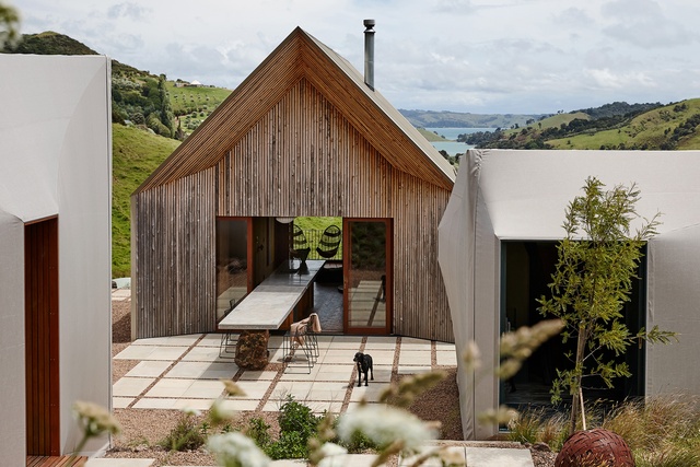
This retreat is an inspirational example of off-grid and pared-back living. The purposeful separation of living and accommodation buildings, and the creative use of utilitarian materials such as canvas to clad them, comprises a clever reimagining of the archetypal campsite. The small cabins, connected by a communal living shed and courtyard, celebrate simplicity both inside and out, but upon closer examination are articulated with precise attention to detail and an appreciation for the beauty found in true functionality.
Light and Clay by Crosson Architects
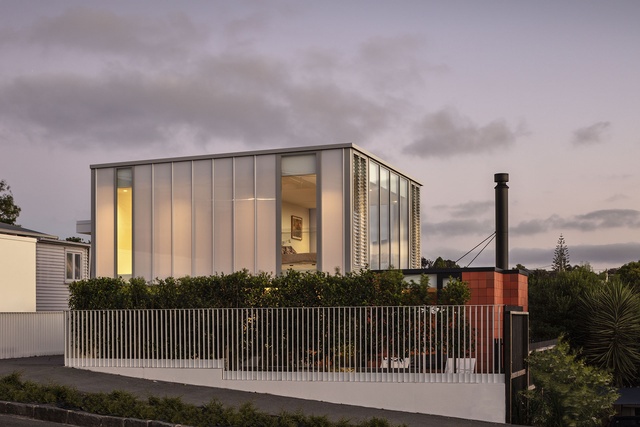
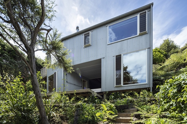
The relationship between concept and form is articulated here via a series of cubic volumes clad in contrasting materials. Light and Clay is a powerful presence on its street, particularly at night when a translucent lightbox containing the main bedroom appears to hover above the clay living volume, which is clad and lined in terracotta tile. A third corrugated-iron box perches on poles, and completes an L-shaped arrangement that successfully orients a living courtyard to receive generous amounts of sunshine. This home is full of stunning moments, including a sculptural arrival space, sunken snug and a stair to the rear garden. The result is an assured study of materiality.
Te Arai by Fearon Hay Architects
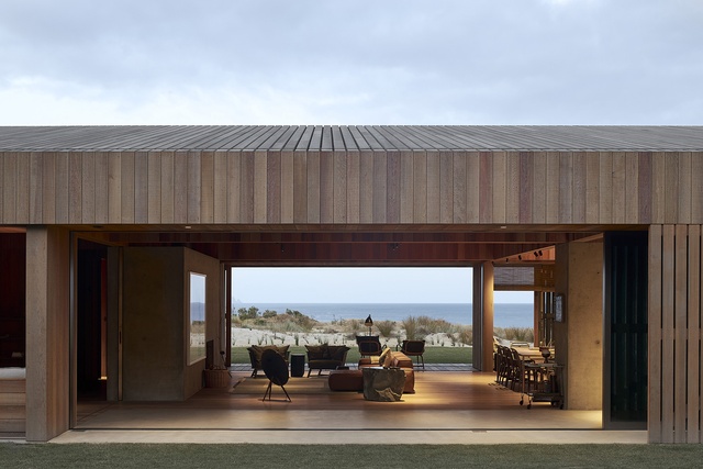
Tucked amid a private enclave of pines and sand dunes, the pure vernacular form and simple materiality of this house creates a rich and relaxing coastal outpost. This unassuming home is comprised of a main dwelling set apart from its guest accommodation, a strategy that breaks down its mass and invites a connection with nature during the journey between the two. Informally arranged living spaces create a serene cocooning effect, with shades and shutters used to layer light, views and privacy. Care has been taken with every junction and material selection in this home, which is an exercise in elegant restraint.
Mawhitipana Beach House by MacKay Curtis
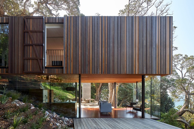
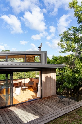
Meandering steps through careful native planting leads to a flat entry on a relatively steep site. The highly crafted timber box that awaits effortlessly floats over custom-made joinery. The apparent thinness of the structure is outstanding and helps the house to sit lightly between well-established pōhutakawa trees. A cohesive, impressively detailed design includes cleverly disguised shutters that split open the timber shell of the upper volume to admit light, air and birdsong.
Hapua House by RTA Studio
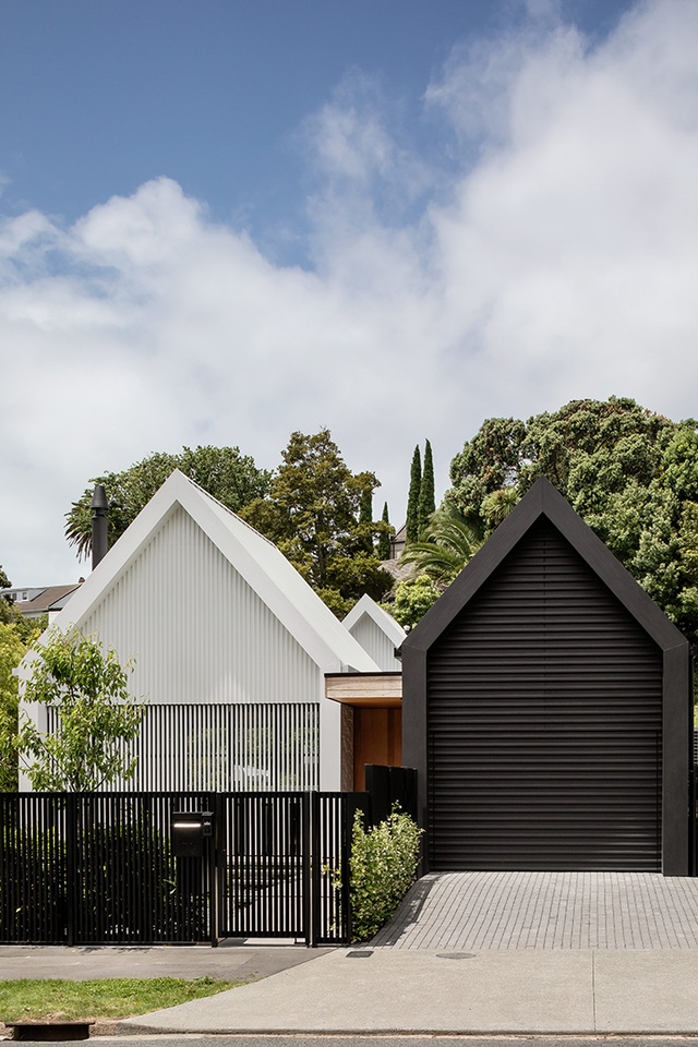
RTA has skilfully planned a family home around a spine-like passage, courtyards and slipping pavilions. The outcome is a stunning design that provides sanctuary and light without turning its back on the street and neighbours. Playful detailing complements the assured architectural formalism of black-and-white buttressed gables. Of particular note is the precision of the concealed garage door, the bifold shutter that hermetically seals the house, and ingenious pool fencing. Cathedral-like interiors are perfectly formed around furniture, and each room has a specific relationship with the garden courtyards. The project is a benchmark for planning homes around the peculiarities of Auckland sections.
Bough House by Sayes Studio

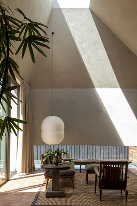
Nestled at the back of a small suburban site, Bough House greets its occupants and guests with a gentle twist in the façade to form a welcoming entry. The architects’ interpretation of the simple brief, which asked for “an outdoor table, a fire [and] a bath” has resulted in a compact house with generously arranged living spaces that can host large family gatherings inside and out. Oversized picture windows and skylights carefully frame views of the garden and sky while maintaining privacy. This clever design makes the most of a tight and challenging site with elegance and confidence.
Zonnebries by SGA – Strachan Group Architects

This clever response to a sloping suburban site also navigated some tight heritage restrictions. The resulting low-slung gable form sits nicely within its context, while gentle street-side landscaping and a relatively open interior creates an interesting dialogue with the road. Inside, this home features a variety of superb spaces to dwell in, with every element beautifully crafted. The backyard bedroom wing forms a surprising contrast to the front by switching to something more vertical, and thereby leaving the backyard free for outdoor living and an amazing tiled pool.
Courtyard House by SGA – Strachan Group Architects
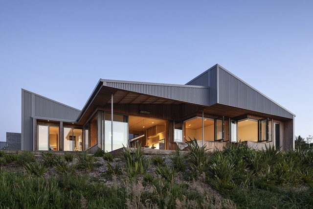
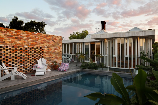
High on a hill in rural south Auckland, this home celebrates retreat and expansion. The house encloses itself from the cold wind (and the street) with a long block wall that cleverly conceals the inside of the home and fortifies the elevation. Upon entry, the plan softens and expands outwards to the view, with floor levels also following the lay of the land. Chiselled roof forms are arranged around the gardens and courtyards that provide a variety of places to relax. Timber tones and crafty details combined with a vibrant landscape create a warm and layered home.
Mawhiti by Stevens Lawson Architects

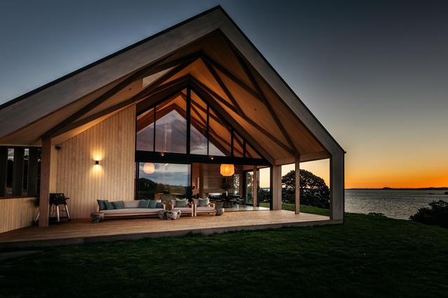
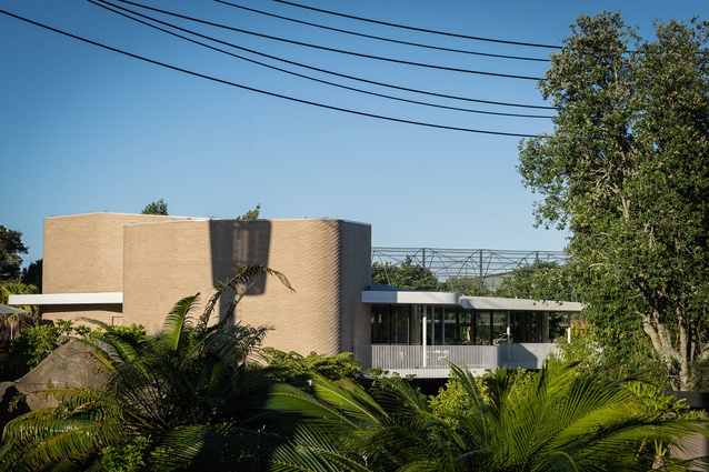
The structural geometry of an experimental folly nearby provided inspiration for this visually powerful form, which references both whare and barns. The decision to allow three gabled pavilions to follow the curves of their site has made the architecture feel entrenched and creates a beautiful interplay between the roofs. The architects paid careful attention to site planning, with cars hidden away and a gentle winding path to the house. Spaces between the buildings have become private courtyards and allow for retreat and shelter. The voluminous ceiling with a lattice timber structure makes the view upwards just as spectacular as the one out to the horizon.
Our House by Studio LWA
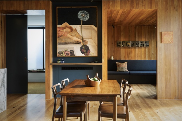
The architect has built her family a compact, rich, colourful and original home in suburban Westmere. Tucked neatly at the front of an original suburban lot, this three-bedroom house is deftly crafted to fit within its site constraints. The material selection, building form and approach to the street contribute significantly to the neighbourhood, and the house is an example of a modern bungalow that explores how to live well within a compact footprint.
Resene Colour Award:
Colour is used boldly in this project and intensifies the originality and inventiveness of the design.
Tuarangi Whare by TOA Architects
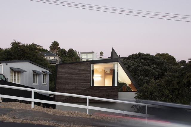
The whare on Tuarangi Road is born out of relentless experimentation and a deep connection to whenua and whakapapa. A fragmented, angular plan and walls reference the volcanic past of Tāmaki Makaurau. The rooms continually warp and enclose, allowing unexpected opportunities to lean on a sloping wall and peer through porthole windows. CLT panels create a rich interior and allow bold cantilevers that add to the dynamism of the form. The house is both radical and warm; playful and full of aroha.
Housing – Alterations and Additions
Connor Concrete Villa by Bull O’Sullivan Architecture
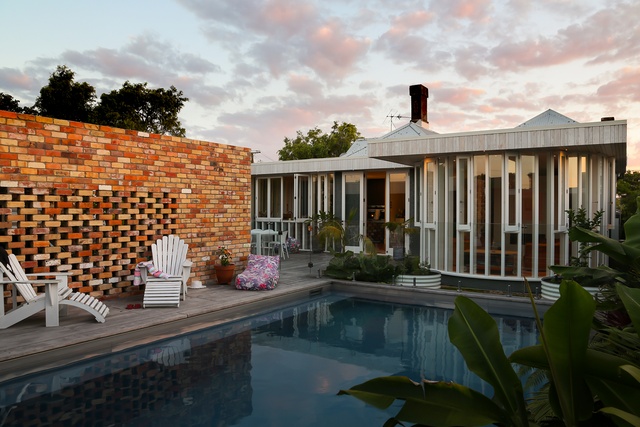
The whare on Tuarangi Road is born out of relentless experimentation and a deep connection to whenua and whakapapa. A fragmented, angular plan and walls reference the volcanic past of Tāmaki Makaurau. The rooms continually warp and enclose, allowing unexpected opportunities to lean on a sloping wall and peer through porthole windows. CLT panels create a rich interior and allow bold cantilevers that add to the dynamism of the form. The house is both radical and warm; playful and full of aroha.
Super Taper by Jack McKinney Architects

A refreshing take on the villa extension, Super Taper cleverly utilises its small site. The typical villa lean-to is reimagined as a sculpted mass with a pierced, tapered roof form that allows the sun to travel across the living room. Windows have been carefully positioned to maintain privacy and curate views. An external porcelain rain screen adds surprise and interest to this exemplary renovation.
Clare’s Place by Lloyd Hartley Architects
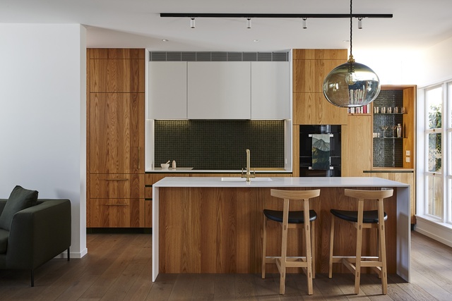
A pop-out window seat overlooking the street is a clue that something’s going on inside this modest suburban house. The otherwise original façade hides an interior transformation that is both surprising and in keeping with the spirit of this 1950s home. Immaculate detailing and thoughtful design decisions, specifically around the placement of skylights and windows, create delight and will extend the life of the original house for another 50 years. As its name suggests, Clare’s Place fits the client like a glove.
2nd on 2nd by Wendy Shacklock Architects

An elegantly executed extension to an existing bungalow, 2nd on 2nd adds extra space to a tight site while preserving the character of the existing house. A modern interpretation of the house’s existing materials means the addition complements its earlier self in a calm and cohesive manner. The new form and façade connects to the old, with clever use of overhangs, eyebrows and pockets to make the most of the northern aspect. Through considered choice of materials and spatial planning, this alteration adds value and charm.
Housing – Multi Unit
Galway Street Apartments by Ashton Mitchell
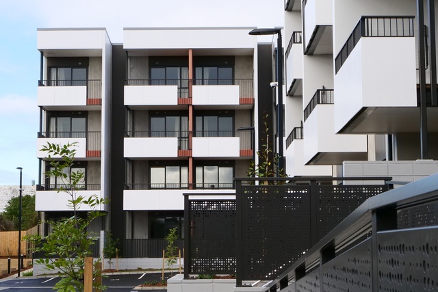
There is a quiet order and dignity in the arrangement of these apartments on a tight and challenging site in central Onehunga. Building materials and components are used to define individual homes within the total composition, and the arrangement of the units and buildings results in light-filled circulation. Common areas and homes are also organised to foster community connections for some more vulnerable members of society, while making the most of proximity to the town centre.
Waterview Court by Ashton Mitchell
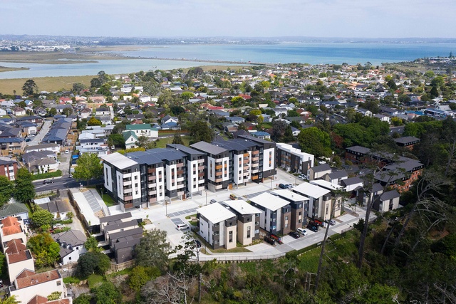
This project for Kāinga Ora provides its residents with well-appointed apartments and houses around an internal courtyard. The arrangement of the apartments gives each household a sunny deck with an outlook over the communal space, the street or the reserve beyond. Circulation through the apartments is light-filled with views to the east and west. The scale and arrangement of the buildings is a great example of urban neighbourhood regeneration.
FABRIC Apartments – Stage 1 by Ashton Mitchell

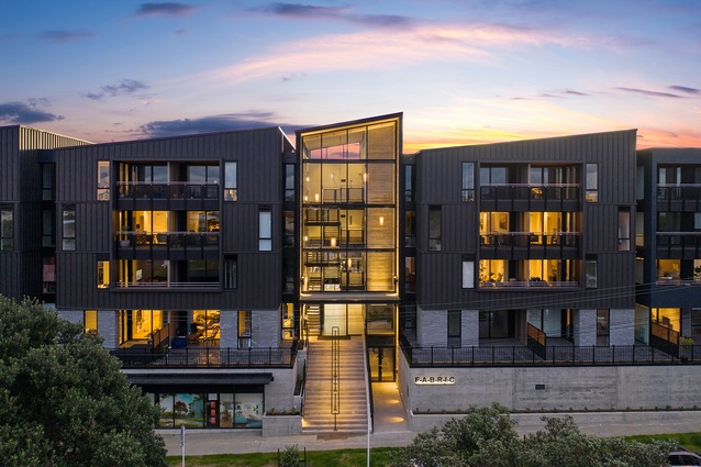
From the street, Fabric cuts a beautiful silhouette, and its sawtooth and mono-pitched roofs keep step with the industrial character of Onehunga. The project achieves so much by getting the basics right. Simple repetition, façade cadence, a restrained material palette, and building massing results in a development that achieves a neighbourhood feel while attaining the required yield. Clever unit planning and orientation allows maximum access to sunlight and creates an overall sense of well-being. The generously landscaped podium not only deals with the problem of cars but makes a communal amenity for those lucky enough to call Fabric home. Solving the housing crisis means building more developments like Fabric.
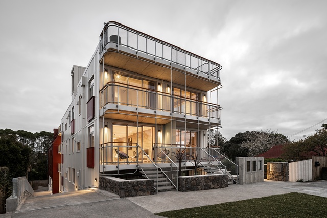
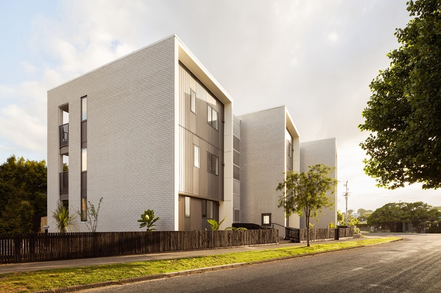
26 Aroha Ave is a labour of love that shows what you can do when the bottom line is not the only driver. As the first development off the rank in a recently re-zoned high-density area, 26 Aroha risked being perceived as a bad neighbour. But instead, this new socially minded rental complex, where tenants live more like a family, gives back to the street through welcoming stoops where neighbours can meet. Efficient and straightforward planning with generous external circulation and shared space provides many opportunities for serendipitous encounters. The icing on the cake is a communal roof terrace where tenants do laundry, chill on the deck and entertain visitors. Here in Sandringham, the architects and ethical landlords have created a sustainable, affordable and joyful new way to live.
Kāinga Ora – Brookfield and Onehunga Mall Housing Development by Monk MacKenzie

This Kāinga Ora housing development is well positioned and holds the corner of a busy road with confidence. The buildings are arranged around a northern landscape aspect overlooked by sunny decks. By staggering the buildings, the architect has skilfully created visual interest and broken down the mass of the development within its low-density context. A cleverly restrained material palette will stand the test of time with brick offering a familiar materiality and sense of quality. A finer and more contemporary mesh detail adds interest to circulation cores. This project demonstrates the importance of good design and material choices when offering high-quality design to multi-unit developments.
Waipārūrū Hall by Warren and Mahoney Architects

The massing, form and colour of this project positively contributes to the city edge where it abuts the motorway. The building’s repeating but contrasting vertical forms bend in plan above the podium, creating a sculptural profile to the city edge. At street level, the podium is glazed and welcoming for its student residents. The entry level presents a range of spaces for the students to gather, study or socialise. There are also places to withdraw to while remaining connected. This ‘learning landscape’ provides a safe and supportive environment for student life in the city.
Resene Colour Award:
Colour is well used in this project to orient residents as they move through the building, providing vitality to the circulation in particular. It is also used to define smaller spaces to great effect.
Commercial Architecture
Te Kupenga (155 Fanshawe Street) by Architectus

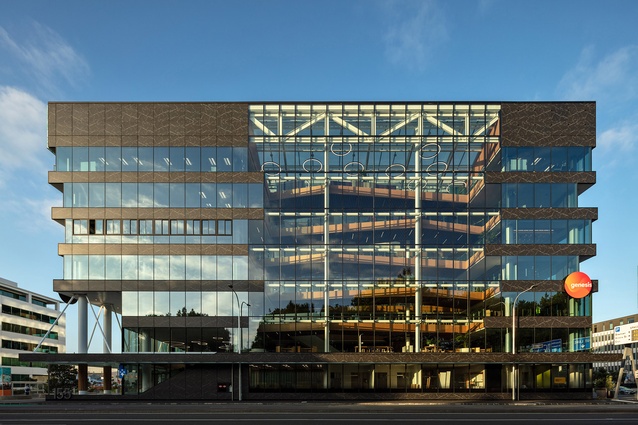
Te Kupenga is a clever diagram translated into beautiful architecture and is comprised of a relaxed stack of floor plates around an atrium. Each façade does something different, selectively responding to sun, street edge, entry, and light. The early sketches show an atrium revealed by a section cut, and the built effect is an extraordinary southern façade that, when viewed from Victoria Park, is alive with the movement of people across playful balconies. The entry cleverly moves visitors up to the piano nobile, continuing the line of the street. The project embraces environmental sustainability and renewable energy and is an asset to the city.
Kotiro Nui by Bull O’Sullivan Architecture
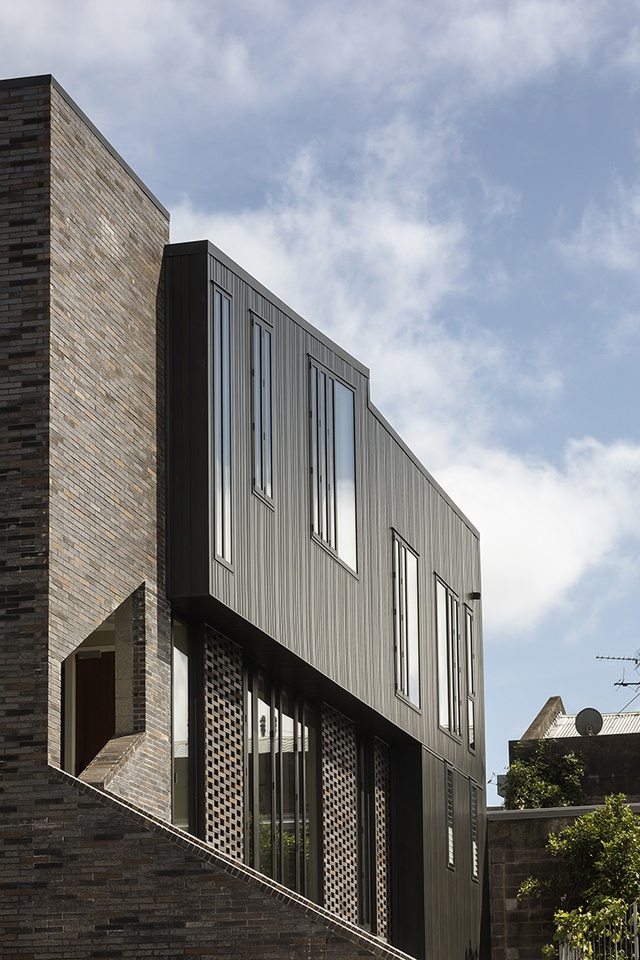
At the end of a lane, a stair tower draws visitors into this mixed-use building occupying a rear site on Ponsonby Road. Clad in brick with aluminium, the three-storey building appears both familiar and new, and is an exemplar of how mixed-used buildings can add density and vitality to urban centres. Although built to provide an apartment over commercial office space, the current use of the whole building for commercial activity shows how robust and adaptable the planning is. Materials have been selected for their robustness; South Island clay bricks, redolent of Auckland’s volcanic stone, also demonstrate the generosity of the owner and design team in providing a handsome neighbour.
The Hotel Britomart by Cheshire Architects
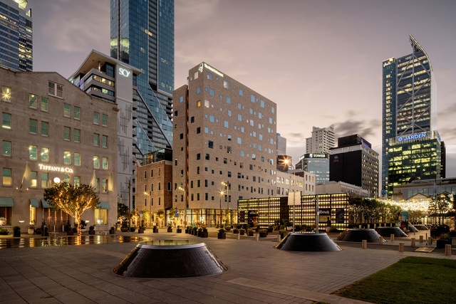
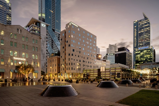
When approaching this building’s deeply thoughtful façade, architecture as a process of crafting – from concept, to thousands of drawings, to the relationships between architect, contractors and clients, to people as occupants – feels magical. This complex upgrade of the historic Buckland Masonic building includes two new rooftop pavilion hotel suites, offices from level 1 to 3, and laneways at ground level to connect with the lively Britomart precinct, but despite all this activity, the bespoke nature of the build makes every piece and part feel meaningful. From its custom door handles to the sight of that façade against the blue Tāmaki Makaurau sky, the Hotel Britomart is a generous gift for Aucklanders.
25 Hargreaves Street by Fearon Hay Architects
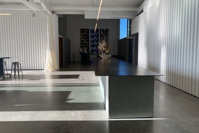
This clever repurposing of a semi-industrial building as a generous, light-filled workspace uses typical steel shed construction techniques and finishes them with sharp detailing and lush fittings. Remnants of the building’s previous life as a mechanic’s workshop have been revealed and paired with new walls clad in matt-white trapezoidal roofing. Luxurious full-height curtains and glass partitioning divide the space, creating a variety of meeting rooms. Unseen from the street is an accompanying network of rooftop solar panels that power the majority of the building, setting a high bar for similar commercial ventures.
Ponsonby Road by Jack McKinney Architects

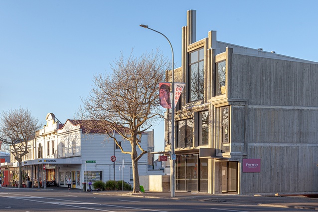
The branded motifs of a nearby historic façade were carefully measured, then rearranged, to create a street-front that playfully jumps across architectural eras. The new insitu concrete composition is entirely modern and, although predominantly glass, the look is in keeping with the grain of the iconic landmarks that line Ponsonby Road. Concrete fills the interior volumes, with particular attention paid to the natural light effects across textured surfaces. The architects were bold and have created a proud addition to the streetscape.
Foodstuffs by Monk MacKenzie
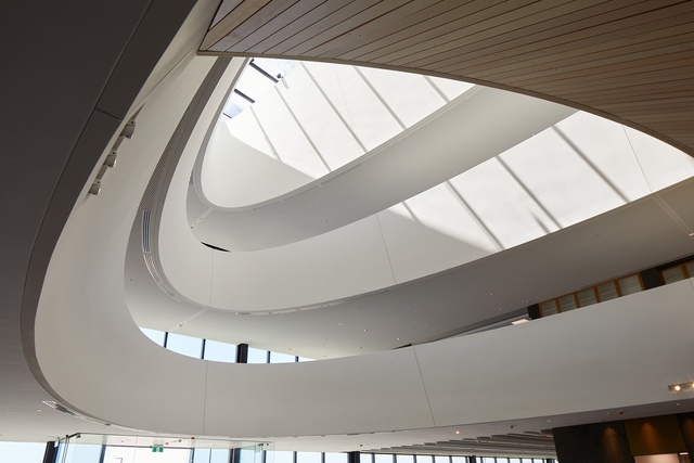
Monk MacKenzie has designed a heroic and sculptural office building that rises from the earth like a giant piece of land art. The architects have transformed a flat site and generic programme into an ethereal and other-worldly project through an impressive dedication to symmetry. A decision to use the landscape to tie the building down and soften its bulk is inspired, and the dramatic, parabolic forms used in a top-lit atrium add air and light. The beautiful organic form combined with polished detailing in earth, stone, GRC and concrete is full-on architectural drama on an epic scale.
The Daniell Building by Warren and Mahoney Architects
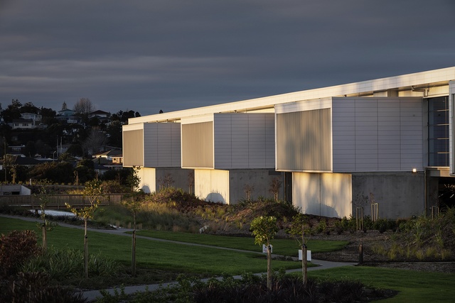
This beautiful piece of minimalist architecture exists within a vast horizontal sliver. The architects did not shy away from the scale of this project, using the programme’s immensity and need for flexibility to create an open-plan workspace that feels like the inside of a giant machine, but a machine constructed with the same precision as the medical instruments engineered within. The staggering scale of the 52,720-square-metre floor is revealed in the deftly handled circulation passage that runs the building’s entire length. Light wells carve into the deep plan to create interior gardens. The machine runs smoothly.
Commercial Bay by Warren and Mahoney Architects in association with Woods Bagot and NH Architecture

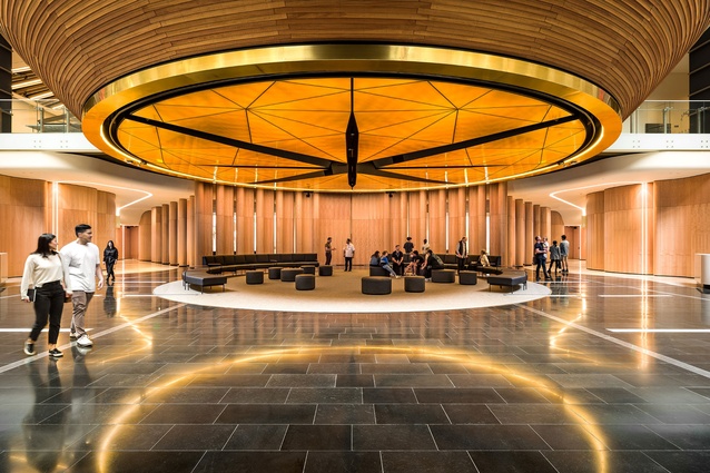
Tāmaki Makaurau’s mercantile history is brought into the 21st century in Commercial Bay. Sited along axes of trade, this commercial building channels Aotearoa’s role in local and global markets in form, programme and ambition. Boldly sculptural, the building faces the future, while still honouring the city’s past. Quiet corners face historic buildings, and internal corridors remember the site’s history, but there is no doubt this is a marketplace of the 21st century. Invigorated by the business of markets and trade, Commercial Bay proposes an architecture that faces out to the world by knowing its own place.
Education
Te Kōhanga Reo O Ngā Pihi O Te Purapura Pai by Bull O’Sullivan Architecture
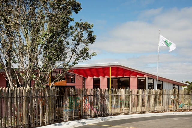
Te Kōhanga Reo O Ngā Pihi O Te Purapura Pai breathes tikanga Māori. The colours of this building are bright songs that celebrate the taonga that is te reo Māori, as life-giving to mātauranga Māori and thus Aotearoa as the land, the waterways, the sky and ancestors. The north-facing ātea is where the sound of tamariki laughing, learning and playing can be heard, while the eastern entry welcomes all in. Whānau bring their greatest taonga into this building, and the building in return holds them close throughout the day.
Resene Colour Award:
The building brief was to provide a place of aroha for past, present, and future generations - a kaupapa that is expressed in the pink, yellows, reds and blues that greet the eye. Inside oranges, purples and other hues are the lively backdrop for a bright future.
New Shoots Early Childhood Education Centre by Copeland Associates Architects

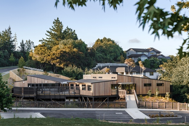
This project transforms marginal land into a holistic learning environment for preschoolers. Entry to the centre is via a timber bridge over a significant ecological landscape where planting will provide habitats for lizards and nesting birds, as well as learning opportunities for children. The buildings are arranged to create a courtyard and capture the sun, and full-height windows provide the children with views into the bush. Exposed CLT walls and ceilings further integrate the interior and exterior experience and enrich this nurturing environment.
Resene Colour Award:
Natural wood in harmony with the emerging bush outside is complemented by soft, warm colour that differentiates the learning spaces.
Enduring Architecture
Pūkenga at UNITEC (1993) by Rewi Thompson and Southcombe McClean & Co
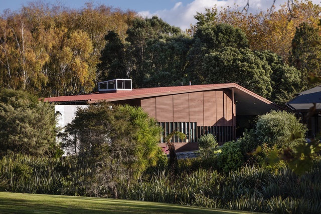
Pūkenga, the Māori Studies Department at UNITEC, is a significant example of translating Māori design ideas into built form. Beyond the beauty of the metal-clad teaching pods arranged around a whare is a deeper understanding of the ways in which materials represent the natural world, with concrete standing in for earth, glass for air, and wood for the clouds. The interior unfolds a complex narrative around a watercourse, constellations and a carved pouihi, which anchors the plan with woodchips from the carving sealed into perspex screens. Tikanga and kawa shape the architecture, with prominence given to formal entry and spatial division around noa and tapu areas. Pūkenga is an architectural journey.
Heritage
Whare Koa – Mangere Community House by Burgess Treep & Knight Architects

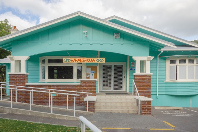
‘Whare Koa’ translates to “house of joy” and this project is certainly full of joy. The restoration and adaptation of this Californian bungalow for use as a community building is respectful, generous and joyful. The original gentility of the bungalow is restored in a way that honours its character, while necessary functional improvements add to the wairua, koa and colour of the Māori and Pacific Island communities for whom the house is a key amenity.
Resene Colour Award:
The exuberant use of colours in this project, which were selected by the architects and clients together, is reflective of the community it serves and the overall joy the project exudes.

This collaborative team has successfully unlocked the bicultural potential in a nationally significant heritage building. By engaging in meaningful consultation with diverse governance to meet public expectations, the collaborators have enhanced both the He Korahi Māori and Teu Le Va experiences. This thoughtful design responds to the proportions of the existing building with a heritage fabric that has been adaptively reused and refurbished, and successfully pieces together old and new. The new work enables a dialogue between New Zealand’s colonial past and the present, and offers a path towards decolonisation.
Saint Patrick’s Presbytery – Seismic Upgrade and Refurbishment by Warren and Mahoney Architects and Salmond Reed Architects in association

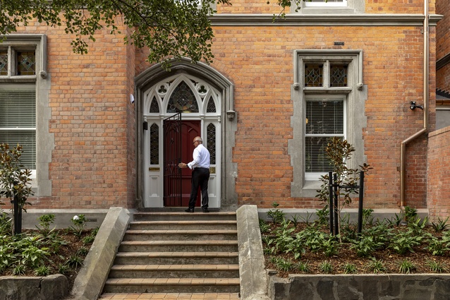
The upgrade and refurbishment of Saint Patrick’s Presbytery is as serene as a prayer. Home to cathedral priests since 1888, this category 1 heritage-listed building presented a puzzle that the architects worked through methodically. Lowered ceilings from the 1970s were redesigned to admit light and space, the kitchen was returned to its original location to reconnect with a courtyard, and the upstairs was reorganised to create four bedrooms, ample study spaces, and generous bathrooms. This project is evidence that even modest architectural solutions can be the answer to someone’s prayers.
Hospitality
The Hotel Britomart by Cheshire Architects
This oasis in the central city is a rich example of how the language of architecture can make visitors feel right at home. From the wrapping of the building in soft honey-toned bricks, to a reception space that provides the warm welcome of a close friend, this project is the built definition of hospitality. Internally, spaces are attentive to the small pleasures of life: nooks replete with intimate lighting for reading; wide, generous window seats; sculpted recesses for children to sleep in; and gloriously big hand basins. This architecture says, “My home is your home”.
Resene Colour Award:
The colours of Aotearoa’s land, waterways and sky enliven every part of this building. Masterfully composed colour glows in every shadow, and patterns, textures and forms mark the passage of space and time.
Ahi by Jack McKinney Architects
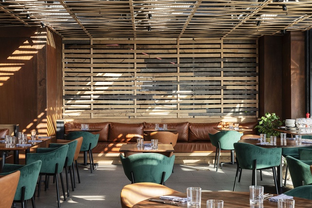
Situated in the midst of Commercial Bay, Ahi has been carved into what was originally an outdoor terrace. Elegant joinery has been used to create a semi-enclosed, well ventilated space with an impressive charcoal fire at its core. The project is driven by a strong focus on locally sourced materials, with New Zealand fabricators and designers used throughout. The impressive interior has been flawlessly constructed using native timbers - some 35,000 years old, and others salvaged from demolition.
Tuitui by Jack McKinney Architects
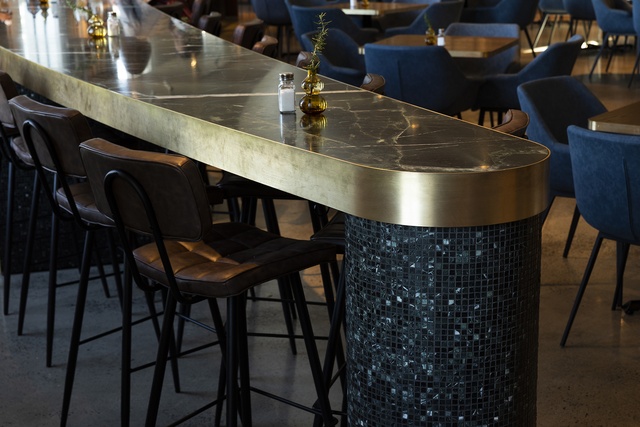
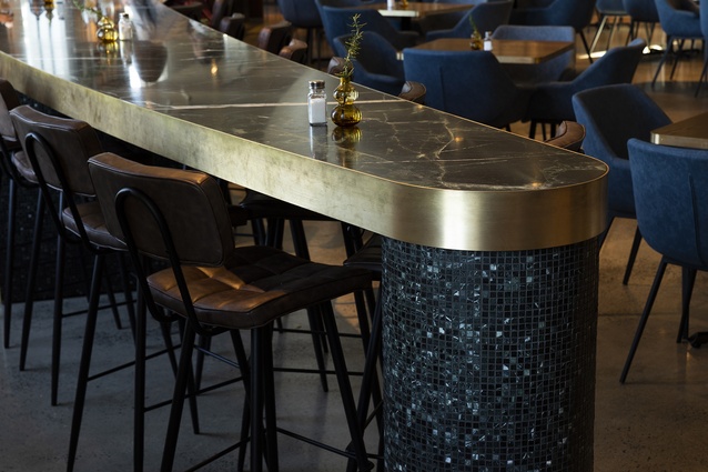
A clear focus on a single element – a crescent-shaped main dining counter – is a breathtaking decision, and is immaculately executed at the new hospitality space in Auckland War Memorial Museum. A limited materials palette accentuates the dramatic green marble top, which is augmented by brass edging. In a clever, highly skilled move, carefully cut mosaics from the same green marble are used to add textural depth to the unit. This is a thoughtful, moody interior, with a warmth and intimacy that fits seamlessly into the existing museum building.
Interior Architecture
The Hotel Britomart by Cheshire Architects
These interiors are love notes to all the ways texture, colour and pattern contribute to the making of atmosphere. Vast sand dunes are evoked in every surface; maunga and rocky cliff faces are conjured by a bespoke burnt wall treatment; and kauri forests are evoked via timber elements. Commissioned textiles invite the touch, and artworks reveal themselves inside cabinetry. With a painterly sensibility, this interior brings Aotearoa New Zealand’s landscapes into the city.
DLA Piper Auckland Office Fitout by Jasmax

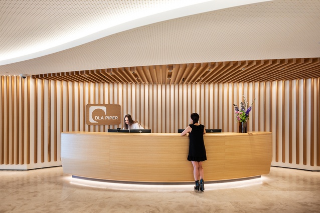
The approach taken here is to gently subvert the rigour of the building’s grid and structural layout to create a seemingly organic and fluid arrangement of timber-lined spaces. Sinuous paths present view shafts to the city and harbour, while informal meeting and work spaces offer opportunities to enjoy the view. A clear delineation between front-of-house and back-of-house does not preclude a strong visual connection between the main office spaces and the views beyond. Staff amenities, including a parents’ room and a well-being room are located discreetly, and add up to a truly 21st-century office.
Chapman Tripp by Warren and Mahoney Architects
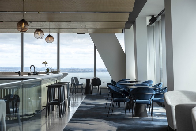
This made-to-measure office creates a lasting first impression through considered and rigorous design. Arrival into the hotel-style lobby is a massive power move; a lightning-fast lift opens into a darkened interior with glimpses of the Waitematā. All surfaces are exquisite, with no expense spared for aged brass, bespoke terrazzo and fluted glass. This rigour carries through to the working areas over three floors, where wood-lined partner offices have been replaced by an open-plan apprentice model.
Commercial Bay by Warren and Mahoney Architects in association with Woods Bagot and NH Architecture
The bustling orchestration that is Commercial Bay carries its many traders across an urban context. Deftly working across scales that move from tower to tile, the architects have made this complex project look easy. The building’s entry axes bring people in on the ground floor and allow them to cross paths in a way that makes the city feel exciting, while natural finishes give this metropolis a sense of place true to its site. Mind-boggling in its many parts and greater than its sum, Commercial Bay is a gestalt of architectural finesse.
Planning & Urban Design
Long Bay Village Centre by Architectus

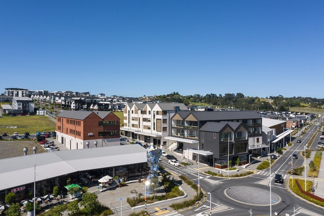
Simply put, Long Bay Village Centre feels like it has always been there. It is a masterclass of urban design and planning that considers everything across all scales, from main streets to downpipe placement. The architects have expertly worked with the land contours to plan plazas, courtyards and streets around a well-proportioned building mass, where the apartments and offices above shops contribute to the urban grain. The architecture has various forms and angles that avoid predictability, and the palette will allow this township to age gracefully and become a unique coastal destination.
Public Architecture
Te Rau Aroha Museum with Tahuaroa Function Centre by HB Architecture
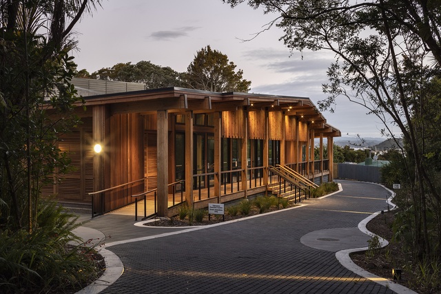
Te Rau Aroha Museum tells the story of the 3600 men who served in the 28th Battalion, also known as the Māori Battalion, during the Second World War. These men are honoured in the building’s pensive mass, which evokes the beliefs that took these men so far away from home without promise of return. A monolithic form protects these stories, while inside they are commemorated through darkness and light. The gallery is sombre and shadowed, while the remembrance space is bright in honour of life and service. Outside the ātea is inscribed with radiating rings, representing the ways that single actions can have significant effects. The building protects the memories of these men, so we can all remember them with mana and aroha.
Auckland War Memorial Museum Tāmaki Paenga Hira, Te Ao Mārama and Cenotaph Galleries by Jasmax, FJMT and designTRIBE architects
Te Ao Mārama marks the arrival of an inclusive and collaborative approach to the storytelling of Tāmaki Herenga Waka. The new South Atrium renovation brings balance to the original European architecture, and embeds mana whenua and Pacific narratives into the museum’s civic spaces. Tikanga now guides welcome, arrival, orientation and kai. New boulevards connect Te Ao Mārama to the Māori Court, and the tanoa bowl form is fully realised with exquisite detailing. External works enhance the pedestrian experience of arrival and provides views to significant landforms. Te Ao Mārama sets a new precedent and lays down a challenge to all who visit it to see their museum, and their heritage, afresh.
Tiaho Mai Acute Mental Health Inpatient Unit, Middlemore Hospital by Klein
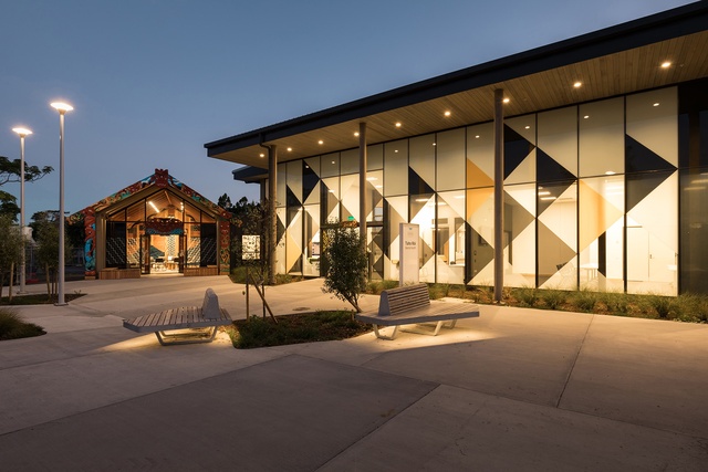
Tiaho Mai embodies a new direction in mental health design, and prioritises wellness, whānau and community as part of the recovery journey. Designed with the qualities of a home in mind, rooms are filled with light and fresh air. The architect’s skilful use of domestic materials offers a human scale and familiarity, and is a departure from the usual clinical palettes. The spatial planning is key, and moves away from the hub and spoke formula to a heart-based spatial concept. An open-plan core provides a space for people to come together and connect with nature through courtyards, planters and garden outlooks. The result is a design that nurtures and uplifts patients, whānau and staff.
Tuvalu Community Church by South Pacific Architecture

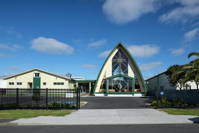
The Tuvalu Community Church rises up to meet a sky alive with Pacific colour, life and aspiration. Established in West Auckland in 1992, this church community has envisioned its new building for 28 years. The fruition of this project is an act of devotion by the Tuvaluan community and, in response, the architects have designed a building that is centred in faith and celebration. Taking cues from the fale uma or kitchen fale, the church form elegantly opens up and out into its industrial context. The church is a metaphor for the community’s resilience and ambition, which soars within this timber and steel vault.
Resene Colour Award:
Alive with Pacific brights on the inside, the outside of this building features green tones selected by the community it serves.
Te Puna at Auckland Zoo by Stevens Lawson Architects and Jack McKinney Architects in association

Te Puna cafe’s fluid geometries, reminiscent of a coastline studded with sheltered niches, provides various spaces to sit, eat and socialise. Two clay-brick pod forms rise above a sinuous veranda, perfectly expressing the relationship between concept, shape and structure. Highlights include a skylight above the servery and white-washed glulam timber mullions. The architect’s technical rigour and a focus on environmental performance have made this an oasis of calm at the heart of a zoo that is undergoing a 21st-century transformation.
Small Project Architecture
Te Nukuao by Beca Architects, Tessa Harris and LandLAB in association
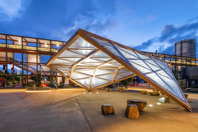
Te Nukuao is both a marker and a signal of the deep connections tangata whenua maintain as kaitiaki of the land and waters of Tāmaki Makaurau. Artist Tessa Harris’ exploration of raranga is a celebration of traditional weaving techniques that pass on mātauranga Māori, resulting in an inspiring handwoven panel. To weave through this urban space is to also be part of the history of reclamation, while below, the underwater caverns that used to exist are acknowledged in this urban shelter. Formally Te Nukuao explores three waka hourua sails, but the space it creates is about journeys, both past and present.
My Whare by SGA – Strachan Group Architects
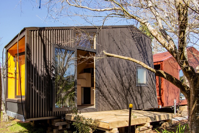
An inspiring collaboration between architects and a community initiative, My Whare studios are prefabricated housing units that will provide warmth and shelter for vulnerable young people who are transitioning out of care or homelessness. With warm timber floors and sturdy steel-framed walls and roofs, the units can be easily transported to the residential properties of host families where, within the lined walls of sustainable ply, young people can make a home for themselves. While the country grapples with the housing crisis, such interventions show the powerful role good architecture can play.
Back House by SGA – Strachan Group Architects
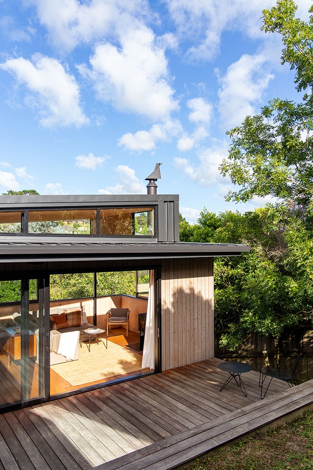
A true collaboration between the architect, client and builders, this 65-square-metre west Auckland house celebrates small living at its finest. The architects’ use of cross laminated timber (CLT) in the floors, walls and ceilings bring structure and interior seamlessly together, cleverly exploiting the inherent richness in the CLT panels’ materiality. Each space is masterfully scaled so that despite its demure size, this two-bedroom dwelling feels perfectly comfortable for everyday living.
Feather’s Nest by Vaughn McQuarrie

A tight budget and a south-facing, bush-clad site made the client’s brief - a home for a couple with space for visiting friends and family - a challenging proposition. But the seemingly effortless arrangement of space in this three-bedroom house in fact reveals the architect’s remarkable ability to make a small space feel commodious and comfortable. The home’s arrangement, with outlook and connection to the surrounding bush, results in a beautifully crafted home perfectly at ease on its site.
The 2021 NZIA Local Awards programme is supported by Resene and APL.

