Whare by the sea
Motutara Road dictates the curvy and picturesque descent into Muriwai Beach. It borders the crest of a hill before dipping into this relaxed, surfing mecca 40kms west of Auckland.
“Motu means ‘to sever’ and tara is ‘peak’. At Muriwai you’ve got the peak and you’ve got the low-lying land and it’s severing that peak so on the plan that’s exactly what this is,” says TOA Architects’ director Nicholas Dalton.
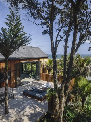
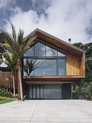
Dalton designed a house severed into two wings: the front house, dubbed ‘Zealand’, is devised to take in the magnificent ocean views; the rear pavilion, named Ngahere meaning forest, is tucked into the hill’s foliage.

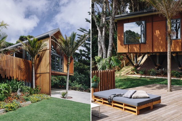
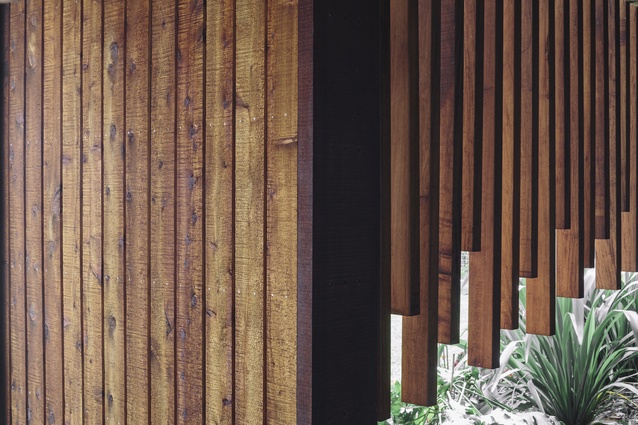
The forms are distinctly Maori, the landscaping and composition unequivocally of the South Pacific. Dalton refers to the home’s façade as the front of a wharenui but with a difference. “Usually the wharenui is symmetrical and has the barge board,” he says, pointing to the poles of the house, which bear an elongated similarity to the external columns of a marae; a leg from its triangular roof line, however, is pinched to create asymmetry. The exterior cladding is batten and ply, and the cedar will silver off over time.
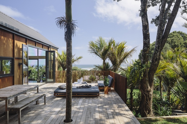
Tapered wooden battens fence the raised deck to the left: “they are the palisades [of a pa site],” explains Dalton, “but upside down. Because this isn’t a fortified place – it is a place of safety – so you’re kind of flipping that over.”
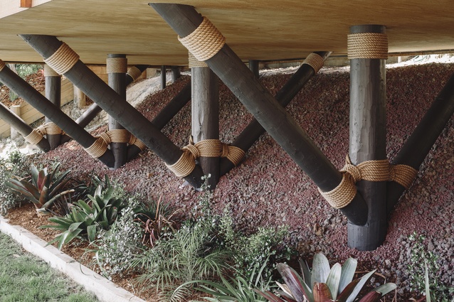
The Pacific elements continue in the rear pavilion where the three bedrooms are located. Imagined as a tree house, it is a long rectangular volume elevated by a series of exposed stilts with inverted triangular supports. Their apices have decorative ropes which were put in place by the man who services the scratching poles for large felines at Auckland Zoo. They are reminiscent of knots tied around the masts of boats or the way South Pacific builders lash interior rafters and cross beams.
“We like referencing stuff that’s been here for a very long time… it’s tricky to do that in a way that’s respectful but I think we’re being a bit more brave about things,” says Dalton.
At the entrance, a long sliding door makes up the lower level’s external wall. It is made of a Canadian, white, ribbed plastic that allows light into the stairwell leading up to the living room. The geometries and translucency here seem to be a fresh interpretation of Japanese rice paper walls with their delicate framing and treatment of natural light.
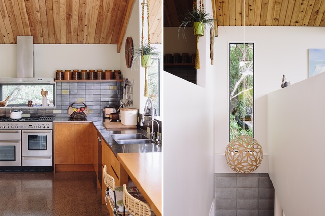
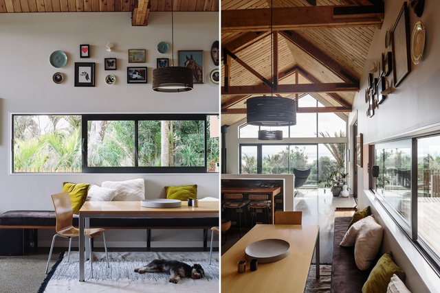
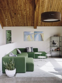
Inside, materials, volumes and filtering of light further accentuate the difference between both wings. The peaked, double-height social spaces are made rhythmic by triangular trusses that emulate the windows at each end. Light washes across the timbers, creating geometric shadows on the concrete floors.
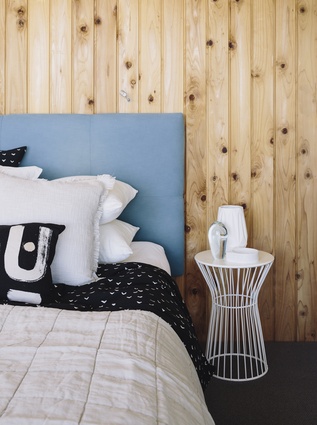
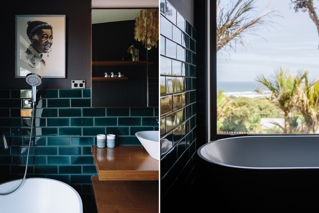
“Materiality here is macrocarpa timber and Japanese cedar on the sarking which is grown in Tauranga,” says Dalton. Plentiful knotholes make the interior seem organic, while glossier finishes (like kitchen and bathroom tiles) lend the space a sense of added permanence and solidity.

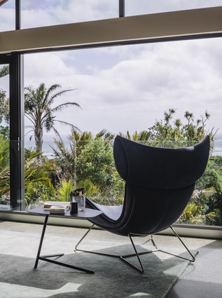
Except for a small TV nook, everything in this wing takes in the sunlight and sea views. One of the owners is a keen surfer and part of his brief was to be able to see what the ocean was doing throughout the day. He also travels frequently and the creation of two wings was partly fuelled by the need to arrive at odd hours, and cope with jetlag while the rest of the family could carry on with daily life.
This spacious living area is hyper-aware of its surrounding nature. It has an impeccable connection to the large outdoor deck and flows seamlessly into a small corridor, a bridge into the other pavilion. The walls of the staircase are lined with exposed concrete blocks.
“Concrete is an important aspect, not only from an environmental perspective but also just that energy it embodies. It has thermal mass and it releases the sun’s energy through the day,” says Dalton.
Narrow stairs lead up to the sleeping areas, and the corridor has a series of clerestory windows threading light into the otherwise cavernous space. The architect has created small, selective views. In the children’s bedrooms, windows frame great slivers of sea and sky. The master bedroom boasts layered views of deck, bush and social spaces.
“Think about the interior of a forest,” continues Dalton, “it’s very dark and from an interior design perspective, you come up here and it’s quite calming. It brings it all down. Outside, this is eventually going to be all lush and green but it’s literally about being in the forest and being under the trees.”
Treading a line between permanent abode and bach, the careful and mature adaptation of vernacular South Pacific forms make Muriwai House a true residential gem.
“I’m very conscious of not replicating these things,” says Dalton of the various, traditional South Pacific architectural dialects, “or blatantly ripping them off. I reference them in a way that I believe is appropriate and has relevance and meaning.”
For an interview with Nicholas Dalton click here.

