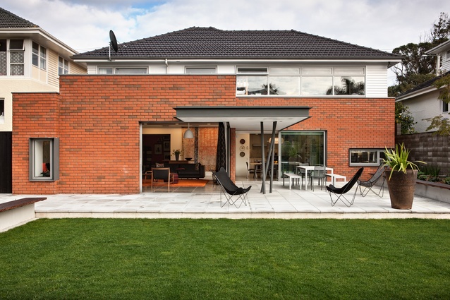
Westmere renovation
While they may not pick up any awards in the aesthetics department with their standardised architecture, there is something we can all agree on when it comes to the humble state house - they have good bones. Which is more than we can say for a number of 1990s-era properties.
Perhaps that’s why homeowners are choosing to update their state house properties rather than start again from scratch. Such was the case for the owners of this property, bought expressly to renovate, says architect Guy Cleverley.
“Funnily enough, the one-size-fits-all single-level design of most state houses makes them imminently suitable for updating.
“Someone had made a start on updating the house by taking advantage of the natural slope and adding a garage and a couple of rooms underneath the existing house, but these weren’t executed particularly well.”
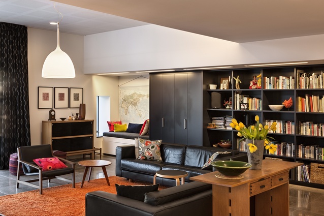
The clients wanted to turn the standard state house layout into a contemporary five-bedroom home that gave them seamless access to the backyard and provided plenty of space for entertaining. They also wanted the result to be as sustainable as possible.
“The house lies along an east-west axis, so the reorganisation of spaces has been designed to follow the sun, from the lower-level kitchen and family rooms in the morning to the warm, street-oriented lounge in the afternoon,” says Cleverley.
“Not only does this take advantage of the natural light, but it also provides solar gain to help warm the home, while the addition of natural ventilation, including the provision for air purging on hot summer nights, aids the overall amenity of the property.”
These passive elements are augmented by heat pumps for hot water and in-slab heating, double glazing and rainwater harvesting for irrigation and to flush toilets.
“Circulation is also a strong theme of the house,” says Cleverley. “With the reorientation of spaces resulting in the kitchen, dining and family rooms being placed on the lower level, the focus became about moving people from the upper level entry down to these public areas.
“The clients wanted the journey, albeit a short one, to be experiential. At the top of the stairs a glazed panel provides a glimpse into a hallway beyond, while towards the bottom the stair dog-legs at a small threshold landing before opening onto the open-plan high-stud living area.”
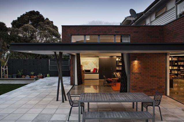
Circulation between the indoors and out was equally important and the clients wanted that connection to be as seamless as possible. Cleverley has eschewed the usual 150mm step in favour of a flush transition. Stacking doors disappear into the walls on two sides essentially creating one large living space that happens to be partly indoors and partly out.
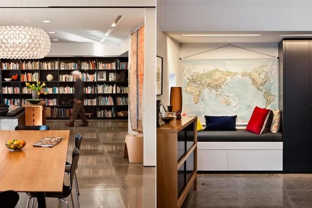
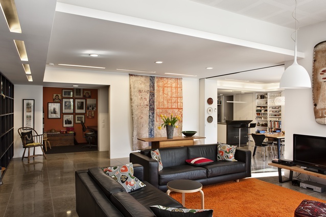
Similar internal doors allow each of the interior spaces to be closed off from one another to create more private individual areas as and when the situation warrants.

