Well grounded: Oliver’s Ridge
With a clear mandate to be elegant, yet passive, Queenstown’s Team Green Architects has delivered a home that is powerful in many respects.
“Modern informality; comfortable rustic elegance; sustainability; sense of permanence; textural warmth and richness; low maintenance; bespoke.”
It’s not often that an architect is given such an eloquent and compact brief from a client but these are the words that were delivered to Team Green Architects as a starting point for the design of this Queenstown home.
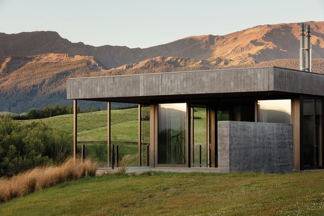
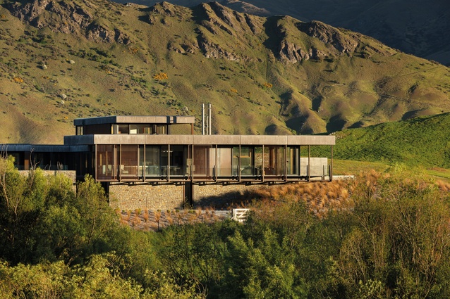
The site is on the side of a steep hill in a rural subdivision in Dalefield, with stunning views that include Coronet Peak in one direction and The Remarkables in the other. A six-metre height limit meant architects Sian Taylor and Mark Read had to look at the design creatively in order to fulfil the home-owners’ wishes for a master bedroom suite with some separation from the rest of the home.
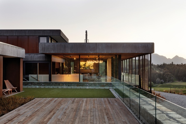
A retaining wall, articulated as a spine running through the middle of the house, holds back the earth and allows for three zones, explains Taylor. “We have the master suite above, the living space with kids’ wing in the middle and, downstairs, the guest suite and garaging. Each storey is bedded into the hill with the top-floor master suite on top of the hill. Each level has connection to the land. That’s one of the reasons that the roof of the garage is designed as a continuation of the landscaping.”
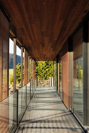
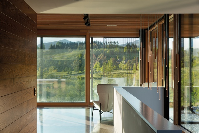
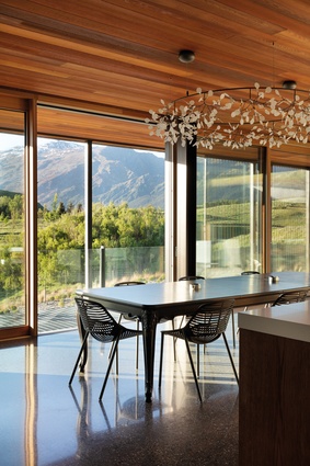
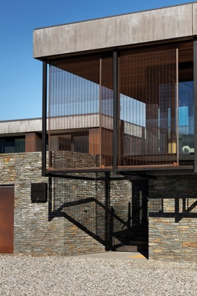
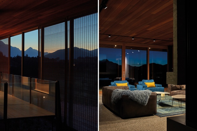
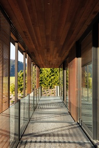
Following the prompts of the clients’ brief, the architects sought to create a design that used natural and hardy materials and could withstand the elements thrown at it from this exposed hillside site. Large-scale, high-performance, triple-glazed windows on the central floor allow the views in while keeping the cold out, and a combination of Corten steel, shuttered concrete and schist gives a rustic look that fits with the brief as well as merging nicely with the landscape. “The colours are from nature – from the ground or the trees,” says Read. “The clients love the honesty of the material palette.”

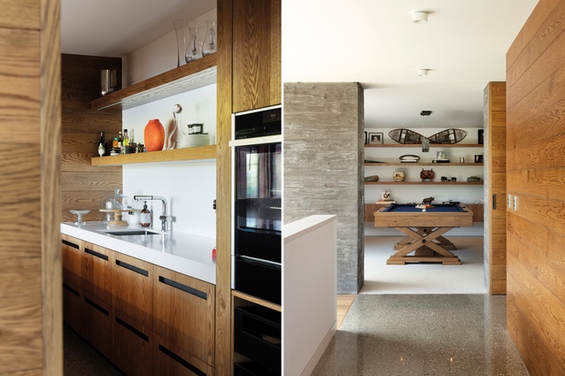
The schist ‘spine’ of the house is a feature of the interior on the central level, where it runs through from the bunker-like den to the kids’ wing, which opens out to the deck on the roof of the garage. The den is in direct contrast to the glazed living area, in that it is mostly enclosed and, in a home that is uncluttered and minimalist, it provides a space for the home-owners’ collection of travel memorabilia.
“We thought it was interesting to play on the subterranean element of the house and reveal some of those materials, such as the schist wall,” says Read. “It was important to bring the outside materials in so we have concrete elements throughout as well.”
Following the ‘sustainability’ aspect of the clients’ brief, and a large part of Team Green’s modus operandi, the house is designed using passive house techniques. A ventilation system, which runs even when the house is empty, ensures fresh air circulates through the airtight home, explains Taylor.
“You can’t tell that it’s running but it’s constantly bringing in fresh air and taking out stale air. Combined with excellent insulation and good windows, and the usual things, like low-energy light fittings and hot water, this brings the energy use right down. Forty per cent of all energy use in most countries is from buildings. This is a big house and, if we hadn’t done what we’ve done here, the carbon footprint could be huge.”
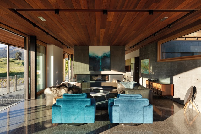
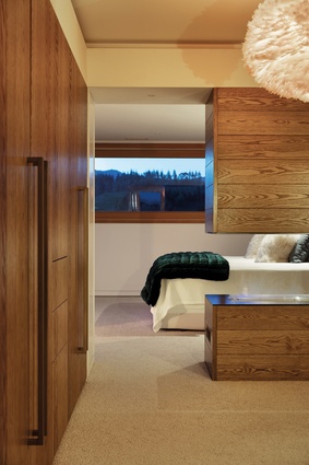
The house has two fireplaces, one in the living room and one in the master suite, but they are not required for heating. “You feel different in a passively designed house and don’t need to light a fire to keep warm but people still like them for the ambience,” explains Read.
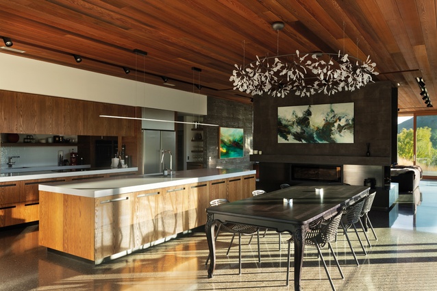
The living-room fireplace is enclosed in a steel structure that takes centre stage in the space, creating division between the lounge and the dining area. The kitchen is clad in American white oak and has an interesting design feature; the scullery can be seen through the back wall, where it takes the place of a splashback.
From the upstairs master suite, the roof of the lower floor is visible. “From up on this level, we were aware that you were going to be looking at a lot of building. We’ve used this large aggregate ballast to calm that view so you’re not looking down at a bare roof. The aggregate is loose and sitting on top with a drainage mat underneath so it can drain freely and not be a problem when there’s snow and ice,” says Read.
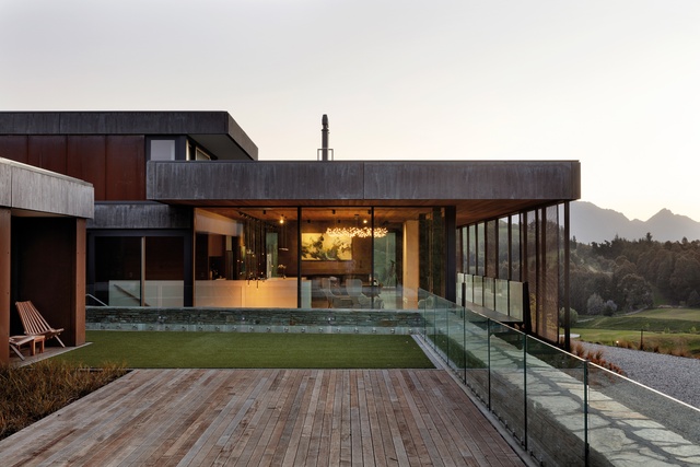
While the house was originally designed to be a holiday home, the clients have expressed a wish to make it their permanent abode; this, Read says, is a sign that the architects have done their job well.
“The context of the house could have been heavy handed so we had to be aware of the softness that we needed to use as well. That came in at the end with some of the fittings and textures,” he says.
“Every house of this scale has the potential to be ostentatious but we identified with these clients that this was not part of their palette or their brief. They are really practical people, who don’t want anything which is not of use to them, and that is expressed in the furnishings and in the architecture of the house.”
This article first appeared in Urbis magazine.


