Walking on sunshine
“Is this year’s Serpentine Pavilion a dynamic amorphous structure or ‘a shanty town’?” asks Colin Martin. With less than a week to go until it is dismantled, Martin reviews Spanish architectural practice selgascano’s colourful offering which currently is sited in London’s Kensington Gardens.
The Serpentine Pavilions in Kensington Gardens, with up to 300,000 visitors annually, are listed regularly among the top-ten most-visited architectural and design exhibitions globally. They began in 2000, when Julia Peyton-Jones, director of Serpentine Galleries, asked Zaha Hadid to design a temporary structure for a gala dinner, which would ‘reinvent the idea of a tent or marquee’ and cost less than hiring one! Whether or not Hadid hit budget is unknown but her pavilion was much admired by diners, and Peyton-Jones decided that it should remain in situ throughout the summer and opened for the public to enjoy.
Fifteen years on, with a constellation of pavilions designed by stellar architects, Peyton-Jones and her architectural collaborators have demonstrated that the public responds more readily to contemporary architecture when it’s presented as immersive and experiential pavilions, than by trekking through text-heavy exhibitions of drawings and models.
The 2015 pavilion was designed by Spanish architects José Selgas and Lucía Cano (selgascano), with engineering services by AECOM. Selgascano’s belief that architecture is secondary to nature informs their own practice and also the way they teach their nature and climatology design course at the Massachusetts Institute of Technology.
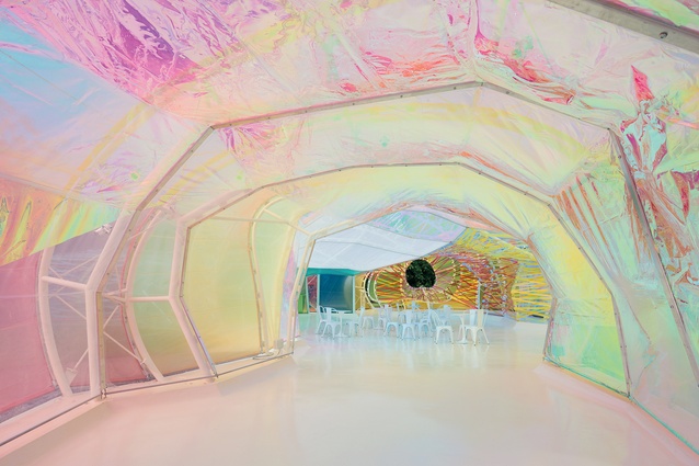
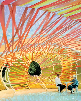
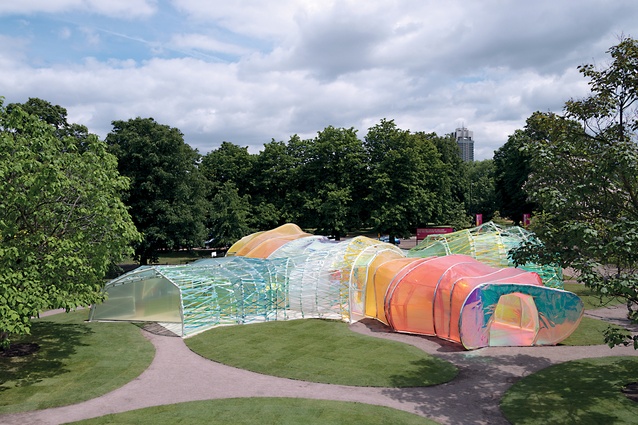
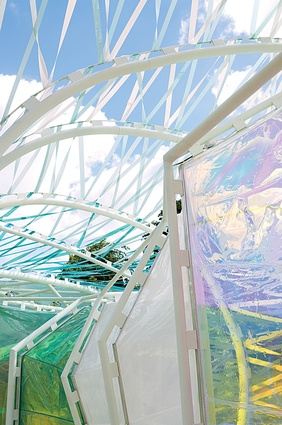
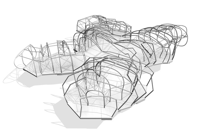
Visitors to their pavilion have a choice of four non-hierarchical entry and exit portals, which, in turn, provide different ways of exploring its outer and inner structural shells with, effectively, an open loggia on the exterior, and of navigating its multicoloured interior. Technically, selgascano’s amorphous pavilion is a double-skinned polygonal construction: a minimalist steel framework clad with translucent ethylene tetrafluoroethylene (ETFE) copolymer printed with 19 different colours, woven and wrapped like webbing.
As I approached the pavilion on an overcast, humid afternoon, my first impressions were not promising. It looked like a shanty town or refugee camp shelter, its exterior woven webbing reminiscent of the flimsy plastic barriers seen at Ebola isolation centres. Pavilion sponsorship by Goldman Sachs and catering by Fortnum & Mason seemed ironic, given its unintentional impression of refugee chic.
But then the sun came out, and the vibrancy of its coloured ETFE copolymer cladding and the iridescent effects created as a light breeze slightly deformed its walls and roof, reflecting light and creating a dynamic structure, banished any jaundiced thoughts. With a gross internal area of 179m2 on a 264m2 building footprint, the 2015 pavilion is smaller than that stipulated by the usual brief to design a 300m2 pavilion. Ceiling heights range between 2m and 4m.
The stage area is smaller than it has been in previous years, too. An open oculus behind provides a glimpse of trees and some ventilation but two free-standing industrial fans indicate that additional ventilation is required, whenever the sun is high and the interior overheats.
“The spatial qualities of the pavilion unfold only when accessing the structure and being immersed within it,” says selgascano, adding: “Each entrance allows for a specific journey through the space, characterised by colour, light and irregular shapes with surprising volumes.”
The vision of creating a colourful kaleidoscope is realised when strong sunlight shines through the translucent walls and roof, and colours dance on the white, reinforced concrete floor.
Films about the pavilion can be viewed here, and an informative technical article can be found here.

