Villa vanguard
The traditional rooms in this 1890s Auckland villa have been compartmentalised, shuffled and ingeniously spread across various levels. The result pushes the boundaries of a well-known architectural style.
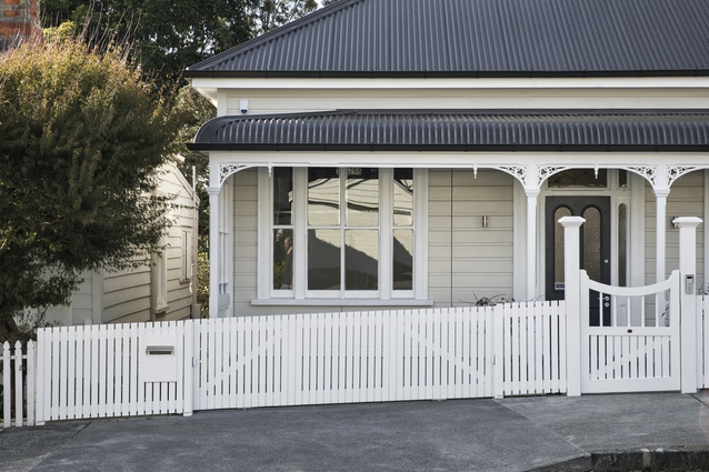
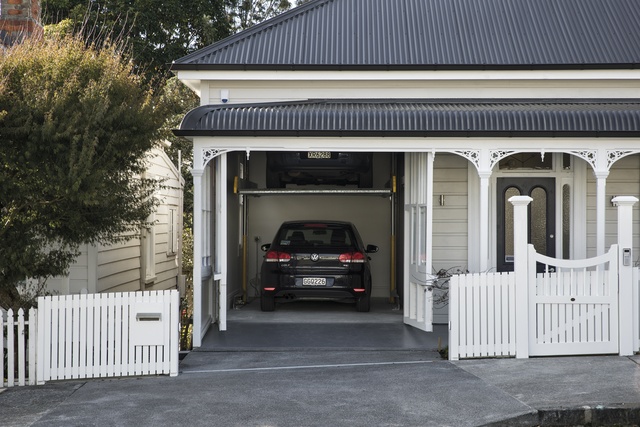
It’s not unusual for first-time visitors to Jonathan and Melody Smith’s Ponsonby home to do a double-take just as they’re about to knock on the front door. It’s then that you notice the square-front villa with its roll-top verandah is not as typical as you might think. A car is parked inside the space that looks like the front ‘bedroom’.
At the touch of a button, the weatherboards peel back to reveal an unexpected garage with car lift included: “We wanted to retain the character from the street so we cut through the joinery units to create two doors and then lined up the boards so you wouldn’t know,” explains Jonathan, who is also founder of Matter Architects and led the project. It’s not the only magic that happens in this city-fringe pad.
In his transformation of the home, Jonathan’s pulled a few more rabbits out of the hat. The first must surely be getting to own this former halfway home, built in 1896, which went up for tender 10 years ago.
Actually taking possession was like a dream until the couple realised they were sharing the space with many unwanted visitors. Vermin aside, there were holes in the floor and mould up the walls, and the brick stove in the seen-better-days kitchen was rusted through.
“We never thought we could live in the house as it was,” says Jonathan. But they did… for eight long years. Whenever the vision was fading in the frosty breath of winter, the architect would clamber onto the roof of the lean-to and remind himself of the vista that stretched west to the water and the Waitakeres. Each summer, a põhutukawa in the backyard put on a Christmas show amid tropical palms that dotted the urban landscape.
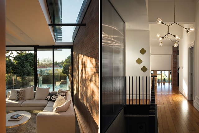
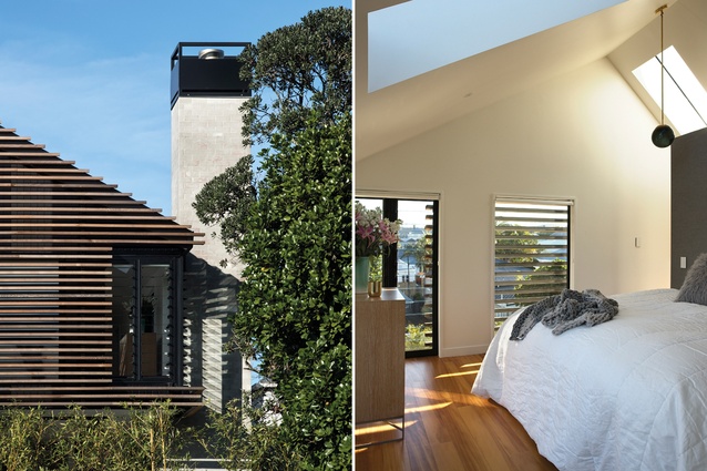
The hardships and the wait were worth it. This is not your pop-the-back, bog-standard villa renovation. This is a journey of discovery. Stretched over two and a half levels, the extended house is more than double its original size and has a master suite up top that boasts spectacular sunset views. Compartmentalised rather than open-plan, it’s a rich melding of old and new, where the floor plan escapes the expected.

The central passageway remains, but it is widened in parts and splits off into a number of ‘up here’ and ‘down there’ options. From the entrance, a glass-backed bookshelf at the end of the hall provides an enticing glimpse of something more. The architectural magician has played on our natural curiosity to create a new double-height living room at the far end of the villa.
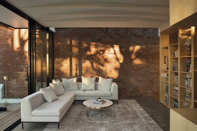
“It’s a destination point but also connects to the rest of the house,” Jonathan explains. The slope of the land means this room overlooks a patchwork of nearby roofs – “it has become one of our favourite views” – but, perched on the sofa, it is also possible to glance up to the intimate dining area and the kitchen opposite, or through the permeable bookshelf to the basement.
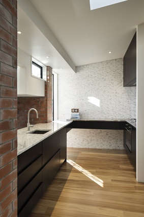
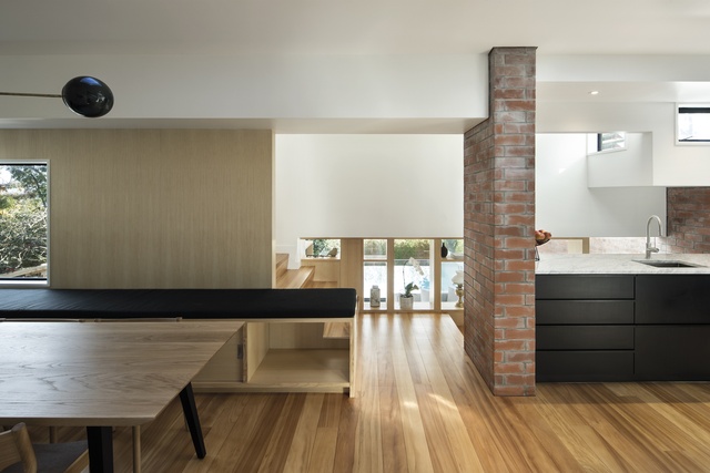
The kitchen, with striking black cabinetry and a hidden scullery, is like a crow’s nest with an enviable position, yet it does not claim standard status as the heart of the home. This is a design programme with an even-handed approach. On the lower level, created in the former two-metre ‘crawl space’, there are spare bedrooms, a laundry and a separate bathroom with elegant marble-look walls.
“They’re actually porcelain slabs,” explains Jonathan. “It’s the first time that product has been used that way in New Zealand.” A freestanding bath was a must-have for the couple’s son, Nic (now four).
For his material muse, Jonathan took the tumble-down retaining walls in the hotchpotch of gardens to the rear of the property. These he reinterpreted in a red brick wall on the eastern elevation, which shutters out the neighbours on that side but also cranks back and forth so as not to appear too slab-like.
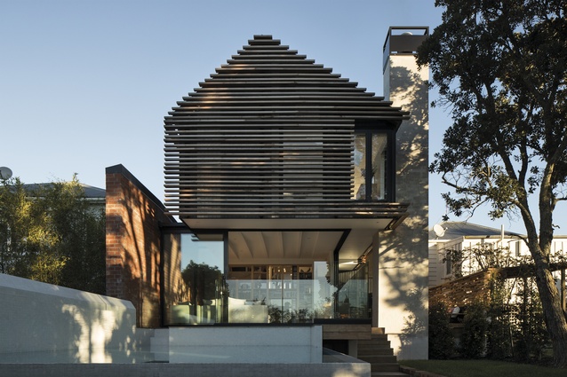
“It’s a large element so this approach helped to break it up,” he explains. Its rough surface is juxtaposed with a smooth marble wall that fronts the kitchen, a tapestry of texture where Victorian elegance meets the ghost of Ponsonby past. A variable cedar rainscreen that steps in and out on the new northern façade takes inspiration from that singular põhutukawa – an element of surprise that no Google street view could ever capture.

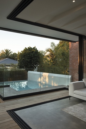
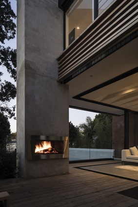
Another unanticipated ingredient in this back-to-the-future building is the pool, a compact yet sculptural elevated form that links to a deck area with an outdoor fireplace, perfect for gatherings on a summer evening. This western flank has a far closer connection to the immediate neighbours.
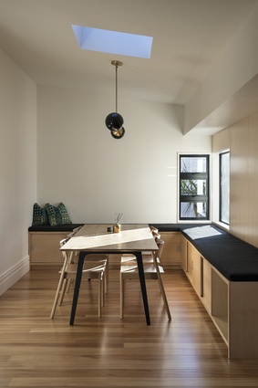
Planting, rather than built structures, define the boundaries of the property. The gardens are visually shared and the sense of community is strong. Sublimely private from the street, the house is fully immersed in its environment. A built-in bench seat in the dining zone, a room that marks the intersection between old and new, is a hotly contested ‘huddling’ spot for reading the weekend papers with one eye on the everyday activity in the neighbourhood. Melody likes to catch some quiet time here but is also thrilled with the practicality of the well-planned laundry which, she says, “makes life so much easier”.

Jonathan meanwhile is rather taken with the cave-like media room on the lower level. “I never thought I’d be one of those blokes who’d be into a projector,” he admits, but when Nic and his little friends claim the space for popcorn parties, he’s more than happy to play master of ceremonies.
While each room has its own character and its own magnetism, the two-year project has delivered more than the sum of its parts. It’s young Nic who, when asked what he likes most about this reborn home, nails the definitive response. Despite the luxury of a pool on the city fringe or the fun atmosphere of the media room, his values are in the right place. “I love the cuddles best,” he insists.

