Victoria University of Wellington Campus Hub and Library
Of all the country’s universities, none shouts its physical presence quite so prominently as does Victoria. Massey, Canterbury and Waikato are bypass candy glimpsed by bored suburbanites. Auckland and AUT University are driven into, and then through and then into again in a mad microcosm of commuter routines (Otago suffers the same anxiety for pedestrians). But Victoria rises above it all on Kelburn’s lofty hills, lauding itself over the Capitol with exactly the right degree (heh) of portentous responsibility.
It is somewhat humbling then to know that this premier location owes more to a cheap land deal than to any great insight. At a time (1901) when the nascent university was hesitating over staking an expensive claim on the Mt Cook flats, the quasi-benevolent offer of six acres of Kelburne Park Reserve – and 1,000 pounds to boot – proved irresistible to the cash-strapped university. That this offer came from the same person who had just staked his fortunes on the newly formed Kelburne & Karori Tramway Company was a coincidence that went ignored or, at least, unacknowledged.
But, as the student count has expanded, the university’s building works have stumbled along the ridgeline like wayward sheep. Victoria became a linear campus completely at odds with scholarly associations with cloisters, quads and Great Halls (although I might be thinking of Hogwarts). So Victoria’s lofty urban advantage has also been its greatest failing, resulting in an architecture that tends more towards incomplete concrete wall than ivory tower.
Instead of a centre, Victoria had an overlap gap between the street-facing Style Moderne of the Easterfield Building, and the ridge-hugging, harbour swooning of the Rankine Brown Library. Not that this gap wasn’t useful. In the early 1970s, it provided handy parking for hundreds of small Japanese motorbikes and, by the late 1970s, it had been transformed into an unofficial smokers’ lounge by covering it with the world’s smallest mega-structure canopy (although, regarding air quality, the difference in this change may have been negligible). Victoria paid for its prominence by giving up a centralised quad – a hub – for the culture of university life.
For all the traffic problems they might have, New Zealand’s other universities have places invariably associated with the theatrics of student life, for good and bad. The quads at universities in Auckland and Canterbury were both designed with the hindsight of the events of May 1968, where protesting students in France occupied Paris University at Nanterre. It is rumoured that Warren and Mahoney was briefed to make the Student Union quad at Auckland too small to allow a critical mass of belligerent students to gather. Further south, stories persist of tunnels under Canterbury’s campus to allow staff to scuttle invisibly to the university’s records room in the event of the students becoming more revolting than normal. Victoria was never going to have that problem. By the time Victoria’s students have clambered their way up Mount Kelburn each day, they are so exhausted the only revolution they are interested in involves a teaspoon and two sugars.
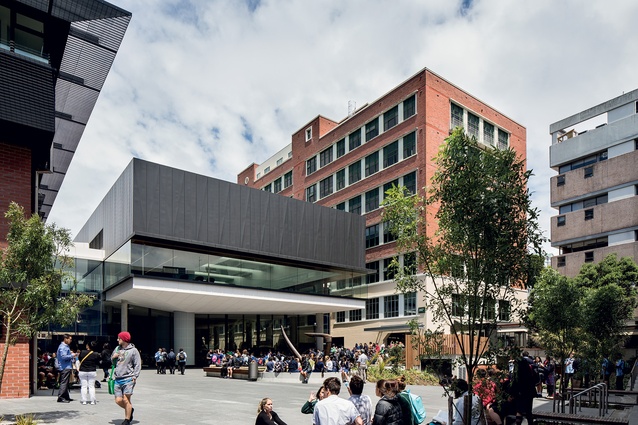
So the Hub is more than the latest addition to Victoria’s campus plan, and the outcome is a work of some brilliance by the architects.
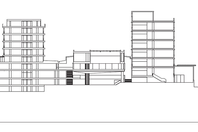
The genius (and I don’t use that word lightly) of this design is that it is not really a building but a complex – integrating a number of programmatic requirements while masquerading as a single solution. It is, in this sense, a wonderful architectural trick in which the Hub holds its own through the vertical articular of an elevated volume. The old idea of a two-dimensional quad has been reinvented as a three-dimensional volume levitating amongst the older, grounded shapes of Easterfield and Rankine Brown as a box unashamedly occupying a gap. This, in turn, responds to three separate design approaches to the programme that can be considered as, broadly, the library Reading Room above, the student common below and the interfaces that link them.
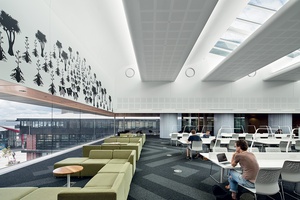
The highlight, with its high lighting, is the library’s Reading Room, which I am prepared to declare one of the finest spaces in the city for the quality of its natural lighting and peaceful, internal composure. In a world that seems increasingly frenetic, the Reading Room is notable for its ordered stillness, and my only regret is that it isn’t nearer the Architecture School
for the education it offers. This is the work of architects who studied at a time when there were certain select buildings that were the touchstones for masterful practice. It is not surprising that, in the reflected lighting and voluminous ceiling line, it is so easy to find the influence of Alvar Aalto (Viipuri Library) or Louis Kahn (Kimbell Art Museum), and the Reading Room’s external presence betrays the influence of Le Corbusier (Villa Savoye) in a contemporary way.
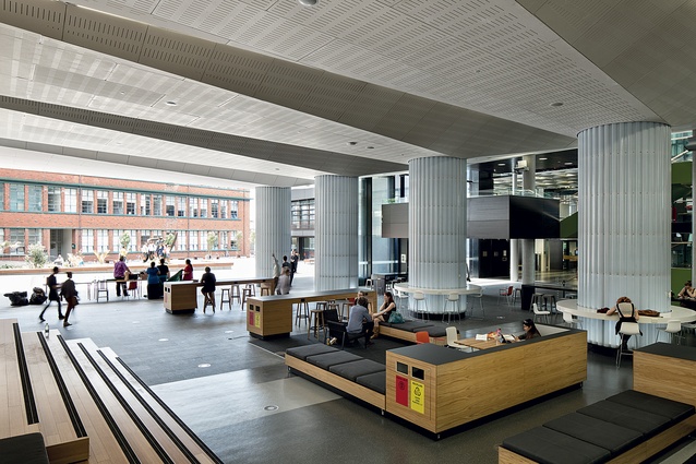
The only problem is that it is arrived at via the student common area, and here the Hub begins to unravel. I am not even sure if I should be calling it a ‘student common’ other than for the obvious reason that it seems very common, like a domestic airport terminal or a library in a ‘better’ suburb. To be clear, the architectural work here is meticulous and well detailed, particularly at the junction points between old and new, but the programme the architecture serves is patronising in its ‘student as client’-led assumptions. The educational mantra for such spaces is ‘informal learning’ and it operates on the belief that students with laptops and a wireless network are irresistibly drawn to immersing themselves in their studies. Thus students can ‘shape their own learning’. Maybe so, but the most obvious shape is provided by coffee. Back ‘in the day’ we tolerated queuing at university once a year, on enrolment day. Now students enrol online and queue every day, for coffee. Even as someone not shy of dramatic exaggeration, I was lost for words at the sight of students shuffling toward their lattes in a line that took them past a new book titled Overcoming Binge Eating and a special on cronuts. I would not be at all surprised to come back a year from now and find dartboards and a pool table with blue felt.
If the Hub were a house, I am sure we would immediately recognise it as a rumpus room. Unfortunately, it is the very worst kind of rumpus room: dug-out beneath better rooms, with thinly disguised buttressing and a ceiling that is just that little bit too low at the middle to ever be relaxing.
However, the student common does integrate seamlessly with the third design strategy, which is the dissolution of institutional barriers between knowledge and learning; i.e. the front door of the library is gone. Instead, entry is diluted vertically and horizontally, like a large department store’s, so that a student could conceivably wander in quite accidentally.
The porosity of this interface has provided the banal world of the ordinary unregulated entry into the cerebral sanctity of the library.
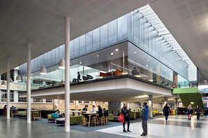
I might hope to see students reading Kierkegaard aloud to each other in the common but the reality is found by students, in library-sanctioned beanbags, surfing the web while slurping on sugar drinks (I know I’m a dinosaur but let’s not forget that the dinosaurs were victims of catastrophic change; they didn’t do the changing). To my tired eyes, this seems symptomatic of the ‘mall-ification’ of university education, where students are ‘special’ clients and it is more important to find a machine dispensing chocolate, chips and cola than a librarian. It also exemplifies a profound shift from hallowed halls to rumpus campus (and that’s not Latin).
This physical dissolution of social and institutional boundaries is an illusion. Like suburban malls and airport lounges, this is a private space parading as a public one, and that should be of concern in an organisation that ostensibly defends intellectual freedoms. The great democratic value of university quads is that they provide a contestable space where tensions between universities and their students can be acted out. Sometimes this invites the sort of political fervour that gave rise to the
May ’68 uprisings but, equally, it might mean a Hare Krishna meal deal. That kind of indiscrimination is exactly the point of contestable space: it is self-determining.
This is not the fault of the architects. They have done such a fine job here that the institutional complexities at play are all but indiscernible. This invisibility extends to the northern Tim Beaglehole Courtyard, which seems designed to provide photographers a line of sight to the Hub.
Given time, and inclination, this space might well become the most important part of the Hub development precisely by being outside the automatic entry doors. At least it is my hope that I might one day get an email warning that “the students are revolting in the B’hole…”.

