Venice 2014: Vernissage day two
A daily account of the movers and shakers at the opening of the 2014 Venice Architecture Biennale by Grace Mortlock, ArchitectureAU reporter at large.
Day two of the Vernissage brings an exponential increase in attending media, architects and well connected Italian visitors, swelling the pavilions of the Giardini. An architectural Disneyland, the Giardini is an expansive parkland that hosts small pavilions in a dazzling array of styles, each populated by a different participating nation. There are too many pavilions to visit in any one day, I have attempted to bring you some of the highlights.
Power Rankings: Day two – The Giardini
1. Cinema
While the Biennale promised to focus on the “Fundamentals” of architecture, the medium for doing so has overwhelmingly been cinema. It has been used as a repository of research material, as a pyschoanalytical counterpoint to buildings, and as a taxonomy of architectural and spatial components. In the main chamber of Koolhaas’s Elements show in the Giardini, a mesmerising showreel of spliced together scenes from a huge range of movies provides an at-once repetitious and ever changing sequence of windows, stairs, doors and floors. Yesterday, having already seen film reels used as an index within the Monditalia Arsenale show, in the Argentinian pavilion and elsewhere, it seems like there has been a widespread rediscovery of cinema’s value as a tool of architectural communication. This seems appropriate given Koolhaas’s background in film journalism.

2. Rem Koolhaas (previous day’s rank: 1)
If Monditalia is the highlight of the Arsenale, the Elements show is doubly so for the Giardini. Contrasting with the cacophany of the national pavilions, the coherancy of an exhibition devoted entirely to the various components that make up architecture registered loud and clear. The Padiglione Italia is broken down into a sequence of rooms, each featuring a thematic exploration of a different architectural element, analysed in forsenic detail. The “Window” room, for example, features a small sample of the 5000-strong repository of historical window frames collected by preservationist Charles Brooking. Australian critic, David Neustein described the exhibition experience as being “like a nightmare in which I have to study for an exam on the Architect’s Metric Handbook while wandering through a crowded supermarket.” He loved it.
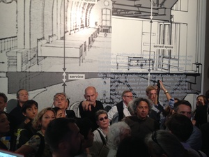
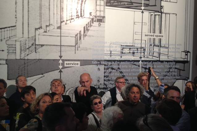
Given the success of Elements, you might ask why Rem has lost his number one ranking? The Biennale’s curator spent the entire day moving around the Giardini conducting private tours for VIPS, accumulating fans and onlookers wherever he went. As the crowds massed, this tall and craggy pied-piper grew more irate and aggressive at every turn towards the throng. It was not a good look. Venice log: Rem scary. Have abandoned all selfie attempts.

3. British Pavilion (A Clockwork Jerusalem: curators FAT Architecture, Crimson Architectural Historians)
Most of the pavilions in the Giardini reflect Rem’s call for a global research project into the effects of the past century of Modernity. While the best thrived within this theme, many lesser pavilions simply presented the aesthetic of research and not its outcomes, overwhelming the visitor with stacked dossiers and piles of papers.
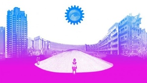
Drawing on pop references from music to film to counter-culture posters, the curators of the British Pavilion managed to convey their content in a witty and engaging way. A Clockwork Jerusalem explores the legacy of British planning, from Ebenzer Howard’s Garden City to the housing estates of Milton Keynes.
The pavilion also provides a fitting swansong for FAT Architecture (which disbanded this year), and specifically for wunderkind FAT director, Sam Jacob. If the pavilion itself wasn’t enough, the party that followed (hosted by the British Pavilion) was the consensus best of the night. I am still recovering as I write this.
4. Japanese Pavilion (In the Real World: curator Norihito Nakatani)
On the entrance door on the way into the pavilion are quotes from three long-established Japanese architects: Terunobu Fujimori, Toyo Ito and Hiroshi Hara. Written in the early 70s, these quotes describe the desire of the then-young architects to rediscover traditional Japanese domestic architecture amid monolithic post-war reconstruction. The writings, research and drawings of this period, presented as if they have just been discovered and inviting the visitor to dive in and explore. Reader, I dove.
5. Swiss Pavilion (Lucius Burckhardt and Cedric Price. A stroll through a fun palace: curator Hans Ulrich Obrist)
While the Australian Pavilion relies on a barely-functional “Augmented Reality” app that has to be pre-downloaded (as no wifi was available), the Swiss Pavilion’s only technology is human. Expert pavilion volunteers wheel trolleys back and forth from a selection of the Canadian Centre for Architecture’s archives, pulling out project folders from seminal architectural thinkers, Burckhardt and Price. These volunteers will explain the particular project to anyone within earshot, translating the immensity of the stored material. Sometimes, simple is best. In the adjacent garden, supercurator Hans Ulrich Obrist presides over a marathon, multi-day extravanganza of talks by prominent architects, filmmakers, artists and theorists.
Not ranked

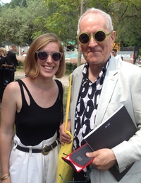
- Sir Peter Cook – Nicest of the starchitects I encountered, we bonded over our love for quirky glasses.
- Brian Zulaikha – In his opening address for the Australian Exhibition, the former Institute President described the incomplete DCM Pavilion as an “embassy” and its canal as a “creek”.
- The Australian temporary pavilion Cloudspace – it’s a tent, innit?
- Aperol spritz – spritz all day, everyday.
- Black – preferred choice of architects everywhere.
- The Venetian sun – not particularly kind to black clothing.
- Queue to the US party at the Peggy Guggenheim – long.
- Attention span after visiting 17 pavilions – short.
- Interminable 45 minute long thank-you speeches – who needs to attend the Biennale press conference, anyway?
- Boxed lunches.
- High heels – the gravel is not your friend.
- Nest Labs CEO Tony Fadell – recently sold his company for $3 billion. Rem took the opportunity to ask him for a collaboration while onstage.


