Urban oasis
A dozen men grunt and groan as they manually push a trailer saddled with an 800kg clear acrylic sheet through a neighbour’s backyard and down into the narrow back section of a turn-of-the-century Ponsonby villa.

Then, there’s the audible intake of breath on site, when the 12 men expertly manoeuvre the six-metre pane up into the air with the help of a makeshift pulley system, the sheet precariously hanging mid-breeze, before it neatly slots into its place as the transparent front wall of the lap pool. Exhale.
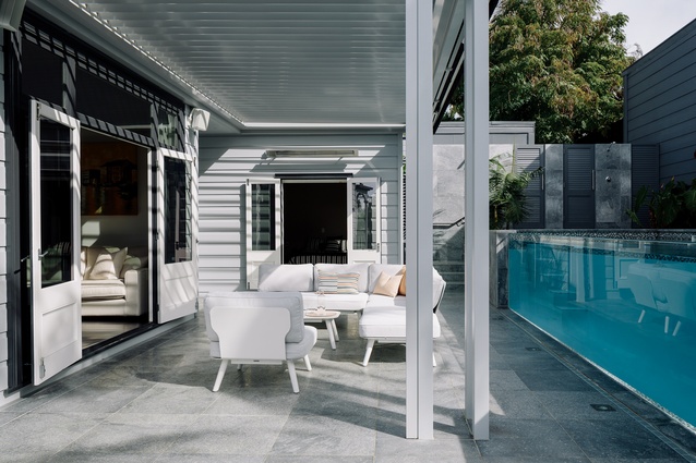
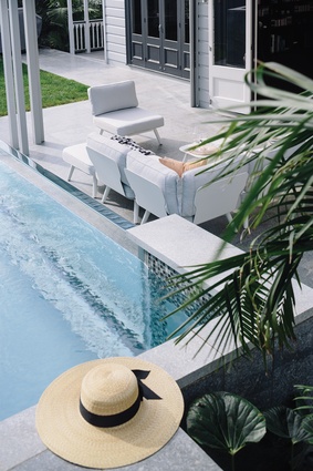
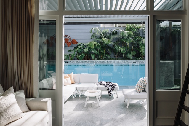
The sheet of acrylic, imported from Germany, is the much-awaited icing on the cake. Like a mirage in the desert, the cerulean water it contains draws the eye through the house and out into the oasis beyond.
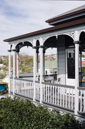
Sited on a steep section, the traditional exterior of the home belies the sense of sanctuary beyond – created by owners Nicola and Graeme Edwards. In fact, the only hint given from the front of the house is the tropical planting – palms and flaxes are lush and tropical creepers flower abundantly.
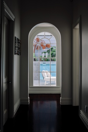
Entering the house from underneath the traditional front veranda, various bedrooms intersect a wide hallway. So far, so villa. Yet drawing the eye down the hall, through an arched Victorian window, is the inviting azure waters of the pool. The juxtaposition between classic villa and modern sanctuary is seamless and is a theme extended through to the kitchen, dining and living areas at the rear of the house.
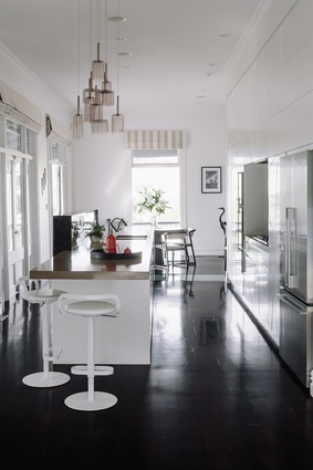
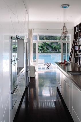
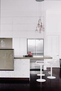
Nicola says the kitchen space acts as a pivot between the various living spaces, but is almost secondary to the exterior space. The kitchen is orientated to this effect; the island bench sits perpendicular to, rather than facing, the pool.
“The focus from the kitchen was for the eye to travel straight out to the pool,” says Nicola.
Designer Natalie du Bois was brought in to redesign the kitchen and integrate it with the adjacent living, dining and exterior spaces.
However, with classic features throughout – timber floors, sash windows and timber detailing – it was a challenge to retain the classic look and seamlessly blend it with the modern exterior space.
A bright, airy kitchen was envisaged, which would cast the eye out through the library nook to the backyard in one direction and down the house to the dining area in the other.
It was decided that while the kitchen needed to be slick, clutter-free and bright, a vast wall of white cabinetry and benches wouldn’t provide the anchor needed to create a strong meeting point between the adjacent living spaces.
The owners and designer collaborated to create a solution and came up with a negative detailing in the wall of cabinetry. While the frontages are clean and bright, the geometric pattern routed into them creates a subtle yet clever tension.
Taupe-coloured Caesarstone benchtops complement the white palette and an up-stand was devised to hide any cooking mess from guests seated in the living area. The up-stand itself is a highly-engineered piece of antique ground granite and the finely-chamfered frame is inlaid with a piece of smoky-grey glass.
The back of the island is laid with porcelain Calcutta tiles in relief – one stands proud of the other – bringing another subtle yet soothing texture to the kitchen. The format of the tiles means they can’t have a cut in them, so the island bench length was dictated by the tile.
This level of bespoke detailing fits within the kitchen’s classic-minimalist style, says Du Bois. “[The kitchen] has a presence, but it doesn’t overtake everything – it works in unison,” she says. “Every appliance is hidden; there is a streamlined, minimalist look throughout.”
At the suggestion of a builder, the floors were laid throughout with an exterior timber product, Vitex, and stained in a dark-walnut colour. The library shelving, replete with ladder on track and wheels, was created by SUP Interiors’ Scott Payne to match, creating a classic but streamlined nook that faces out to the pool area.
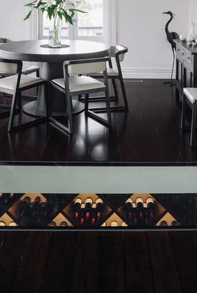
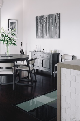
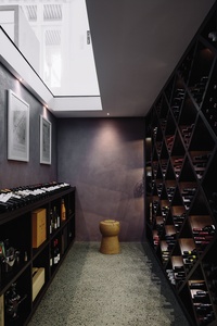
The transparency of the pool is echoed indoors, with a large glass window recessed into the floor between the kitchen and dining areas, showing off a purpose-built, brightly-lit wine cellar below. It’s an unexpected surprise as one crosses the threshold from kitchen to dining, yet the slick, seamless glass window fits well within the classic-minimalist styling and is a cheeky nod to that other impressive glass pane in the backyard.

