Urban living
As New Zealand’s population keeps growing and plots reduce in size, urban living is being redefined. Justine Harvey talks to a range of New Zealand architects about how they design for smaller inner city homes.
New Zealand’s resident population has grown by 2.1 per cent in the year up until June 2017 and currently sits at about 4.79 million. This rapid increase is substantially affecting the demand for dwellings in our bigger cities. Apartment buildings and terrace houses are going up all over the place in an effort to cram in more dwellings and to keep prices lower as land costs increase.
Architects are also having to be a lot more clever about the way they design and renovate inner-city houses, which often sit on tightly-constrained sites. How do they extract the maximum amount of space on smaller plots without compromising quality of living? How do they capture or create outlooks and respond to the local context while maintaining privacy from neighbours?
When designing his own house in the Maungawhau (Mount Eden) area of Auckland, architect Dave Strachan felt that it was crucial to acknowledge his local maunga. “We tried to be a good neighbour, so we have deliberately offered a view shaft from the road through the building, kind of like a landscape bridge from Maungawhau in the east to the Waitakeres in the west,” he says. “The tall glazing allows Maungawhau to exert its powerful presence over the house.”
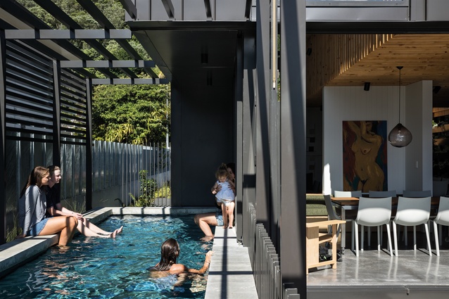
However, most urban houses do not have a mountainous view. Guy Tarrant from Guy Tarrant Architects suggests that “it is often necessary to create your own views on an urban site that has no outlook. The relationship to the outside becomes especially important”. When designing Courtyard House in Auckland’s Point Chevalier, he abutted a swimming pool with the house to create a sensory dimension with its reflections and plays of light seen from inside the home.

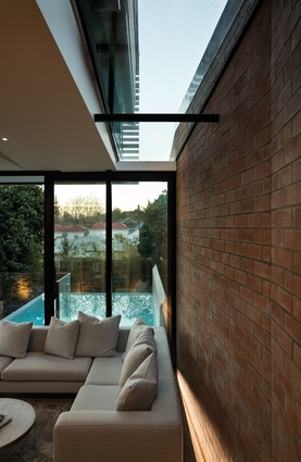
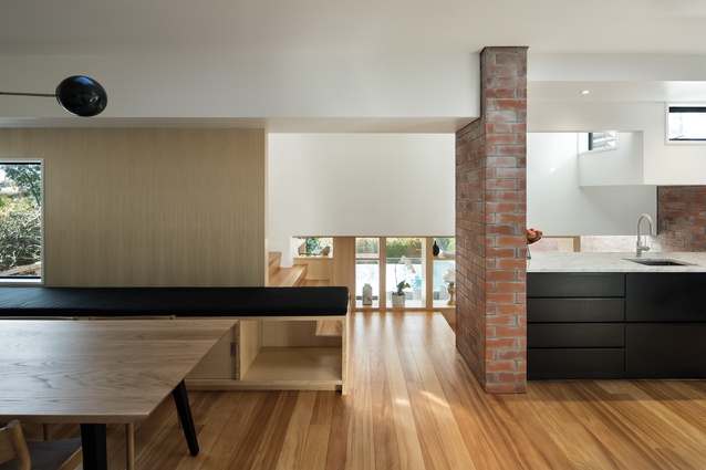
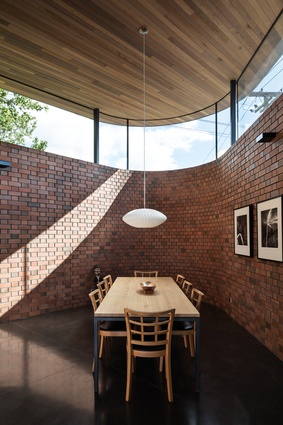
Similarly, Jon Smith from Matter Architects describes dealing with a northern-facing site with a view in the tightly-knit historic area of Ponsonby to build Brown Street House: “We used brick wing walls to create privacy and to direct the views. We picked up the brick material from the old retaining walls of the neighbourhood, creating a crank in the wall because we wanted to reference the way those old retaining walls look, sitting around all overgrown; so we brought that into the house.”
To separate the wall from the house, he incorporated a light shaft, a skylight and a mirrored shaft in the concrete floor at the base of the wall, backlit with LED strip uplighting to insert warmth and reflection into the space. “The wall gives us privacy from our neighbours while still drawing in light, especially in the mornings.”
Two of the more common challenges for architects designing in urban areas is maintaining privacy and limiting noise between properties. Dave Strachan of Strachan Group Architects suggests that “high levels of insulation, buffer zones and double glazing assist with noise attenuation, and a variety of screens, selective window placement, opal glazing, pergolas and vegetation assist with privacy.”

D Ross Brown from Rosso Design agrees: “Devices to maintain privacy essentially come down to good planning; although, of course, there can be conflicts here. What is best for sun and views may also lead to a compromising situation in terms of being overlooked and so on; then, physical devices – such as screens, louvres and spaced-off patterned glazing – may well have to be employed to mitigate against this, although this can often be an admission of defeat!”
Maximising space on a tight inner-city site is crucial and can be achieved by activating difficult spaces with skylights, creating media rooms or nooks in spaces that have no windows, building in storage that could double as a room divider and so on.
Brown approached his design of Lods House by inserting storage into every possible available space. He suggests that it is necessary to use every square metre purposefully, working with “the spaces sometimes leftover as sideyards where the building may have to be spaced off from the boundaries for various reasons, such as town planning, access and the like,” he says.
“We make these often narrow areas a working and integral part of the linked outside spaces.” He also likes to create rear courtyards to take maximum advantage of the outdoor space, ensuring that it relates well to the sun and the outlook, and dealing with the front yard to ensure there is convenient and visible access to a front-entry, as well as maintaining a good relationship with adjacent buildings and the streetscape more generally.
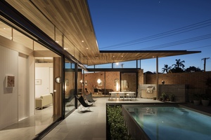
Tarrants’s Courtyard House is one of the smallest houses he has built for his family. It’s located on an unusually-shaped corner site that still feels very spacious. “The courtyard plan is very efficient and creates a sense of generosity by providing views through the house and an intimate connection to the garden.” To reduce costs, he eliminated extra spaces, such as a guest bathroom and a separate laundry, and concentrated on making the living areas feel luxurious.
For anyone undertaking a new build or renovation, Jon Smith suggests: “Make sure that you’re respectful of your neighbours and, when you’re completing a project of any sort of scale that affects an existing environment fabric, you have to be very aware of the effect that you have on others.”
For example, the access to his Brown Street House was very difficult because of its proximity to surrounding houses. “Our neighbours were amazing and gave us access through their property but even just having builders on-site for such a long extended time is hard. I mean, that’s their home and they’re having to put up with what we did. Now, when we work with clients, we’re very open with explaining that they need to be aware of how it’s going to affect the environment. It’s realising that the process to get there isn’t always going to a straight road; it’s going to be involved and stressful but, hopefully, results in a successful outcome that is good for everyone.”
Nature within
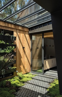
“The idea for this conservatory was to have a transition space that buffered the main road noise and, more importantly, acted as a kind of ‘lung’ – providing oxygen from the greenery to offset the petrol and diesel fumes from vehicles. The roof is double-glazed to catch the early morning light as it comes over Maungawhau (Mount Eden, Auckland), so it also acts as a kind of greenhouse for growing plants and herbs (we have had all-year-round basil).
It is easy to maintain as we have a hose tap in the courtyard for watering and an automatic watering system for the green wall planters, which uses some of the 15,000 litres of rainwater collected off our roof and stored at the rear of the property. Occasional trimming and weeding is very minimal.” — Dave Strachan, Strachan Group Architects
Built-in exercise

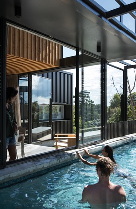
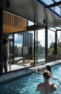
“This pool has a series of powder-coated steel ‘soldiers’ and hot-dipped galvanised panels as a pool fence, plus a powder-coated aluminium pergola, which allows transparency yet privacy, plus some sliding steel windows that we can open directly onto the pool area.
We have located pools close to houses before, but this one opens directly onto the indoor/outdoor dining space. It also acts as a water body when not in use, reflecting light and movement following the path of the sun, and breezes assist summer cooling and create an ever-changing water surface that is an interactive feature in itself.”
— Dave Strachan, Strachan Group Architects
Privacy and light
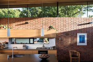
“Elevating the windows by creating a continuous clerestory allows light in without compromising the solidity required for visual privacy and sound protection from a neighbouring busy road.
The clerestory is an alternative to conventional windows. As well as creating an ever-changing play of light in the interior spaces, the clerestory captures views of street trees that change with the seasons. From spring to winter there is always something beautiful and interesting to look at.”
— Guy Tarrant, Guy Tarrant Architects
Maximised storage

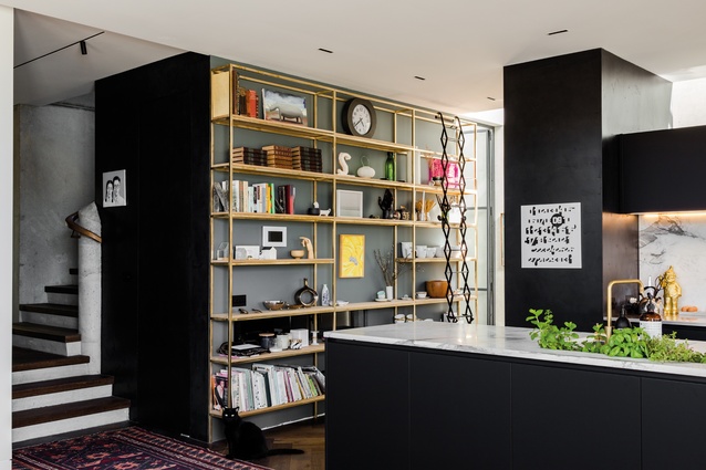
“Here, storage was tucked into every nook and cranny. The kitchen was widened to include a corridor along the outside edge to provide a functioning bank of shelves and benches; all providing out-of-sight storage, and the garage was made a metre longer than usual for a storage wall across the end.
Corridors were off-set and widened at strategic points to include storage walls to one side. The floor under the stairs was dropped below ground level to squeeze in another low-height room – mainly for wine storage it has to be said!”
— D Ross Brown, Rosso Design
Shading effects
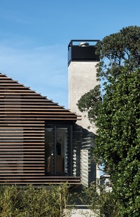
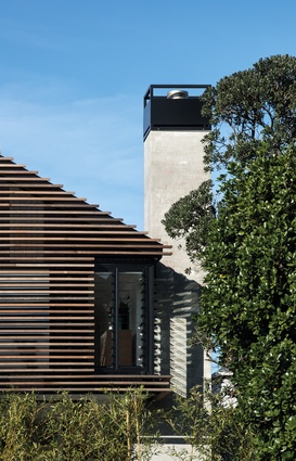
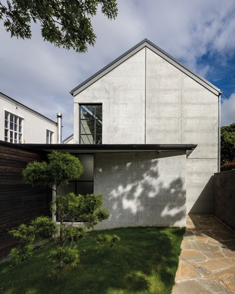
“We chose a different grey cladding beneath the cedar slats to give it a shadow – you don’t really see the cladding because of the softening of the cedar colour. We overset different width boards to present an ever-changing façade, picking up on the changes throughout the day and evening.
The layering is very important: you have that front face, which picks up the light, then you have the shadows within that, then the gap, then the actual cladding and then the louvred joinery units as well, which sets it back even further.
The louvres act as a visual device but also provide solar shading and privacy. Practically, you could say it’s completely aesthetic, but it also helps the house to keep cool; it passively looks after the cladding.”
— Jon Smith, Matter Architects

Site constraints
“Massing the house on the site boundary and designing a courtyard wall created a very intimate relationship to the street, while achieving privacy. The only intrusions in the house’s solid walls are brick screens and the entrance portal, so it presents a very solid face to the street.
This is the smallest house we have designed for ourselves, yet it feels particularly generous. The courtyard plan is very efficient and creates a sense of generosity by providing views through the house and an intimate connection to the garden.”
— Guy Tarrant, Guy Tarrant Architects

