Unnecessarily beautiful
A series of multinational, not-for-profit, children’s tutoring centres has put interior design high on its priority list. This excerpt from a book about the organisation explores some of the reasons behind its whimsical aesthetic.
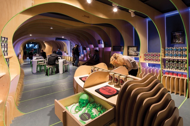
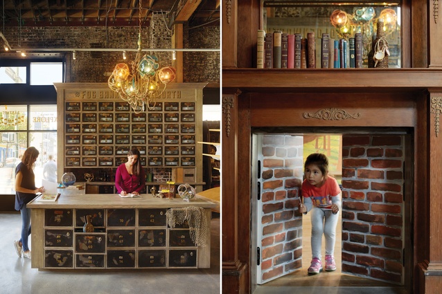
The story: back in 2002, some friends in San Francisco had an idea for a youth writing and tutoring centre. They rented a building for this purpose, only to learn that the address was zoned for retail; they could do their writing and tutoring, sure, but they had to sell something in the front of the building. So, they decided to sell pirate supplies, and to decorate the storefront as if it were a real shop for working buccaneers. It was a ludicrous solution to a bizarre problem, and it ended up being the key to everything.
The Pirate Supply Store at 826 Valencia took up about a fourth of the building, which seemed at first a problem – all that real estate just to meet the zoning obligation! But because the store was open to the public all day, every day, it had a galvanising effect. It brought people in – random people, shoppers, tourists, potential students and donors and tutors. Most non-profits are more or less closed to the world. This one was unexpectedly open.
Once inside, visitors could see the students hard at work, and they might be more likely to buy a peg-leg or puffy shirt. The Pirate Supply Store – a real retail operation with a full-time manager – helped pay the rent and helped create a bridge with the neighbourhood and city, with the most random passers-by. The storefront itself became a weird kind of destination. Thousands came every week.
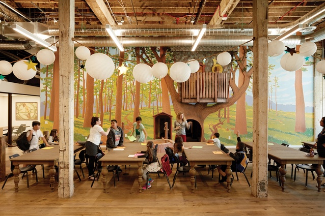
And for the kids who came into 826 Valencia for extra help with their homework, The Pirate Supply Store had an important de-stigmatising effect. They weren’t coming to The Place for Students Falling Behind Academically. They were coming to The Pirate Supply Store, which was an actual pirate store. No stigma at all. And the theme had a powerful effect on kids’ imaginations. For reluctant writers, or kids who learned differently, working in such a bizarre and rule-flouting place unleashed their creative sides. The space was loose and weird and welcoming and free, and, in such a place, every kid was welcome and free to be loose and weird.
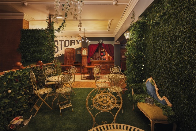
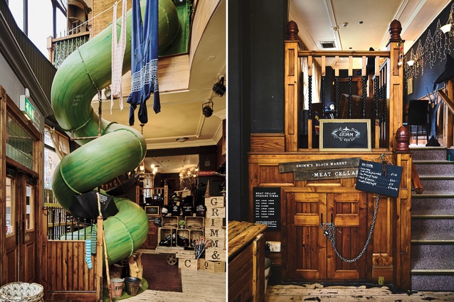
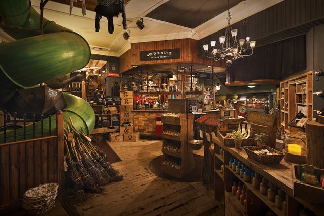
Soon enough, similar groups around the world started opening their own centres, adapting the idea however they saw fit. Some of these centres are within the 826 National network, but most are more loosely affiliated in a new body called The International Alliance of Youth Writing Centers. The Alliance comprises the Echo Park Time Travel Mart (a convenience store for temporal sojourners), the Mid-Continent Oceanographic Institute (located in Minneapolis, thousands of miles from any sea), England’s absolutely insane and beautiful Grimm & Co, and about forty other learning centres around the world.
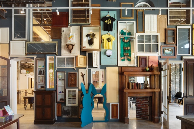
Though not all of these locations have retail storefronts, they’re all richly imagined learning environments that, in their creative anarchy, mirror the unhinged world view and sense of humour unique to kids. Young people’s imaginations are boundless and inherently allergic to rules and logic, and these creative spaces try to respect and emulate that state of mind.
— Dave Eggers, co-founder of 826 National and Amanda Uhle, former executive director of 826michigan and director of The Hawkins Project.
Grimm & Co
Rotherham, England
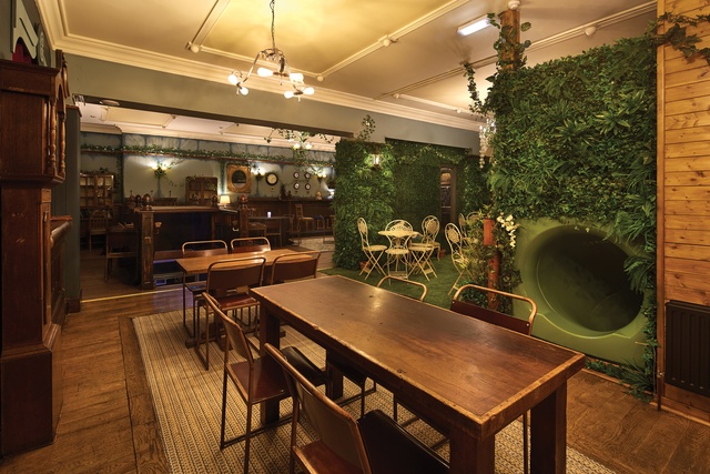
What is the purpose of the apothecary?
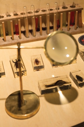
Our inspiration did not come from the fictional world of humans. The apothecary primarily provides a fantastical front for the story destination. We wanted to create an immersive theatrical experience for all of our customers and provide excellent customer service for magical beings and the odd human. We created the Apothecary to the Magical, where immortals and beings of the magical persuasion can purchase all their ready-made ingredients and potions, including Extract of Genius, Success Stimulant, and Human Blood, Sweat, and Tears.
How does the writing centre differ from the storefront?
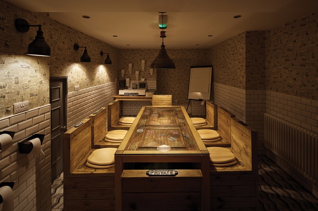
This is a place where young people experiencing chaos or disruption in their lives can shake off the experiences that block their imaginations and obstruct learning. By the time young people arrive in our writing centre, they’re ready and hungry to engage and they have the licence to use their imaginations. We do not provide magic stimulation in our writers’ space – just a playful space that’s not childish. Our story centre provides a range of places to encourage children to be all they can be and imagine themselves as writers – this includes writing bureaus, cushions, desks, canopies and grassed areas.
What sparked the idea for this space?
Our whole reason for being began with a foundation of significant research into how to narrow the gap in children and young people’s literacies. This determined the framework on which to create our space. We then had the gift of seeing Dave Eggers’ TED Talk, which further inspired our model. We sat with our writers and wrote the story that connected the story space to the shop. We undertook significant levels of consultation with the community and, essentially, children and young people to develop our theme. The community chose the magical apothecary theme so we, then, needed to write its backstory. It is this backstory – the characters, the local connections and the belief in the story – that allowed us to develop the brand and the detail of Grimm & Co.
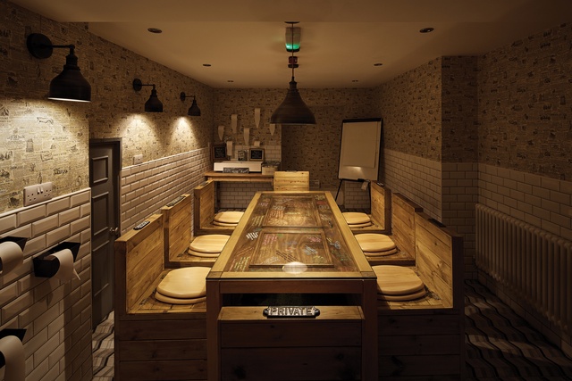
How did Grimm & Co come to fruition?
We started with amazing designers Dave and Oliver of Side by Side, who helped us to develop our unique brand and design for the centre. They brought our story to life, lifted the characters from the page and allowed them to influence every detail and decision; this ensured absolute authenticity. This work also created a thread directly back to the community, who had determined the idea and theme. We rallied around the community to see who wanted – or who could be persuaded – to be involved in the creation of the centre. The presentations about what we wanted to achieve (with their help) to businesses, business networks and the local authority sparked interest and curiosity.
This, plus a lot of additional discussions, led to huge levels of in-kind support and donations. The key was to secure amazing designers and have them use this project as a jaw-dropping showcase for their talents. Side by Side worked with us to hold an exciting cultivation event for businesses, which secured lifelong supporters and friends. We had researched evidence to back up why we were creating a space like this and what we would be doing in this space.
Story Factory
Parramatta, Australia

What is this place?
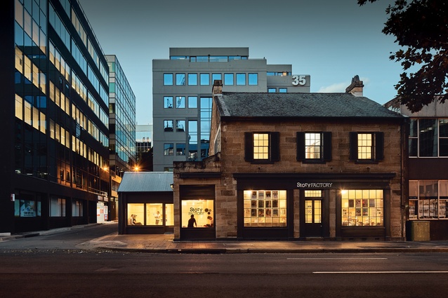
Our goal was to create a space for young people where normal rules didn’t apply. We wanted a non-traditional space: a world away from the classic classroom, that would pluck kids out of their everyday lives. We wanted it to instantly prompt stories, ideas and freedom of thought. The final design turned an 1830s’ heritage-listed cottage – formerly a family home, lolly shop, and real estate office – into a fluid, continuous space called the Dream Lab.
What was the concept behind the design?
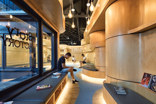
The architectural concept was to connect four separate rooms with a continuous blue splash or ribbon, so as to awaken imagination with non-linear design. Spatial continuity is realised with a series of free-flowing timber elements, which meander through the space and create seating, shelving, furniture and lighting. Architect Chris Bosse of LAVA said the design weaves a story through space and time, from early settlement to space travel. For The Glue Society, who helped conceptualise the space and did the interior design, the core design challenge was creating something that would appeal to both a seven-year-old and a seventeen-year-old. The idea of a ‘dream lab’ seemed to fuse imagination with experimentation.
How did you make the Dream Lab a reality?
When we opened the first Story Factory in 2012, we begged favours from every creative we knew. The Glue Society was the first to agree to help. They had already worked with Will O’Rourke, a production company, and Bosse, so Glue asked them to help too. Miraculously, everyone agreed to team up and do everything pro bono. After consulting kids and volunteers, Glue came up with the concept of the Martian Embassy and LAVA brought it to life. When we opened the second Story Factory in Parramatta in 2018, we were thrilled that Glue and LAVA agreed to design it for us again.

Illuminating imagination.
We had to comply with council and heritage regulations while affordably merging the old and new parts of the building – and anything we installed had to be removable at the end of the lease. In one room, a blurred-out clock references the ‘forever time’ concept – the notion that time is not past, present or future, but always – found among the Indigenous Australian Yolngu people.
A beautiful place like this.
We are taught to think in boxes and straight lines but the lab breaks these rules and puts curves everywhere. A primary school student said, “I like how the space has curves. You can hug the building.” And she did. Two high school boys, Brody and Jacob, asked to move in so they could write stories every day. Some high school girls also loved the space but not for the reason we thought. There’s a big mirror in the bathroom and they reckon it’s “sick for selfies”.
Tangible inspiration.
Initially, The Glue Society wanted to create a suite of large, digital, interactive art walls for young people to play with. Budget prohibited this, which forced Glue to realise that, for kids who are interacting with screens constantly, physical sculptures can be an engaging change. Glue made a series of sculptures from discarded technology. They raided thrift shops, bins and recycling centres for everything from cassette players to old phones, helmets and motherboards, repurposing them into strange artefacts from the future.
826 Valencia: Tenderloin Center
San Francisco, California

How does this space differ from the original 826 Valencia?
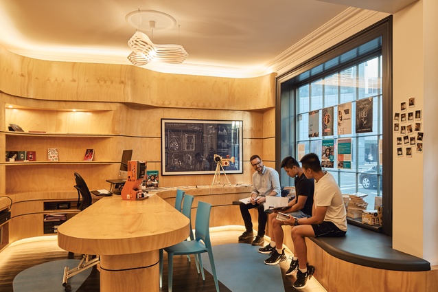
We wanted King Carl’s Emporium to feel like you were stepping into an old department store. There isn’t much retail in the Tenderloin District, so we wanted to offer a range of daily-use products with a whimsical twist (e.g., lip balm is Unicorn Horn Polish). Because the Tenderloin neighbourhood is very ethnically diverse, we thought that the theme of a travelling royal pufferfish could include items and experiences from many different cultures around the world.
We also honoured these populations by putting the motto ‘set forth and explore’ on the windows in eight different languages. While we were creating a storefront that would also serve as reception for our programming, we wanted to positively activate the street and considered greater monitoring and safety. Simple improvements like windows and a whimsical mural increase neighbourhood pride and allow passers-by to see the students at work. Many people do not know that the Tenderloin is home to more than 3000 young people and we wanted to create a joyful and beautiful space for them.
How did you gather support for creating this space?
While working with more people is, in some ways, more work, it makes each piece of the project more manageable on a budget. It also engages the community in the space from the beginning. Always focus on the mission and how what you’re doing makes a positive impact on the students and community. Treat this as you would any monetary donation: be clear about purpose, explain the opportunity in an inspiring manner, express lots of gratitude all the time, and have excellent follow-through on all tasks to make it easy for people to be involved. Also, engaging passionate pro bono partners ensures these advocates are asking others to be generous as well. Our construction partner asked every subcontractor if they would donate their portion of the project and, often, the answer was yes.
Images and text in this article come from the forthcoming book Unnecessarily Beautiful Spaces for Young Minds on Fire. The book was edited by The International Alliance of Youth Writing Centers, which is made up of youth writing centres around the world who uplift young voices. To purchase a book, visit McSweeneys.net. To be involved, go to youthwriting.org or email hello@internationalallianceofyouthwritingcenters.org.

