‘A neat trick’: Two Halves House
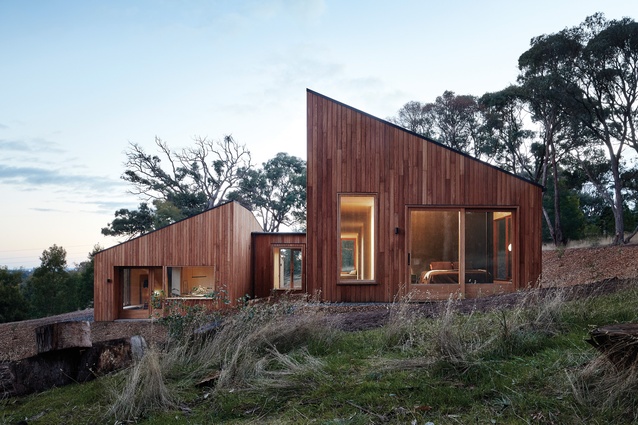
Responding eloquently to its lightly forested, sloping site, this earth-toned house by Moloney Architects has been split into two, with a bathing and sleeping pavilion sitting above an open-plan living space.
Two Halves House, outside Ballarat in Victoria, is a study of measure and balance against careful siting. But the house might never have existed if it were not for the ability of Moloney Architects to effectively share inspiration and open a dialogue with its clients, allowing them to explore their full range of options.
The couple, who own and built the Two Halves House, had initially engaged Mick and Jules Moloney to renovate a house in central Ballarat – a project with a relatively modest budget. But after the architects invited them to visit a project that they were completing, they abandoned the renovation in favour of a totally new design and build exercise, on a site just outside of town.
Moloney Architects set about designing the new home in response to two principal “forces” in the project: the site and the modest brief requirements of the client. With regards to the site, the house is designed to sit on sloping ground. The lightly forested land slopes away to the south, which is also the direction of the view; north is toward the top of the slope. This particular orientation established the factors that the siting of the house – its positioning and massing or bulk on the site – had to deal with. The architect’s response to this was thoughtful and clever.
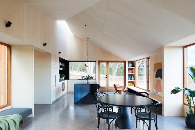
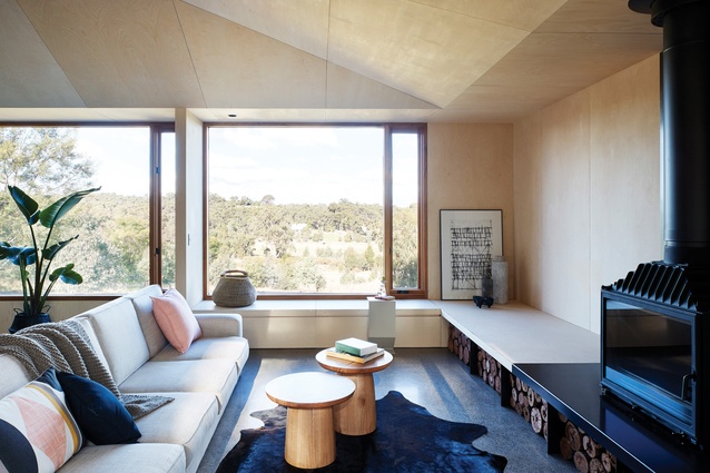
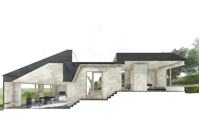
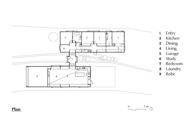
Rather than combine the overall house into a single mass, the architect split the brief into two equal halves and each became a separate pavilion. One half contains the living spaces, including kitchen, dining, lounge and conversation areas, and the garage. This half is positioned toward the southern, lower end of the slope, allowing it to take advantage of the views to the south, out across the valley. The second half contains the study, bedrooms, laundry and bathroom areas of the house. This half is positioned on the upper or northern end of the slope.

Dividing the house into two halves was only the first part of the strategy. The real trick was to separate the pavilions and position them at different levels, cascading down the slope on a series of terraces. Separating them in section (vertically) helped to get sunlight and views into both halves, as did the other key move – sliding one half further along the site than the other – separating the halves in plan (horizontally).
This split-and-slide manoeuvre allowed Moloney Architects to reconcile the two competing factors in the site: views in one direction and sunlight from another. The result is that both halves of the house have access to both features – sunlight and views. A neat trick.
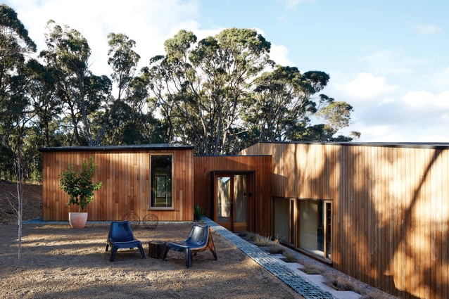
Connecting the two halves is the small entry pavilion, on a third level between them. One arrives at this point via a long, terraced landscape, which gives the arriving visitor a low, oblique view of the connected halves.
The architects have thought carefully about how the house is seen in the landscape, and the arrival vista is the first orchestrated view; the second is the view from outside the house at the opposite, eastern end of the site, where by contrast the house looms high and appears much larger and more heroic. In this way the dwelling has been designed to be pleasing from both the inside out and the outside in, from multiple viewpoints.
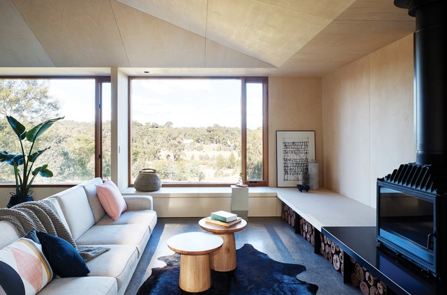
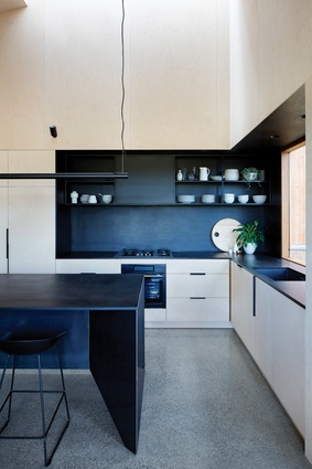
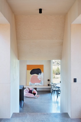
The house doesn’t contain a single piece of plasterboard. The quality of detailing and the finish of the build are commendable; doors slide into walls as planes of abstract flatness and appear again as if out of thin air. The owner-builder’s attention to detail has been exacting, with the plucky duo finding more than one opportunity to refine the design in the actual building process. Their tenacity in researching the finest details of the building went one step beyond what one might expect from the average builder, realizing the Moloney Architects design as it was intended.
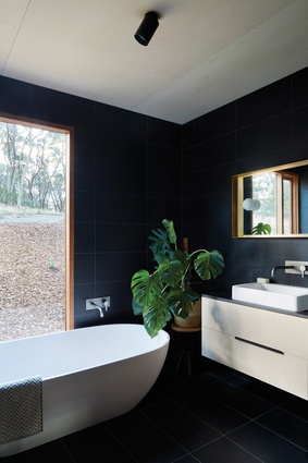
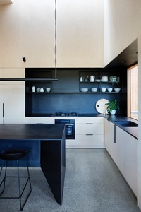
Finishes and colours throughout are quite simply delicious. The house is highlighted by an earthy palette that evokes the many hues of the bush in general and eucalyptus in particular. Colour is in all cases used sparingly. Flat, neutral tones of timber, concrete and black porcelain tiles form a background and base for the moments of more saturated colour. The result is a harmonious, and very Australian, palette.
In an act of “giving back,” the owners of the Two Halves House agreed to open their home to interested strangers after a request from Open House Melbourne, who recently expanded the festival to host the inaugural Open House Ballarat (28–29 October 2017).
The pair’s motivation to do this was inspired by that initial site visit with Moloney Architects – from this act of sharing came the impetus to create the Two Halves House. There is nothing quite so compelling as seeing the real thing, and it is hoped that this ongoing gesture of personal generosity on behalf of the clients will feed a virtuous circle of future inspiration and commission.
This article was first published on architectureau.com

