Triple threat: Collingwood Street Residence
Jerram Tocker Barron Architects (JTB) was given a deceptively simple brief for this NZIA Local Award-winning house in Nelson. Or, as architect Simon Hall puts it, “It was a case of trying to fit in what you might call the ‘common’ requirements for a family – they still wanted to have 2-3 bedrooms, a pool, a double car garage – but on a reasonably compact site.” Fitting everything the clients wanted into a home that didn’t dominate the site and maximising views in a dense neighborhood were the main challenges with the project, Hall notes.
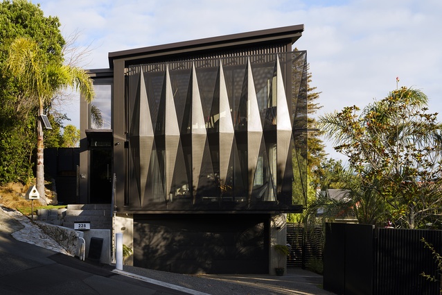
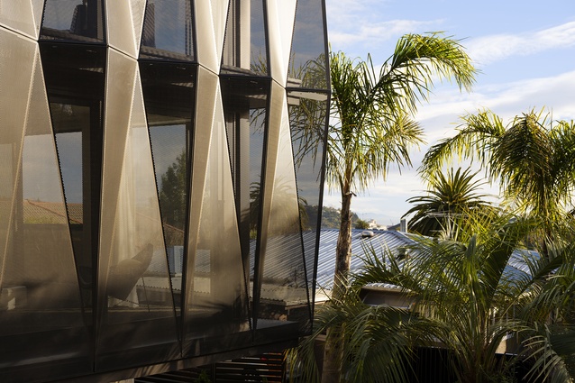
Rather than creating a glazed box, the designers made a bold choice to incorporate folded aluminium screens on the street frontage, providing privacy and shading. Amongst the sea of cedar-and-black and long, low houses that often dominate regional award winners, the visual interest provided by this tall, metallic-clad home is a welcomed break. The screens are not purely decorative either, “They’re working quite hard,” Hall says, “which is what good design is all about.” Perhaps sometimes, function does follow form.
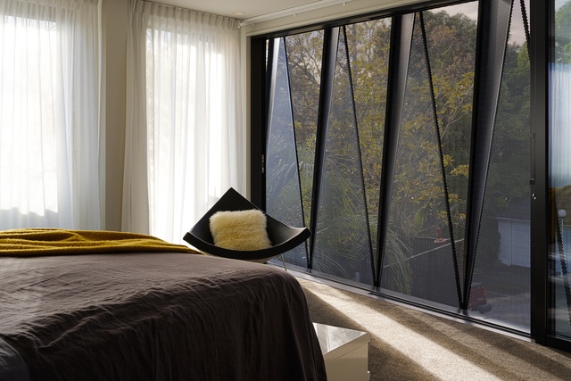
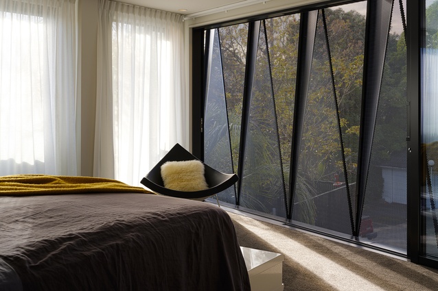
The design of the aluminium shades is an evolution from a previous JTB project, and they’re a triple threat. Hall explains, “They’re doing three things: providing shading, providing privacy and they’re also providing fall protection.” With sliding doors behind them, the perforated aluminum sheets act as a balustrade for an exterior wall that can be almost completely opened up, allowing for a connection to the outdoors despite how protected the frontage appears from the street.
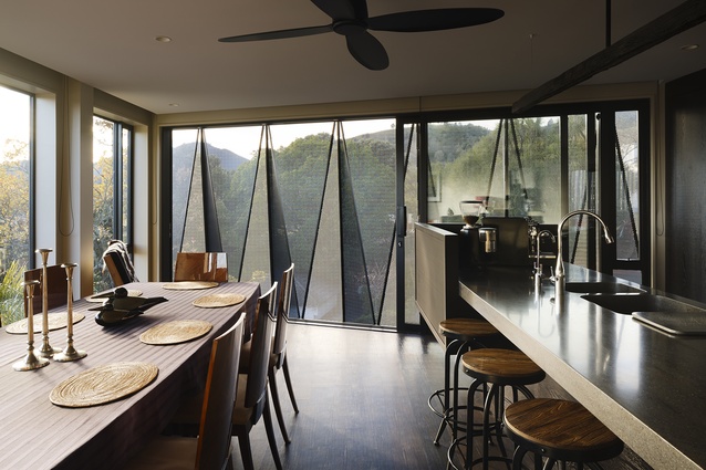
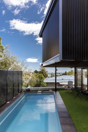
The owners wanted to downsize after having lived further up the Collingwood Street hill for several years, but still wanted breathing room. As we often see with smaller sites, the house needed to go up, rather than out, to capture its views across Nelson. It is organized vertically with three levels: a bottom level consisting of garaging, laundry and a guest bedroom; the middle level housing the master bedroom and another guest bedroom, which opens out onto the adjacent pool on this level; and the top level being used for living spaces and an additional outdoor area.

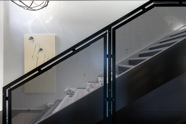
The vertical separation allows for privacy between floors as well, with the owners being able to rent out the bottom floor bedroom as an AirBnb or giving extra space to guests. Interiors draw on the industrial, heavy nature of the outside of the house with dark timbers and rich tones, but it is juxtaposed with the natural light that is allowed in by the screening.
Though the site may be smaller than others, the house certainly stands out among it’s low-lying, light-coloured neighbours. If nothing else, the Collingwood Street Residence is a case for reducing suburban sprawl and large footprints, even in the regions. It shows that even an infill-like site can be the perfect environment for a home that has it all – space, views, nature and accessibility. It shows that there is a place at the table for all kinds of architectural interventions, should we make room for them. And, it shows that good design belongs everywhere.

