The unlimited city: Tokyo
Marnie Morieson journeys to Tokyo, where she finds a lack of planning control has resulted in a unique urban fabric.
1. Chaos
Beset by biannual seasonal floods, frequent fires and semi-weekly earthquakes, Tokyo’s urban landscape is marked by a history of cataclysm. A cycle of erasure and rebuilding is punctured by two major events: the Great Kanto Earthquake of 1923 and the Operation Meetinghouse Firebombing of 1945. The magnitude of these events, in terms of urban and civilian catastrophe, outstrips the rest: flattening or obliterating the majority of the city and reducing building stock to a 20 year life span. It is this culture of catastrophe and reconstruction that is said to be at least partially responsible for the non-rational and visually chaotic urban landscape of Tokyo. Opportunities to rebuild according to considered planning rationale following both the Great Earthquake and American firebombing raids were abandoned due to economic imperatives and insufficient political will. Minister Goto Shinpei’s ambitious urban plan to modernize and rationalize Tokyo following the Great Earthquake of 1923 was rendered impotent by the resistance of private interests to changes in planning, as well as the impetus for rapid rebuilding. Similarly in 1946, Chief Planner of Tokyo Metropolitan Government, Ishikawa Hideaki’s Capital Reconstruction Scheme, a “green dream” of garden city planning that would see 46% of the land affected by the bombing dedicated to parks and gardens, was annulled by the resistance of local landowners and a devastated post-war economy.
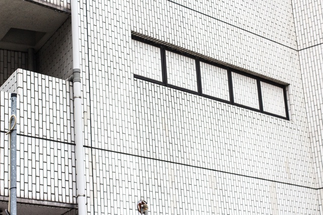
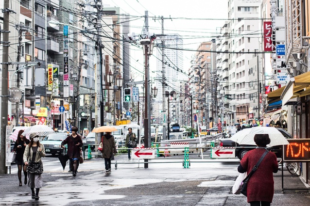
To the casual visitor, Tokyo’s built fabric may appear to constitute a kind of labyrinth, bereft of the legibility of other models of planning. There is no overarching grid to assist navigation, nor the axial orientation of streets to a recognizable monument. Each turn unveils another roji, or alley, that takes it’s guest on a circuitous route into the depths of the chō – the idiosyncratic Tokyo city block, comprised of increasingly smaller, more irregular and piecemeal lots as one moves toward its centre. Architect Kitayama Kō refers to this urban curiosity as the angawa phenomenon, a play on the dessert anko, whose dry outer crust belies a bean-paste filled centre1. This tasty metaphor can only take us part way, however, toward describing a fragmented crust unencumbered by aesthetic planning by-laws and embellished with innumerable overlapping symbols and signs that capture and refract our attention and direction.
2. Order
A gently sloping strip of land in central Tokyo known as Daikanyama stands out, somewhat ironically, for the carefully curated visual homogeneity and spatial generosity of its architecture. On it stands Hillside Terrace, a series of three-to-four storey commercial and residential spaces that were realized over three decades by architect and urban planner Fumihiko Maki. The development manifests plainly Maki’s theory of “group form” which prioritizes human scale and the vernacular, contextual sensitivity, restraint of material and construction methods and, perhaps most importantly, “sequential development of basic elements over a period of time”2. Here, the robust volumetric concrete elements of the buildings of the late 1960s and early 1970s are complemented by comparatively lightweight, layered and reflective glazed and metallic surfaces of adjacent developments from the late 1990s. Yet all exhibit a spatially layered, porous relationship to the urban realm, embracing the visitor in a series of courtyards that grasp loosely in pools of shadows and light between the street and the residences behind.
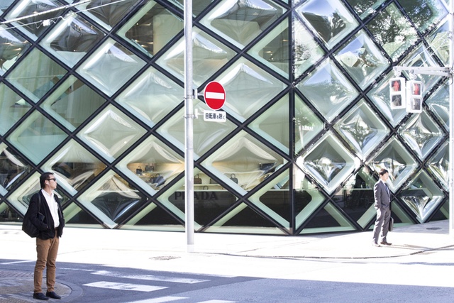
Some three kilometres north in Aoyama lies another curated urban experience, a boulevard of architectural dreams known as Omotesando. Here, the arbiter of taste is the high-end fashion market and the level of architectural consistency dictated by the uniform program of luxury brands along the length of the street. Intended as a ceremonial approach to the Meiji Shrine, leafy Omotesando has become laden with idols of the more fashionable kind, housing glittering architectural manifestations of globalized luxury brands since 2000. The “fast-fashion” labels typified by H&M and Zara are concentrated on the perpendicular Meiji-dori, forming a physical and programmatic intersection of luxury and populism on the fabric of Aoyama3. This fashionable cross is inscribed on an otherwise labyrinthine mesh of miniature lanes, boutiques and residences that date from the Edo period.
3. Rules
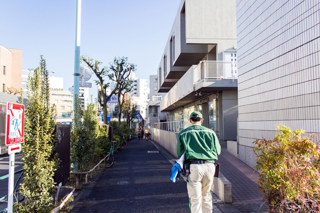
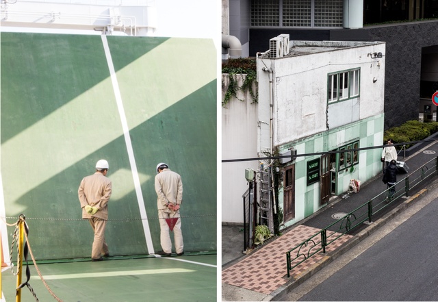
A fastidious attention to detail calibrates the uniforms of seemingly all varieties of workers, from police officers to traffic wardens, Shinkansen drivers and cleaning staff, who tote matching badges, battens, watches and cloths in coordinated and regular formation. Behavioural protocols, particularly those relating to public etiquette are venerated; in contrast, the urban landscape is scarcely regulated. Aside from the requisite earthquake, fire height and solar access regulations which dictate the physical separation of buildings, signage to operable external glazing and stabilizing piles beneath the earth, there is little in the way of legislation to impinge upon a building’s appearance, material choice, form, setback or relationship to its context. Buildings are not considered in relation to the greater environment or block, but respond only to their immediate neighbor with a unique set of aesthetic and formal outcomes. The successive division of lots into increasingly smaller, and more irregular parcels highlights the absence of formal controls on the urban environment. Improbable slivers of built fabric posing as residences, shops and offices squeeze themselves into remnant title boundaries. Extensively and affectionately documented by Japanese architecture firm Atelier Bow Wow, these micro buildings are often shorn of pedestrian pavement, and fringed instead with dozens of meticulously cared-for pot-plants. In the absence of macro organizing principles, a sense of order and decorum is achieved in the miniature: in the rituals of dressing, eating and drinking as well as in the private interiors and pocket or pot-planted gardens.
![]() 4. Void
4. Void
The centre of Tokyo is occupied by a void of sorts, the Imperial Palace and its associated grounds housing a purely ceremonial and ineffectual leader4. In an inversion of the typical organization of a city, the core of Tokyo is an inaccessible and symbolically impotent vast green space, around which all traffic must circumnavigate. Voids are also present in the built environment, where gaps created by the separation of one building from its adjacent neighbor in response to the threat of fire and earthquakes produces a rhythm of intervals that permeate each city block. These physical pauses in the urban environment both insulate one building from potential harm and noise transference, and cause each building to be read as unique objects scattered in space. These spatial intervals have been compared conceptually to the gaps (called ma) in the post and beam building technique observable in traditional temples, where the spacing of the members creates a visual play of overlaid voids.
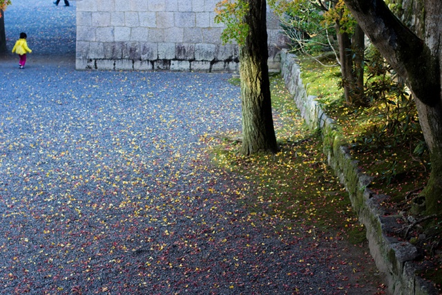
The notion of void space most famously plays a role in the conception of interior space in Japan, referred to by Chinese-Taoist scholar Lao-Tze in his metaphor of the vacuum. As interpreted by Japanese scholar Okakura Tenshin, Lao-Tze claimed that the void or emptiness within the vessel was of primary significance as an enabler or facilitator of promise. “Only in the vacuum lay the truly essential. The reality of a room, for instance, was to be found in the space enclosed by the roof and walls, not the walls themselves. The usefulness of a water pitcher dwelt in the emptiness where water might be put, not in the form of the pitcher or the material from which it was made. Vacuum is all potent because all containing.”5
4. Redundancy
The term “Thommason” was coined by artist Genpei Akasegawa in 1985 to describe an urban feature that is both completely useless and yet regularly maintained. The word refers to American baseball player Gary Thomasson, who, after a relatively successful career for the San Franscisco Giants, nearly set the all time strikeout record after he was traded to a Japanese team, the Yomiuri Giants in 1980. Thomasson was signed to the biggest contract ever given to a player in the Nippon league, and was maintained for two years in this role, despite his disappointing (some might say useless) performance.
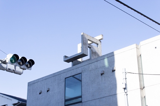
Despite, or perhaps because of the memorably mean-spirited reference in this term, Akasegawa drew a cult following in his cataloguing of Thomasson’s in the Japanese urban environment, indexing freshly painted stairs that lead nowhere; polished gates standing idle while their adjacent fencing has been demolished; external doors to upper floors bereft of a balcony to step safely onto. Akasegawa collected examples of these urban phenomena in a now defunct blog, encouraging his fans to observe, examine and catalogue their surroundings. Readers would debate the relative uselessness and/or level of maintenance of a particular urban feature, exploring the narrative of its previous use as well as its journey into irrelevance.
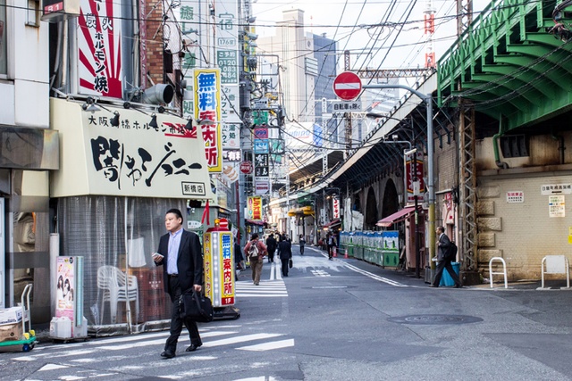
Countering this encouragement to scrutinize the urban environment, the proliferation of signs and symbols in contemporary Tokyo obscure a reading of the architectural forms behind, and represent a form of redundancy through oversaturation. Innumerable adverts compete for attention in a peripheral blur of colours, numbers and promises, flickering and flapping noiselessly while the savvy pedestrian consults his phone.
1. Manuel Tardis, Tokyo Portraits and Fictions (Paris: Le Gac Press, 2011).
2. Fumihiko Maki, Investigations in Collective Form (Washington: School of Architecture, Washington University 1964).
3. Julian Worrall and Erez Golani Soloman, 21st Century Tokyo (Tokyo: Kodansha Press, 2010).
4. This notion of Tokyo possessing an empty centre has been extensively examined, most famously by Roland Barthes in his 1970 Empire of Signs, in which he states: “The entire city revolves around a place that is both forbidden and indifferent, an abode masked by vegetation, protected by moats, inhabited by an emperor whom no one ever sees: literally, no one knows who does ever see him…Its centre is no more than an evaporated ideal whose existence is not meant to radiate any kind of power, but to offer its own empty centre to all urban movement as a form of support, by forcing perpetual traffic detours. Thus, it appears as an image that unfurls again and again in endless circles, around an empty core.”
5. Okakura Kakuzo Tenshin, The Book of Tea, 1906

