To the bat cave
The superhero mythos might seem an unusual starting point for an architectural project. But, when you take a look at the thoughtfully conceived and deftly resolved concept-driven work of Melbourne’s Breathe Architecture, it all begins to make sense.
The concept underpinning this small (110m2) project emerged as the architects got to know their clients, lawyer Steph and coffee entrepreneur Russ. “They both work in very high-stress, extroverted professions where they are constantly ‘on’,” explains Dan McKenna, project leader at Breathe Architecture. “When they come home, they want to put on some music, read a book and chill out. They are introverted people living extroverted lives. It’s almost like they’re leading a double life – like so many of us do – and we started to think about how to interpret that architecturally.”
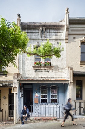
This understanding of the clients’ public and private faces led the architects to the Superman/Clark Kent dichotomy – and the concept for the Double Life House was born. Nestled in a row of Victorian terraces in Sydney’s Surry Hills, the house was a little worse for wear after a 100-odd years and a mishmash of renovations. The brief was to reimagine the house as a contemporary dwelling without forgetting its rich history.
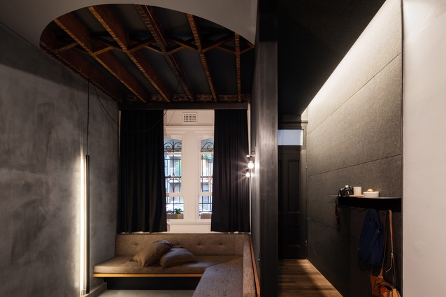
Retaining the façade’s original character allowed the architects to modulate the transition from interior to exterior carefully. Inspired by Superman’s phone booth/changing room, the entry is subtly lit and wrapped in sound-deadening acoustic fabric. “It eliminates all the sound from the street, and you feel like you’re being transformed from one space to another, as though you can peel off the façade you’ve been wearing all day,” McKenna explains.
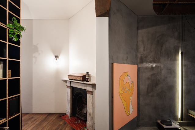
Alongside the entry, a sunken lounge is equipped with an L-shaped banquette seat. Above, a scoop has been taken out of the ceiling, revealing an elegant lattice of joists. “When we removed the plaster we found this beautiful old floor framing with a herringbone pattern through it. We really wanted to show it off as part of the heritage of the building,” McKenna says. In one corner of the lounge, an original artwork conceals a hidden cabinet with the usual mess of AV equipment.
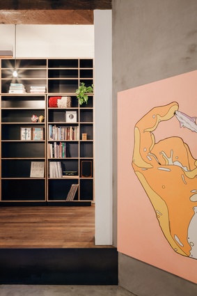
This playful game of concealment continues in the library, where a seemingly innocent section of the bookshelf flips open to reveal a compact under-stair laundry – a kind of domestic Batcave. The cape, that incontrovertible symbol of the superhero genre, is repurposed in the hallway as a heavy-duty curtain that conceals the staircase to the upper floor. “We wanted to be able to separate the levels acoustically,” McKenna says. “Instead of having a door, we installed this super warm, super tactile curtain.”
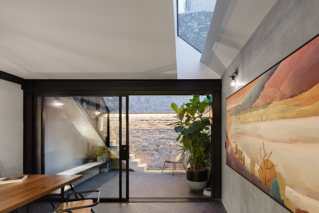
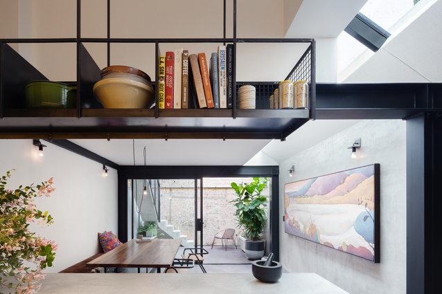
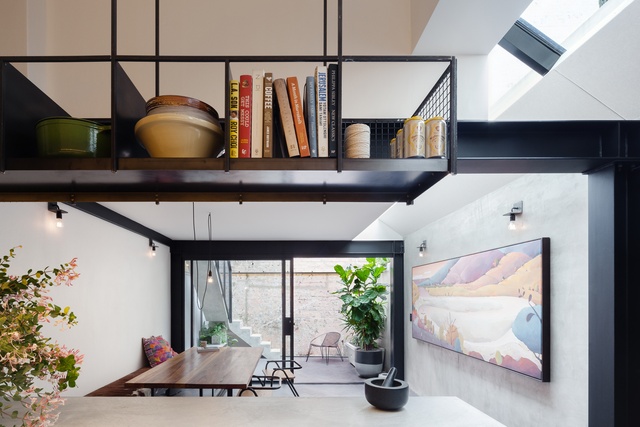
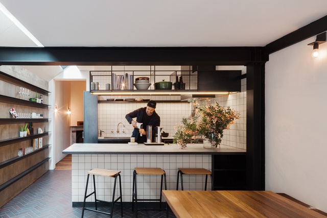
In the open-plan kitchen and dining zone at the rear of the ground level, Russ’s background in hospitality set the parameters. “He was really keen to have a full commercial kitchen with a commercial cooker and under-bench fridges. It was scaled back a little but they still ended up with this really generous commercial-style kitchen in their house,” McKenna says. “They’re big entertainers, so the kitchen is a really important part of that – the theatre of cooking. There’s a deep concrete bench that you can access from all three sides.”
Material choices were informed by the practice’s focus on sustainability. Robust, honest and built to endure, the palette draws together velvety concrete surfaces, brick tiles underfoot and hefty steel elements that span the space and frame the large sliding doors at the rear.
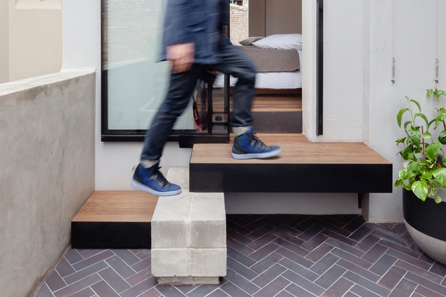
In the site plan, the project navigates the typical challenges of the terrace typology – a narrow site with limited access to natural light in the internal rooms and neighbours close by on either side. With this in mind, the architects were keen to make the most of the house’s rear courtyard. A narrow concrete stairway, cast on site, wraps along two walls, connecting the courtyard to a terrace on the second level. While it’s still early days, pockets of garden creepers will soon make themselves at home on the steel wires, mesh balustrade and steel-framed awnings.
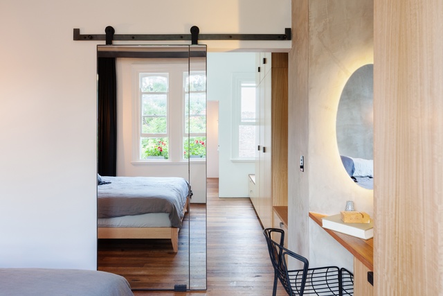
The upper level is home to two bedrooms and a central bathroom. A new joinery unit runs the length of the hallway, sliding into the main bedroom at the front. While a sizeable insertion, its surfaces and levels are carefully articulated. It steps down to form a chamfered seat that hugs the window at the rear – allowing light into the space – while an angled desk has been inserted alongside the wardrobe in the main bedroom, breaking its bulk.
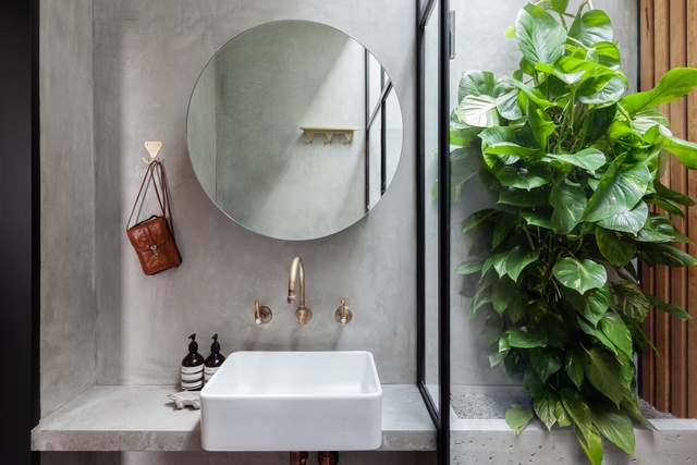
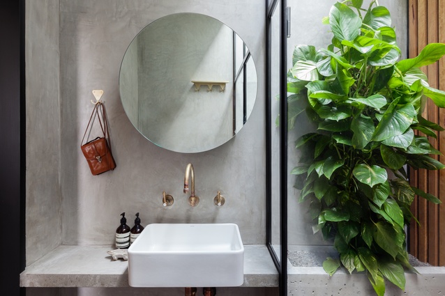
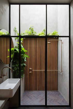
The main bathroom gives a neat demonstration of Breathe Architecture’s inventive approach. “The clients really wanted an outdoor shower, but we had some concerns about the thermal implications of removing a portion of the roof,” McKenna explains. The elegant compromise is a full-height shower cubicle, enclosed by steel-framed windows with an operable skylight above. “It’s a small space, but we used the verticality to enhance it. When you look up, all you see is the sky,” he adds. Like a miniature courtyard, it is equipped with a deep concrete planter box which is already spilling over with greenery.
The rich conceptual framework underlying this project draws together the practice’s focus on sustainable design and tailored responses. “We spend a considerable amount of time thinking about how a project is going to be in 30, 40, 100 years’ time,” McKenna says. “Choosing robust, honest materials helps us build projects that will endure.”

