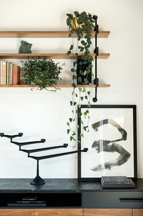
To keep you home: Architect’s family residence
Ancestry, an indie-rock song and an innate desire to keep one’s family safe make this Auckland home unique and truly welcoming.

The architecture or design of a house is often discussed by condensing its merits (or downfalls) into sets of fairly standard parameters: Was the house built well? Do the materials fit their context? Does its interior flow? Do its exterior and interior communicate well with each other? Is there a driving idea or aesthetic and was it communicated well and consistently throughout its many alcoves? Is it fit for purpose? Does it sit within, or push, current trends?
For this Auckland house – designed by Rogan Nash Architects for one of its directors, Eva Nash, and her family – there are satisfactory answers to all of these questions.
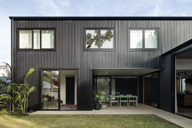
Its L shape, northern orientation and internal colour palette recognise and relish the presence of an old, imposing pōhutukawa on the site.
“I absolutely love the dappled light through the tree,” confers Nash. “It provides relief and shade in the summertime and, when the sunlight is lower in the winter, it gets underneath the tree and right into the kitchen and into those internal spaces.”
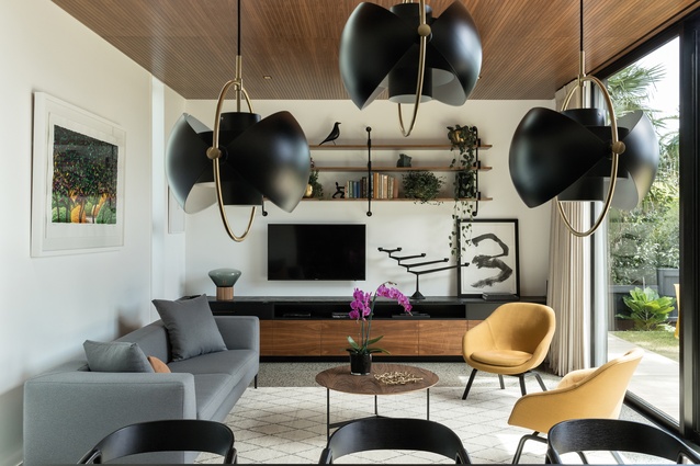
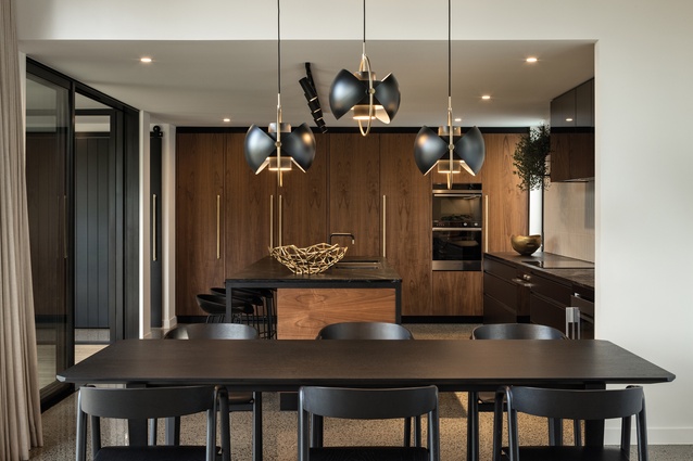
The tree has also influenced some of the decisions inside through a combination of materials (walnut is a primary timber here) and colours (bold pops of green abound in unexpected spaces). Even the art – by New Zealand artists such as Gordon Walters, Gretchen Albrecht and Karl Maughan – seeks to reflect the frondy, green vegetation outside.
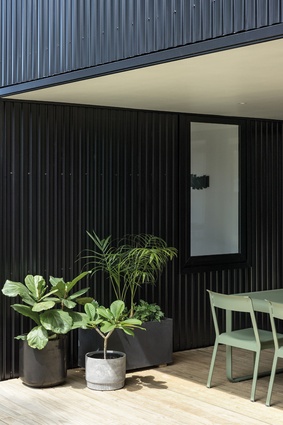
The home’s external envelope – selected partly for its low cost and ease of maintenance – is a black metal cladding that is similar to corrugated iron but with a different profile. “We find, with metal, there is a crispness to it. We love timber but the metal, next to the earthiness of the tree, is quite a nice play,” says Kate Rogan, Nash’s business partner and the house’s co-designer.
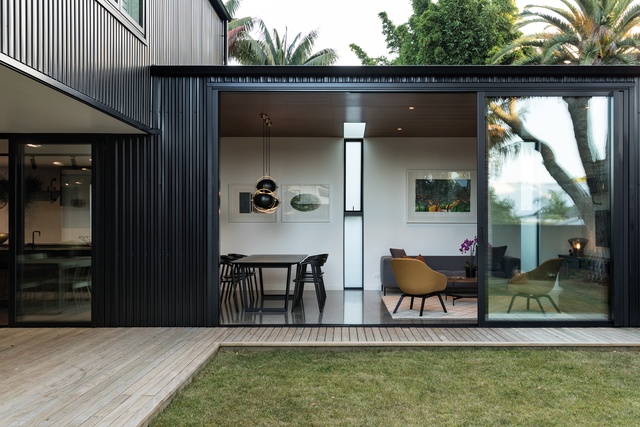
“Inside this house, we have carried that through with metal accents everywhere. It has a real sort of continuity with the aluminium joinery as well.” According to Nash, the move was also made to “speak to that New Zealand vernacular”.
Yet it is outside of these practical parameters, outside of the standard, physical preoccupations of architecture where this home’s story really shines. The house becomes a home through some subtle but tangible threading of history and the hopes of keeping a family united, safe and comfortable through emotive design gestures.
In its 2002 song Here I Dreamt I Was an Architect, the indie band The Decemberists waxes lyrically about three dreams, one of which says: “And I am nothing of a builder but here I dream I was an architect, and I built this balustrade to keep you home, to keep you safe”.
For Nash, this sentiment was synonymous with what she wanted to achieve in this, the home she shares with her husband, David, and their two children (Nico, 7, and Aida, 3) in the city-fringe suburb of Westmere.

“The whole theme behind the house,” which came to be known as the ‘To Keep You Home, To Keep You Safe’ house, “is family,” says Nash. “It’s about giving them a space that they can really fall in love with and where they want to stay and be comfortable and be safe.”
To that effect, the designers have created a set of design moves that, combined, trigger a powerful sense of comfort. However, this is not a comfort driven solely by materiality or excess but from a cohesive story that puts heritage, family and personality at the core of every decision.
To enter the house, for instance, visitors must walk to the door over a small footbridge: a sort of symbolic funnelling from an exterior space into an ante-room that serves as an enveloping preamble.
The first room to the right is a warm, cocoon-like kids’ playroom, which has an interior window with direct sight to and from the kitchen. “You can actually see right through, so you can imagine someone is making dinner and the kids are playing in here,” explains Rogan.
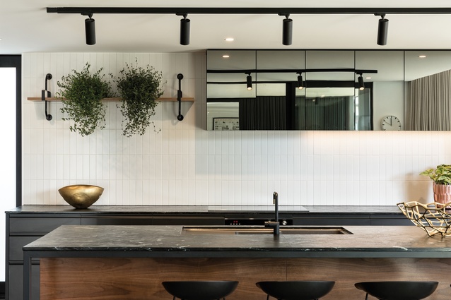
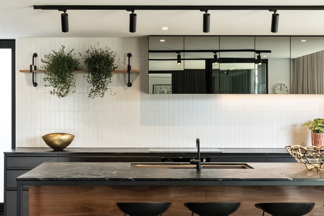
The kitchen itself has been conceived as “the heart of the home, if you like,” says Nash. “So, from here, you have that vantage point of the living space, the outdoor entertaining area and the kids beyond in the playroom. It was an important part – the lynchpin of the house, holding it all together. It is also an anchor.”
The impressive, oversized, leather-granite bench is roughly textured rather than being polished or honed, as is more common. “This gives it more of a rustic, raw finish. We are the types of cooks that make a big mess and this is so easy to keep clean and to use. I always have got the red wine, or the lemon juice, or the turmeric out and this bench survives!” confesses Nash.
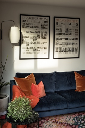
The choice of a warm, yellow-orange colour for many of the soft furnishings was a nod to Nash’s grandparents, who emigrated from Croatia to New Zealand and mined kauri gum, an amber-coloured material used to polish timbers. Nash often refers to her close relationship with her grandmother – who sadly passed during the construction of this home – and how some of these design moves were made to keep her memory alive.
It is also hard to ignore the strong friendship between the two architects behind this abode; both of them were co-designing and building their own homes at similar times. “The thing about Kate and I is that for any project on which we work, we often arrive at the same answer, which is interesting,” says Nash. Meanwhile, Rogan points out how, during the building of both of their houses, they understood each other’s quirks and knew when to step in and when to step back to let the other make material and design decisions.
This house, then, is perhaps a testament not just to the hard, solid aspects of architecture but how some intangible narratives can, and often do, slip into the making of a true ‘home’.
This article first appeared in Urbis magazine.


