Tight-knit: Mt Pleasant Community Centre
Chris Moller Architecture + Urbanism’s latest design is a marvel of prefabricated construction, which involved a highly technical and collaborative team approach that could pave the way for the future of design and construction in New Zealand.
For hundreds of years, the people of Ngāi Tahu have fished for kai moana from the edge of the river mouth at the Heathcote and Avon estuary, catching pipi, tuatua, tuna, pātiki and more. Around 100 years ago, a small causeway was built across an inlet of the estuary for passing trams but, over the years, the inlet was infilled, and low-lying sports grounds replaced the sprats and flounders.
A squash court was built in a plain but functional shed and the rattle of trams faded away to be replaced by the hum of cars. A War Memorial Community Centre was established at the base of the nearby hill. Mt Pleasant was indeed a rather pleasant suburb.

All that changed in the February 2011 Canterbury quake, with hillsides crashing down and liquefaction rising up. The eastern edge of Christchurch was particularly badly hit. The old Mt Pleasant Community Centre building was broken, condemned and demolished, while the community rallied hard to raise funds for its replacement.
The resulting building is an important commission for Chris Moller and his practice Chris Moller Architecture + Urbanism (CMA+U). You may know him better as the Grand Designs New Zealand presenter but, overseas, he is perhaps better known as an architect, urbanist, teacher and agent provocateur.
He was the urban design champion in Groningen, a city in northern Netherlands where he lived and worked for many years. Moller has one of the more unusual methods of practice in the country – when he is not flying around the motu doing endless retakes of “If they’re not careful, they’ll be up shit creek” or “My goodness! It’s amazing!”, he collaborates with other like-minded souls to commit the actual drawings to paper. This building is one where Moller’s practice literally spreads its wings and takes flight.
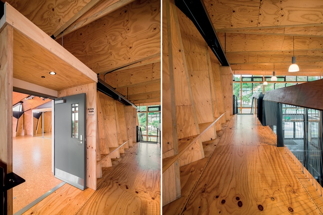
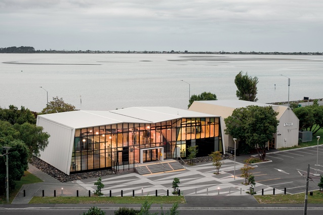
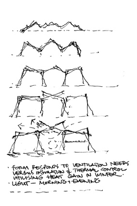
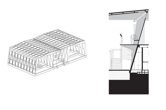
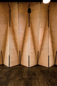
Inspired by a shellfish, Moller dug out of the mud of the estuary, the building is like a crusty bivalve: two halves of a shell, reinforced and held together at the hinge. The external weatherproof shell is plain, while the inside has a richness of simple geometry. The undulating structure inside the building is a homage to the ripples of the sand in the nearby mudflats, endlessly repeating in a rhythmic mathematical pattern: a nice, simple concept but quite complex to carry out!
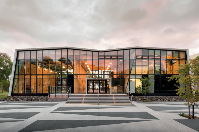
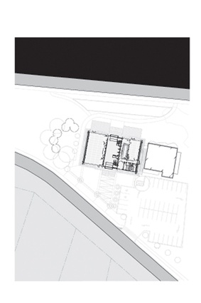
Crustaceans rule the nearby mudflats. Within this tidal landform, a concrete plinth wall rises up, growing out of the sand and grass like an oversized limpet, rocks encrusting the edges. A deck edges out towards the sea. The above-ground structure is like a trimaran, timber hulls cresting the waves, or like a crab itself, scuttling across the landscape.
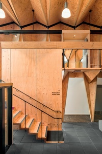
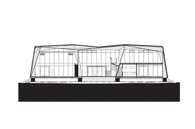
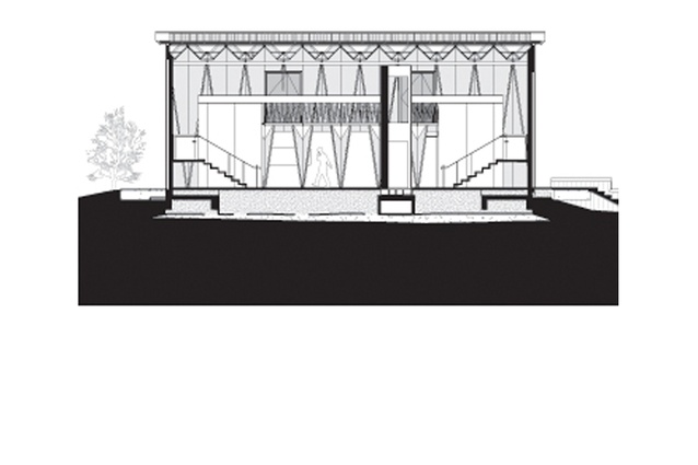
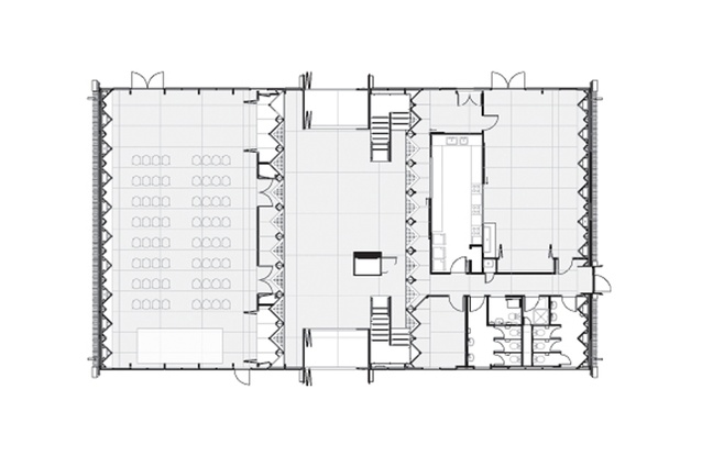
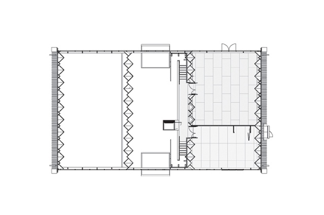
The building’s role is quite simple: flexible planning was required for multiple potential uses. On the west side is the large, full-height, multifunctional space – indoor sports, dancing, town hall, etc. The east side is double storeyed so the downstairs houses functional things like the office, kitchen, WCs, kids’ play area and a flexible space that becomes a small community café.
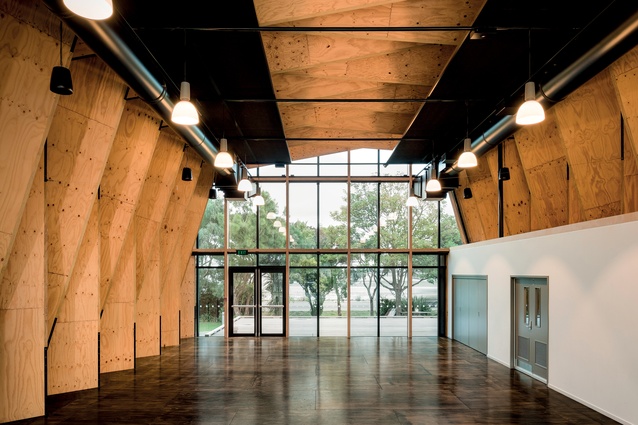
Upstairs lie two further flexible spaces for diverse activities – hot yoga devotees in one while I was there, a discussion group in the other. Twin stairs lead up to a generous balcony overlooking the central space – what Moller calls “the Atrium” – the physical and social hinge, the double-height mixing space, the glue that binds it all together.
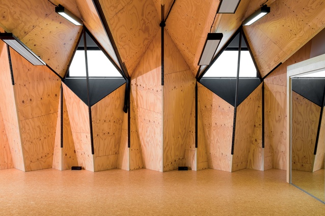
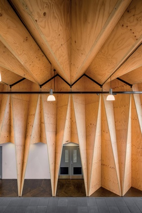
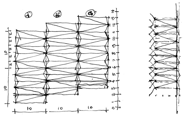
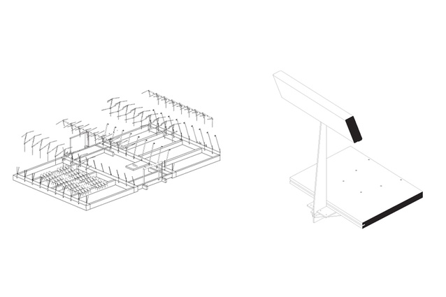
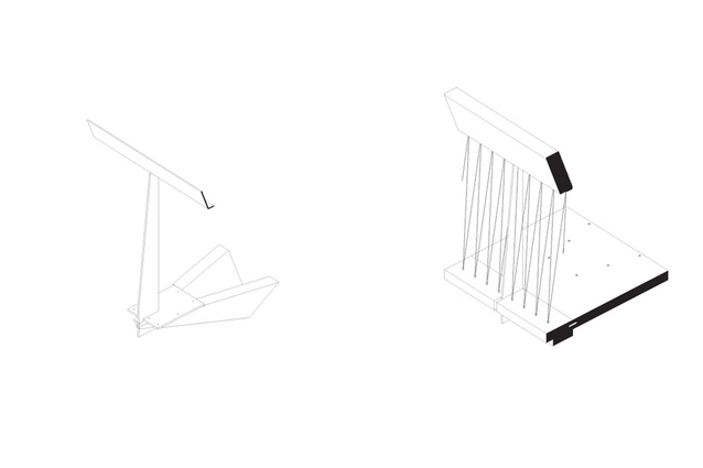
Thin (45mm) triangular billets of laminated veneered lumber (LVL) are folded into a continuous plate to form four interlocking rows wriggling across the building, pierced at points to provide access between. There’s none of your typical stud and dwang verticality here. Indeed, nothing is ordinary when Moller is working along with everyone’s favourite wizards: structural engineer Alistair Cattanach and services guru Patrick Arnold.
The cross-banded LVL is the structure, the decoration and the seismic solution all folded into one, with the end effect of being wrapped in a big wooden blanket or being cocooned under an upturned boat. LVL billets stand precariously supported on one skinny end either side of the doors, while opening up completely in places upstairs to provide more light.
North- and south-end walls are great glazed planes of light, permitting gently dappled sunlight through the trees out the front to dance across the floor, with views out to the estuary and blue sky beyond. The roof wraps over and down each side wall (east and west), providing a bland cloak of invisibility. Despite the cars buzzing past outside, it feels welcoming and friendly: truly a communal space. The hot yoga instructor warmly invited me into the sun-filled room; regretfully, I declined.

Technically, this project is a marvel of prefabricated construction: design, fabricate, assemble. Although the LVL came from Nelson Pine, it was taken to XLam’s nearby Nelson facility to be finely machined on its 5-axis router to achieve perfect cohesion at the joints. Moller collaborated with great fabrication detailers, like architects Earl Rutherford, Grant Douglas and Sam Curtis, to achieve intense levels of accuracy.
With a tolerance of only 1.5mm per panel, the resulting building was, amazingly, completed to within 3mm over a 30m length. The LVL panels are fixed together rigidly with an array of both steel and timber joiners at the edges, screw-fixed in two directions. The thin, black lines and nodes of woven steel structure stitch together the fabric of the building, while the surface-mounted services are also trimmed in black to achieve the duotone colour scheme.
Moller passionately believes that architects should become, as Renzo Piano says, ‘digital craftspeople’, using the power of the CNC machine to carve their designs, instead of the tapping of a physical chisel as did the master masons of old.
Architects should not be slaves to the machines of commerce and technology but, instead, by harnessing the power of the technology, should once more take the lead they deserve in the construction projects on which they work. There was no ‘project management’ consultant eating up fees on this project, just total teamwork at play in this modern industrial age.
I’m hopeful that this is an example of the future of design and construction in New Zealand – clever beyond belief, highly technical and collaborative, based around (but not driven by) an integrated BIM model, and with architects, engineers and contractors all working together towards the common goal.
Was it because of the tight-knit community of Wellington consultants that it succeeded without mishap or was it because Leighs Construction practised on a full-scale prototype? Moller sings the praises of the construction team led by Andrew Wallace and Mark Thompson at Leighs – evidently the complexity and sheer craftsmanship required for the building was a major drawcard and the end result is a stunning achievement.
There are some disappointments, as with any project. Moller and Arnold are saddened that the hoped-for PV panels on the roof did not eventuate, because of budgetary restraints, while I’m regretting that the complex geometry of the roof, so visible in the ceiling, is invisible from above. It is much safer for shedding rainwater, of course, but less visually exciting for passing seagulls and the views of nearby residents of Mt Pleasant. Still – like a shell, whether pāua or pipi, tuatua or whorling mollusc – the true gorgeousness is always on the inside. Tasty stuff.

