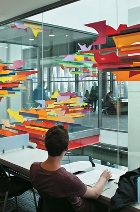
The University of Waikato Student Centre
It’s normal when visiting a building for the purpose of reviewing it that the architect offers to show you round. This is generous of them and may avoid the risk of your accidentally looking at (and writing about) the wrong building. However, it comes with a risk: that one gets to hear the architect’s own version of what the building is rather than working it out for oneself. It may be better to decline, preferring instead just to encounter the object of the exercise in the way that most people will discover it. The issue hinges around the question of whether one looks at a work of architecture as a narrative or text, or whether it is more properly viewed as a spatial work, to be experienced largely visually.

Quite a lot has been written about this in the last few decades and, early on in The Republic, within the chapters on education, no less an authority than Plato remarks that, “Our first business is to supervise the production of stories, and choose only those we think suitable”. But, while the development of narratives about architecture is something which human nature almost inevitably leads people to do, there is no need to assume that, just because an object can generate a narrative, this is what’s important about it. A stranger may well tell you that the plastic comb he is showing was given to him by Elvis but it’s still a comb and a more important issue might be whether it’s useful for arranging one’s hair.
What might one look for in a building anyway? There are likely to be at least three questions: What is the architect trying to achieve? What skills have been displayed? And what social purpose underpins the conception? Certainly, a major university building raises the issue of what a university is and of how its buildings might represent its primary functions. This is an instrumental view of architecture and of course it represents some sort of a narrative – which proves how resistant to suppression narratives are.
So, a review requires a narrative and, since the accompanying photographs will reveal what the building’s visual qualities are, this one starts with some thoughts about the space of education. Returning to Plato, one notes that he gives some emphasis to the influence of the physical environment. “Architecture,” he says – including it with the graphic arts – contains both “beauty and ugliness, but ugliness is akin to poor-quality expression and character… We must issue orders to all artists and craftsmen, and prevent them portraying… meanness, or ugliness in… architecture, or any work of art.” To fail in this duty, he asserts, will result in serious cumulative psychological damage. As to what a university is, there are some prominent guides. Milton, in his essay On Education of 1644, speaks of it as a place dedicated to the good of mankind and the development of character, both of them noble goals. He is also aware of the importance of a sense of place since knowledge and the located culture within which it arises are linked. Cardinal Newman, in his series of discourses On the Scope and Nature of University Education of 1852, writes of the advancement of Universal Knowledge (which he capitalises) and the cultivation of the feelings (which he italicises), both of which are admirable sentiments.
What then of a building which might deliver some of these lofty aspirations? The new Waikato Student Centre, a product of AECOM and Warren and Mahoney, sits in the pleasant grounds of The University of Waikato in Hamilton. There may well be a masterplan for the campus but it’s not apparent in the disposition of the buildings, which give the impression of having been located by random dispersal from a high-flying aircraft. But, the outer-suburban location of the university has provided it with a park-like setting and it has many agreeable corners admixed with a slightly disorienting sense of spatial incoherence.

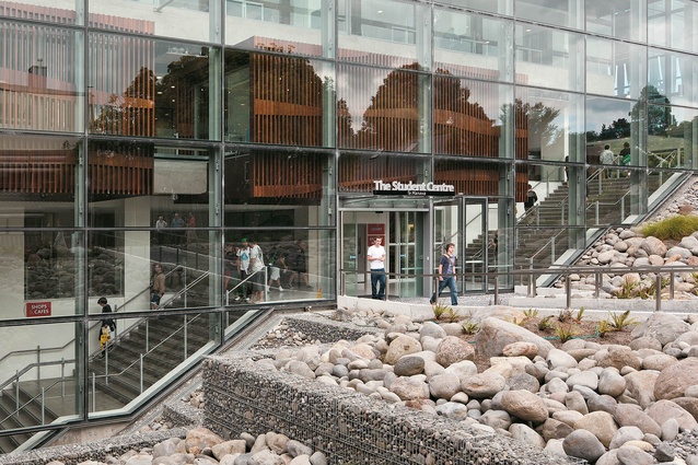
The 12,500m2 Student Centre complex originates in the old main library building, a ponderous and forbidding structure of the ’70s, five storeys high, which has been extensively re worked and to which some new spaces have been added. There are a number of changes-of-use within the building but, more importantly, the university has recognised that the library is, at least symbolically, the centre of student life and that other facilities such as cafés, bookshops, commercial spaces and the student union itself might appropriately be associated with it. It therefore houses a combination of different uses, which sit together companionably and reflect a serious gesture towards reconciling town and gown, although the town proper is still a long way distant.
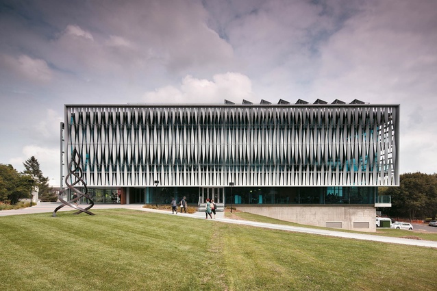
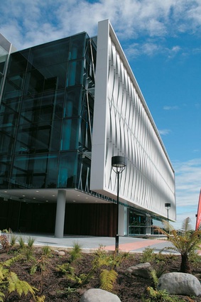
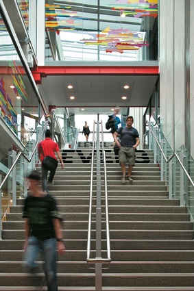
This $30.5-million project is a comprehensive and well-considered intervention which turns an oppressive building into a much more open and accessible one. There are some nice touches in the major staircases, which express a certain transparency and provide a sense of drama in the circulation, and also in the new balconies which offer an opportunity to relax. Informality and openness, both of which reflect a social purpose, appear to be the major issues the architects set out to address. They have been well handled. The levels of skill displayed in the execution are up to a good standard too, and the north-east face of the building has a signature lightweight Warren and Mahoney sunscreen which presents a delicate contrast to the massive pre-cast concrete fins of the original building. What is lacking is what the campus very badly needs and that is the ability for this building to organise the spaces around itself, and thus bring a greater coherence to the overall site planning. But, this was perhaps beyond the scope of what was possible within the brief.
All the people spoken to in and around the building really liked it and one has little difficulty in seeing why. This being so obviously the case, it is a source of profound disappointment that the university’s four-page, full-colour leaflet, describing the building and the positive response it has received from users, does not mention the architects. One is reminded of Cardinal Newman’s words when he observed, “such a procedure though defended by much plausible argument and not a little wit… seems to me an intellectual absurdity…”.

