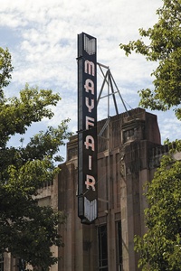
The Mayfair
Back when I was a kid, it was a rare treat to go to Mayfair cinema in my home town of New Plymouth. I have vague recollections of The Muppet Christmas Carol, an abundance of plush red, the smell of buttery popcorn and the feeling of Tangy Fruits getting stuck in your teeth. This was simple cinema, when movies had a half-time instead of eye-popping 3D effects.
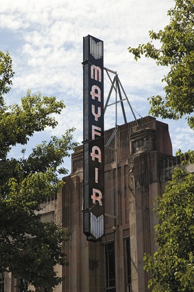
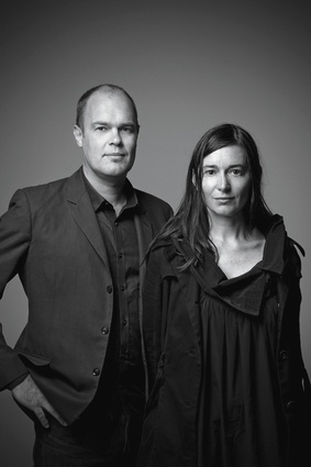
Since then, the Mayfair theatre – an art deco gem and one of New Plymouth’s few heritage buildings – has had its fair share of incarnations. When architects Cecile Bonnifait and William Giesen of Atelierworkshop stepped in, the building had a hodgepodge of functions – and some slightly lascivious ones at that, such as a shop for X-rated adult supplies and a strip club.
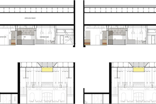
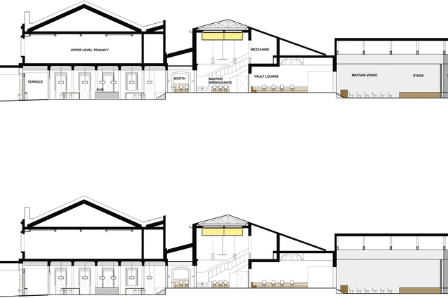
The pair was given the task of transforming the building into a large entertainment venue that could be adapted for a range of events – everything from corporate functions to performances by popular New Zealand musicians. While it can accommodate up to 700 people during concerts, the building may only hold a handful of patrons for a casual drink on an average weeknight. It was therefore crucial that the space be versatile enough to fulfil a variety of functions.
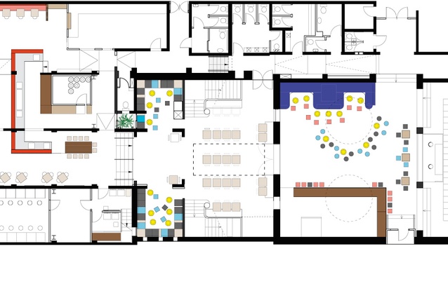
In order to achieve this flexibility, the architects completely opened up the routing to seamlessly link the once-separated spaces. The particulars of the brief, however, were quite unclear from the outset. “We came back to the studio after the meeting and thought: wow, they don’t really know what they want,” says Bonnifait.
Perhaps it was the diversity of the parties involved that caused the initial confusion. The project became a lesson in creating harmony, both within the expansive space and amongst all those investing in the renovation. The architects had an existing working relationship with the building owner, having recently designed his new house in addition to collaborating on the renovation of another of the city’s landmark buildings, the White Hart Hotel. This time, though, Bonnifait and Giesen also had to accommodate the needs of the tenant and the beverage sponsor.
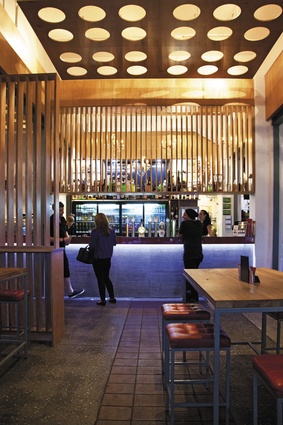
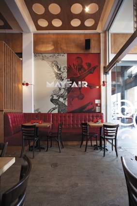
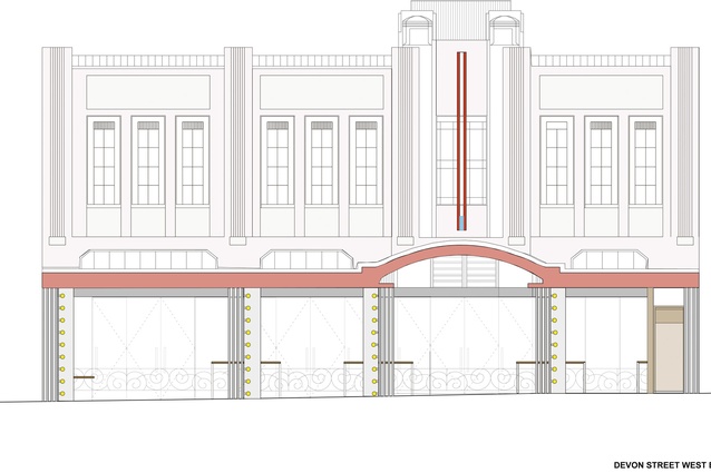
The street-facing bar is arguably the Mayfair’s most important function. “These guys [the tenants] really want to sell beer,” says Bonnifait. “That’s their main goal.” The bar and its adjoining restaurant are therefore the face of the building, and furniture spills out from the covered entrance to the street to invite passers-by to stop in for a drink.
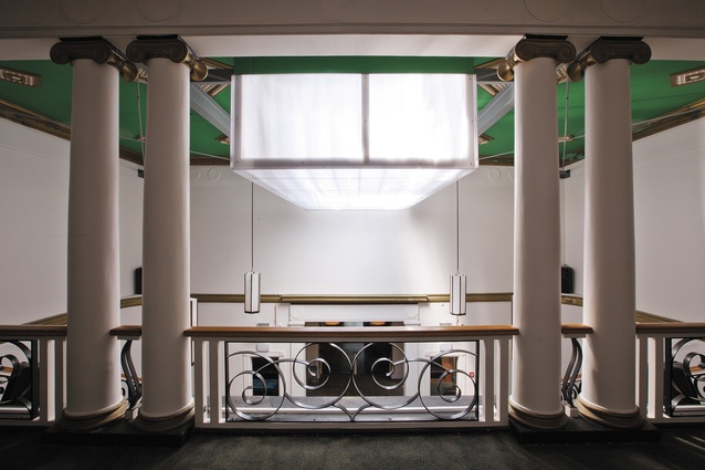
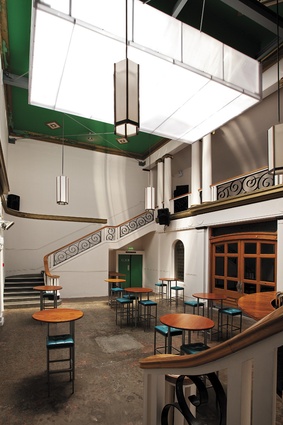
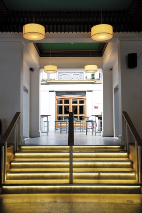
A long corridor lies to the right of the bar. This corridor – which once led to the cinema, and was reinserted as a reference to the building’s original function – lends access to the larger part of the venue via an atrium that celebrates the Mayfair’s art deco heritage. “The atrium is one of the Mayfair’s best features, yet it was only being used as an annex to the strip club,” says Giesen. “You barely noticed it.”
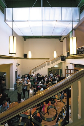
It’s hard not to notice it now, as the room is flooded with light thanks to a new translucent polypropylene box that lets in sunlight by day and is artificially illuminated by night. While this space and the larger entertainment venue beyond are fully functioning, they’re not yet complete. “The atrium still has a clunky old bar and we’re waiting on some of the right furniture,” says Bonnifait, who adds that the second stage of the project is likely to commence this year. For now, the space is well equipped for use as a small entertainment venue, with two staircases leading to a mezzanine level to separate a DJ from the dancers.
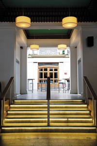
The staircases reveal another important element in the project: the preservation of the building’s historic features. While Bonnifait and Giesen aren’t restoration architects, they believe in keeping the best of a building’s bones. “We want our additions to be contemporary, but hopefully in a way that’s sensitive to what’s existing,” says Giesen. The decorative banister detailing is original, and so are the plaster mouldings that occur throughout the space. “We haven’t tried to re-create history by designing fake Art Deco elements,” says Bonnifait. “We’ve left the original details and used them to inspire our additions, such as the circle motif you’ll find in the suspended ceilings – it’s translated from the original mouldings. We also added colour that fits with the art deco theme. All the gold elements are original, but we added exuberant blues and greens.”
It’s clear the architects considered these translations to be more successful than some – namely the reinterpretation of the banister detailing into a graphic for the entrance windows, which didn’t match the architects’ drawings. “Perhaps it’s just a sign we need to get a bit more involved with the graphics, though,” says Giesen.
Despite a few hiccups along the way, the duo is happy to add a venue of this scale to one of New Zealand’s smaller cities. “It’s a big step,” says Bonnifait. “And it’s nice to see the reaction of people who came here as kids. The building is now part of the city again, with all the memories that go along with it.”

