The inside-outside thing at work
Amanda Harkness visits Irving Smith Architects’ new studio in Nelson and finds a reductive yet expressive design approach, built to address both present and future needs.
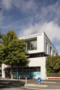
If you look closely from a certain angle, you can see WallÉ,1 read into the east, street-facing elevation, behind a large pin oak tree on a narrow central-city site. His head and eyes the top floor, his pivoting waist at mid-level and, below, the engine room of the small, waste-collecting robot, made famous by Pixar in 2008.
But you can also see a building where sculpted cut-out slots let in light and life above the concrete boundary walls, not dissimilar in concept to Matra Architects’ Kaleka House in Delhi. In his Essay from India,2 architect Jeremy Smith points to the concrete house as one with an interest in boundaries, in a country that has long been testing boundary relationships.
This story of Irving Smith Architects’ new studio in Nelson is as much about its outer contextual boundaries as it is about its lack of interior ones, and how an open-minded approach to a seemingly challenging middle-floor positioning led to a rich, imaginative design response, well positioned for the pandemic, the climate crisis, new neighbours and any other curve balls likely to be thrown its way.
Originally Irving Smith Jack, this small South Island practice designed and built its former studio 15 years ago, just 80 metres down the street. “Your practice develops over time so this new space is more about where we are now and being sustainably better and carbon better,” says Smith. “It’s also about setting up the interior to suit our practice and the way we like to work.”
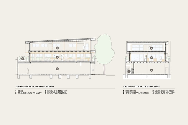
The site, zoned city centre, came free of the burden of carparking provision, which enabled Smith and fellow director and convenor of this year’s national architecture awards, Andrew Irving, to create a building that occupied the full 300 square metres. Previously home to a small bungalow housing a tattoo parlour and framing gallery, the landlord seized the opportunity to develop a three-storey commercial property in conjunction with the World Architecture Festival award-winning architects, who were to take up the second-floor tenancy.
“The middle-floor position is traditionally the worst floor in a three-storey central building, right?” says Irving. “Your design response is to put pre-cast down two sides and you may get away with the top floor having windows at the side but, generally, you don’t. You end up with a retail tenancy, a dubious middle-floor space and then, possibly, a top floor where you can pull back from the edges and get more glass on the front and back.”
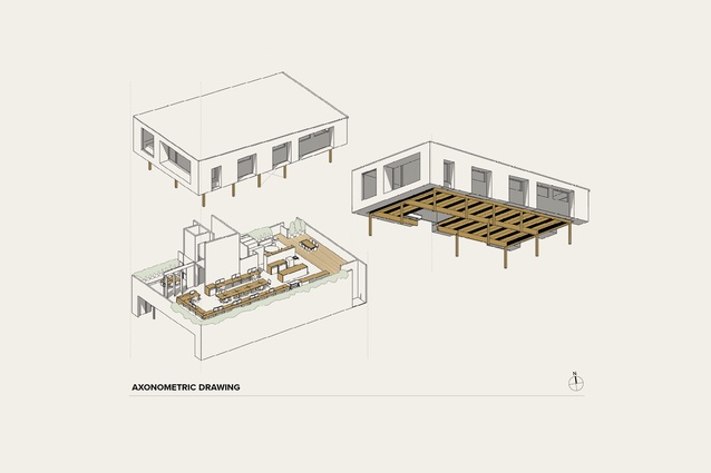
With the architects modestly noting they’ve been “playing games with timber and construction and things over the years” – think NMIT, Scion, Bach with Two Roofs, Feather House – they took some of those lessons learnt and applied them to make the most of the free space and cheat the side boundaries on the middle and top floors.
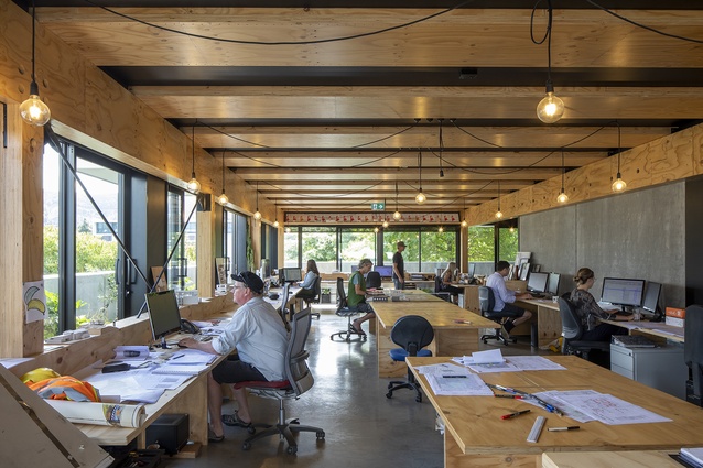
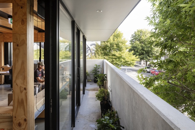
“This is where we have this 1.5 concrete, 0.5 verandah and 1.0 timber storey ratio,” explains Smith. “That approach sees the concrete doing the fire rating downstairs hard to the boundary and, from our end, we can work on the verandah, have the windows open, everyone has an edge seat and we’re kind of controlling a jungle between us and the street.”
But how sustainable is building with concrete? Irving replies with what he admits is cold, hard, Presbyterian pragmatism: “We like the phrase ‘carbon better’. With this hybrid building not using all pre-cast, setting back, and using more timber, we’re saving 50 to 60 tonnes of CO2 equivalent in the embodied energy of the building, which is a defensible outcome for a developer.”
The duo imagines a world where future new builds follow suit – where the Indian restaurant on one side and drycleaner on the other develop with the same amount of generosity on the upper levels and WallÉ finds himself with 1200-wide verandahs and plants and decks on either side, and a street above the street evolves, and commercial space begins to operate differently.

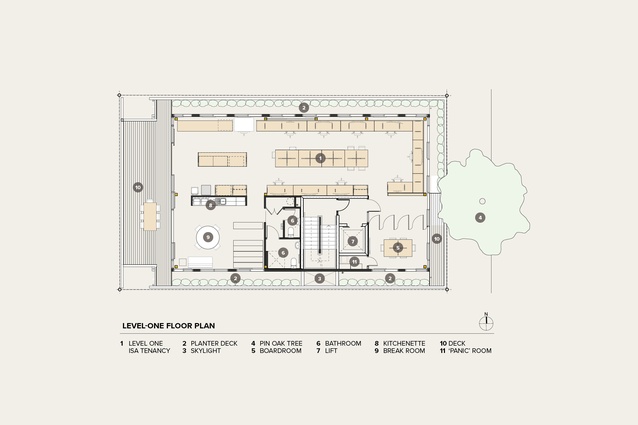
Smith, who lectures on preparing for change in a shifting world,3 says that, in designing the building and the practice’s interior space, they projected where their neighbours would build. Above the studio’s wraparound verandah, in the top floor, is a series of slots, which the architects refer to as skylights or holes in the canopy. “Even if our neighbours build hard concrete walls right to the boundary above us, we’ll still have light from above and from the street and the back, so we are controlling,” explains Smith. Irving likes to call it “daylight insurance”.
Extensive planting along the verandah is not only designed to help combat climate change – capturing carbon, filtering polluted air and providing shade and transpiration – it also softens the glare and provides a natural outlook as it grows over the concrete wall. “If someone built next to us,” says Smith, “those plants would grow upward to the light and then our space would change. We’re not intending it to stay the same.”
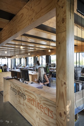
Inside, the open-plan layout is similarly fluid. Individuals manage their space for air and light, sliding doors and raising blinds, and exposed mass timber lends warmth and informality. Employees sit around a large, communal table to share ideas, make models and play long-ball table tennis, then swivel their seats to the perimeter to look outwards and engage in more-singular work.
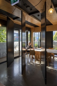
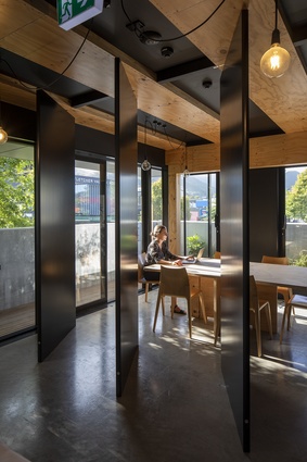
Pivoting walls to the south-east-facing meeting room offer privacy and the entire space opens to the verandah, which is a boon in terms of ventilation for pandemic protocols. Those looking for fresh air can move around the building externally, without walking through the studio itself.
“That whole notion of the inside-outside thing at work is kind of life-changing,” says Irving. “And having releases within the day are really important,” adds Smith. “Whether that’s going out to turn on the watering system, to hang out in the garden or to pick a lemon, everything seems slightly easier afterwards.”
In this carbon-better project, Irving Smith has created a building that is ready to adapt to both its built and its environmental surroundings. It’s the sort of architecture that RIBA Gold Medal-winning architect BV Doshi would describe as a backdrop to life: a living organism that is subject to change and modification. And, just like its namesake WallÉ, it’s doing its bit to help keep the planet clean with a large dose of endearing personality along the way.
1 The project name WallÉ refers to it being carbon-better and of similar proportions to the robot.
2 Architecture NZ March/April 2020.
3 Jeremy Smith is Adjunct Associate Professor at the University of Auckland’s School of Architecture and Planning. His Ch-ch-ch-ch-changes studio (2017–2022) for first-year master’s students investigated strategies for buildings to prompt, predict, react and change in relation to time. His Borderless studio (2020–2022) asked, if we can design buildings to ch-ch-ch-ch-change, how much are we now being held back in our response by those border relationships established in an attempt to control the landscape?

