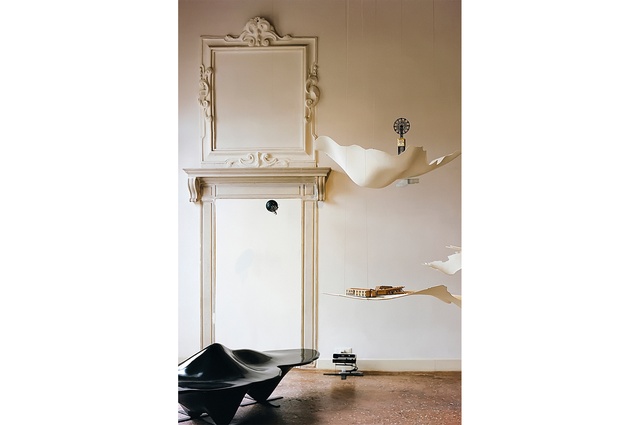
The beauty is in the detail
Maggie Carroll and Jessica Barter discuss their journey since launching Bureaux in 2010; theirs is a practice known for its careful crafting of space and unwavering focus on collaboration.
When we first began, it was in the midst of the GFC. While some firms were falling over, with people losing their jobs, we were diving into the chaos. In hindsight, it was the best time to start something new – we were motivated and inspired, and we worked hard to establish client and industry relationships. That has been our focus from the start – to develop a strong network of people that can collaborate with us to deliver outstanding projects.
Post pandemic, we’re purposefully evolving our studio culture, strengthening our capacity for collaboration. We’re not an eponymous practice but, as directors, we set the tone for Bureaux in terms of design inquiry and interest in the careful crafting of space. That hasn’t changed; however, we more consciously encourage the studio team to bring forward ideas, join the critique and enjoy a sense of ownership in its work.
Today, throughout the design stages of our projects, half of the office might be involved. The best ideas ‘win’. The practice today is about extending our reputation beyond our two personalities and giving more opportunities for design authorship – the reason we all entered the profession to begin with.
Pre-Bureaux
Both of us attended the University of Auckland School of Architecture and Planning. After graduating, Maggie worked at Fearon Hay, assisting in the design and delivery of high-end houses for which that studio is well known. Jess continued with her master’s, focused on making and craft, evidence of which can be seen in one of her first projects, a café for Coffee Supreme, Good One. It was an exercise in space-making through craft and the tiles were made by hand in her living room. A few years later, after Maggie left Fearon Hay to establish her own practice, we shared a collective workspace in the Canterbury Arcade on High Street, Auckland, the home to many architects over the years.
In those early days, we had open minds about what our business might offer – we were interested in a multidisciplinary approach and, to a point, we still are. We worked collaboratively on every project that we had and, often, our clients came to us because of the working dynamic between us.
We advocate for fair remuneration but, back in our early days, we did a lot of work for free, including events and activations with very low budgets. However, we were fortunate to have a crew of talented friends and colleagues we could call on to help us out, many of whom we are still working with today.
We’ve both enjoyed a hands-on approach to creation, whether we are on site or in the factory, hunting for objects and designing new pieces out of materials that have never been used in those applications before. For our early projects, we were necessarily resourceful and there were no boundaries (except the obvious one: cost). Despite the way we have grown as a practice, our original motivations are still with us: to find and design something new and inspiring.
We were both involved in Te Kāhui Whaihanga New Zealand Institute of Architects early on in our business, through the local branch, organising Auckland Architecture Week and supporting the Graduate Development Programme. Through that involvement, we were introduced to other architects in our community and we developed a strong support system from those relationships; some of those people, who were years ahead of us, generously offered us their mentorship and continue to support our practice today. While we can’t speak for wider Aotearoa New Zealand, the Auckland architecture community is a uniquely supportive and collegial group. Jane Aimer and Lindley Naismith of Scarlet Architects, in particular, were very supportive and regularly shared their wisdom with us. They took us under their wings at the beginning and recognised that, like them, we were a young and female partnership starting out.
A question of style
Most of our work has been residentially focused, perhaps because we are most stimulated by that high level of engagement, striving to push the boundaries of how we live and how a house might be inhabited. We look to make a deep connection to context and to avoid ‘over-design’; we integrate design, offering a sense of quiet restraint that can let the natural qualities of the site and building materials, and the landscape and its sensory qualities, do the heavy lifting. Enough is enough but knowing what is enough is a skill.
Looking back at the body of work we’ve created in the last decade, it’s obvious that we have established a distinctive aesthetic. Many of our projects take a year in the studio and then two years or more to build; this means we’re not interested in trends. We are, however, interested in longevity – the idea that the houses we design could have been there for 20 years or could be built in 20 years’ time.
Rather than looking at architecture as an object, we tend to design around the client and seek to enhance the human experience. We want to understand the ways in which our clients would, ideally, live and strive to create environments that are extensions of their personalities and lives. Successful spaces make emotional connections; they naturally make sense, and welcome you to touch and inhabit them.
Environmental context is another key driver. Our architecture and the interiors that we design for architecture often commit to a very natural, textured and tactile materiality. On some projects, we advocate for renovation over demolition and don’t hesitate to argue for appropriate scale and form in sensitive environments.
Interior monologue
We feel very comfortable and confident in the interior realm – but we are architects. When we were developing our practice, interior architecture was a domain we pushed – to the extent that we’ve had to work hard in the last few years to shift the perception that we do only interiors. However, our point of difference from other practices is that we do both. We describe what we do as ‘total concept’ architecture. From high-performance building envelopes to furniture to bespoke crockery. We prefer to do it all if the project permits us to do so – and that’s why many of our clients come to us.
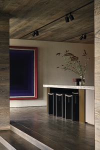
Lower Shotover House
We designed this house for a ‘ski family’ – it’s a significant home and probably their main dwelling, despite the fact they are Aucklanders and Auckland is where they spend much of their time. A few years after this project, we would rethink our St Heliers House for them.
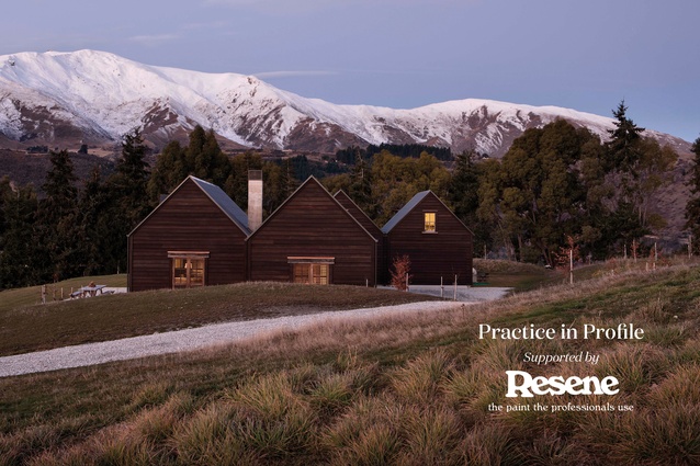
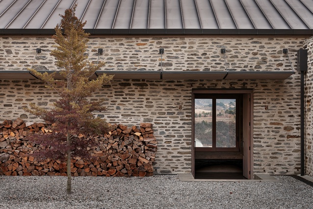
Schist and gable are the vernacular of this part of the country. It’s a language of permanence but, here, it’s given a contemporary inflection. It will still look good in 100 years. Naturally, the house is orientated towards the mountain views, but it’s also partly embedded in the sloping site to provide that sense of refuge in the face of such incredible prospect, the landscape’s many moods and character.
That idea of retreat is heightened through the entrance – it’s like descending into a finely crafted piece of joinery. Floors, walls and ceilings are variations of charcoal-stained oak. It’s also a custom project, in the full sense that we designed most of the furniture and worked with the client to specify and commission the other furniture and objects.
St Heliers House
This project was undertaken for the same people who were our clients for the Lower Shotover House. We had a well-established and strong, trust-based relationship with them by this stage. The brief was to re-imagine the interior – to echo the craft, materiality and texture of the Shotover House but for it to feel different. We developed an interior language, with many bespoke elements unified through the use of dowel legs.
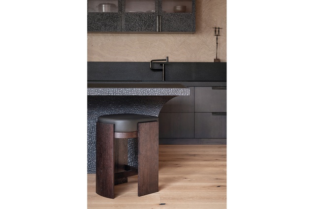
In a compact space, just a few considered interventions can have a great impact. The floors and ceilings were the broadest canvas for texture – planks of wide oak below and a narrower board above. Adze-finished, fumed maple distinguishes the kitchen. Bespoke forged hardware was ‘boiled’ for a head start on the patina that time will eventually deliver.
Arran Bay House
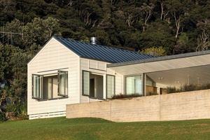
For this home, we wanted to modulate scale: to fit in rather than stand out. The idea of an ‘encampment’ is well referenced in New Zealand architecture – for good reason – and, on this beautiful coastal edge, our approach was to design multiple volumes that better relate to the existing scale of the seaside village.
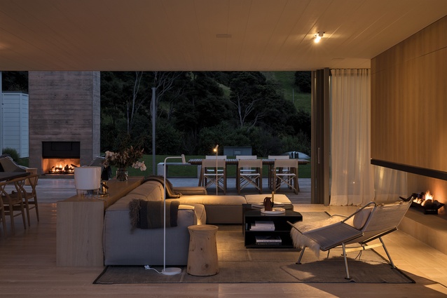
The idea is sheltered and comfortable living, achieved through colours, materials and textures that reference the land and seascape. The house provides the requisite opportunities for sun, shade, views and shelter, front or back, depending on the elements, while the boat shed sits right at the water’s edge. It’s constructed from concrete, colour-matched to the beach sands, and is bunkered into the sloping embankment. It’s the epicentre for beach life, while the central pavilion is a sheltering ‘canopy’ between gabled wings with a master bedroom and guest rooms on one side, and bunking and an entertainment or games room on the other.
Bendemeer House
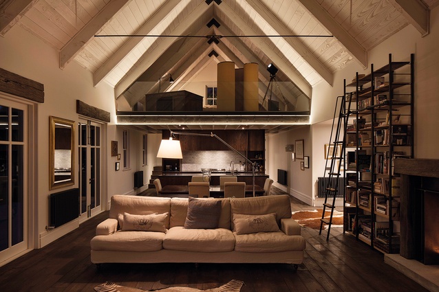
This project has special significance as our first completed new build. The south’s alpine scale and rural vernacular always provide good design motivation. This house has an old-fashioned charm and warmth, and is designed to weather into the landscape as it ages. It is materially restrained – a dark-stained exterior of oversized cedar weatherboards – and carefully crafted with rustic reclaimed-ironbark lintels, textured copper flashings and storm shutters.
The interior is generously scaled and quite simple – the mezzanine draws the eye up to enjoy the surprising height of the ceiling; comfort and charm are attended to by a large log fire, book-lined walls and deep-stained timbers. There are also some quirks, such as a secret bookshelf-door off the main living area that gives access to the master bedroom.
Herne Bay Villa
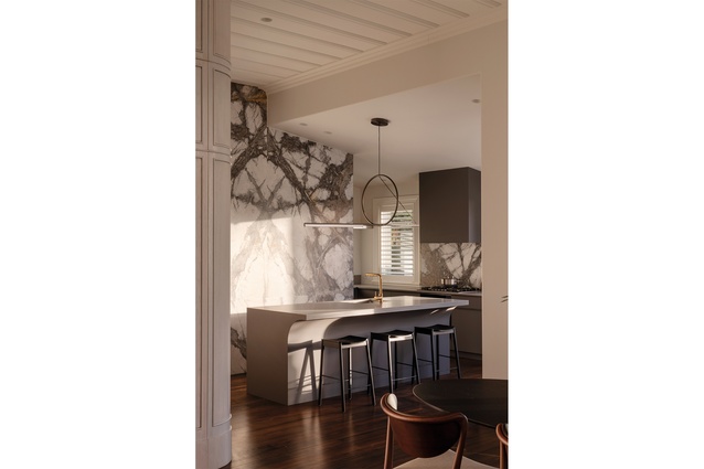
The objective of this project was to heighten the luxury of experience, rather than the size of the experience. After purchasing a villa in Herne Bay, our client’s original plan was to build up and out, maximising the built space. However, with several planning heritage overlays to contend with, it was expedient to investigate solutions that would offer the same quality of experience without the added scale.
Tired but handsome and built on a corner site, the square-front villa had an excellent aspect with good access to light – and a footprint that offered almost enough space. The key was to find more floor area in the reorganisation of circulation – rethinking bedroom and bathroom access without compromising privacy was the architectural challenge.
The interior was also an opportunity to acknowledge heritage craft, with beautifully detailed timber panelling wrapping throughout the home, becoming part of the furniture and storage in places, and celebrating graceful curves that always attract a trailing hand.
Sandringham Villa
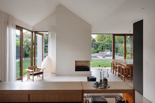
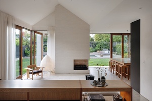
We love the challenge of bringing solidity and timelessness to suburban modernisation projects. The success of this Sandringham Villa alteration and addition rests on the treatment of ground and ceiling planes. The ground plane bridges the drop in level across the site and delineates living spaces. Overhead, a high gable ceiling also defines the new living space, heightening the spatial experience as it expands out as you enter from the villa hallway.
Inside, several visual anchors enhance the experience of space. A finely crafted console defines a dining area, the white-brick fireplace chimney brings the exterior materiality inside, while an exterior fireplace built into the back of the chimney provides an intimate gathering point outside. The warm timber tones, marble and slate accents, and finer details of the kitchen cabinetry reinforce the commitment to craft.
Commercial Office
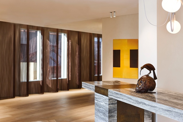
The brief for this ‘legacy’ office stipulated a lifespan of more than 20 years. To achieve our client’s request for an enduring, flexible and sophisticated space required a combination of careful planning and use of natural, textured materials that would improve with age. The office houses two related businesses, with the floor plan configured for the respective privacy of each and the ability to share centrally located amenities. The bar can be completely concealed behind sliding doors and the office centrepiece is a massive, travertine-slab-topped bench with brass inlay – frequently used for informal meetings, meals and social events.

