Teach the children well: Freemans Bay School
From hospital to office, Dr Andrew Barrie traces the changing face of educational architecture and finds in RTA Studio’s Freemans Bay School an environment of fun, activity and not much furniture, and with a street edge inviting the community to enter.
Educational architecture is tricky. Currently, it seems to be the building type most subject to change. This is perhaps because, despite the fact that raising children has been one of humankind’s most important activities since the dawn of time, we still haven’t come to any consensus about how to do it.
Notions of discipline and empowerment, and ideas about how we learn and what to teach, vary not only from culture to culture but from generation to generation. Not only do values and techniques differ widely but they are also evolving rapidly over time.
In the time of our grandparents, there was a fairly well-accepted notion of what a school looked like. It typically consisted of rows of identical, spacious but rather box-like rooms, linked by wide corridors. Classrooms were high-ceilinged, had large windows to provide ample light and fresh air, and gave easy access to ablutions. One teacher looked over 30 kids and the environment prioritised routine, cleanliness and good order. Set against other buildings of its time, an old classroom block most resembled the type of a hospital ward.
In the post-war period, school design passed through a stage of more domestically scaled spaces. The pattern of one teacher and 30 kids in each separate classroom still prevailed but the boundaries – particularly those between inside and outside – became more sophisticated and porous. Clusters of rooms were often arranged around intimate courtyards.

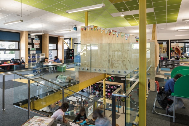
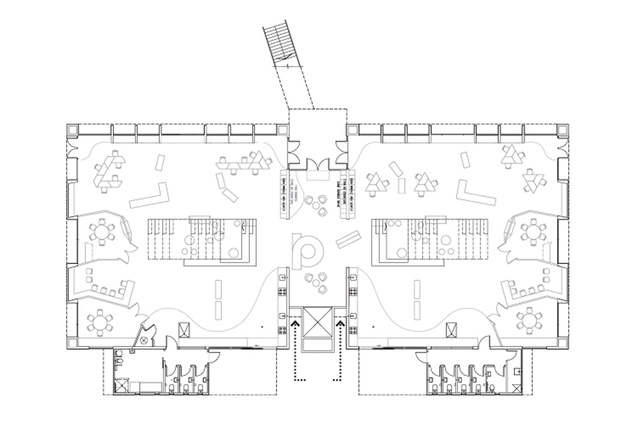
The contemporary school, with its large, open spaces – innovative learning environments or ILEs – is defined by pods, hubs and break-out spaces, and by colourful, movable furniture. Each of these spaces is typically staffed by three teachers, who collaboratively oversee 90-odd students.
Emphasis is placed on collaboration, flexibility and providing students with choices about where and how to learn. The building type a contemporary school most resembles is the modern office.
The intriguing thing is that the shift from hospital to office across a few generations has been from an institutional building type designed to promote well-being to one designed to promote productivity. (Cynics, or grumpy teachers, might say the transition has been from psych ward to workhouse.)
The science confirming the benefits of new collaborative teaching methods is strong but evidence supporting the role of the associated architecture has been slower to emerge. Given this, the temptation is to attribute the current enthusiasm for ILE spaces to their simply looking exciting and ‘modern’.
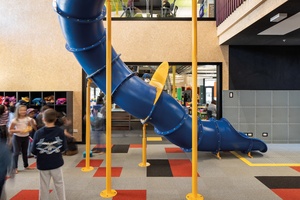
Even ILE fans would likely concede that the clearest influences on learning seem to be made by school culture, teaching methods and furniture – the role of the architecture is murkier and may, at least in part, be symbolic. Of course, symbolism, the representation of ideas and qualities, is one of the tasks architecture has to perform.
Freemans Bay School, located in an inner-city suburb, is one of Auckland’s oldest schools. The story of its campus, with buildings constructed in the 1880s, 1920s, 1970s and 2000s, follows fairly closely the pattern outlined above.
Located in a super-diverse and cosmopolitan community, Freemans Bay is a highly future-focused school. Sandra Jenkins, the school’s principal since 2007, is a passionate advocate of innovative approaches to teaching. Before starting the design process, she travelled in Scandinavia to visit new schools and gather ideas. This confirmed the emphasis the new project places on physical movement, which Jenkins argues benefits learning engagement, social skills and health.
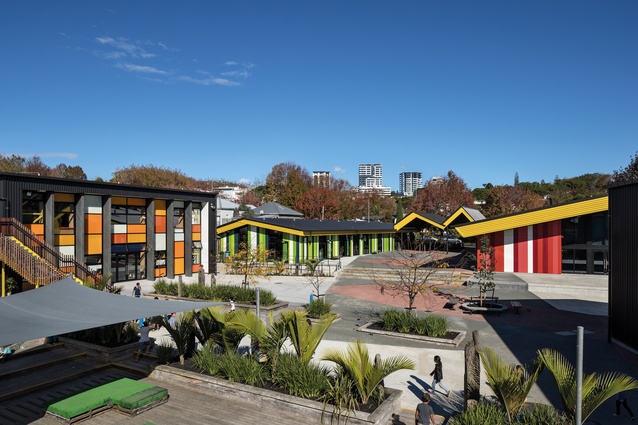
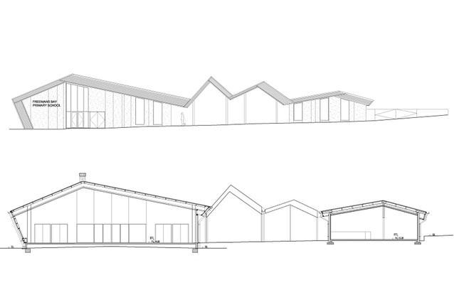
RTA Studio has developed something of a speciality in educational architecture. In addition to individual buildings for schools and universities, the practice has also completed whole-campus projects in the towns of Wairoa and Kawerau. In each of these projects, part or all of the campus was drawn under a large, folded roof plane. This integrated indoor and outdoor spaces and gave the buildings an almost civic scale.
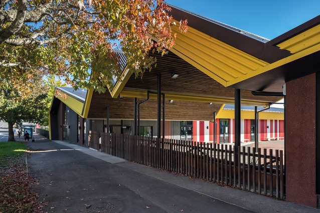
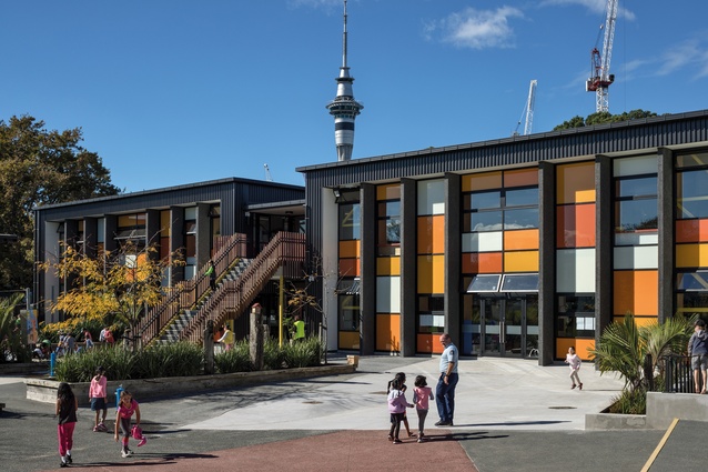
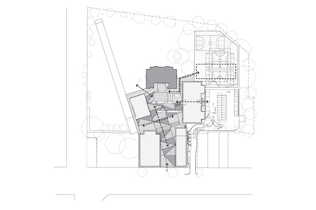
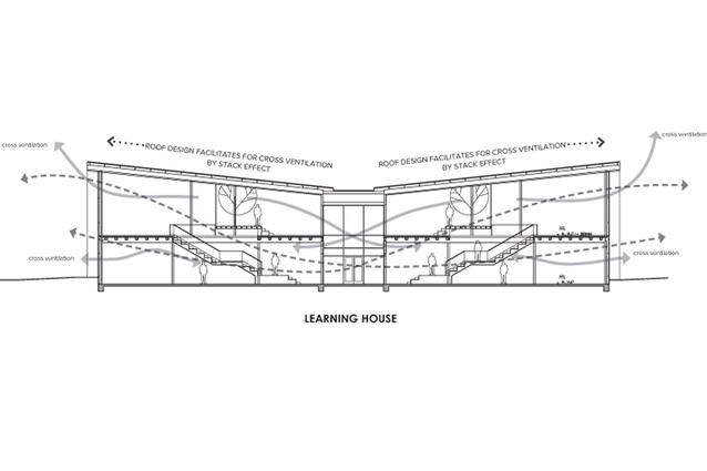
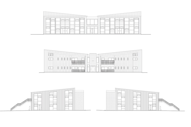
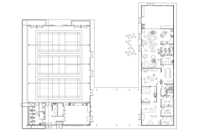
At Freemans Bay, RTA follows a similar approach. The campus, which had to allow for staged construction, includes four new buildings – a hall, an administration block, a Māori immersion unit and a two-storeyed classroom block (‘Learning House’) – and retains the classroom block from the 2000s. The architects arranged the buildings around a central open space, with the hall, the administration area and a covered entry space pushed hard up against the street frontage.

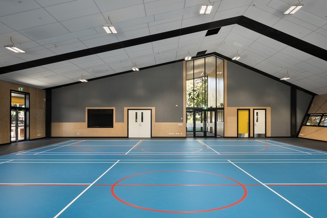
Where the old school buildings sat back from the street, RTA’s new arrangement promotes engagement – literally and symbolically pressing the life of the school up against that of the wider community. During the morning drop-off and the end-of-the-day wait, the sheltered entrance encourages families to linger and chat with each other and with passers-by. The school hall can be entered directly from the street, emphasising the expected role of the building in the community.
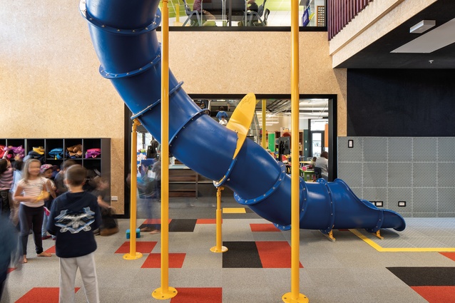
The teaching spaces are full of amenities, including many that can serve multiple purposes: seating steps, wet areas, kitchens, fab labs, break-out rooms, a large slide and withdrawal areas that double as play forts. The architecture provides plenty to do, which perhaps explains why there isn’t much furniture; the open interiors are intended to be adaptable to a variety of activities. The architecture is also full of fun; the classroom and playground have merged, demonstrating the expected role of physical movement in learning.

The collected innovations demonstrated in the school are a marvel, given the Ministry of Education’s constraints. As with much under the government’s Tomorrow’s Schools, oversight of the design of new school buildings was devolved to school leadership and boards.
The MoE, however, still retains a high degree of control through sets of rules covering key parameters, such as classroom numbers and sizes, as well as through guidelines for technical issues, such as ventilation and acoustics. It also retains a veto – the ability just to say “no” to anything the particular MoE property manager doesn’t like.
For RTA Studio, much of the pleasure in the Freemans Bay project was in the ability to reconcile the wishes of the school community who will use the building and the constraints of the MoE who paid for it – two sets of constraints that did not initially align.
So educational architecture is indeed tricky. Designing a school requires that architects resolve often-incompatible constraints and accommodate a loosely defined and evolving set of teaching and learning tasks. The interiors at Freemans Bay have excited ILE fans but it is in the external moves, where the project extends the civic quality seen in Kawerau and Wairoa, that Freemans Bay may have taught architects something.
In the two former projects, the buildings were designed to address fairly distant landmarks. At Freemans Bay, the project is pushed up to the street and into the city, and it explicitly invites the community to enter. Maybe we are still not sure how to teach but this project shows us how we can create new institutions that promote engagement in and with the city.
This article first appeared in Architecture New Zealand magazine.


