Te Uru
Anyone who has ever spent time upon the ocean adjusting a sail to the whims of the breeze is likely to understand this new, west Auckland gallery in ways entirely different to those of most pedestrians.
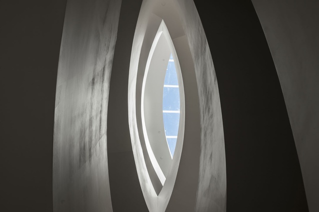
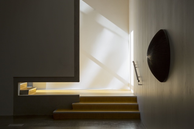
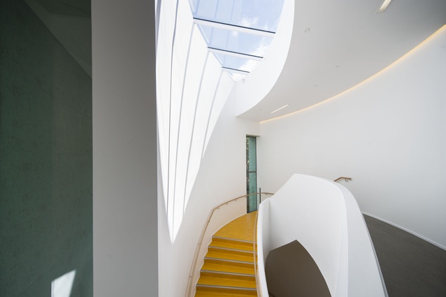
Its main staircase unravels from a skylight reminiscent of a crab claw sail (the inverted triangle type) found in traditional boats throughout the Pacific. Sunlight sips onto a nearby curved wall projecting muntin bars in yet another subtle allusion to nautical forms. Its thin, wooden handrails are arched much like the spars that connect a traditional outrigger to the hull of its main pirogue.
One can add to this reading the fact that the gallery’s name is derived from ‘Te Hau a Uru’ (wind from the west) – a reference to the air currents the Waitakere region contributes to Auckland’s nautical and other ecosystems.
Much like the moods of a full sail, each of the five individual galleries that make up this six-storeyed building inspire sensations of tautness and release, compression, vastness and even vertigo as dictated by various ceiling heights, natural light, voids and sight lines to the nearby landscape.
“Compression and release, or tension and release, is what makes it work,” says Julian Mitchell from Mitchell & Stout Architects. “You tend to modulate the spaces; you have some… that are quite high voids and smaller spaces that are more compressed, closed and intense for different sorts of exhibitions.”
The sentiment is echoed by Te Uru’s director Andrew Clifford: “There are points where you catch your breath, but there are also walls that angle slightly giving you an exaggerated perspective… it adds tension. It is not just a box.”
And, in an era when the design of galleries and museums seems to follow a dichotomy between the ‘squiggle’ and the ‘white box’ – between the monumentalism of Frank Gehry’s Bilbao and the quiet interiors of Renzo Piano –Te Uru seems comfortably anchored between both poles.
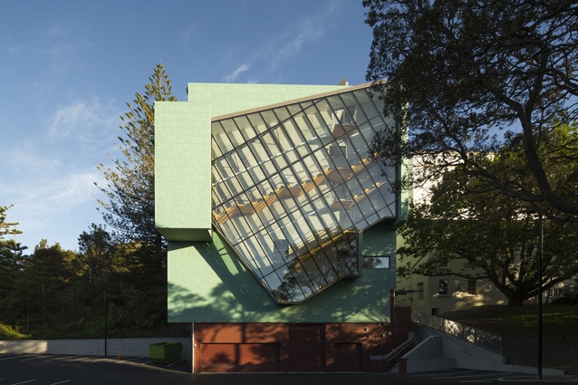
The colour scheme here is bold and includes a façade painted green like copper patina. The ‘golden sunset’ yellow on the floor of the internal stairs is explained by Mitchell as hoping to “give the place a lift and a bit of joy, and it is probably to some extent a little reference to the Paimio Sanitorium by Alvar Aalto with its yellow vinyl stairs… I know there are some colours that I would have chosen that people would perhaps be more surprised about!” he jokes.
The central core of the building extends throughout its six storeys and has been left in concrete: a somewhat unusual, britle material choice for a business that makes its living from hammering and refilling holes on walls.
“It breaks it up a little so it is not just white walls everywhere. It gives the architecture a little more weight in the conversation… and I guess it is a little bit of a nudge to us to maybe not put art everywhere and let the building speak,” confers Clifford.
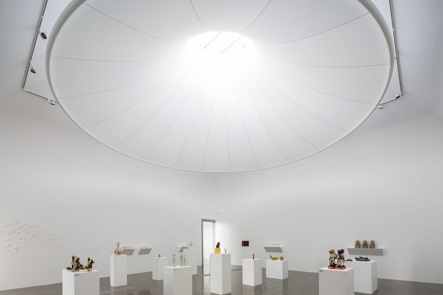
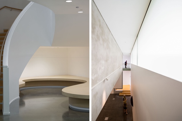
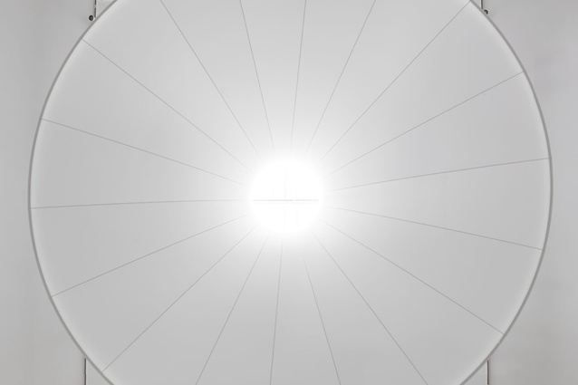
Other grand gestures of the interior’s design include a transitional space on the top of the main stairs where there is a bridge, its curvature emulated on the ceiling. There is a playful cut-out that allows a handrail to transverse an internal wall and a similar one in Gallery 1 that serves as a navigation aid. There is a jaw-dropping, Anish Kapoor-like light diffuser in Gallery 2. There are small, balcony-like alcoves that serve as unexpected frames for artwork, architecture or people-watching. “That’s kind of a great deal of what excites us about public buildings… there are always people coming and going and you don’t know who they are… so the people become part of the choreography and the artwork as well,” says Julian.
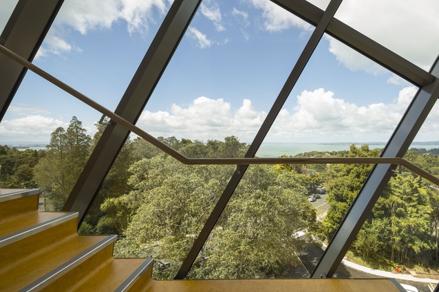
“It also happens with the view,” continues Claire Natusch also of Mitchell & Stout, about the gallery’s stunning views of the Manukau Harbour. “We closed off the view completely in areas and then, as you walk around the corner it’s all exposed… there are little glimpses of something always happening through the gallery.”
But it is not all about design flair in Te Uru’s interior. Although Mitchell and Natusch point out the influence and admiration they feel for strong, gestural designers such as Josep Lluís Sert, Peter Zumthor, Steven Holl and Álvaro Siza, there are also several moments of architectural restraint and eloquent silence.
There is a small platform on the top floor overlooking the view; there are many clever ways in which natural light is brought in and diffused into the various galleries (one of the main design drivers for the interior). There is a compact tenseness in Gallery 4, there is a rather instinctual flow at play.
So, on second thought, the maritime reading of this interior – one highly influenced by David Mitchell’s (Julian’s father and also part of Te Uru’s design team) recent contribution to the Venice Architecture Biennale – is probably too narrow for the breadth of this design. As one descends the sculptural main stairs, the nautical forms seem to morph into koru-like undulations. There is a seating space on the lowest landing that looks almost as though it were designed by Gordon Walters.
There is choreography (David’s words), there is a respect for its surrounding nature and the neighbouring heritage structure (Lopdell House) to which it has been subtly stitched. “It’s a bit like music this business of architecture,” states Julian and, yes there is plenty of that here too.

