Te Atatu Peninsula Library and Community Centre
Te Atatu Peninsula shows a particular kind of Kiwi ingenuity: faced with an interesting land mass – jutting out into the Waitemata– Harbour – its planners and builders have made it dull. The Whau River and Henderson Creek on either side are ignored. Instead, the main thoroughfare, Te Atatu Road, runs straight down the middle of the peninsula, as far from the edges as it could be.
The visitor driving past modest shops might think that this road will lead to something magnificent. But, as soon as the road reaches the middle of the peninsula, it stops abruptly before anything too exciting can happen. A roundabout disperses traffic in three directions and the road dwindles into a surburban street. The visitor has reached neither an end nor a centre. Nothing stands out or commands attention. Te Atatu Peninsula’s most prominent building is a supermarket.

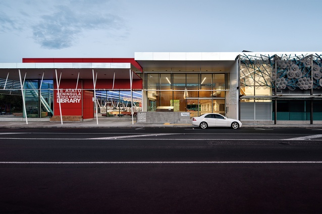
Moller’s new community centre and library building has been placed near the supermarket at the end of the main street. This was the site of its predecessor, a simple work of municipal modernism that seemed determined not to make a fuss. Like that building, this one comprises a community hall, a library and some smaller rooms. These are joined by an entrance foyer and a broad corridor between hall and library.
These elements are unexceptional. In plan, it is unprepossessing: reminiscent of the community buildings built for provincial towns in the 1950s and ’60s. Enough rooms are provided for the community’s needs, enough space is provided for circulation and there are enough toilets. No extravagance is allowed. The plan could have been a work of plain and simple draughtsmanship, made with T-squares and 2H pencils to a strict budget.
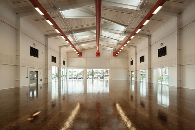
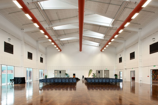
But on this simple plan, Moller has made something bold. The design comes into its own in elevation. Both hall and library are boxes but each becomes a dynamic space. The hall has been given a roof of two intersecting gables that create dormers to provide natural light and break the ceiling into alternating spaces and voids. Inside, beneath the gable, three pipes run in parallel along the length of the hall, two of which hold electric lights.

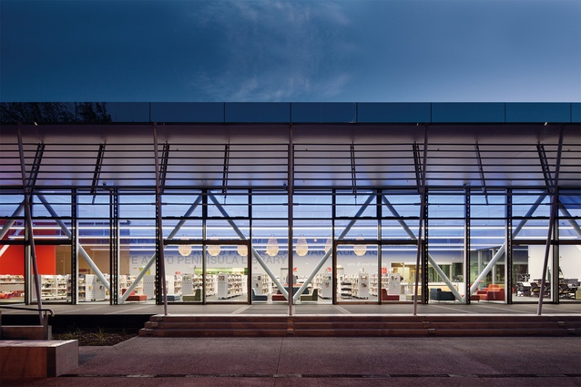
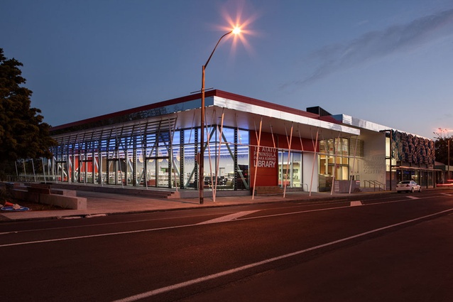
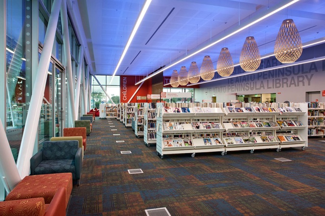
The library is a double-height glass box. The glass is articulated by its frames and by the diagonals of the tubular struts that support the roof. It is reminiscent of 1970s’ high-tech: a space held by its supporting members. The interior is severe. While other new Auckland libraries are divided into multiple spaces for various uses, this one remains a single volume. Its spaces are created by screens and by furniture, not by walls. A clear division is made between architecture and decoration. This is not a library of nooks and corners. This is no place for whimsy.
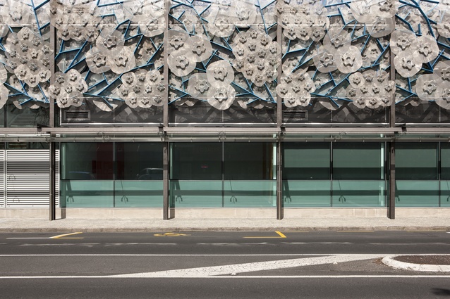
This austere and serious architecture is enlivened by colour and applied objects on the exterior, most notably sunscreens designed by the sculptor Chiara Corbelletto. The old building was reticent: a low brick building set back from the street by an entrance courtyard. The new building is extravert: built up to the pavement, making its mark. It marks the end of the street and makes itself a centre, both in terms of the services it provides and in the definition it gives to the suburb. It makes the slovenly wilderness of suburban streets surround the peninsula’s centre.

