Sweet isolation: Wyuna hideaway
A lush home at the edge of the world provides a majestic haven with views and inherent calm.
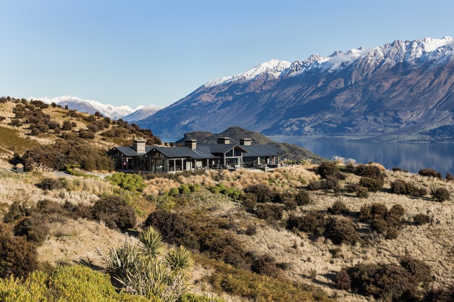
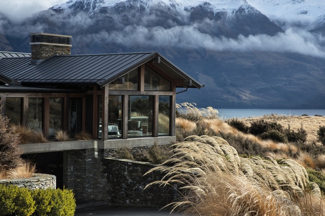
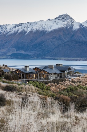
Wyuna Preserve near Glenorchy is “at the bottom of the world and the end of the road”, says Mason & Wales architect Hamish Muir, and that is one of the main appeals of the development for clients who want a combination of privacy and pristine views in a wilderness setting.
Many of the owners of the large, vegetated sites at Wyuna – including the owners of this home – came to it via a stay at the neighbouring Blanket Bay lodge. This internationally renowned luxury lodge is designed with a similar aesthetic to that of mountain lodges of North American towns such as Lake Tahoe or Banff and, unsurprisingly, it inspires visitors to want to stay on more permanently.
“It’s the big mountain views and the lake that draw people here,” says Muir. “They are summer and winter properties that get plenty of sun, unlike many Queenstown sites with similarly spectacular views, and it’s also only 40 minutes from downtown with stunning scenery along the way.”
Muir led the design of this house, dubbed the Twin Peak View House, following preliminary designs by Mason & Wales director Francis Whitaker. Unlike many projects of this size, the clients were absent for the majority of the design and build period, and Muir and his team met them only after the concept design was delivered and, after that, just a handful more times before the project was completed.
However, they knew the clients were interested in a similar style to that of Blanket Bay – and the rest they learned through careful observation. “When they were here for a visit, we would have three days of eating every meal together so it was quite immersive and it gave us insight into how they lived,” says Muir. “We didn’t talk to them about architecture but about fashion, travel, cars or food and, through that, we gathered an understanding for who they were.”

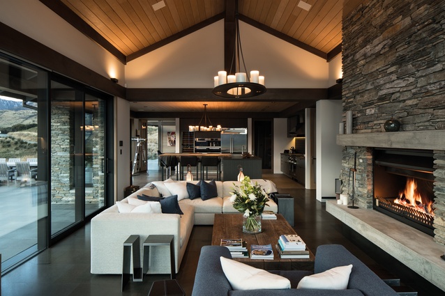
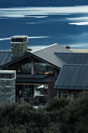
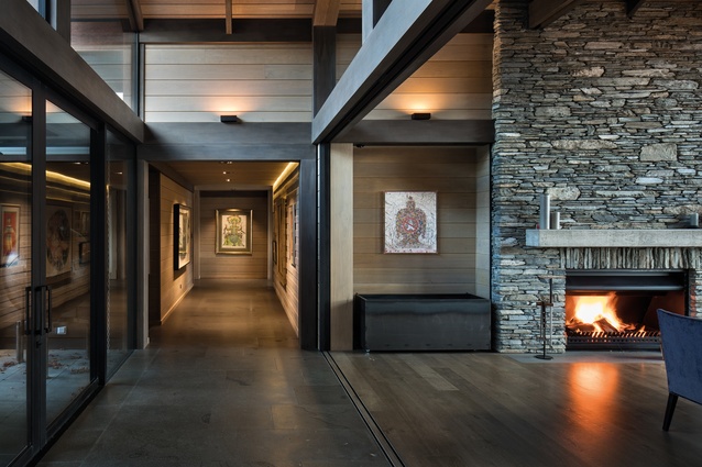
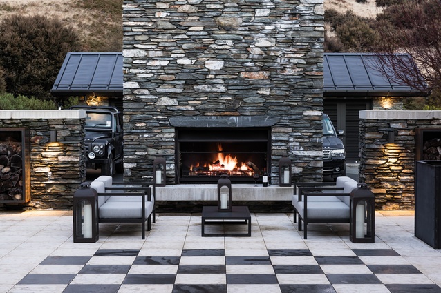
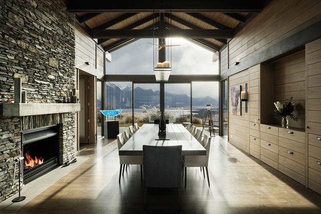
What is not immediately evident from the pictures is the sheer scale of the house. The timber posts – made of premium, dense, heavier-than-steel Purpleheart – are 300mm thick, instead of the usual 100mm. Local schist, taken directly from the site, is used to form bulky chimneys and thickly framed walls.
This sets up a scale that is oversized throughout. Battens are chunky, rafters have excessive tails and spoutings are massive. “All these layers soften it and help to make it look smaller. They didn’t want to show off,” says Muir.
The largeness of the rooms caused some challenges with the interior design, as normal-sized furnishings appeared lost but, fortunately, the clients were very decisive about what they liked, preferring a European aesthetic but requesting New Zealand-made whenever possible.
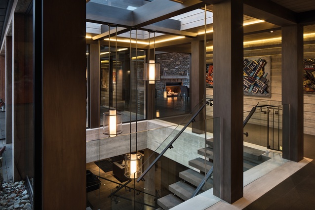
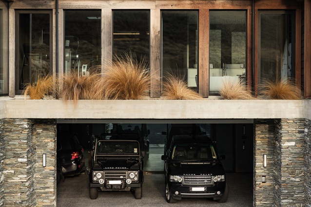
Floors are oak throughout the house, with the exception of the carpeted media room and the eight-car basement garage, which has the same rubber-feel flooring as does a Formula 1 garage. A shuttered concrete wall lines the main corridor, providing a neutral, yet textured surface for display of the home-owners’ extensive art collection.
Boffi features heavily in the kitchen and bathrooms, where it is chosen for a brushed-steel finish on tapware and a clean, clinical look in the bathrooms. The kitchen has a leathered-finish Boffi benchtop, which has a rustic texture that fits with the landscape and appeals to visiting chefs.
For Muir and his team, this project was an opportunity to introduce the clients to some interesting technology. In one of the en suites, a door that connects to the hot tub patio is glazed with iGlass, a product that uses an electrical current running through the layers of glazing to change from frosted to clear glass with a touch of a button. Each of the bedrooms has a television which rises out of the foot of the bed and every room is fully automated with heat sensors and blinds that silently rise and fall within the window frames.
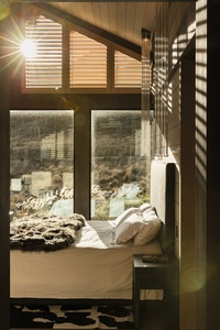
Surprisingly for a house of this size, there are only four bedrooms, but each follows the same scale as that of the rest of the house. A Californian King looks like a double in these rooms, each of which has been furnished with a slightly different style in fitting with the landscape.
The steel and Timaru Bluestone stair doubles as a lightwell, bringing daylight into the basement level. Here, more iGlass is used for the garage wall, to allow display of the home-owners’ impressive car collection – or not. A clear route is carved from the garage through to the bar, via showers, drying room, laundry and steam room: essential when returning home from a ski trip or hike in the surrounding hills. This galley area is fitted out in an industrial style, like an oil rig, with red Boffi valve taps on the showers and basins.
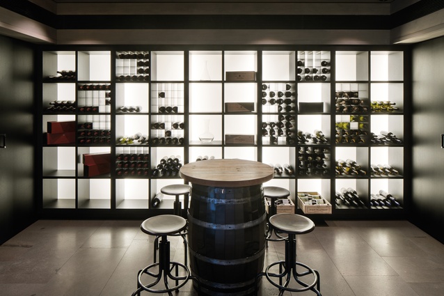
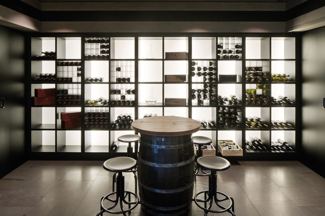
Once clean and steamed, it’s to the bar, with its commercial-level equipment and full pool table, or beyond this to the media room and wine cellar. “It was interesting for us to learn from these clients, who are accustomed to a different lifestyle from ours,” says Muir.
“This house has spurred jobs from other foreign clients, each of whom has different needs, depending on where they’re from. For most people, this is legible architecture – people know what a gable roof looks like and they like the connection between spaces. They like the way in which the house sits in the landscape – it’s commanding without being ostentatious, and it’s timeless.”

