Stripped to its bones for the planet
In Building 201’s extensive makeover by Jasmax for Waipapa Taumata Rau University of Auckland, Bill McKay finds the future of architecture is not about prioritising appearance, it is about taking climate change seriously.
Is this the futuire of architecture? Even architecture firm Jasmax calls this project a refurbishment but, really, it’s a transformation. It’s just an alteration, I can hear you say, but it’s more fundamental than that; the rationale underpinning the approach here is more radical and aligned with the responsibility of our role as professionals in a time of climate change. A recent BCI Central survey of architects found that, when specifying products and services, cost and aesthetics came first and second. Sustainability was sixth out of ten. Is our profession fulfilling its role to society and future generations, if we don’t take climate change seriously, especially when our designs and the built environment play a big part in carbon footprint and climate impact? But, here is the good news; this adaptive re-use project shortened the design and build time by a year and also resulted in an estimated cost saving of 25 per cent when compared to a new build. You can’t argue with that, if cost is number one on your list of concerns.
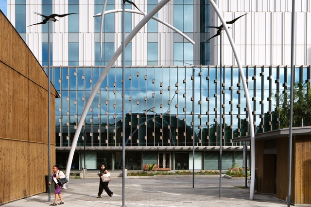
Many of us who have been through the University of Auckland will remember Building 201 as the Human Sciences Building, in Symonds Street between Manning Mitchell’s School of Music and a cluster of old merchant houses. Pat Hanly, who taught a generation of architecture students how to draw, would regularly walk us to the “inhuman sciences building”, as he called it, to develop our perspective skills by sketching this late-Modern big lump of a place from all angles: from bleak plaza, through skinny, nicotine-coloured corridors to dim interior rooms. Good for exercises in chiaroscuro but not particularly pleasant places to be. I gave lectures in the place a few years ago and always had to leave the architecture school early to find my way around the labyrinth.

The University of Auckland initially wanted a cheap and cheerful do-up, aimed at extending the life of the building by another decade or two, as is the New Zealand way. But it turned out that asbestos was all over the place, the concrete cladding was spoiling, there were seismic issues and so on. The usual story, so far, but Jasmax then organised a series of rapid-fire workshops with consultants and it seems the University’s Simon Neale, boss of property, was a big part of gaining client approval for a more far-sighted approach.
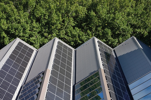
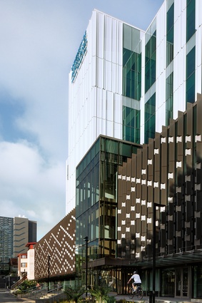
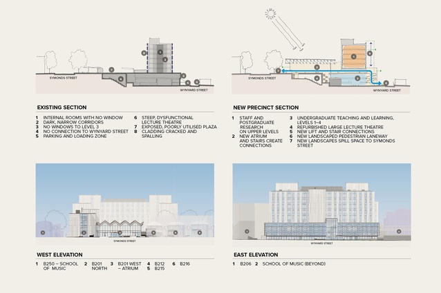
Basically, the building was stripped back to its bones of concrete columns, floor slabs and beams. Given the carbon footprint of concrete, it doesn’t make sense to demolish a lot of it, chuck it in landfill and pour some more. To deal with the strength of the structure, the heavy cladding has been removed and replaced with a new and much lighter one, made mainly from recycled aluminium. This new cladding has the great advantage of also being more thermally efficient. The extent of glazing has been increased but, of course, the glass selection these days is able to deal with letting the good stuff like daylight through while minimising heat gain. We often think of big buildings in terms of heating them but (and especially in subtropical Auckland) the big issue is cooling them.
Air conditioning is set to increase globally with climate change and contributes to the heat-island nature of our cities. The building’s new envelope also adopts the principles of passive housing in that its airtightness reduces the need for heating and cooling, which also reduces ongoing building operating costs. For fresh air, windows automatically open and close. Even in a building on a busy street in our country’s biggest city, I’d rather breathe Auckland’s air directly than have it filtered through traditional heating and cooling systems.
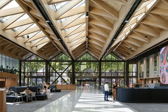
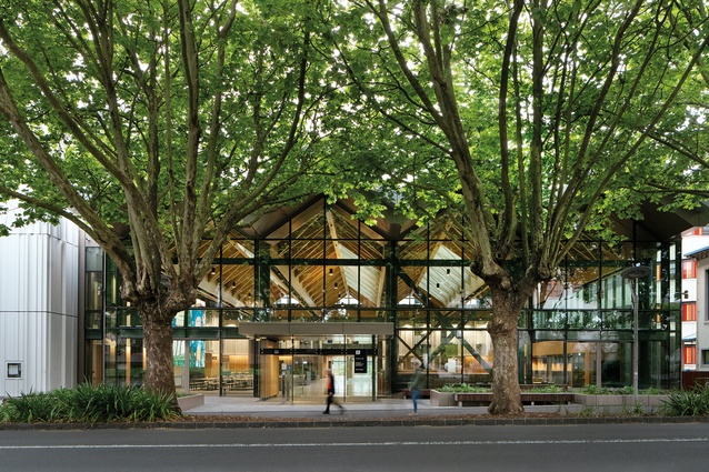
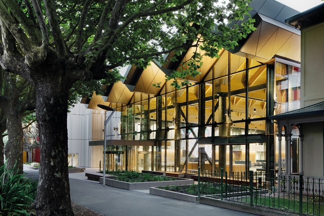
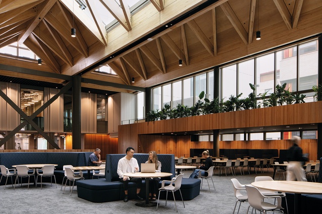
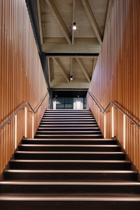
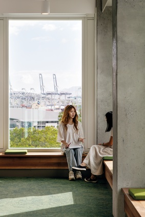
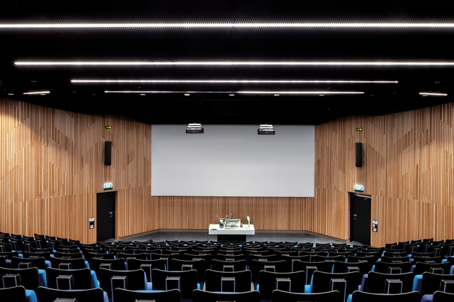
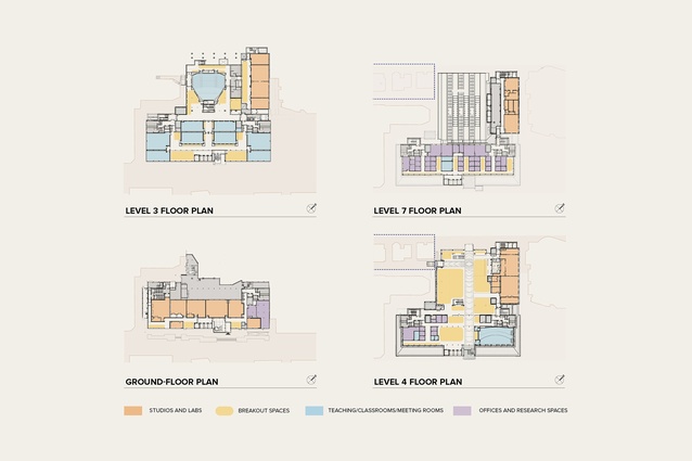
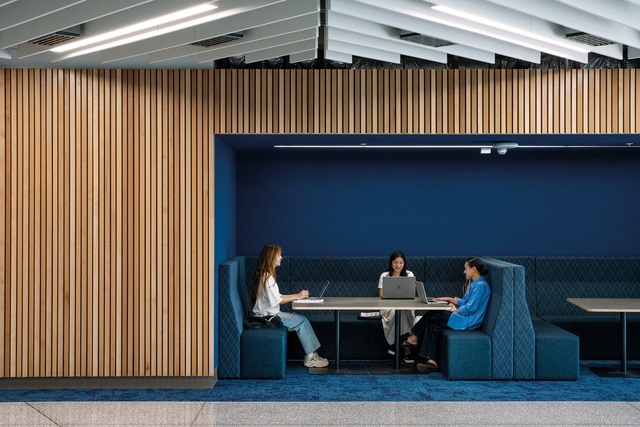
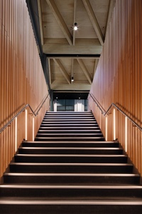
So, what is the building like to be in? The biggest change you will notice from the street is the old plaza has gone, built over with a folded structure of engineered timber and steel, creating a large and airy atrium. It is set back from the street front slightly to accommodate the driplines of Symonds Street’s plane trees, but still seems to create a welcome frontage and nice big social space with lots of spots for working or talking between lectures. With universities worldwide moving away from what they call chalk-and-talk lectures, more of this kind of space is needed. The corridors are broader and the external ones, with new glazing, now allow built-in seating to provide spots for waiting and working. I was surprised to hear that the stair pitch still complied although, of course, staircases have been upgraded. New lifts have been inserted in more sensible places and the old wells reused for services and air movement.
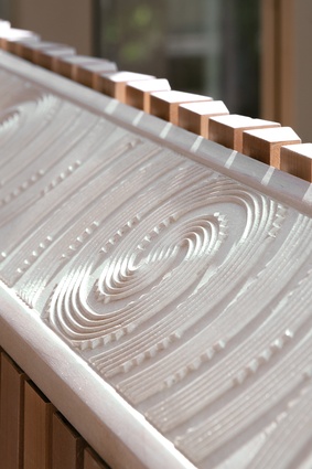
The big move in terms of planning has been to push a through-site link from the entry to the rear. When the building was originally designed, the area to the east was pretty much all service lane but, now, with a marae and Pacific Studies fale there, as well as a short cut to the Business School, a connection across the site to the rest of the precinct is not just great in terms of access, it opens the whole place up to eastern daylight and a view across Grafton Gully’s motorway ramps to the green hills of the Domain. This is a major improvement in a new or casual user’s ability to navigate around the building. Allied with this, there is more of a sense of place. The university’s Waipapa Marae is located very close to the site of a Māori landing place for waka, before foreshore reclamation, and a 19th-century hostel and trading area. The ripples from this period of history are evident throughout the new building in the work of Haumi and Karl Johnstone. Various works and details are intertwined in such a way that they become almost like a conversation rather than being big statement pieces. This interleaving, weaving is extremely appropriate to what is, after all, a place of interchange of ideas, thoughts and knowledge, pathways and journeys.
What does the place look like from the exterior? If you are one of those architects who puts aesthetics second on your list of things when specifying products and services, you will probably shrug your shoulders over the aluminium cladding. In terms of appearance, I am not a great fan either; it seems a large, white iceberg of a place. The east side’s screens are much more engaging with twisted facets like little nicks. But, that is the point I was making at the beginning of this piece. The future of architecture isn’t about prioritising appearance, it is about continuing to make the world a better place. And, these days, that means engaging with climate change in a meaningful way.

Anne Lacaton and Jean-Philippe Vassal won the Pritzker Prize in 2021 through a similar approach to existing buildings and adaptive re-use as we see here. Jasmax has taken this building and transformed it into the country’s most highly rated building in terms of sustainability: six Green Stars. And, if you are one of those architects who puts cost at number one when selecting services and products, a year on the build was saved along with an estimated 25 per cent of the cost of a complete rebuild. Not bad.


