St Cuthbert’s College Performing Arts Centre
Performing arts centres come in all shapes and sizes, many of them seen by eager architects as licences for swirly expressionism, remembering from first-year history that, according to Goethe, architecture is apparently frozen music. Actually, Daniel Libeskind first found fame as a young master of the accordion; such skill would be handy for any architect faced with compressing the client’s brief, not to mention the architect’s aspirations, into the site and budget. David Mitchell is accomplished at the fiddle, which explains not just his manifold achievements but, also, the plan of The University of Auckland School of Music. Anyway, I digress as usual. Goethe had the baroque in mind when he coined his aphorism but, in the Auckland suburb of Epsom, Architectus has composed a performing arts centre for St Cuthbert’s College that is highly effective although characteristically cool.
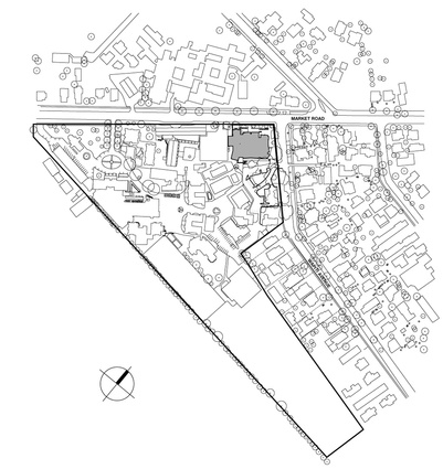
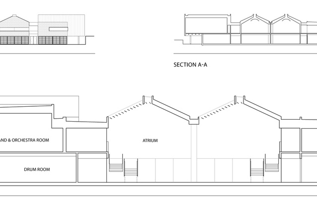
The design is driven primarily by the need to fit into the context of the urban environment, one full of lawyers and wealthy neighbours – I mean a street full of villas, bungalows and mature trees. But seriously, the complex is sited on the corner of a main road and a residential street: a site only recently acquired so still zoned residential and not part of the school’s development plan. It was important to continue the college’s public frontage at a respectable scale along Market Road and to mark the corner adequately, while also respecting the scale and character of Wapiti Avenue, its heritage houses and decent-sized gardens. And this being a performing arts centre, it was also crucial not to let a hell of a lot of noise leak out of the complex. Luckily, this site has a handy topographical fall to the north and the main road, allowing a two-storeyed structure for the most part but a great deal of big noisy rooms to be tucked underground.
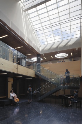
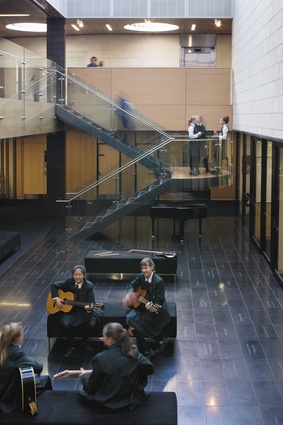
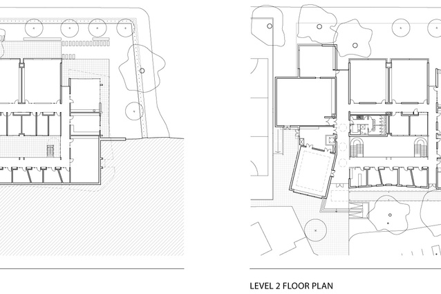
To draw daylight into the heart of this partially buried building then, the spaces are arranged around an atrium, with music mostly on the upper level, drama on the lower.

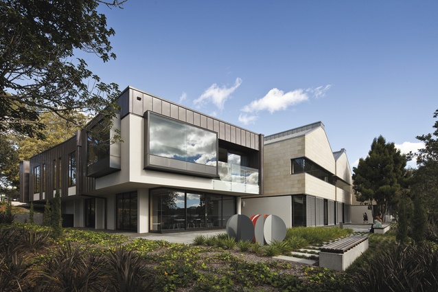
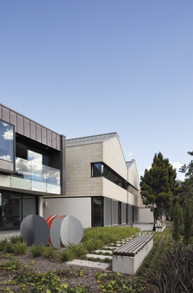
Along the main road frontage, the public face of the school, the building is broken into a series of two-storeyed box and gabled forms, set back from the street behind a screen of both existing and new trees. These forms are expressive of some of the larger classroom volumes and the functions of the building, and they can also be read on the inside, clustered around the atrium. Many are finished in Hinuera stone, a reference to the school’s chapel, and some are copper: all materials that will weather well and a palette that starts to tie together the school’s array of structures.
Turning the corner into quiet and leafy Wapiti Avenue, a long copper form enlivens proceedings, a few windows and bays giving a nod to the domestic scale of the street. As this snakes around into the school grounds with an undulating walkway, the scale drops to that of a school kid. It also sets up a nice bit of drama because, from the entrance into the building, its two-storeyed scale comes as a surprise and you find yourself on the upper floor of the atrium space.
There is no big public entrance directly off the streets as, unlike other performing arts centres, this is more a series of rehearsal and teaching spaces – public events mostly take place in the school’s existing hall. However, some of the larger spaces, along with the atrium, do give the complex enough flexibility to have smaller events here and cart docks are strategically arranged to service these. The partially buried nature of the building also means it’s a bit of a wunderkammer – you wouldn’t suspect it has a pretty large orchestral room, a choir room, a big black box as well as a several large classrooms and numerous smaller offices, practice spaces and, of course, storage for instruments of all shapes and sizes.
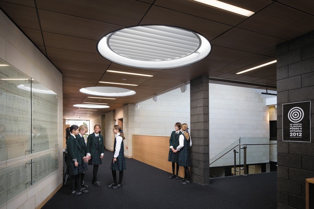
The atrium means many of these can open internally onto that day-lit space, rather than competing for exterior frontage. It also allows the complex to be cross-cut with view lines so, at points, you can see right across the building and also orient yourself very easily. Along with the atrium, the upper classrooms have top lighting that filters daylight creating a lovely, quiet, pleasant quality of light. Circulation is generous, allowing its use as break-out space for small groups and conversation, while the staffroom is in a terrific spot, nestled back on the street corner facing north, opening out onto a terrace garden.
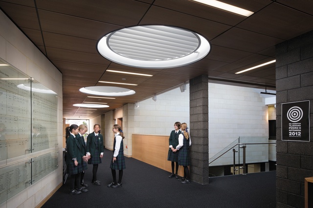
In terms of noise control, the building is pretty much all concrete block, allowing good sound reduction between spaces, with a variety of wall linings to fine-tune sound within rooms. This solidity also allows the structure to do a few more gymnastics, overhangs and cantilevers than the usual more-stolid school classroom blocks. Unfortunately, because of its location in a residential area, it has to be a sealed box with air conditioning. But sound is allowed to leak out slightly from the interior spaces into the atrium and circulation areas and this gives a nice sense of the building being alive and used.
As always, Architectus has delivered a well-planned and organised building, in their usual algid aesthetic. But while we have seen plenty of fizzy cocktails in the world of music schools and performing arts centres, from photos, this complex may appear to be a much cooler concoction. But Architectus seems to believe in buildings as infrastructure rather than expressive forms: stage sets that come alive with the presence of people. And it is appropriate that a rehearsal complex such as this should be a springboard for activity rather than the centre of attention. And here, with students clustered in the atrium, the lively activities in the various spaces and the sound of music seeping out of the rooms you pass by, one has a sense of shared endeavour, life and vitality that make it a lovely place to be.

