Spendvision
Camille Khouri explores an Auckland workspace with lots of colour, vibrancy and design quirks.
On entering the Auckland headquarters of transaction management company Spendvision, you might be mistaken for thinking you were looking at the offices of an energetic advertising or media company, not a place where the majority of the staff spend their workdays engrossed in coding. This sense of ‘young elegance’ is exactly what Spendvision requested from the interiors division of AECOM, says director of interiors David Morgan.
“Spendvision was a New Zealand company that has now gone global, with offices worldwide. There was no head office to answer to in terms of the design and workspaces, so we were able to offer up ideas and gauge their reactions. All the hard fit-out elements have been located close to the central core of the building, to allow a flexible zone around the outskirts where more workspaces can be added as the company expands.”
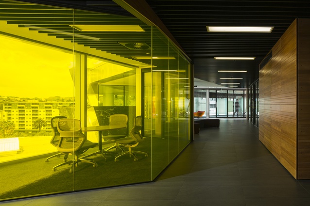
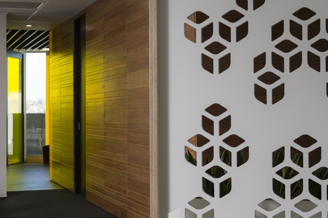
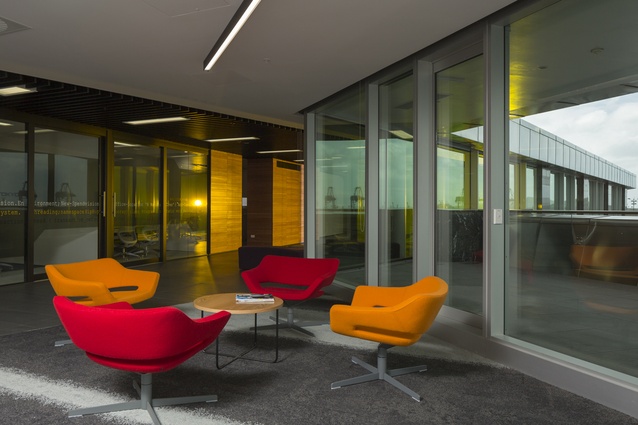
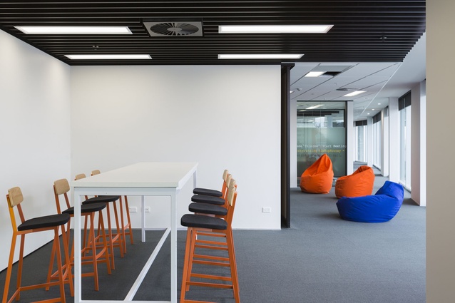
Native wood was one key request from Spendvision, reflected in the tōtara wall panelling in the entrance foyer. A yellow-tinted ‘daffodil room’ provides an illuminated splash of colour in this area. Furniture is comfortable and colourful, with beanbags used for informal meeting or ‘scrum’ spaces.
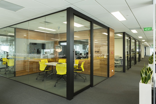
“Spendvision staff contributed to a virtual suggestion box for the design, and one of the results of this was the binary walls that wrap around the meeting rooms. These tell a story, a series of in-house jokes, as well as lending some privacy screening. The meeting rooms are named after cities where Spendvision has offices, a subtle nod to the global nature of the company,” says Morgan.
Wherever possible, walls are fitted with black markerboards to allow for easy notation during informal meetings. Patterned perforated screens provide some separation between desks.
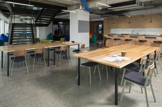
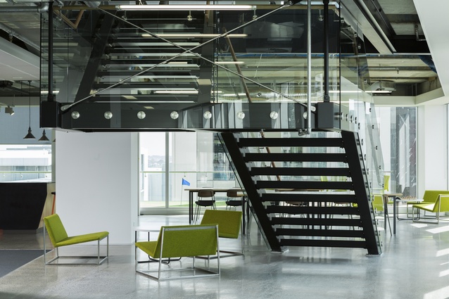
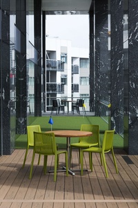
An internal staircase links the two floors and provides access for all staff to the café on the lower level, which features a gaming area, foosball and table tennis tables, and opens onto a wide deck with a putting green.
This space is differentiated from the workspaces by a polished concrete floor and exposed services on the ceiling. Directly above the internal stair, dot-matrix-style ceiling panels indicate the more serious objectives of the offices above.

