Snakeskin chic
From its bone-like verandah posts and sleek, blue-mirrored glass façade to its slender structural diagrid and rooftop oculus, Guy Marriage finds much to like in BNZ Place in Wellington, designed by Jasmax with fit-out by Studio Pacific Architecture.
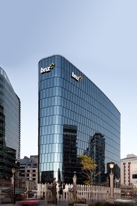
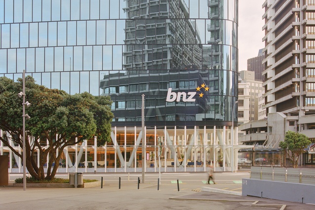
Wellington’s corporate office towers stretch out along the Quays, jostling to find the best view. A curious gap was left in this row of shiny teeth: the best site left empty except for a lonely petrol station. No more: Newcrest’s latest tower, BNZ Place, completes the grin with a shiny new tooth. Because it is on such a prominent corner, sitting almost directly in Parliament’s view shaft to the harbour, I’m sure that Jacinda and both of the Chrises have been enjoying a good eyeful of the construction. Back to work now.
The BNZ’s history in New Zealand is as old as the capital city itself; the company has constructed a succession of head offices, each larger and more impressive than the last. Starting off at Windy Point, with three classically correct sandstone temples to commerce, the BNZ progressed to “the big black one” aka Darth Vader’s pencil case (Stephenson and Turner, 1984), brooding malevolently over the city. Then, there was the short-lived BNZ Harbour Quays office campus (Jasmax, 2009) across the road from the train station: a groundscraper with large atria on reclaimed port land, sadly condemned after the Kaikōura quakes and obliviated. The bank was then scattered to the winds for seven years, occupying nine separate sites concurrently across Wellington, before this latest BNZ Place (Jasmax, 2024) opened.
Does BNZ have it right, finally, this time? Is this new waterfront site its forever home?
As it is with other new towers along the foreshore, constructed on reclaimed land, its structure is base isolated and well anchored to the rock deep below. The building has a strong diagrid external skeleton, courtesy of engineers Dunning Thornton, wrapped in a snakeskin dress of shimmering blue mirrored glass, stretched tight and leaving little to the imagination.
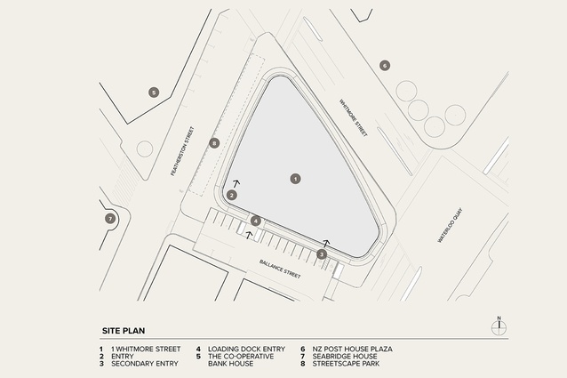
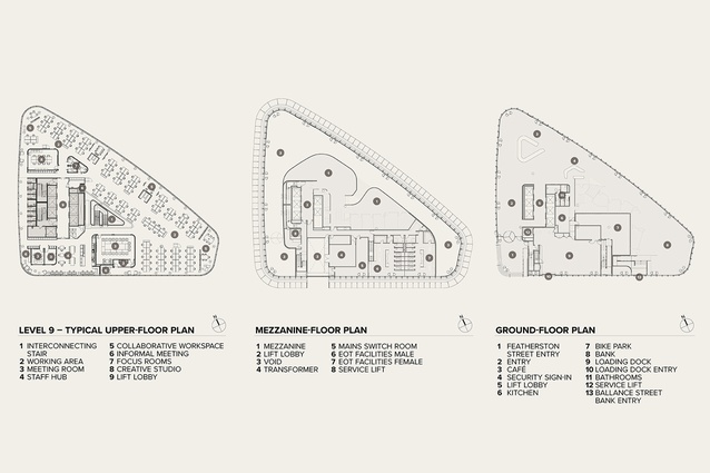
The site is an odd shape: no problem for a petrol station but perhaps more difficult for a tower. In a seismically driven city like this one, engineers may wish for a regular floor plan in order to calculate reactions more easily. The result is not square, nor triangular, and not quite circular, but somewhere in between. A lozenge, perhaps, or an odd-shaped egg.
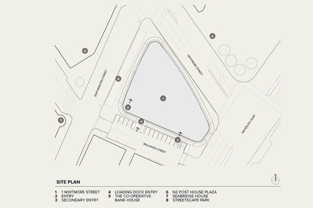
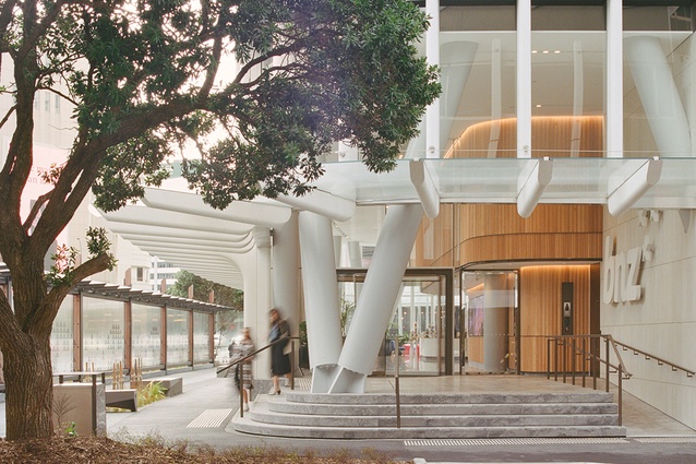
Jasmax architect Nick Moyes attributes this smooth exterior to a process of weathering, like a beached rock on the shoreline. As this corner is (in)famously the windiest central-city spot in the capital, the smooth striation of the exterior surface reflects the wind and the waves wearing away at the façade, streamlining it and leaving minimal traces. The building is fringed at the base with a series of white, bone-like concrete posts that support a glass verandah roof in a valiant effort to control the wind that whistles round these parts. They have a somewhat Calatravaesque flavour to them — not unlike the bleached bones of the Southern Right whale, which used to be hunted and flensed on the beaches nearby.
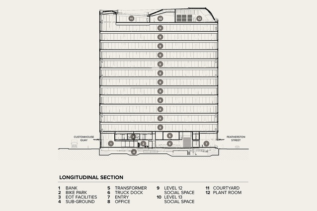
The fit-out architect was Studio Pacific Architecture, which integrated its design very closely with Jasmax, so the two companies worked in sync. At Newcrest’s previous Wellington building (Deloitte), a couple of blocks down the street, the façade gently flexes like origami at the diagrid joints and is clad in carefully positioned external louvres to keep the sun out. Here, Jasmax relies completely on the efficiency of the glass for temperature remediation, leaving smooth, unblemished skin. No louvres, no visible exoskeleton, less fussy but more anonymous. Arriving by ferry from the sea, the BNZ will look tall, refined and slender but most of us arrive by land these days and the proportions look very different. Aesthetically, it probably really wants to be taller but Wellington’s height limits restrained it to this more urban scale.
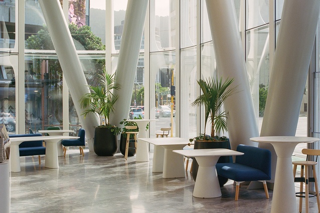
You couldn’t get much further away from traditional bank design if you tried, where solid stone walls kept the money secure inside and potential robbers at bay outside. Here, things are reversed, with no walls at all and, of course, no money anywhere to be seen. Mostly, the ground floor is given over to a café and appears white, light and bright; the entire outer clear glass wall looks out onto the encircling promenading verandah.
A small bank branch exists on the ground floor, too. It is possibly the most ethereal bank branch you’ll ever find, seemingly composed of two ATMs and no tellers, just one solitary (real!) human perched at a desk. Above the ATMs is a massive, flat display screen that curves around the corner, bringing passing eyeballs inside the building. A mottled grey marble throughout the ground floor keeps our feet anchored, while the core walls are wrapped in a warm, fluted timber finish, as though a giant timber Corinthian column has been unwrapped around the periphery. It is a beautifully crafted work from New Zealand southern beech wood, repeated at Level 1 with a half-sized flute, a human touch of nature amidst all the corporate-white, modern finish. Crisp and delectable.

The façade is a clever beast. There’s no doubt that this is an extremely competent building, well-designed and superbly engineered, but, by day, it is a relatively anonymous form. At dusk, the bulk reveals its suspended undergarments (aka the diagrid), lurking behind the surface, and is much more interesting. To soothe the corners of the plan, mullions do not rise continuously up in one go but, instead, they offset sideways by a third each floor, so some panels are curved, some are flat and some are both. Completing these surfaces in double-glazing required the massive panes of glass to be sent halfway across the world to be heated, curved and returned, in order to bring this effortless curve to you. The end result has the curious appearance of snakeskin, each panel overlapping the one below, as the building carefully slides around the corner.
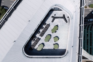
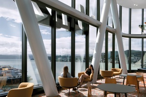
Unlike New York’s great 1930-era towers with their pointy spires and the bosses with the best views, BNZ Place has been inverted. The staff members have their space right on top, with stunning views and a lofty double-height volume above a pool table. A grandstand of stairs/seating steps down to the Level 12 staff space: light and airy, with stunning views out over the entire harbour front. Level 13 turns out to be the roof deck, an oculus open to the sky above with views out over the harbour and home to the staff BBQ. The bosses have no special offices — they desk it with the rest of the workers.
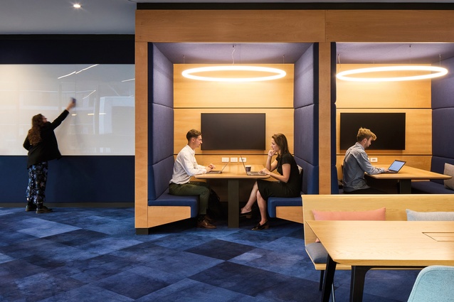
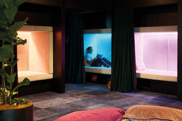
The fit-out is playful and welcoming, including amenities such as yoga rooms, wellness spaces, sleep pods, gym spaces, table tennis and excellent end-of-trip facilities — big, roomy bike sheds and changing rooms. It shows the post-Covid ethos at play here: a plea to the workers to come into the office to work and not to stay home any longer. So far, it seems to be succeeding. These may be the most inviting offices yet to be seen in the capital, and employees appear to love working there.

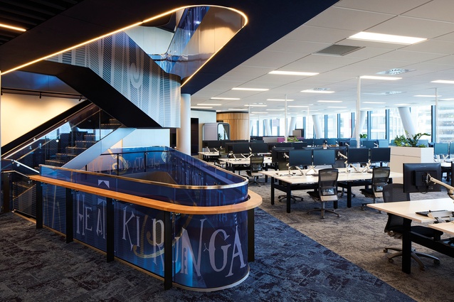
The large, column-free northern side houses the myriad workers, with an invigorating multi-storey internal connecting staircase running from Level 8 up to 12, set within a triangular cut-out. Studio Pacific’s collaboration with Te Ātiawa sculptor Rangi Kipa is evident most prominently around the internal stair void, where the words of a beautiful karakia are layered onto the glazed balustrading and, if you read it carefully, it climbs up all the floors towards the subtle Southern Cross lighting at the highest point of the stair. Studio Pacific carried the timber finish upwards to clad the cores on each floor, wrapping the personal spaces, like meeting rooms and lift cores, in the beech timber, working audibly as well as visually. This sets up clear zones and boundaries, reinforced by changes in carpet colour from blue to grey, all subtly in line with the corporate BNZ logo and colours.
It reinforces the navigation theme of BNZ as being New Zealand’s first bank, forging the way through the waves. This is a sumptuous experience of the banking journey, bringing the bank back to its spiritual homeground, making money on the shores of Te Whanganui-a-Tara. I’m picking it will be happy here for a good many years ahead.


