Sleight of hand
It is hard to think of a more apt name for Whoa! Studios than the moniker it has been given. The initial reaction when entering the complex is one of astonishment – even for someone a couple (ahem) of decades past the age of the intended audience.
Seemingly rising out of nowhere in Henderson’s backwater industrial zone, the ‘family destination’ was created using the bones of a tractor factory that stood on the site since 1955. Founder David Sutherland bought the building, after making his fortune selling a technology company he ran from his West Auckland garage, with the intention of creating something good for the community.
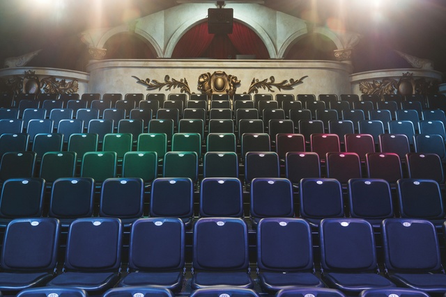
The resulting complex does just that, providing Henderson with an impressive drawcard, a fine dining restaurant (called The Grounds) and a happy escape for families. It houses four elements: restaurant, working film studio, theatre and playground.

The latter is visible from the carpark and acts as the first ‘whoa’ moment. A 12-metre-high woven scramble net created by artist Toshiko Horiuchi MacAdam is the hero feature, vibrant in its colours and clearly popular with small users and Instagramming parents.
So who designed all this? A true team effort: Orb Design was involved in The Grounds; Make Architects designed the front façade; Hayley Brown from Lou Brown Design did the foyer – but making all the overarching decisions and facilitating the different elements of the design was Sutherland himself, for whom the project was somewhat of a baby.
“I provided continuity with everyone on board,” explains Sutherland. “We really crossed over design and architecture with the film industry. All the electrics, roof, soundproofing, cladding, ceiling – were created with heavy input from the New Zealand film industry. There were three design elements we were hoping to merge: it’s a studio, a restaurant and it used to be a warehouse. Our aim was to be true to the warehouse aesthetic, but in a subtle way.”
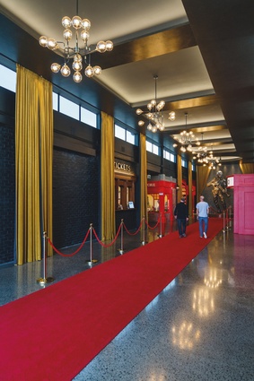
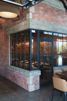
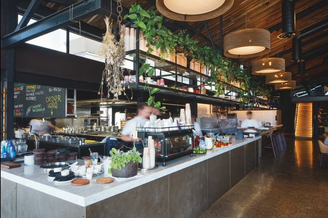
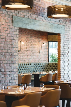
The floors and columns are original, with new life breathed into them through the use of grinders and polish. Rafters and trusses were removed from the restaurant ceiling to give it more height. The ceiling itself appears original, but like a lot of the details at Whoa! Studios, the distressed-looking pine boards are a product of the magic of set design. Similarly in the foyer and restaurant, the ‘brick’ wall was created using plaster casts of real bricks.
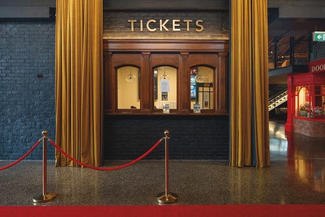
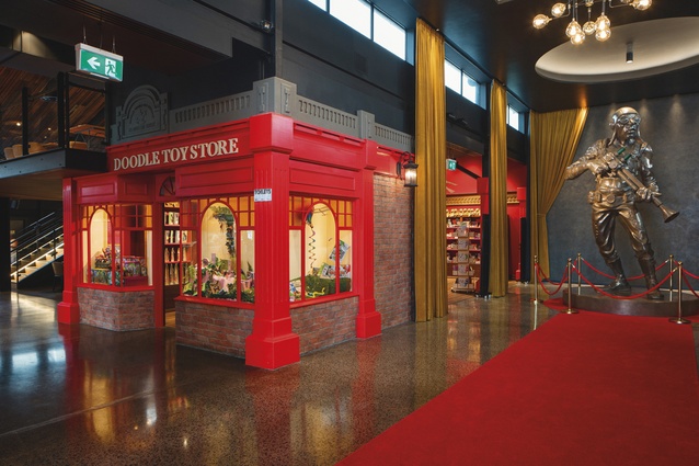
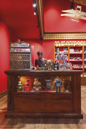
The result is a slightly industrial, village look that contributes to the sense of history (nods to the 1920s and art deco) and theatre evident in the foyer design, with its long, velvet mustard-coloured curtains and customary red carpet. The show’s villain, Doctor Gloom, looms large and gilded over the space, on a red-roped plinth, like an oversized and cartoon-like Oscars statue. The classic brick shoppe look reminds one of Disneyland – and when Sutherland hears this, he is ecstatic.
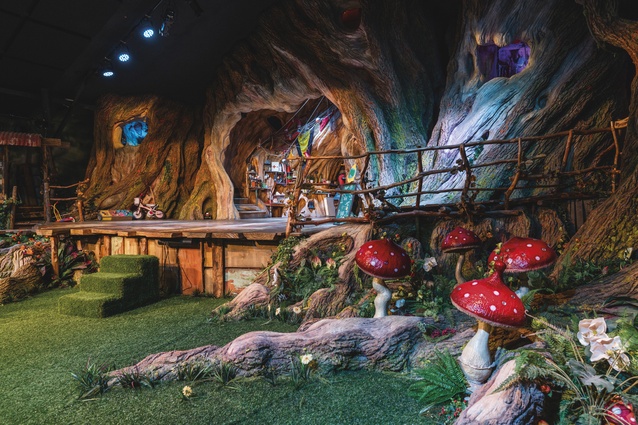
“Yes! That is entirely the sense of magic we were going for!” he enthuses. Through the studio doors, the magic really begins. A tree-house set that spills from the stage into the 115-seat theatre is stunning and highly detailed, to the quality of a film set. The theatre is decked out with the latest projection and lighting technology, says Sutherland.
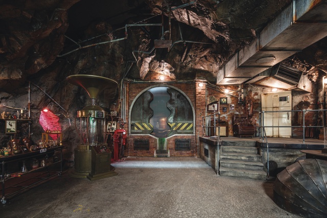
“The tree house is here to stay, but with projectors and lighting, we can transform it into outer space or project waves on it and make it feel like a pirate ship.”
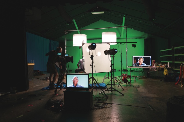
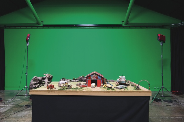
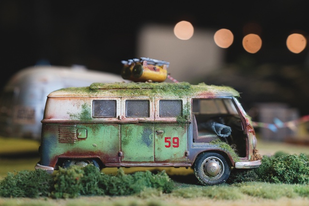
The studio continues beyond the doors, with a film studio that is currently being used to create a feature film with some of the same puppets that appear on stage. Scenes in the stage show are filmed in this area and projected onto the stage. The studio has green and blue screen technology and the walls are painted in the functional ‘studio black’.

Back to The Grounds, which has ex-Grove chef Benjamin Bayly in the role of executive chef, and the restaurant is bustling with everyone from families to business people having meetings. The intention here was to lift dining expectations in the West Auckland area and also to provide for a range of diners.
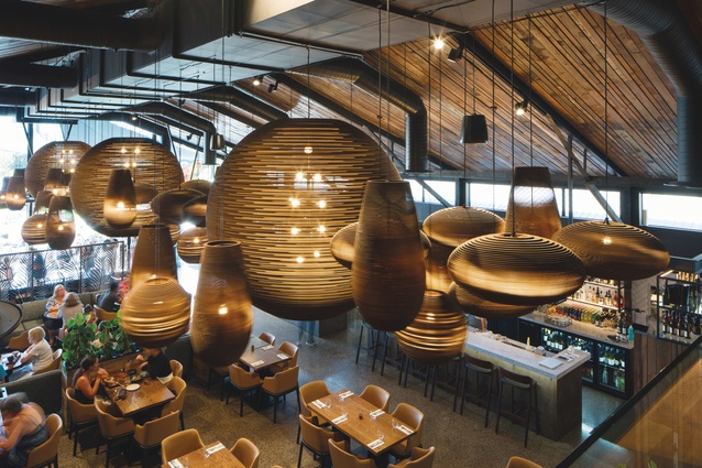
This sounds like no easy task, but it is executed successfully with comfortable furniture in neutral tones, and a layout that allows space for buggies and high-chairs but also some closed-off large tables and a mezzanine area for more private dining. The main reception and bar are able to be moved aside to make space for events. Sutherland sourced the huge, Graypants light fixtures that hang above the restaurant.

“This was a victory,” he says. “We needed something to fill the volume in the ceiling space. I contacted the company that makes these recycled cardboard fixtures and told them our story, and they came on board.”
Outdoor seating spills out towards the playground, allowing plenty of space for parents to relax while they watch their kids having the times of their lives. Leaving Whoa! Studios and heading back to the carpark, where it has started to drizzle, one feels a bit like landing back on Earth after being away in an alternate reality zone.

