Ship’s ahoy: The Houseboat
Built as an upside-down ship’s hull, this award-winning home in southern England brings the idea of an eternal, maritime summer to a completely different level.
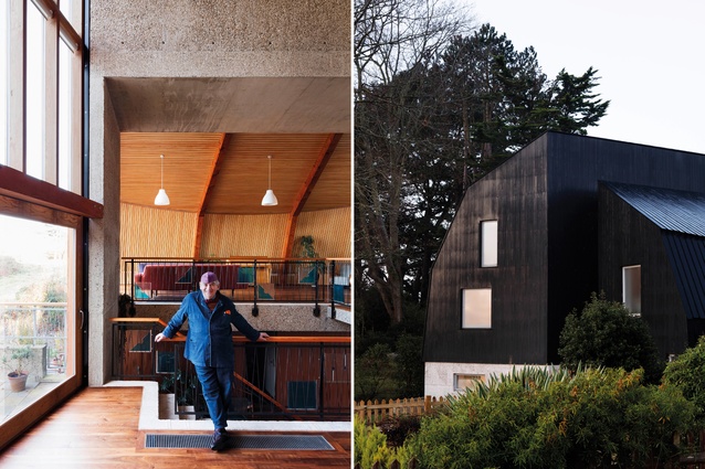
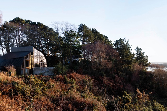
Designed like the upturned hull of a ship, sheltering its interiors from the coastal site in Poole Harbour in southern England, The Houseboat is a light-filled, lofty home with a difference.
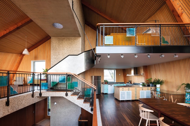
Its layout is a successful exercise in architectural experimentation that follows a design concept trademarked by its commissioning client, Roger Zogolovitch, and Solidspace, the company for which he is creative director. Named the Solidspace DNA, the concept arranges spaces for eating, living and working over an open series of half-levels.
“It is designed to give an internal experience with both volume and light,” says Zogolovitch. “All homes have a double-height volume within them, which generally allows us to make double-height, studio-like windows. These high windows allow more sky to be viewed from within, creating homes that feel spacious and are flooded with natural light.”
The arrangement also has health benefits in that residents are required to do a good degree of stair-climbing in their daily lives, as well as being able to soak up plenty of vitamin D.

The home is on the same site as is Zogolovitch’s family holiday home, the Boat House, which was constructed in 1936 around the salvaged interior of a transatlantic liner. Parts of the captain’s cabins and the second-class ladies’ saloon are integrated into the interiors of this home, which enjoys extensive harbour views.
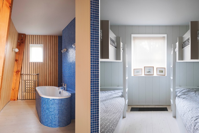
The Houseboat inverts the layout of the Boat House, says Zogolovitch. “At the Boat House, you arrive on the first floor and descend into the living room via a circular gallery into a timber-panelled room. The Houseboat has reversed that section. You arrive on the ground floor with bedrooms at that level, and lift to the upper floors, which are on three open levels, within a curved and high ceiling.”
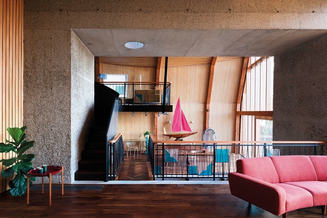
Zogolovitch commissioned architect Meredith Bowles to create the design, which received the RIBA Stephen Lawrence Prize in 2017. He requested the interiors be home-made in aesthetic, textured and evocative of the sea. He especially wanted exposed concrete to reference sea walls, and details that alluded to ideas of beachcombing and British seaside life. This was delivered by way of the selection of materials, especially the use of cast concrete with an exposed aggregate for the core structure of the house.
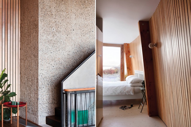
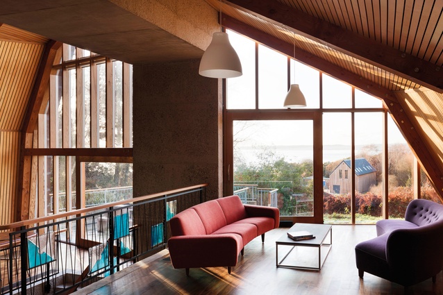
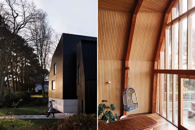
“This appears as a proscenium arch,” says Zogolovitch. “It provides the structural support for the Douglas fir portals holding the curved, hull-like roof. Without it, the house would have needed a cluster of columns, which would have destroyed the feeling of space. Light floods the surrounding spaces via the glazed, west-facing elevation.”
The concrete bridge that connects the kitchen and the sitting room is spot-lit from a circular rooflight above, adding to the theatricality of the arched ceiling. The top level, called the eyrie, is accessed via a winding, nautical-style steel stair with a curved steel balustrade. The interior of the staircase is oiled with Jade oil, which makes it velvety to the touch, while the outside is left raw and polished to a bright shine.
The floor uses solid black American walnut, chosen to fade in colour depending on how close it is to the windows. Different floorboard layouts add to the handmade eclecticism of the home. “All these materials – steel, timber and concrete – are traditional building materials that have been used here and exposed, meaning that the story of the making of the building remains evident throughout its life,” says Zogolovitch.
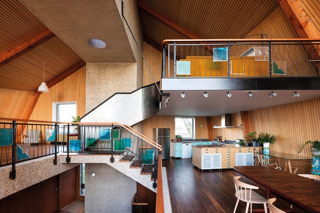
One such story is in the blue and green Italian Murano squares that adorn the balustrades throughout the main levels. These were a lucky find by Zogolovitch and are used to create an ever-changing arrangement that reflects light and colour through the spaces.
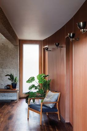
The curved walls caused some complications when it came to furniture choices, but the geometry in the centre of the space and volume is orthogonal, meaning that arrangements could be made around these edges, with the curved sides allowed to float.
For Zogolovitch, it is the clever combination of the unusual aspects of the home that make it work. “When viewed together, they are like ingredients in a cake: first separated but, once mixed together and cooked, offering a delicious and surprising amalgam,” he says.
This article first appeared in Urbis magazine.


