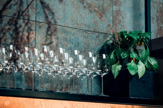
Sense of theatre: Lillius

Click to enlarge
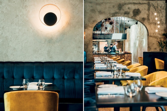
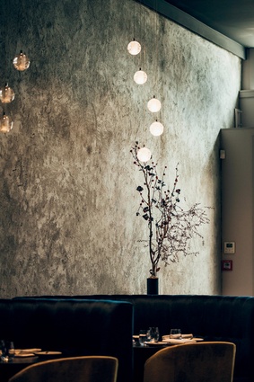
Lighting at Lillius has been chosen for its softness and visual interest.

Lighting at Lillius has been chosen for its softness and visual interest.

1 of 6
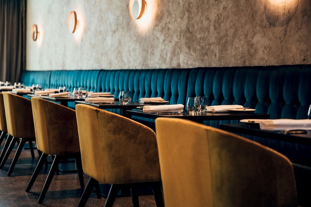
Velvet seating in regal tones is juxtaposed with the plastered walls and concrete floors.

Velvet seating in regal tones is juxtaposed with the plastered walls and concrete floors.

2 of 6
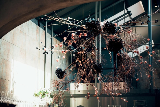
The dried-flower arrangement was created by Mark Antonia Ltd. This draws the gaze of diners back to the kitchen. Lighting has been chosen for its softness and visual interest.

The dried-flower arrangement was created by Mark Antonia Ltd. This draws the gaze of diners back to the kitchen. Lighting has been chosen for its softness and visual interest.

3 of 6
“Even if you sit in the curved banquette seats, your eye is drawn to the kitchen," say the interior designer Justin Roderique.

“Even if you sit in the curved banquette seats, your eye is drawn to the kitchen,” say the interior designer Justin Roderique.

4 of 6
The open kitchen at the rear forms the focal point so the dining area is left fairly stripped back.

The open kitchen at the rear forms the focal point so the dining area is left fairly stripped back.

5 of 6
The interior designers wanted to capture the grit of the original building while creating an inviting space.

The interior designers wanted to capture the grit of the original building while creating an inviting space.

6 of 6

Located at the top of Auckland’s Khyber Pass Road, Lillius is a new restaurant with the right mix of luxe and grit to fit with its city-fringe neighbourhood.

Although in the midst of a slow gentrification, the intersection of Symonds Street and Khyber Pass Road, along with the surrounding Newton Gully, still has a feeling of authentic urban culture. This has made it an apt location for Lillius, a restaurant which the founders, well-versed chefs Fraser McCarthy and Shannon Vandy, define as one of casual fine dining. 
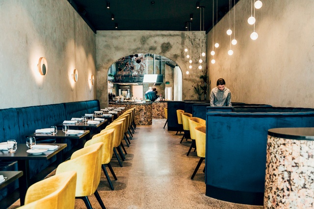
Velvet seating in regal tones is juxtaposed with the plastered walls and concrete floors.

The interiors, designed by Justin Roderique of Pennant & Triumph, reflect this balance between comfort and finery, with velvet seating in regal tones juxtaposed with the plastered walls and concrete floors. “We wanted it to look original. The existing space was quite rundown and tired but it had the arch doorway and a pitch through the back so it was already a cool space. We used natural stone with a gritty texture and flecks of metallic in the bar and counters.”

The dried-flower arrangement was created by Mark Antonia Ltd. This draws the gaze of diners back to the kitchen. Lighting has been chosen for its softness and visual interest.

The ceiling is charcoal-plastered to offset the walls and ground the space. The open kitchen at the rear forms the focal point so the dining area is left fairly stripped back, explains Roderique. “Even if you sit in the curved banquette seats, your eye is drawn to the kitchen. That was a key consideration of the layout and the material selections. We wanted Fraser to be the hero.”


More projects