Sense of craft: Sea Change House
With hills behind and the sea just a block away, this home was a gentle introduction to the city for a couple used to open fields.
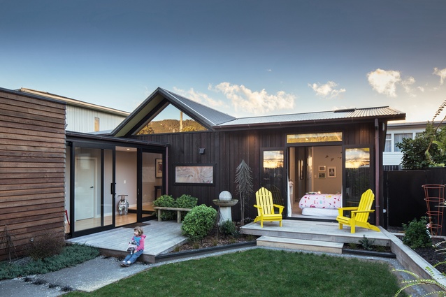
Named for the major lifestyle change the move to this house meant for its owners, the Sea Change House is a neat family home that manages to maintain privacy despite its tight suburban site.
The homeowners, a scientist and a building contractor, moved to the Wellington house in the suburb of Eastbourne from a lifestyle block in Whiteman’s Valley, around a thirty minute drive from downtown Wellington. Accustomed to wide open spaces, they were eager to make their suburban pad into something of an oasis and enlisted architect John Mills to make it so.
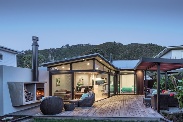
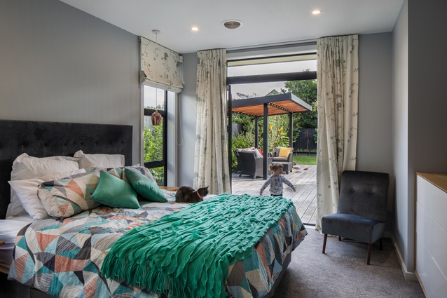
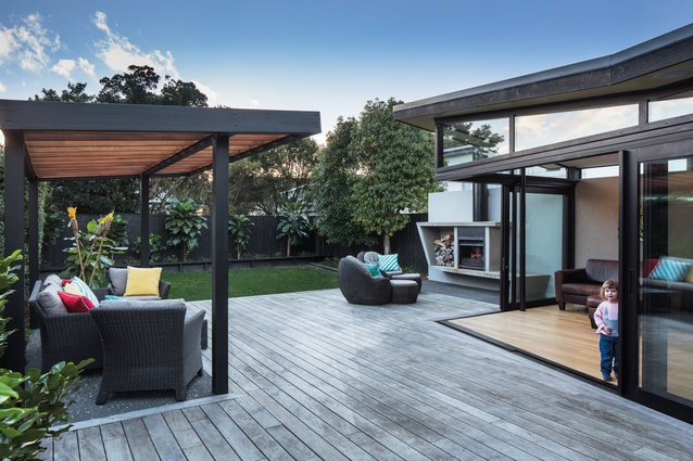
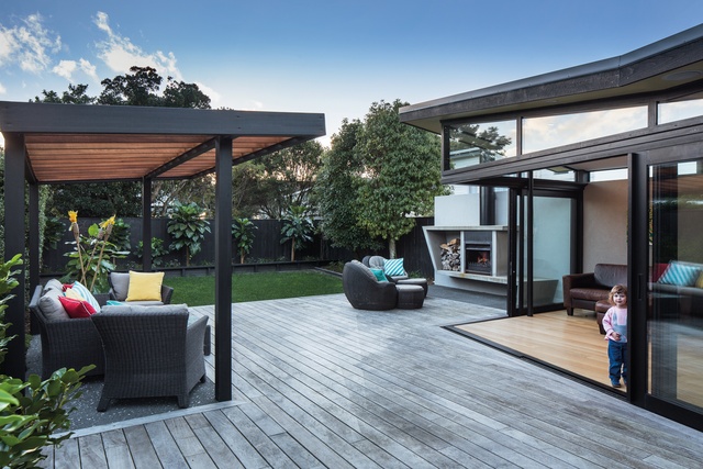
The house that existed on the site before the rebuild had a Spanish aesthetic with arched windows and a swimming pool that took up the back yard. That was the first to go, because as Mills points out, the Wellington climate doesn’t supply many swimming days. “In its place, we created a private rear courtyard with an outdoor fireplace. This area is close to the street but, from within the courtyard, you don’t have any impression of traffic or neighbours. It is all about being in the garden and being enclosed,” he says.
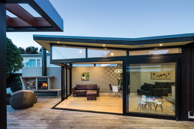
The interior flows effortlessly into the exterior, with stacking sliding doors that provide a seamless transition from the living room to the rear courtyard decking. The wall of the living room merges into the wall of the outdoor fireplace. The living room roof is vaulted and points away from the hills behind. This shape and angle is echoed by the fireplace, creating a further connection between the inside and outside spaces.
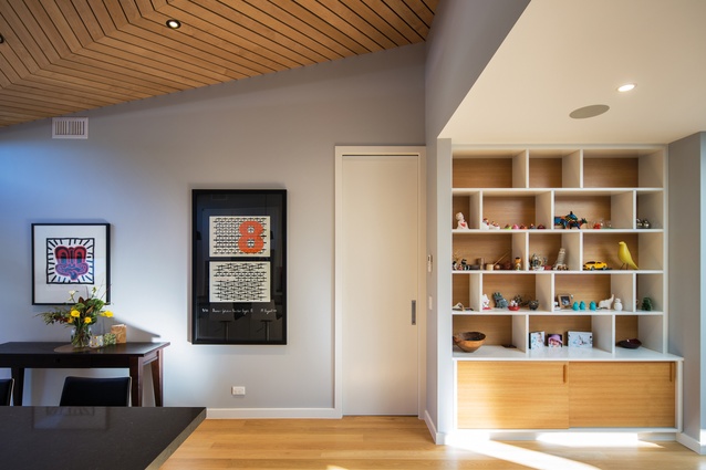
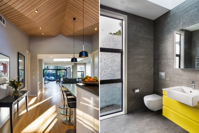
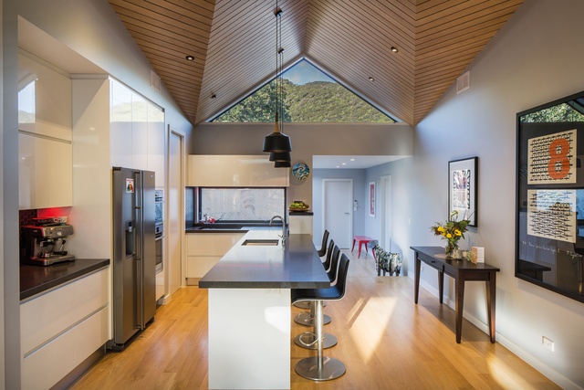
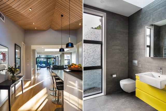
“Being a builder, the client wanted his home to express his sense of craft,” explains Mills. “This is how we came to the angular roof and, also, the vaulted square-dressed, maple-wood board ceiling in the kitchen. All the panels on the ceiling are skilfully mitred on an angle. The shape of the ceiling also provided the opportunity for the triangular window at the roofline, which takes in the view of the hills. It receives this lovely light coming through, especially at sunset, which changes the colours in the maple wood.”
In such a tight site, which touches the boundary on one side and is just one metre away from the fenceline on the other – bringing light into the home was essential. The living room makes up the centre of the home, with the bedroom wings on either side, so a substantial skylight was inserted to flood this family area with light.

Mills is known for his use of frosted glass, which he patterns by hand and has used in a number of his projects. In the Sea Change House, this features in the bathroom and near the entranceway, where it prevents visitors from peering straight into the kitchen. “This is very effective when illuminated at night, when you can see the leafy patterns, but it also gives privacy. I have being doing it for many years on a number of different jobs,” he says.
The delivery of this home happened to coincide with a delivery of another kind for the homeowners; their first child was born not long after they moved in. With its front and rear courtyards and series of unique and light-filled spaces, this Wellington home turned out to be a change for good.
MATERIAL SELECTOR
John Mills discusses the design of the maple-wood ceiling in Sea Change House.
The vaulted, tongue and groove maple ceiling in the kitchen is striking. How did you create the design?
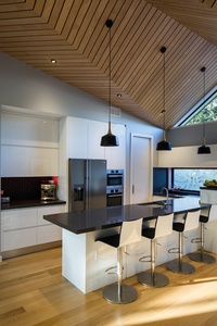
Working with the builder, we drew up a few options for the ceiling, which would be a key feature of the interior. The builder made a mock-up, and we went with this pattern. It reminds me of a dart from back in my high school days.
Why choose this variety of wood?
We liked the lightness of colour and the even grain of this warm timber. Its rich colour helps to reflect the most light possible into the kitchen space from the green hills beyond.
Was it a difficult task to construct?
It was quite a work of art and a labour of love. We lined it with plywood and secret nailed and glued the carefully-cut lengths one by one. It has been much commented on and the builder is a bit proud!

