Russell McVeagh
This law firm’s refit takes its cues from an impressive art collection.
Law firm Russell McVeagh recently turned 150 years making it one of the country’s oldest. As such, the firm has played a role at various national historical junctures (including the creation of Fonterra, among others). It is here that significant legal battles, retributions and counter-attacks have been strategised and where paper fortresses have been erected to prevent such belligerence.
“If you are visiting this place it is often on serious business,” says Natasha McIntosh Moorman (from MMiD) who was tasked with the re-fit of the firm’s Auckland and Wellington offices, “we also wanted it to feel like an extension of the lawyer’s home.” MMiD’s Auckland project also managed to bring a touch of warmth to the – more often than not - cold interior world of jurisprudence. “We wanted to give it a feel of gorgeous glamour… while at the same time being strong and businesslike,” confers the designer.
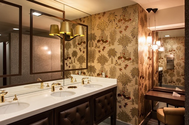
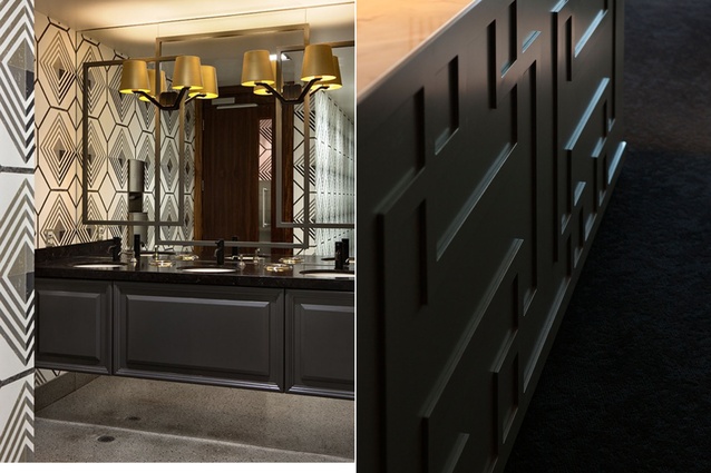
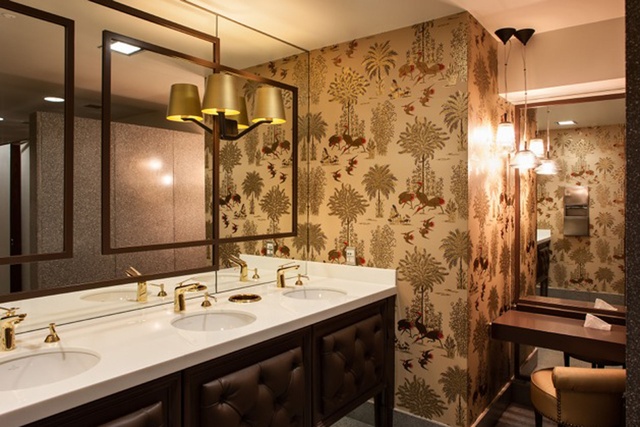
The project included reconfiguring reception and dining areas to add extra seminar and meeting spaces. MMiD updated some of the surfaces, such as original Eames bases, with new table tops in the boardroom and all meeting rooms, provided new cabinetry and furniture in all rooms and fully refurbished the bathrooms. All ceilings, walls and floors were addressesed to give an updated approach. This included sanding and re-polishing floors, custom made new carpet and rugs, walls re-coloured and painted, and a reduction of wooden surfaces in all areas.
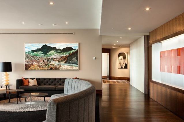
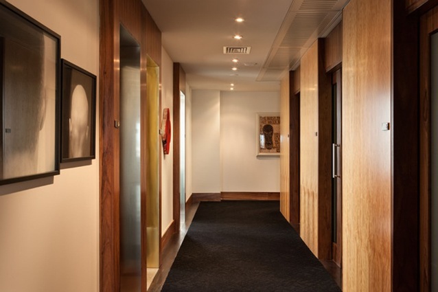
In Auckland’s iteration (completed in January this year), the golden doors of the Vero Building’s lift open up onto the 30th floor and deposit one onto a lobby runner carpet (Arcadia by Easton Pearson for Designer Rugs, custom sized and coloured by MMiD) depicting flowers and redolent with crimson, pink, white and green. The lift’s shine is replicated on the overhead light fixtures, which, when combined with the wooden walls hint at something earthy, verging on classic, and with a predilection for the streamlined elegance of art deco. McIntosh Moorman points to TV series Mad Men and Dick Frizzell’s Black Hills Diptych (more on this painting later) as visual reference for their design.
The firm’s original fit-out was conducted in 2000 by Jasmax and was dominated by dark wood and orange tones. “We wanted to retain the warmth and the feeling of welcome but we really wanted to rationalise the spaces,” says Janet Grant, Russell McVeagh’s Marketing Manager and the firm’s coordinator for the project.
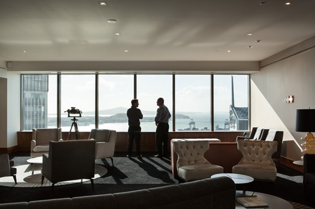
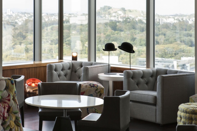
The entry sequence flows into a spacious (100m2) reception area framed by large windows overlooking North Head, Rangitoto Island, the constant motion of the Pacific, and its local harbour and stevedores. The waiting area is a mixture of furniture, “some custom-designed furniture and rugs by MMiD and made by Trenzseater, Designer Rugs and Titan Furniture. Other furniture supplied by David Shaw, Matisse and a couple of Mid Century pieces,” said McIntosh Moorman.
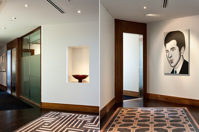
It is from the vantage point of the waiting area that one starts to notice another of the key elements to this spatial redesign: the artwork. Artist Dick Frizzell’s Black Hills Diptych (a horizontal 2,400 x 1,200mm oil on board he painted in 1987) dominates the largest wall space here. This benevolent, expressionist landscape from somewhere in the South Island has been a centrepiece of the firm’s reception area for approximately 20 years. Through one of the corridors leading into the inner spaces, one can see the immaculately displayed Large Wide Bowl (Red, 2000), a delicate patterned glass creation by Ann Robinson. Peeping from the opposite wing is a large Gavin Hurley painting – in his trademark caricatured portrait style – of a man in a black suit.
“There is now sufficient neutral space so that the artwork can breathe,” says Trish Clark, an art advisor who worked closely with MMiD and Russell McVeagh in seeking a symbiosis between the new refit and the existing art collection. “Many designers have a tendency to burden spaces with design elements and that doesn’t work for a significant art collection,” continues Clark.
The geometric abstractions found on several of the art pieces throughout the floor (such as Stephen Bambury’s Chakra and Siena) seem to be echoed on subtle patterns found on some cabinetry, ceilings and other detailing. The black and cream koru of Gordon Walter’s Tamaki (1983) hangs on the void between two windows somehow conversing with the city’s architecture and Albert Park directly outside.
The list of artists displayed here reads like a who’s who of New Zealand’s artistic landscape. Clark “was strong about ensuring that the collection wasn’t overshadowed by the refit. The elements and colours we chose needed to be pulled out rather than stand out,” says McIntosh Moorman.

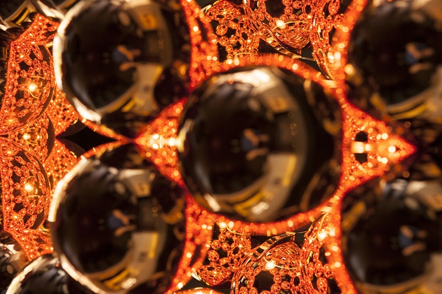
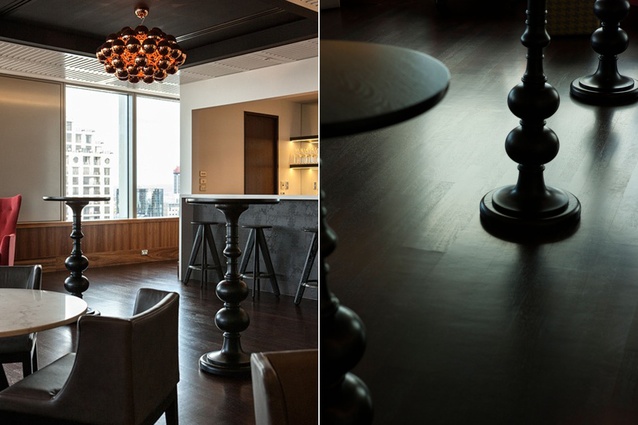
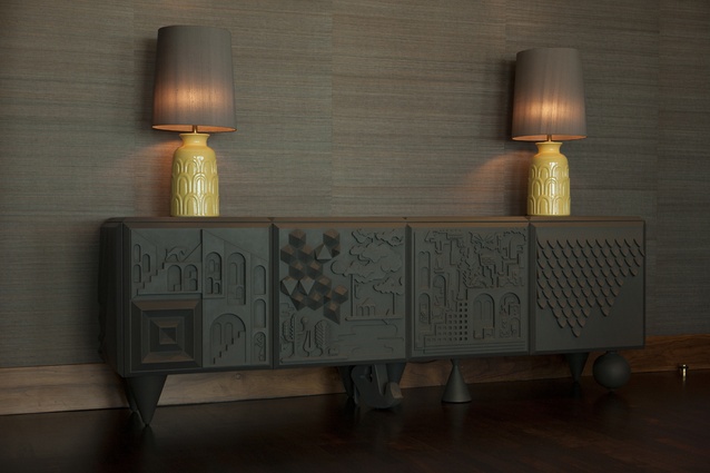
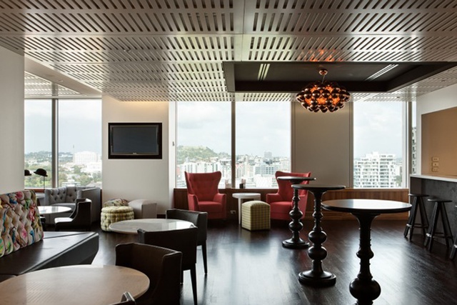
One of the spaces where the art seems to, more overtly, converse with the décor is in the newly renovated and highly eclectic bar where the firm’s partners entertain clients. According to McIntosh Moorman, the former incarnation of this space evoked the casual ethos of a sports bar/gentleman’s lounge. Now, the textures on walls and colourful, pop-art-influenced velvety couch, the sculptural chess-piece-like legs of bar stools, the patterned cabinetry and the copper bubbles of the chandelier are surrounded by youthful contemporary art pieces by artists such as Sam Mitchell and the ever-so-intriguing Nick Austin.
Fred Ward, one of Russell McVeagh’s partners and a member of the firm’s art committee, explains that the collection must be self-funding (an artwork must be sold if the art committee wishes to purchase new pieces) and is not used as an investment mechanism. Nonetheless, if they are opting to purchase work by an emerging artist, they do so by looking at their track record, and “not taking a punt but looking for someone who has credibility and who will stand the test of time,” says Ward. He also explains that works are not chosen to fit specific spaces but purely for their own merit.

To maintain the space flexible enough so that the rotating, and changing nature of the collection is catered for: “reduced colour palette, minimal decorative finishes and sufficient neutral spaces… not just on walls and display spaces but throughout the whole disposition of the space,” says Clark.
Besides being a competent conversation between interior fittings and art, this refit succeeds in bringing a home-like, comfortable feel to some of the public spaces of the law firm. “We were just trying to display an idea where commercial could go. A white box with white furniture and a grey desk is a look adored by many but we want to add another approach, one that mixtures the right amount of glamour and luxe into everyday living,” says McIntosh Moorman.

