Rural reminders: 12 Year House
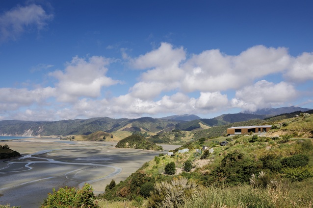
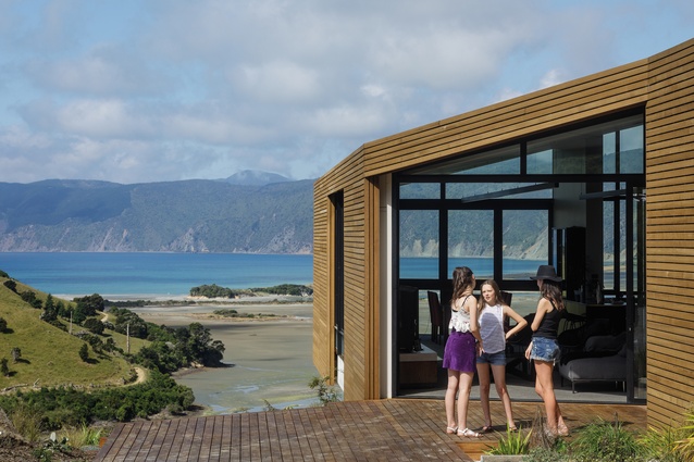
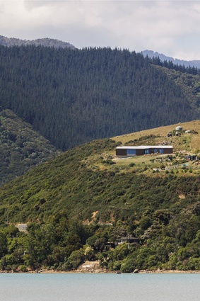
This contemporary hideaway captures idyllic, panoramic views of an inlet at Rotokura/Cable Bay, near Nelson.
It may have taken some time to arrive at the finish line – around 12 years, hence the house’s title – but, for the owners of this contemporary hideaway 18km north-east of Nelson, it is an idyllic and peaceful retirement spot worth waiting for after years working a busy farm.
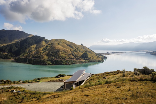
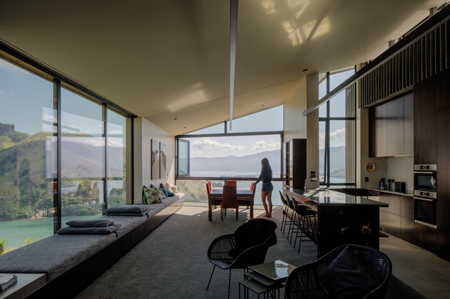
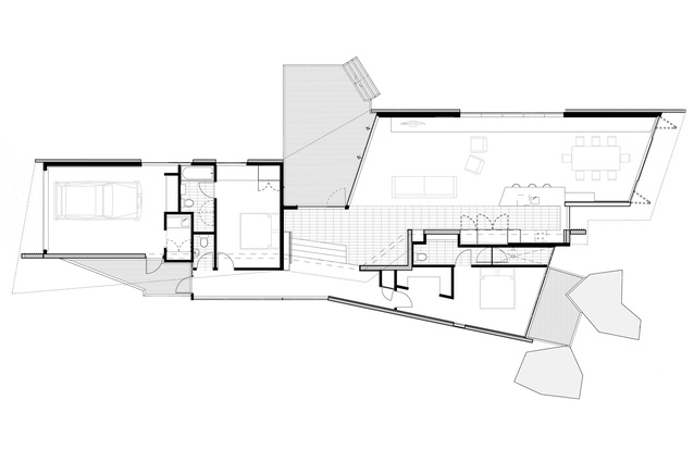
The house was moulded around a narrow stretch of useable ground amongst a rocky outcrop overlooking a tidal inlet, with each room positioned to take in vistas of the surrounding water and hills. “We didn’t want to excavate into the hill so we had to shape around it,” explains architect Jeremy Smith of Irving Smith Architects. “We massaged that shape to open up views in different directions: outwards to Cable Bay, downwards to the stream and back to the farm.”

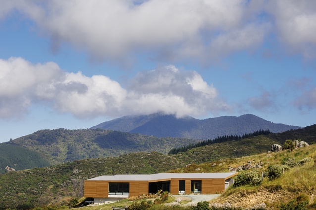
The rural life is still very much a part of the home-owners’ world and clerestory windows along the hill face of the house capture views of cattle grazing in the paddocks; they are surprisingly close. These windows drive the angled roof, which appears to float over the house like a protective shield. In terms of external materials, the farmhouse aesthetic gracefully persists, with cedar rainscreens and fluted concrete lending a rustic feel.
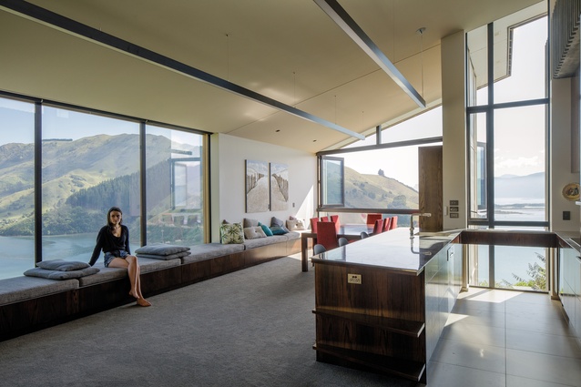
While it appears substantial from the outside, the house has just two modest bedrooms and extra space is given over to the living room with its high ceilings and open plan. The breathtaking views over the water here are framed by a 9m-long window seat, which doubles as sleeping space for overnighters by the home-owner’s grandchildren. “Everything is quite layered so even that main space narrows at one end and folds in at the entry. This was all governed by the shape of the hill,” says Smith.
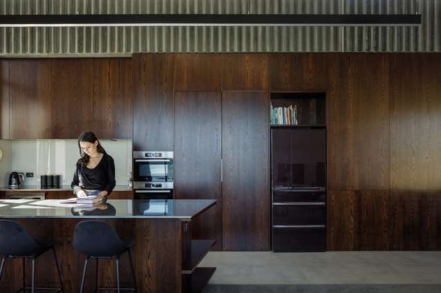
The kitchen cabinets line one wall of this space with dark teak, while the colour palette of the rest of the room is elegant and contemporary with black metals, pale greys and soft fabrics. This is in delicate contrast with the rural aspect of the home’s exterior.

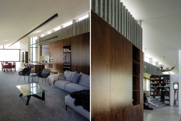
A large chandelier made from deer antlers acts as a reminder of the rural past of the home-owners and was installed as a surprise for the husband. Sheer curtains in the living area seem to mimic the shapes and forms of the fluted concrete, as well as providing a soft screen for the light that spills into the space.
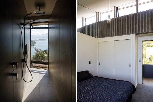
The private rooms are contained in a variation on a lean-to that hugs close to the hillside, adjacent to the living room. “There’s a spine running through with the fluted concrete inside and out,” says Smith. “There is also a set of steps up to the private area, as a kind of signal of a change in zone, and the colour scheme and flooring differ too.”
A large boulder butts up against the outside of the master bedroom, making for a striking view. The bathroom for the master suite is narrow and slot-like, with an incredible vertical panorama over the water. “Throughout the house, there is such variety of views – the hill and the bank and the rocks and the water,” says Smith. “It keeps you looking and you can never lose interest.”
Material Selector
Jeremy Smith discusses the materials chosen for the 12 Year House.
Why did you choose fluted concrete for your design?
Making concrete is a bit like baking a cake: you never quite know what you are going to get. The fluting downplays some of the imperfections in the concrete while providing an undulating surface with the texture, depth and richness of concrete. We’ve used the technique before and, recently, on a commercial building to prevent the occupants from putting up signage! But here it was about pulling back the finishes to a more personable scale and fitting in with the honesty of the rural landscape outside.
What was the thinking behind the timber cabinetry?
The views, light and colours from the landscape come from many directions into this house. We were interested in keeping the cabinetry planar, recessive and dark in colour as a backdrop to the movement and liveliness of the long living space. The timber is teak. It runs more like a wall than cabinetry, with the dark colours of the concrete spine and the uphill areas of the house providing warmth, direction and grounding. It’s like a quiet armchair to lean back into.
This article first appeared in Houses magazine.


