Rooms with soul
The interior of the newly opened Sofitel Wellington (a 14-storey, $50 million, 130-room hotel) is an exercise in cohesion through eclecticism. The overall design drivers here are: nature (given the inn’s proximity to the Wellington hills and the Botanic Garden), a vintage flavour (a quiet nod to the post-colonial history of the city mixed with the hotel’s French heritage) and luxury.
In lesser hands, this could have ended up being a sort of student flat’s ad-hoc gathering of textures and furniture. Here, it evokes a luxurious homeliness; an antithesis to the multinational hotel blandness and, perhaps, as a reaction to Airbnb’s pressures on the industry, to become more domestic, more ‘honest’ in its design and acutely aware of the local rather than the global.
According to Space Studio, responsible for the interior fit-out, the renovation had its challenges. The Auckland-based firm was unexpectedly given the job halfway through completion of the base build. Although this did not mean the designers were erasing previous spatial solutions, there was the need to make pre-drawn spaces work for the vision of the new designers.
“It was really about working with what was there and improving on the interior finishing and detailing. There weren’t many opportunities – apart from, probably, the restaurant – to change any planning as such,” says Vee Kessner, director of Space Studio.
Associate designer David Sweatman insists that, due to the change in design team, they “knew that things were going to clash and there were going to be junctions that wouldn’t quite meet; so, rather than try and fight that and create a minimalist box, it was like… ‘well, this is it’. It worked really nicely with [the operators] wanting a boutique experience… they wanted boutique, intimate. We were not so stressed about cohesiveness because that’s part of a boutique experience. It’s almost as if it’s been there a long time and developed over time – a collection of ideas.”
The team was also expected to work with a myriad of stakeholders, including: the owners (the Pandey family), whose portfolio includes several local and overseas hotels, the local operators and general manager (in charge of operations on the ground), their head offices (in Singapore and Bangkok), as well as a marketing team and a Paris-based designer.
Add to that mix the fact that Sofitel has a tradition of working with some of the top designers and architects worldwide (Jean-Paul Viguier, Leg Bunnag, Kenzo Takada, Christian Lacroix, Pierre-Yves Rochon and more) and the potential rewards and expectations were both relatively high.
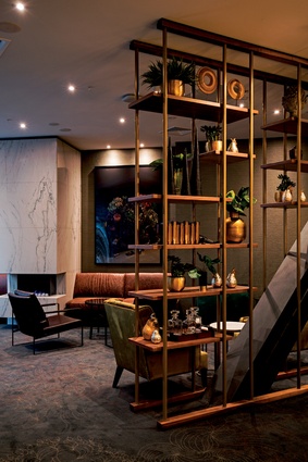
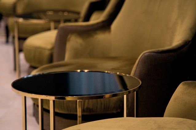
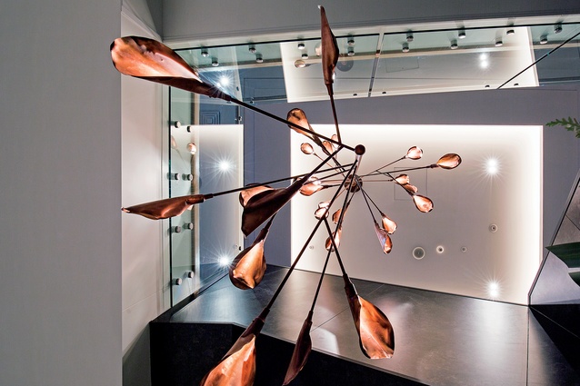
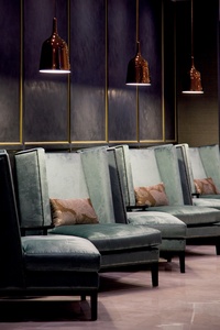
At first sight, the result of the Wellington iteration is vintage in its forms. Furniture in the public spaces include Morris Chairs and classic-inspired lounge chairs. Lighting features go from the industrial to art deco, with detailing and interpretations that make them entirely contemporary.
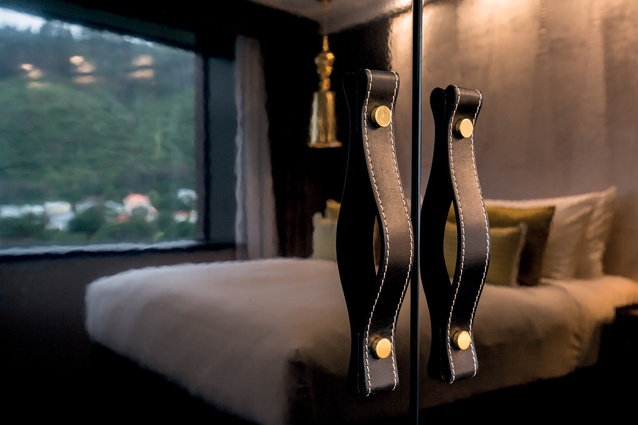
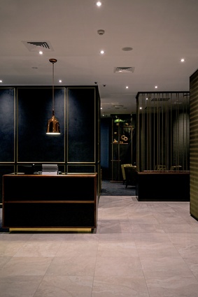
In the ground-floor and meeting spaces, there is a sort of Louis Vuitton aesthetic that hints at well-used travelling trunks, leather handles and timbers patched up with livery and the logos that define a tribe of nomads.

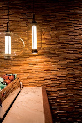
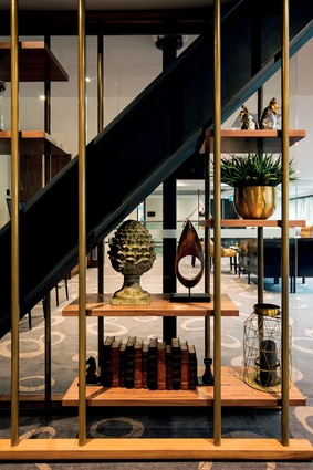
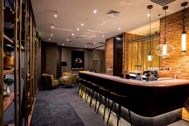
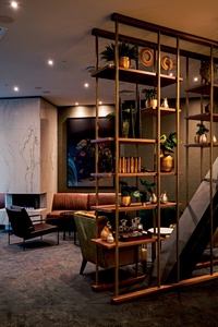
The Green Room is a small, cosy bar that acts as “an anti-space to the main reception, complementary but notably softer, warmer and more intimate than the entry space. Glimpses of the space are offered through vertical brass screens and curated artefacts. But its defining feature is a leather upholstered bar and deeply-textured timber wall,” according to Sweatman.
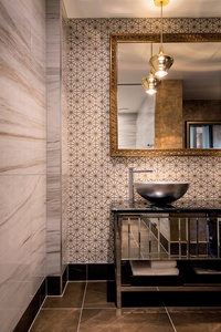
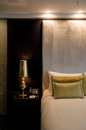
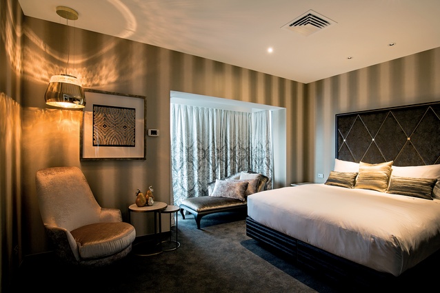
The materiality of both the public and private spaces here are defined from very early on and draw heavily on a traditional notion of luxury. “We utilised golds, brass, velvets, leather and botanic patterns. The functional elements in the rooms are more refined and contemporary. The harmony between the traditional comforts and contemporary functionality provide a very modern experience of luxury,” says Sweatman.
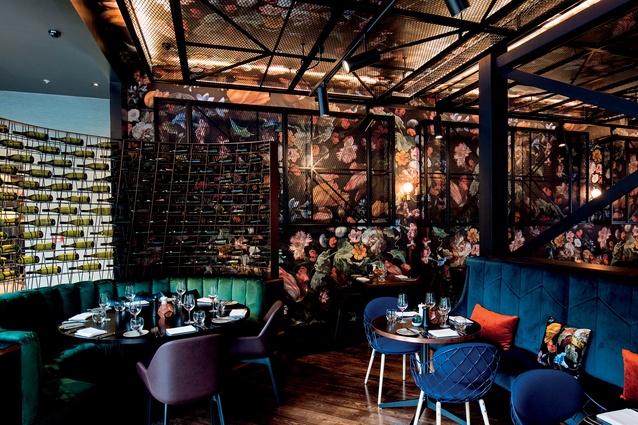
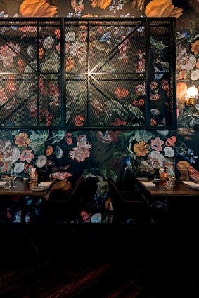
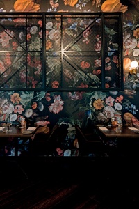
One of the most impressive spaces is the Jardin Grill restaurant, which uses Still-Life with Flowers by Rachel Ruysch as its backdrop, while the colourful plush seating and a motif of metal structures give a certain feel of nature contained within a gilded cage.
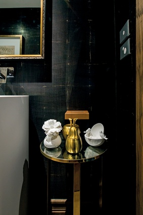
The most impressive of the rooms use velvet, fabrics, and various curated objects to differentiate levels of in-room luxury. The bathrooms alone, which vary from an emphasis on natural stone through to metallics, are an exercise in textural excess within an elegant boundary.
There is no doubt that the sharing economy is creating a myriad of disruption across markets, and the hotel industry is no different. It is through the design of domesticity and intimacy through texture and variety that this hotel manages to stay one step ahead of the Airbnb-ing of the seemingly booming accommodation industry in New Zealand.
TEXTURE
Abundant textures are scattered throughout this interior, affording the space a sense of drama and sumptuousness.
A timber feature wall divides the bar and reception area and provides a theatrical transition from the classical, refined look of the reception area to the softer, more relaxed bar space. The depth and shadow created by the timber divide amplify the ability of a single wall to deliver a dramatic shift within the same space.
Floral print wallpaper on the restaurant’s wall and ceilings – enlarged and adapted by Space Studio from a still-life by Dutch baroque artist Rachel Ruysch – complements other botanical concepts that are applied throughout the hotel. In some instances, the wallpaper is overlapped by black mesh screens, managing to create a harmonious space, though the opposing elements fight for attention.
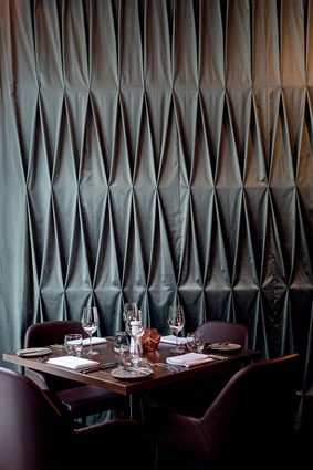
The back wall of the restaurant features a bespoke curtain that ties in with the materials used in the French-inspired bedrooms and lobby. Its soft surface provides a contrast to the steel and glass components – meant to bring the exterior inside by hinting at the garden greenhouse – included in the space. The diamond-shaped design reflects the geometric forms of the restaurant bottle display, a garden trellis and arbour. It also serves a practical purpose as a form of acoustic absorption.
Other textures include brass metal detail, timber veneers, wardrobes with more tactile fabric on the outside and velvet on the inside, opulent rugs, and various light fittings and artefacts.
DESIGN SOLUTIONS

Associate designer David Sweatman details the inspiration behind some of the design elements.
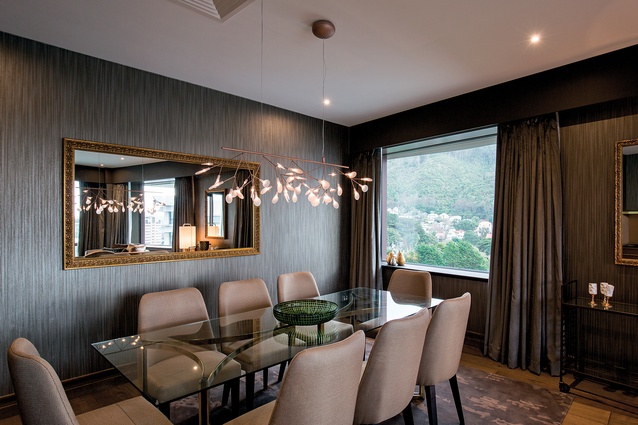
A striking feature for many of the rooms is a line-of-site view to the hills in Karori – a wall of dense trees dotted with white villas. With the Botanic Gardens across the road it was important to continue the botanic texture into the interiors.
The detailing, finishes, furniture and artefacts draw heavily on a traditional period notion of luxury to acknowledge Wellington’s colonial heritage. This was defined by tactile details including natural timbers, brass, copper, velvet, leather and botanic patterns. The functional elements of the hotel were detailed with sharpness and refinement in contrast to the traditional thematic. The harmony between the traditional comforts and contemporary functionality articulate a very modern experience of luxury.
Our approach to the design of the suites was to layer luxury experience through all the elements of the room. We built in surprise and delight wherever possible so that the experience continued well after the initial first entrance. Examples include the leather top and gold-lined drawers to the writing desk and bespoke leather handles to the gold-velvet-lined wardrobe.
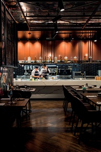
For the Jardin Grill restaurant, the brief was to design an expressively feminine space around a kitchen and menu defined by a flame grill, rotisserie oven and charcuterie. Playing with the contrasts of the brief with overtly expressed gender theming, the design abstracts a baroque still-life painting by Rachel Ruysch into a wallpaper repeat that become an enveloping botanic fresco. This is contrasted and obscured by a grid of French industrial-inspired trellis mesh that strictly observes the structural grid of the building.
The open-plan kitchen is an interpretation of a domestic kitchen, with discretely refrigerated timber bookshelves, natural timber chopping boards and a vast stone island. The kitchen space functions as both open buffet during the daytime and chef’s kitchen during the evenings. The proximity of the diner to the chef delivers on the boutique objectives for the guest experience in the hotel.

