Roman mythology
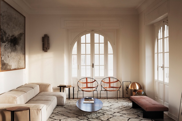
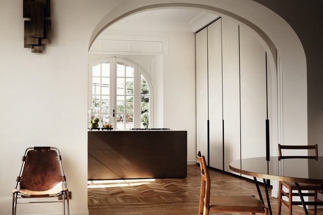
There are two round leather chairs in the living room of this Roman apartment that, although basic in construction, possess a strangely alluring persona.
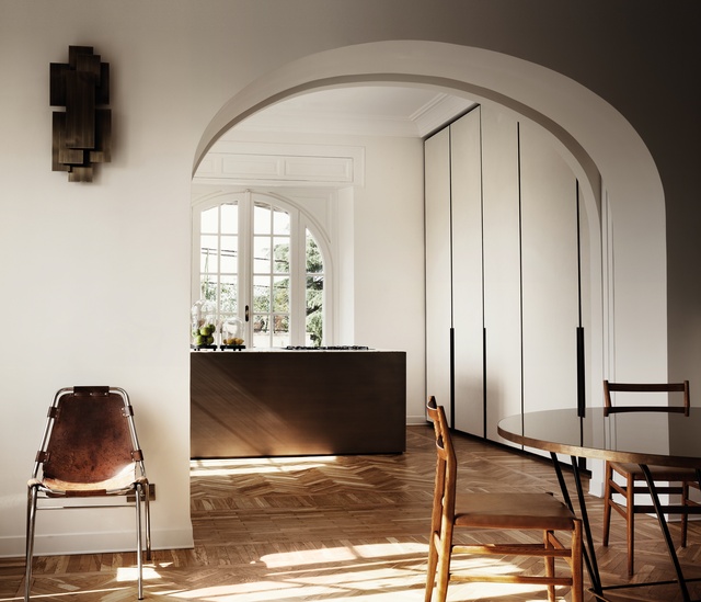
They are nothing more than a steel circumference supported by an unadorned structure onto which leather straps are wrapped – stretched and slacked in places. From a distance, they could easily be confused with the Acapulco Chair’s posh, polo-playing cousins, yet on close inspection they are entirely better-crafted thrones.
The FDC1 chairs were created in the ’50s by the irreverent Brazilian architect and artist Flavio de Carvalho. According to reports, their design might have been influenced by an African tribal trend that was all the rage in Europe at the time. The originals were made as bespoke, pseudo-spiritual tokens – much like masks used in some ancient ritual.
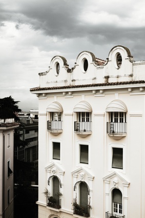
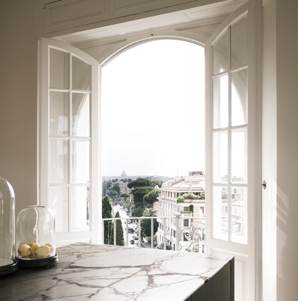
Yet, nowadays, dislodged from that history and placed within the context of this apartment on the edge between Vatican City and Rome and overlooking St Peter’s Basilica, they take on a more gladiatorial vibe. The leather emulates the straps that were used to hold protective gear onto bodies, or even bit mouthpieces onto battle horses.
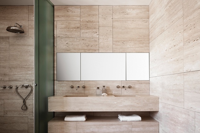
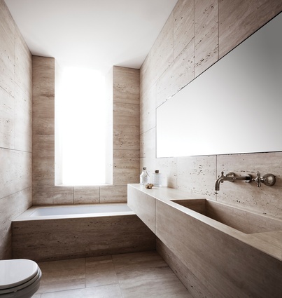
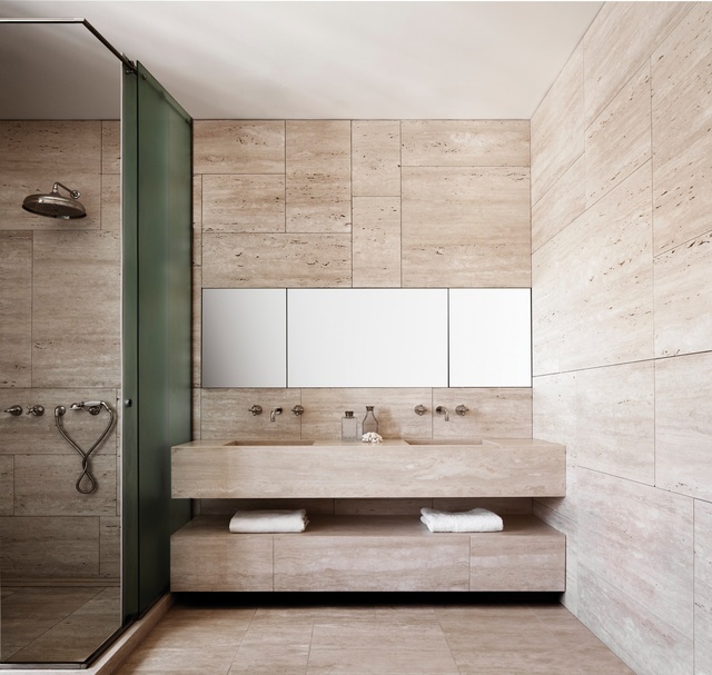
The Carvalho pieces are not the sole allusions to its surrounding city. According to Fanny Bauer Grung, one of the lead designers from the firm responsible for this apartment’s refit (Quincoces-Dragó & Partners): “The bathrooms were completed in a light travertine, in fact, where the pores were left open to give life to the material. So, although the cut of each slate and its pattern is modern, the overall feel is that of a classic Roman bathroom.”
Grung’s design partner, David Lopez Quincoces, began his career alongside Italian architect and furniture designer Piero Lissoni. Quincoces now designs for Italian furniture powerhouses like Living Divani, Salvatori and, for this apartment, contributed many bespoke pieces to complement and modernise the classic architecture.
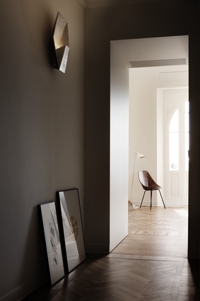
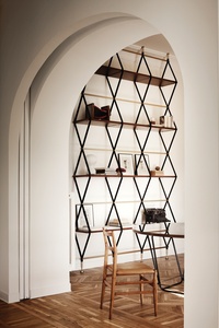
Casings and woodwork above the beautifully rounded doors retain classic proportions and geometries. The wall sconces are at points Roman architectural, at points gladiatorial ornament. The Berber carpet in the living room (from Altai in Milan) “is a masterpiece in itself, so old yet so contemporary!” according to Grung.
She continues: “It was interesting to try and bring so much history into the apartment… it became clear immediately that an essential feature for us was to keep its history, a process which could be done by looking both inwards and outwards towards the city itself.”
Yet, besides a carefully stitched narrative, this apartment was also in need of clever spatial reworkings.
Grung: “The client needed a more functional space, so we had to rework the plan completely. Before, there was a small bathroom, a small kitchen and two very small bedrooms. We transformed this into two bed, two bathrooms, with a large walk-in closet and united the living and dining area, to keep the private areas separate from the communal ones as the client desired.”
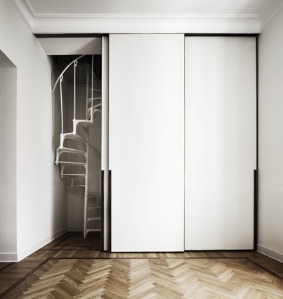
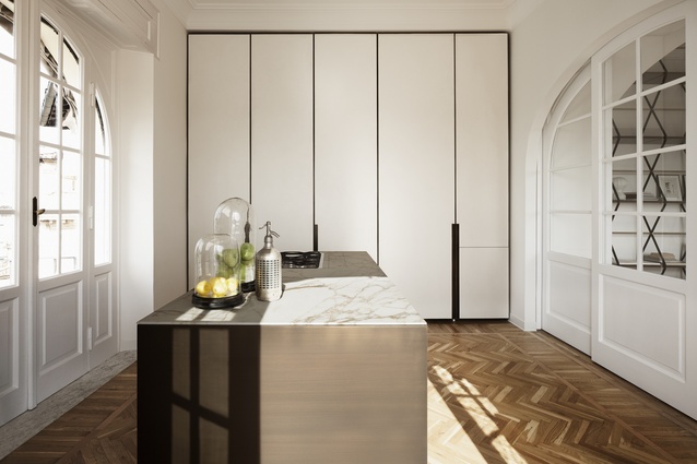
The minimalist sliding door that divides the kitchen and the living room was a new intervention – to allow the spaces to live separately – but it’s done in perfect symbiosis with the rest, giving the impression it has always been there.

“We tried to optimise the spaces as much as possible, giving some detail like the brass frames of the wardrobes, and kitchen doors that hide the kitchen, which exists apart from the island itself. This is important as it meant that the furniture had to dialogue with small but precious details, like the brass and cement resin, whilst allowing the space to breathe.”
Much like the Carvalho chairs, this Roman apartment is deceivingly simple. Behind its muted tones is an impressive design narrative that makes this home a thing of subtle depth… it has a quiet confidence that exudes elegance and pedigree.

