Risk and reward
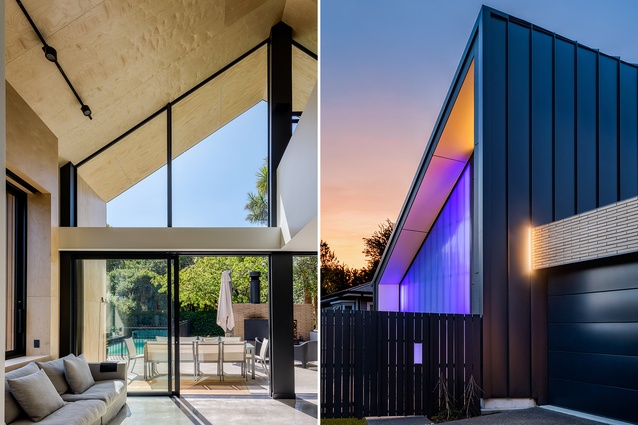
Architects’ own homes are often a breeding ground for taking risks – a chance to do the things other client’s wouldn’t let slide. The Hawthorne Street House, designed by and for Sheppard and Rout director Tim Dagg, is full of these slightly surprising moments. The most obvious of these happens on the approach to the house, with its defining backlit polycarbonate cladding, but stepping inside the dwelling and circling round the back leads us to a few more.
“One of my pet hates is when you’ve got a bedroom facing the street and you look straight in. Hence, we do have one bedroom facing the street, but we went for the polycarbonate cladding, which brings light in but no one can see in,” Dagg says. A train line runs adjacent to the front bedroom, so advice from an acoustic engineer was to put a part-wall behind the cladding, thus the idea for the colour-changing LED backlighting was born.
It is an unusual move for a residential design, but Dagg says it has engaged the community and led to encounters he may not have otherwise have, citing neighbours asking for their favourite colour in honour of their birthdays and conversations starting during lockdown walks.
Dagg and his family have occupied this particular site, just a few minutes’ drive outside of Christchurch CBD, for several years, purchasing the old bungalow that occupied it. They liked the location but decided that they needed more space, so they tore down the old house and started again. “I probably spent about a year and a half designing it even before I took it into the office. I’d draw a bit, then come back and refine a little, but [the design] stayed mostly the same,” Dagg says.
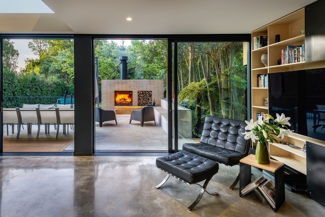
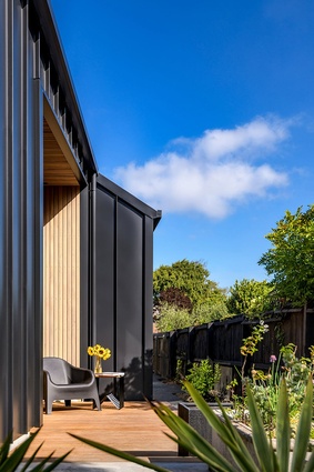
Site constraints led to the unique folding roof, which begins as a half-gable on the street elevation and morphs into a full gable at the back of the home, where the garden is the centrepiece. “One of the original owners had put in all these trees: the cabbage tree, the kowhai, the lancewoods. So, you had all this mature garden, which we wanted to take advantage of.” North-facing light, the existing pool and the neighbouring site being unbuild-able made this area the perfect place to focus the family’s outdoor living.
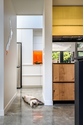
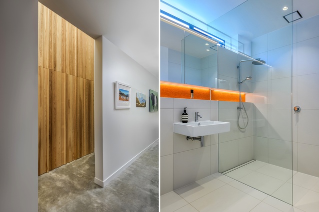
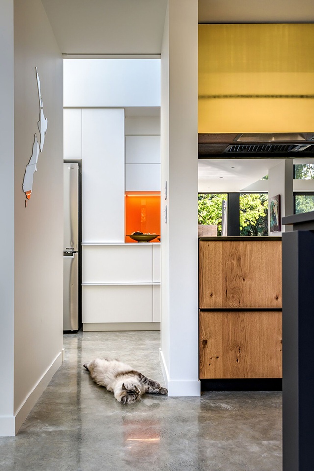
Inside, the material palette is mostly what you’d expect: concrete floors, warm birch ply accents juxtaposed with sustained black elements. But, here too is not without its surprises. Pops of bold oranges and pinks enliven the rooms along with a varied and approachable art collection. A swatch of metallic gold cladding hangs over the cooktop in the kitchen – warm against the monolithic black island.
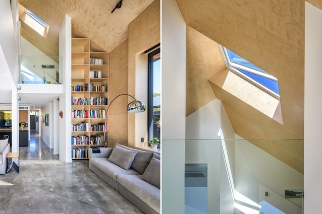
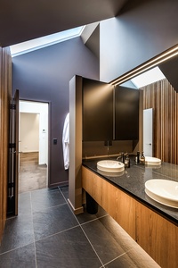
A final unexpected moment occurs upstairs in the master suite. The size is modest, but strategic angles and skylights increase the feeling of volume – as they do throughout the entire house, actually. Recessed lighting and shelves also help with this. The en-suite steals the show here, though. Dark surfaces from ceiling to tile floors give the space a sanctuary-like feel that is brightened by skylights and timber accents. Like the colour-changing facade, design moves often reserved for commercial spaces are done in a homely way. “Originally, it was going to be a reasonably white and light palette, but we stayed in Auckland at the SO/ hotel where the lobby down there was black and I asked when we got back if we should make the whole thing dark,” Dagg says.
Throughout this home, measured moments of respite from the norm have created a family home that is a delight for the occupants and community alike. High risk, some may say, but this NZIA Canterbury Architecture Award-winning house appears to have reaped a high reward.

