Richness in texture: Westmere House
A modern addition breathes new life into this 1929 home, without overpowering its original glory.
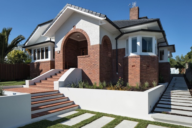
Turn-of-the-century homes such as this one in the city-fringe Auckland suburb of Westmere often have a grand sense of street presence and appeal. This is accentuated in this home by the stairs leading up to the arched entranceway and by the striking brickwork, which makes use of red bricks brought over from Melbourne by the original homeowner, creating a strong contrast with the earthy tones of local brick.
However, like most homes built in this era, the internal spaces were compartmentalised and lacked the natural light and indoor-to-outdoor connections relished for modern living.
“The house was very dark with the back being a rabbit warren of rooms that were small, enclosed and had no relationship to the outdoors,” says Felicity Letcher who co-owns the home with her husband Roger Murray, “we wanted to create a large kitchen that was the heart of the house and create a solid relationship with the back garden.”
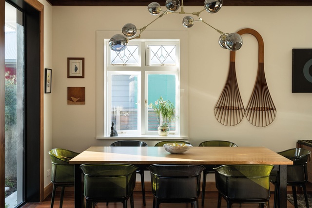
The couple brought in Eva Nash and Kate Rogan of Rogan Nash Architects to address these problems by creating a new kitchen, dining and living space that extends into the outdoors. “The existing kitchen was designed for service by a maid, galley style,” says Nash.
“We opened up the back to get light into the space and created a generous kitchen to accommodate teenaged children and entertaining family and friends. There is now an overall flow from the back of the site to the original areas.”

The architects used the home’s art deco aesthetic as a basis for the style of the new spaces. “The great thing about the arts and crafts movement is you can bring together the styles of the time and touch on different aesthetics and elements,” says Nash.
“We wanted to have a clear distinction between the traditional and the modern home. We felt the grand old lady of the house was the street side and the rear could be something much more modern.”
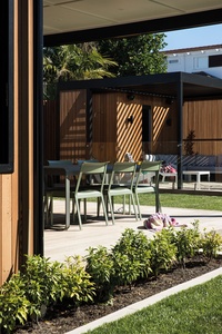
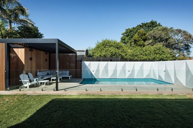
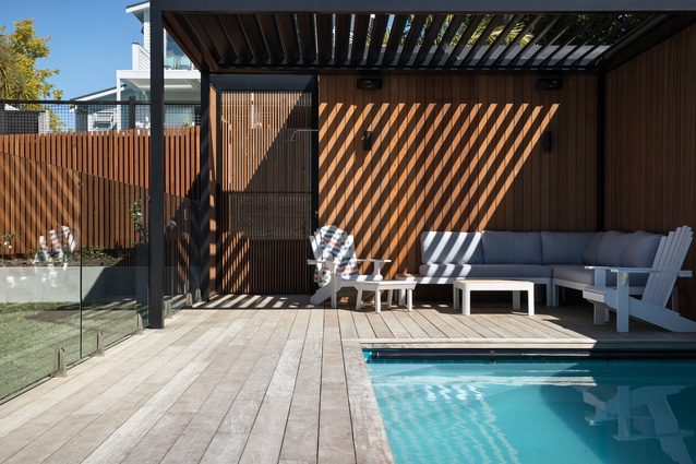
Letcher continues: “We wanted a pool, areas for entertaining and most importantly a covered, outside living room. We found references of porches in South Africa – large porches at the back of brick houses that provided shade and comfort in the heat. That seemed such a great solution for our hot summers and rainy winters.”
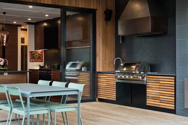
The addition is clad in cedar and includes an outdoor kitchen, which connects with the indoors, with a rangehood, outdoor bench, fireplace and fridge. “The cabinetry feels continuous from inside and out. The homeowners are entertainers. We imagined them congregating in the kitchen and being able to go outdoors to the pool cabana,” says Nash.
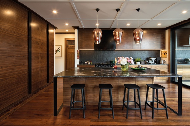
Inside, the kitchen is clad in rich timbers, with walnut cabinetry and a panelled ceiling that references the era of the house. The wide marble benchtop is light on its feet, balanced by steel arms and a timber base that melts into the floor. The splashback, with its matte black hexagonal patterning, also harks back to the heritage of the house while still appearing modern.
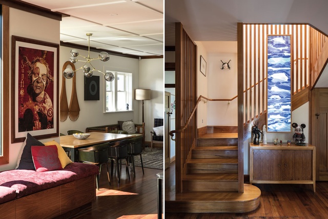
The existing staircase was transformed into a feature of the house through the removal of walls which previously enclosed it. With its curved bottom step, it adds to the art deco theme. “We were keen to open the original areas up so all the spaces felt generous. With that old architecture, you have great ceiling heights and wide corridors so, when you do a modern addition, you have to be careful that it still has that generosity and doesn’t feel mean,” says Rogan.
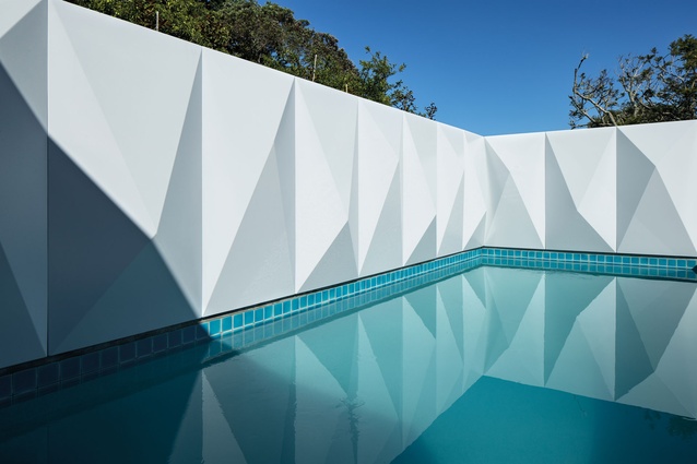
The pool surround is an obvious feature of the garden which again plays on the art deco style. This was part of the original brief from the clients, who wanted to use glass-reinforced concrete for the surround. It was built by Main Reactor, which is the homeowners’ company. “We came up with a template pattern to craft around that world,” says Nash.
“This adds a beautiful moment in that part of the garden. It reflects a lot of light, not just from the water but also from the light of the panels. The origami folded appearance of the pattern is reflected from many angles so the shadows change throughout the day, which creates a constant interest.”

Letcher agrees: “The shadow/light play throughout the day is just magical. You can spend hours watching it. They are deeply intriguing to people who come to the house and can’t believe that they are actually three dimensional!”
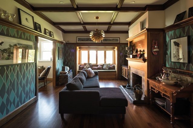
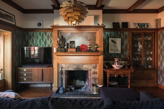
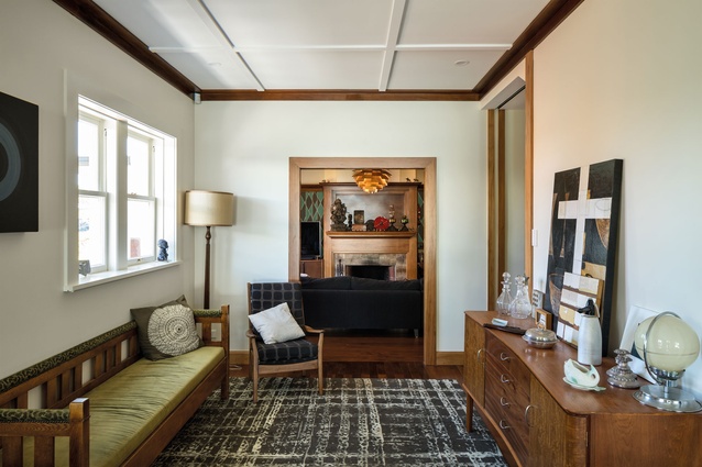
Rather than transform the original dining room, which the homeowners use as a lounge, the architects instead restored it, paying respect to the fireplace and the panelled ceiling and adding a patterned wallpaper that harks to the design on the pool surround. A servery was removed and replaced with a large opening to bring light into the room.

“The clients have stunning taste in furniture,” says Rogan. “Our role was then to make sure their stuff fitted with the house. The success of the project was a result of an excellent collaboration with the homeowners.”
So how does the house comprare to its previous iteration? “It is literally like night and day,” says Letcher, “it is so satisfying to see it work at it’s best – at Christmas and big events like my mum’s 70th birthday – when it’s full of people and functions in the way you envisaged. The house is very much a rich reflection of Rog and I – and our family. It is filled with things we’ve collected over the years – furniture, art bits and pieces – that now seem to make sense in this invigorated space”.

