Revisiting the Aaltos
Pete Bossley tours Finnish architecture and design, using drawing as thinking to uncover its power.
1982: As a young architect, I had wrestled my way from Turkey to Finland, at the soggy end of a hitchhiker’s version of the Grand Tour, involving low-budget lodgings, sleeping on beaches, thumbing lifts and cheap food. All wonderful. Aalto’s Church of the Three Crosses at Imatra was a high point: a luminous joy, offering more natural illumination inside than the grey, overcast gloom outside.
For years, I had dreamt of returning and so the chance for Miriam van Wezel and me to join an Australian Studies Abroad tour led by Stephen and Naomi Crafti was irresistible. In 2020, though, Covid had different ideas. Now, in 2022, the tour lives: fourteen days of intense programme, incorporating more than just Aalto. Design, art, contemporary architecture, interesting company and good food were all rolled into an intensive and pleasurable fortnight.

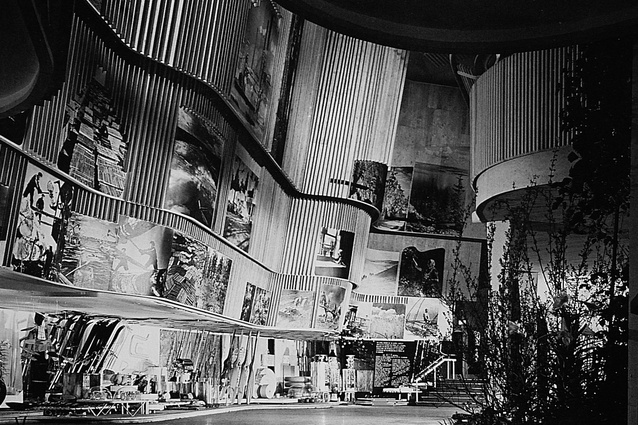
Much has happened in Finland since Aino and Alvar Aalto created what seemed to be a singlehanded version of the country’s design ethos, when they designed the Finnish Pavilion for the 1939 New York World’s Fair and celebrated landscape, furniture, lights and glassware. Architecture, furniture, fabrics, ceramics and products by younger designers have subsequently developed in different directions but, somehow, still offer the world a vision of continuing Scandinavian integrity that looks wholesome in relation to other international directions.
Forty years ago, I would contemplate Aalto’s plans and wrestle with the eccentricities only to conclude: “I’ve got so much to learn”. Seemingly, this is still the case. I would marvel in the way he would set up a rhythm, then adjust it slightly, then break out with a naturalistic form, then insert a break or a disjunction, then revert to a slightly different rhythm.
Where do these directions and redirections and idiosyncrasies come from?
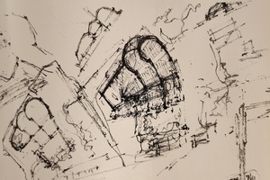
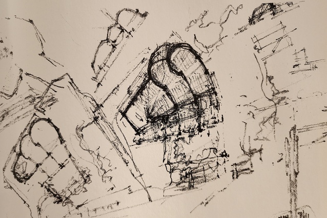
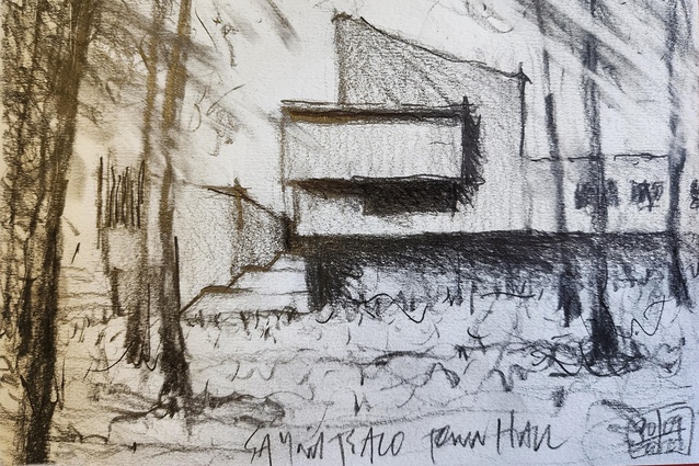
Does it come down to the design process? The famous drawings and the atmosphere of consideration/reflection they propose? Aalto loved lines… “that curving, living, unpredictable line which runs in dimensions unknown to mathematicians.”1 They look as though they are drawn in grainy sand, soon to be washed away by the incoming tide. What is this granularity? The 6B grain compared with computer clarity: grubby line versus clean. Possibility versus precision: in fact, the deliberate suspension of precision. The process of rumination as the pencil trembles across the tooth of the paper. What is contained in the grain? Does imagination reside in the dots? Does the void between the dots allow the imagination in? In the same way, a soft pencil and watercolour drawing allows the viewer’s imagination to inject itself, in a way that resolved computer renders emphatically don’t.
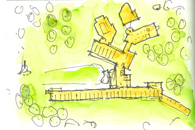
As an obsessive sketcher, I understand that this process and the mental exploration it implies is critical. The free flow of pencil accompanies and encourages the flow of thought: a repeated cogitation and layering of ideas, a gradual development, reworking, feedback. The hand and the line impact on the next moves, with a slow overlay of critical editing to reveal what touches the soul and the mind. Sheets of trace overlaid, shapes and forms redrawn – each time a little differently, with new thoughts and new propositions. Sometimes there is rejection, sometimes refinement. And the pleasure all that affords. Not pleasure because one has done a ‘great’ drawing but because there is something on the paper that might, just might, have credibility, integrity and presence enough to lift itself into the world, and survive long enough to become a building.
God created paper for the purpose of drawing architecture on it. Everything else is, at least for me, an abuse of paper.2 It is drawing as thinking, recognising the speed of the feedback loop. Every line has architectural baggage attached; it is not just a line on paper. It represents a three-dimensional object, with imagined height and mass, with the ability to enclose space, let light through, keep the weather at bay. To shelter and nurture and inspire people. But it is not precise; it could be 10mm or a metre thick. It doesn’t need accuracy and it won’t complain if it is too long or short or crosses over another, or even meanders on, uncomplaining, into a flourish. Whereas the computer demands we understand the programme, limits us to what the software will let us do or, even more, to what we know we can get it to do. A time-consuming, potentially frustrating, process. I wonder how often we design something because we know how to persuade the software to do it, and that to do something more subtle or complex is too difficult. Many current buildings do look as though they were designed on SketchUp.
Aalto was an enthusiastic, committed young man, incredibly confident about his own abilities. He was outgoing and made himself very well known about town. Partly as a result of being here, I realise how amazing is the story: the way he took Jyväskylä, and then Finland, and then the world, by storm. Imagine setting yourself up as an architect in a town (the size of, say, Havelock North), in a tiny basement studio, and convincing everyone you were the man for every job and, despite the fact that you moved out a few years later to a bigger town, and then again a few years later to Helsinki, you end up doing so many public buildings in town that it now runs Aalto tourism. And has an Aalto shop and an Aalto museum. As do many Finnish towns. The ambition was unrelenting.
Aalto was a big thinker. He leaned against the contemporary struggle to preserve Finland’s national identity by privileging national over international, preferring instead to see them as complementary.3
The Paimio Sanatorium, designed in 1929 when Alvar was only 30 and Aino was 34, was an extraordinary achievement that gave them almost instant international recognition. Intended to combat the scourge of tuberculosis, it was steeped in the functionalist approach, imbued with the modernist beliefs of healthy living, space and contact with nature, espoused by architects and doctors across Europe at the time.
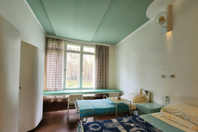
The wings are aligned ‘biodynamically’ to suit the requirements of sunshine and view but Functionalism barely explains the wonderfully eccentric, wilful plan. The elegance of the eight-storey-tall slender bedroom wings and sun-lounging terraces is astonishing; the singleloaded corridors wouldn’t pass muster in our age of value-managed paucity.
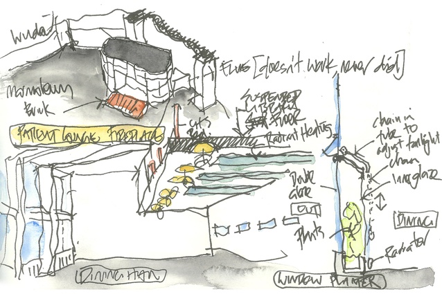
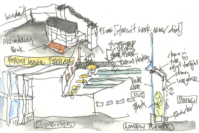
The remarkable commitment to patient care extends from room proportions to loungers, chairs, lamps, washbasins and wardrobes, all to nurture a stay that could last months or years. The beautifully proportioned and light-filled Dining Hall, simple at first glance, is chockfull of interesting details, from the doubleskin conservatory windows to the suspended mezzanine floor and the heating panels concealed in the ceiling. The free-standing fireplace in the patients’ lounge bravely eschews a vertical flue in favour of a floor-level one, which apparently never worked. The bedrooms look pleasant enough by our standards but must have been radical in their day.
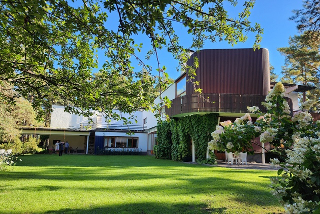
Villa Mairea has always held me in a seductive thrall. Something about the contrast of orthogonal and curvilinear, white against wood, slick against rustic, has lifted my spirits and raised the desire to experience it full frontal. But, also, it raised the fear that it could not possibly live up to my potentially elevated romantic expectations. It did not disappoint. The interior spaces are generous, comfortable, soft yet exciting, alive with delightfully innovative details. The wide range of materials roll gently against one another; the famous stair of vertical reeds, the famous fireplace with its sculptural indentations and the famous door handles, all contribute to a holistic language rather than competing. Somehow, the uncompromisingly Modern (remember, it was designed 85 years ago) reaches out and hugs the ubiquitously rustic to propose a whole new way forward.
As it happens, the day we visit, it was my birthday: one of the great presents.
It was designed by Aino and Alvar in 1938 for their close friends and Artek co-founders, Maire and Harry Gullichsen. Because it is still used by the original family as a holiday place, interior photos are banned, which is unfortunate but understandable. The walls are casually adorned with paintings that gradually expose themselves as a personal but serious collection: Arp, Léger, Picasso, Gauguin, Cézanne, Matisse, amongst others. Some of them were gifts from the artists who were friends. Maire was a great collector and is credited with bringing modern art to Finland.
The seemingly casual combination of materials and details creates an effortless sense of relaxed comfort: the large windows and connection to the garden and forest don’t overpower the interior cosiness and emotional warmth; the spatial flow linking the various areas doesn’t undermine the stillness of any one space; and the multitude of fascinating details doesn’t detract from the overall sense of cohesion. Even on a functional level, the house is astonishing; one example being the slotted plywood ceilings, where 62,000 holes provided natural ventilation originally, and now allow mechanically assisted air to ventilate the living areas.

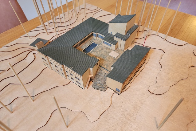
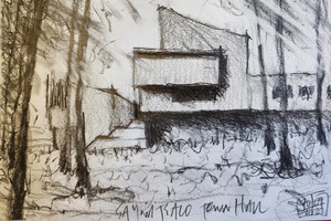
It is gratifying to reaffirm that projects with a great reputation are, in fact, great. The Säynätsalo Town Hall of 1949 is one of those. The brick blocks composed to sit and cantilever gently over and above one another, almost top heavy, rest in a very low-key landscape of trees, gravel paths and rolling long grasses. None of the pomp one might expect from a provincial town trying to assert itself as a national player. The promenade architecturale leads up the broad stairs into the beautifully proportioned grass courtyard with its pool, sculpture and running water, a storey above ground level, with no spaces underneath. This is pure scenography. Aalto is choreographing an event from the level shift and remember that this is not a natural rise of ground level; he created it. Once again, he is doing something inexplicable with such conviction that it becomes natural, acceptable, obvious.

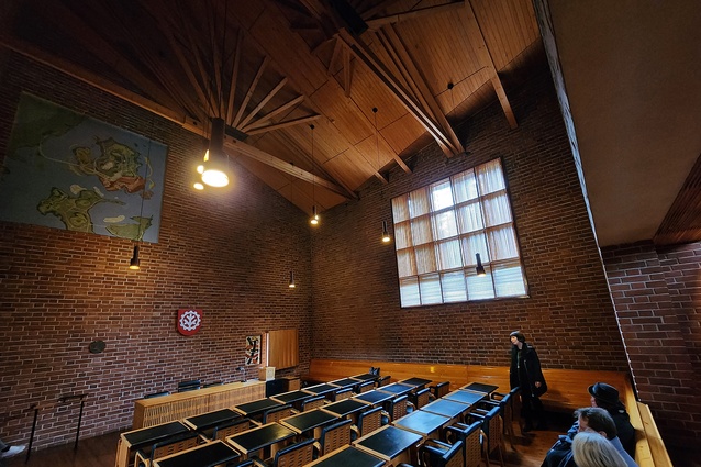
The confident use of scale is quietly breathtaking. The courtyard, the internal colonnade, the library all contrast with the relative grandeur of the Town Hall space. This is both a severe and a comforting place. The celebrated roof structure is further away than I expected, almost remotely high and in relative gloom. The bricks Aalto used, cheap seconds (reputedly one of the reasons he won the competition), are dark and they envelope the space without relief. Highlevel light is filtered through fine battens and is the only source of natural light apart from a small, permanently louvred window on the wall behind the mayor’s tables. As it is with most of the Aalto churches, the exterior is deleted, only implied by the presence of light.
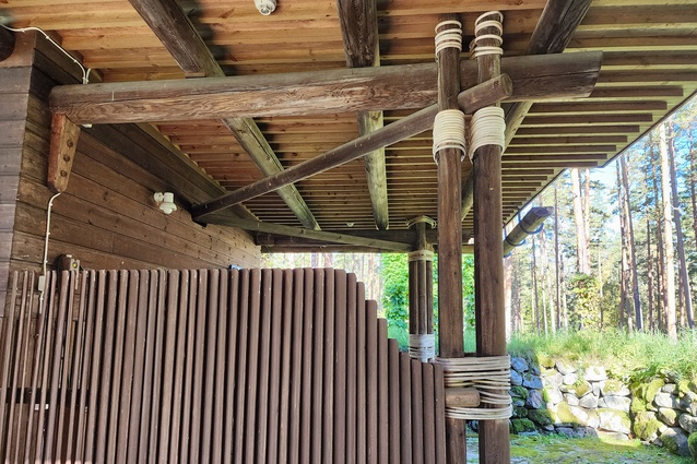
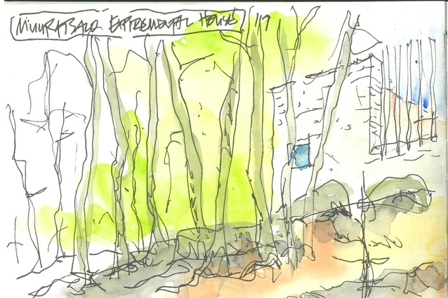
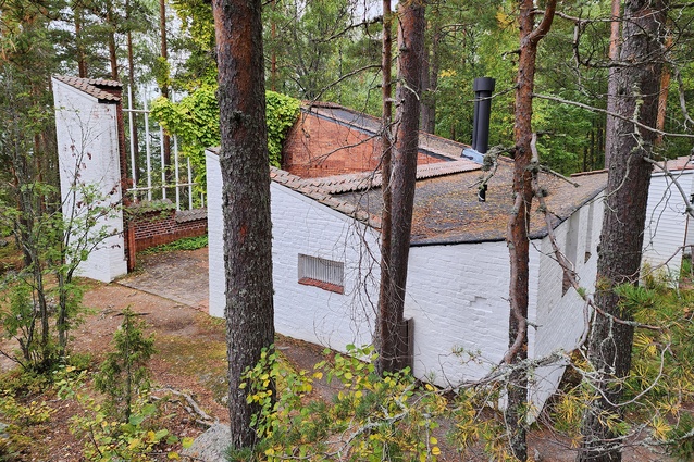
Alvar and Elissa designed the Muuratsalo Experimental House in 1953. From the road, it is approached down a naturalistic path, barely defined amongst the fallen leaves. It’s a 10-minute walk through beautiful trees, which, during our visit, were singing their autumnal tunes with ferocious yellow gaiety. The path leads down to the edge of the lake and turns abruptly left beside the log-cabin sauna.
From there, the path winds towards the house, barely visible amongst the trunks, approaching from the north.

The access is totally by foot, creating a construction problem that was solved in a typically Finnish way; all materials were trucked across the frozen lake to await summer construction.
The siting is extraordinary, especially for a Kiwi architect who has spent his life wrestling with steaming clay that breathes like a newly skinned rabbit. Here, the solidity of the rocks is ubiquitous, and the white brick form rises against the fall of the land, culminating with an imposing verticality that belies the modesty of the interior spaces. To experience it rising from the snow must be a real pleasure.
The white carapace shelters the natural brick interior façades, composed in a variety of patterns of bricks apparently from Aalto projects. I like to think they may have been poozled. It is all about the south-facing courtyard. The central fire pit creates an inwardness and focus to balance the modulated connections to the landscape through the two openings in the surrounding walls. One of these allows passage and curates the lake view, while the other is raised off the terrace to lift the view to the trees and sky.

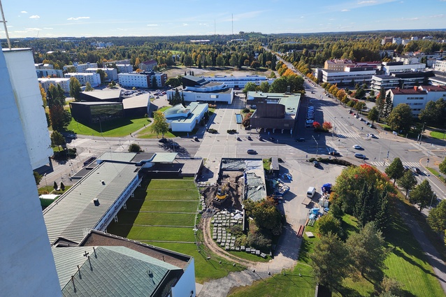
The Seinäjoki Town Centre project has always intrigued me. A group of five buildings resulting from two competitions both won by the Aaltos (Alvar and Elissa), one in 1952 and the second seven years later, it is a display of civic responsibility beyond the design of the buildings themselves. The urban design conveys a sense of nurturing the local population, with the relatively low-key buildings gently holding the three interlinked traffic-free squares and slowing the experience of the city. The church seats 1300 and is too large for what was then a town of only 14,000 but the burghers were punting for city status. Unfortunately, they lost out to the neighbouring town. But the forecourt shaped by the church and parish buildings is gorgeous: a raking grass plane that accommodates 1500 people outside large sliding doors on the church axis.
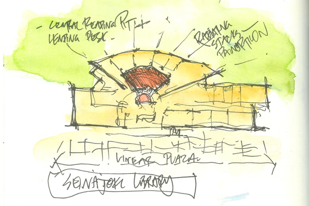
Across the road, the sensibility continues, the linear plaza (Citizens’ Square) held by the Town Hall with its bright-blue hoop tiles and stepped grass terraces on the north, and the long horizontality of the library on the south. This is one of the Aalto radiating libraries: panopticonlike, where the fanning aisles can be viewed from the central desk. This energy, combined with the intense central pit and concentric scooped skylights, creates an extraordinary space.
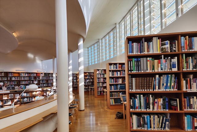
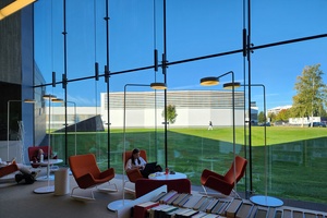
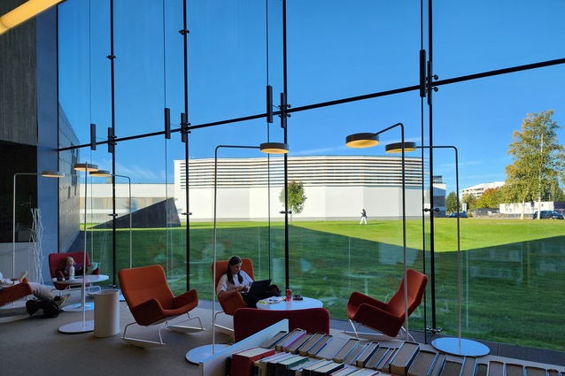
It has been expanded by the recent addition of a new building. Designed by JKMM, this is a minor triumph. Set to the south of the original, the new building sets its own course, with an origami folded roof and large glazed wall that focuses views back to the Aalto. This has the benefit of highlighting the beautiful fanning wall of the original, which had previously been out the back, concealed in trees. The mediating lawn is punctuated by a skylight that signals the presence of space below and, indeed, there is. An occupied tunnel links the two libraries, rich with activities, hidey-holes for kids to read, pool tables and free-form meeting caves.
What shines through in these and other projects that can’t be included here, is the determination to do it differently and better, and to fight for the right to do so. Like Eliel Saarinen before them, the Aaltos, their partners in Artek, and many architects who have followed, seem to have persisted with this belief. Internationally, the certainty that architecture can improve people’s lives has been tarnished by late- and postmodernism. And now inflation, stratospheric construction costs, unfettered bureaucratic organisational systems designed to protect the mediocre, maybe even the computer programmes we wallow in, all seem to be driving us towards a more cautious approach. But our world of conservatism, greed and global warming is in pressing need of revised directions: authentic architectural approaches that involve more than plonking a few trees on the roof are vital. As architects, we must fight for a wider range of thinking, push our boundaries and our clients, and maybe subscribe to Aalto’s belief: building art is a synthesis of life in materialised form. We should try to bring in under the same hat not a splintered way of thinking but all in harmony together.4
References:
1 Alvar Aalto from an unpublished fragment printed in Göran Schildt, The Decisive Years, 1986, p. 12, quoted in Richard Weston, Alvar Aalto, Phaidon, 1995, p. 114.
2 Alvar Aalto, fictional conversation between AA and Siegfried Giedion, Arkkitehti, numbers 1–2, 1968, quoted in Göran Schildt (ed.), Alvar Aalto: In His Own Words, Rizzoli, 1998, p. 264.
3 See Alvar Aalto, National- International article in Arkkitehti, numbers 7–8, 1967, quoted in Göran Schildt (ed.), Alvar Aalto: In His Own Words, Rizzoli, 1998, p. 218.
4 Alvar Aalto, quoted in Bruce Newlands, The Art of Building. cicstart.org/userfiles/file/IR9_28-38.pdf, cicstart.org

