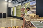
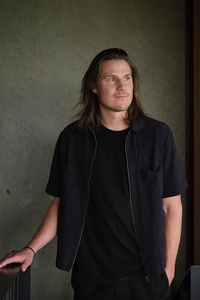
Colour Collab: Oli Booth
Known for its grounded, curated response to environment, Oli Booth’s eponymous architecture practice works with client and landscape to elevate the human experience.
How did you choose a career in architecture?
Oli Booth (OB): I was fortunate to grow up within a wider family who encouraged creativity from a young age. I spent hours and hours with my cousins, creating worlds and environments, and we were lucky to have an eccentric collection of aunties and grandparents who each excelled in their own crafts: from music, to woodwork and art. So, I think the exposure to this and a combination of these skills inevitably led us all towards creating worlds of our own.
The best way for me to express this was through creating homes for the characters and objects in our lives. We were fascinated by how these inanimate figurines might live their lives so we built worlds around them from timber, fabric and stone. As time went by, the scale changed, as my cousin and I dreamed up ways to construct cabins on remote Banks Peninsula islands to live a life of so-called solitude. Ironically, my cousin became a builder, so the dream may still be within reach.
Who or what influences your thinking?
OB: We begin with an understanding of context (site and environment) and behaviours (people and their routines). When combined, these elements create moments, which become embedded throughout a space and, ultimately, inform the architectural response. This understanding creates a platform for connection between people, space and landscape, which is deeply personal. We then work with honest materials, celebrating them in their simplest forms.
When layering the elements of a design together, we accentuate the qualities that make each material special and the use of local materials ultimately informs a richer response to site. We draw inspiration from nature, particularly around the beauty in asymmetry. Natural environments play a huge role in our design process; the ways in which we can fold the landscape into our homes and blur the edges between built and natural forms help to create a sense of grounding and awareness.
How do you factor colour into your work?
OB: Colour plays a central role in our designs. Often, it’s not so much about a variety of colours but more about expressing tonality and texture across one colour range. The way that you represent colour can change dramatically when it is represented in paint, tile, metal and timbers. The consistent tone of colour across these materials provides an anchor in the spaces we create. We often select warmer, earthy colours to complement the tones and textures of natural materials, which we use extensively.
What was the thinking behind your collab?
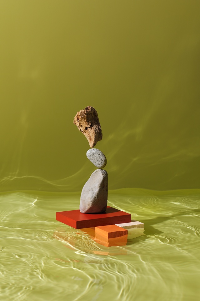
OB: It references the intersection of landscape and architecture, and how materiality can inform ‘moments’ which stitch together the story of a home. Natural materials can have an inherent softness that isn’t always observed on its own. When combined with something else, such as water or light, they can completely transform the way a material is interpreted or experienced, like the effect of water over rock or shadow over bark. Incredibly rigid and immense elements, on their own, can appear hard and cold but, when another layer is added, such as light, it transforms how we experience that material and introduces a level of softness that may otherwise go unseen. This also has an impact on the spaces we design; the way we interpret materiality can transform how space is experienced and helps to develop a richness and narrative. Robust materials can develop an unexpected delicacy and help tie moments together between buildings and landscape.
How did you arrive at your colour choices?
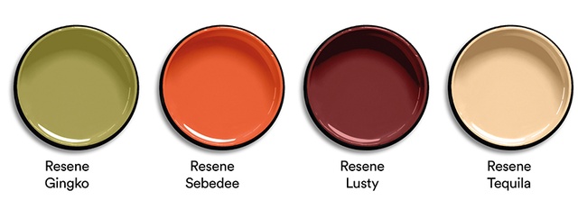
OB: The tones of the natural materials complement the soapy, resinlike palette of the solid geometric shapes and the water beneath the stacked, balanced forms creates rippled light. Resene Lusty speaks to grounding, landscape and warmth, while Resene Sebedee and Resene Tequila reference the wonderful asymmetry found in nature, which makes you second-guess what you’ve actually seen. Whether it be a Resene Gingko-type lichen, moss or bark, it reminds you that not everything is regular and ‘perfect’. There is comfort in that.
See more from the Resene Colour Collab series here.
ArchitectureNow works with a range of partners in the A&D supply sector to source appropriate content for the site. This article has been supported by Resene.