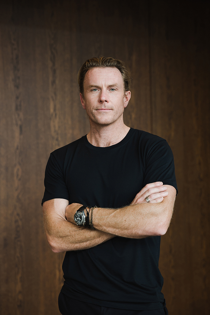
Colour Collab: Chris Stevens
As founder and principal of CTRL Space, Chris Stevens, along with his team, has created a host of beautifully executed, narrative-driven hospitality spaces throughout Aotearoa and further abroad.
How did you end up in the world of interior design?
Chris Stevens (CS): Such a long time ago! It actually came pretty early on — I always enjoyed designing and making things at school and was also keen on the technical aspect of design. While I appreciated art, I wasn’t the best but I enjoyed pencil drawing nonetheless. When it came to making some further study decisions, design seemed a natural path for me. I studied interior architecture at university in the UK and then transitioned into the design world after I arrived in New Zealand.
Is there anything in particular that influences your design thinking?
CS: Personally, I’m a huge fan of Modernism and, specifically, Californian modernist design. It blends the simplicity of the essence of Modernism but adds a touch of flair (read colour) into the scheme. I also live by the doctrine ‘form follows function’ in all my decision-making. It’s such a core part of the design process; to achieve an objective or resolve a problem, the function needs to be understood in order to be addressed. From there, the aesthetic can take over, again, derived from context and narrative.
Does colour play an instrumental role in your designs?
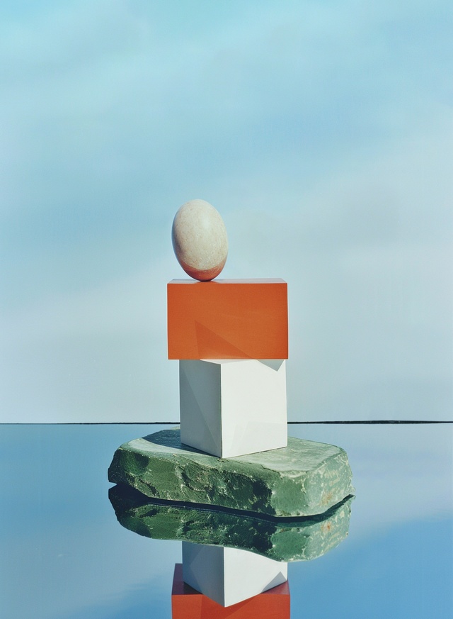
CS: Not as much as I would like it to. I consider myself quite restrained with my colour application in my own designs. But, if the brief and objective calls for colour, then I’m very happy to fully embrace the process. We’re currently working on the Drifter hotel series and the first of five planned for New Zealand recently opened in the old Gummer-designed Wellington Woollen Manufacturing Company building in Christchurch.
The colour palette was inspired by the Bauhaus movement and, where spaces required more energy and visual engagement, we introduced stronger colours, materials, art and decorative elements. We effectively created a building colour hierarchy, where the colour application related to the energy and activity on each level, with bolder, brighter tones in the lower, more-public-facing spaces and muted tones in the private areas. This gives guests instant spatial recognition of public versus private zones.
What was the thinking behind your collab?
CS: I saw this as the perfect opportunity to be more brave with colour. I had just returned from a trip to Mexico, where bold colour plays such a dominant part in the architectural landscape: even to the point that every town and city has a multicoloured sign name to greet you when you arrive. The relationship with this colour approach and the tones identified in the collab felt honest, without trying too hard.
Tell us how your colour choices came about.
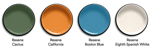
CS: They are kind of muted tones, without being pastel, but I also see them as strong colours with earthy undertones. The soft, warm Resene Eighth Spanish White comes from the classic plaster application found on many modern buildings. The Resene Boston Blue was inspired from the idea of the Californian sky — on the west coast of the States, the colour of the sky is quite unique and it seems to be ‘bigger’ there than it is anywhere else. The warm green of a cactus or palm sits really nicely against this palette: hence, the Resene Cactus of the rock base. And, finally, the pop of orange (funnily enough called Resene California) brightens the whole page, as it references the scorched earth of a desert or a sunset… or, perhaps, even a vintage Porsche 911.
See more from the Resene Colour Collab series here.
ArchitectureNow works with a range of partners in the A&D supply sector to source appropriate content for the site. This article has been supported by Resene.