Regent Park Apartments
The Regent Park Apartments complex is situated on a tight site in Wellington’s Newtown. On entering via Owen Street, you would think that it is just that – apartments: apartments you might buy but certainly not what you’d imagine a council-owned social housing project might be like. It’s clearly evident why Wellington City Council’s (WCC) and the architects Designgroup Stapleton Elliot (DGSE) keep winning awards for the scheme and their precedent will, I’m sure, inspire better New Zealand housing in the future.
This complex was to be the only new build among the first nine projects to be completed as part of WCC’s housing upgrade programme. At the time of design, 70 to 80 per cent of WCC’s housing stock was bedsits and one-bedroomed apartments and Council was keen to introduce a mixture of family units into its portfolio.
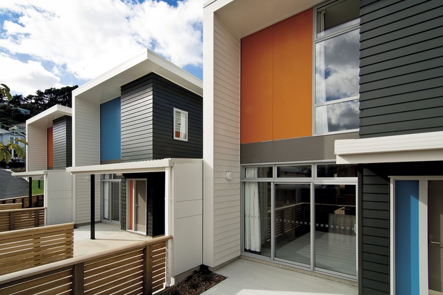
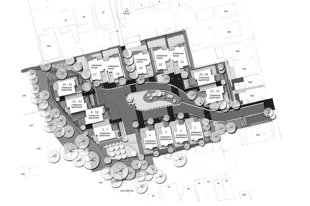
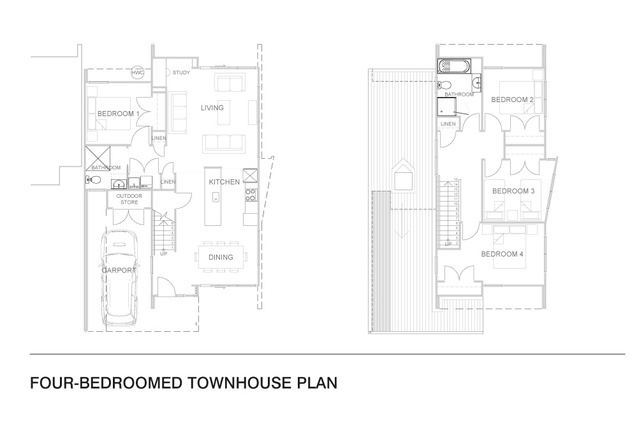
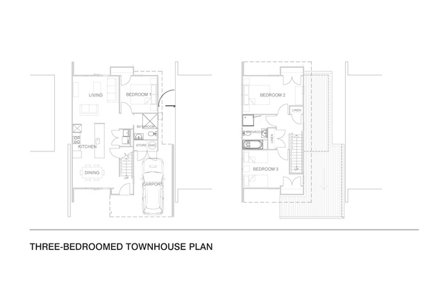
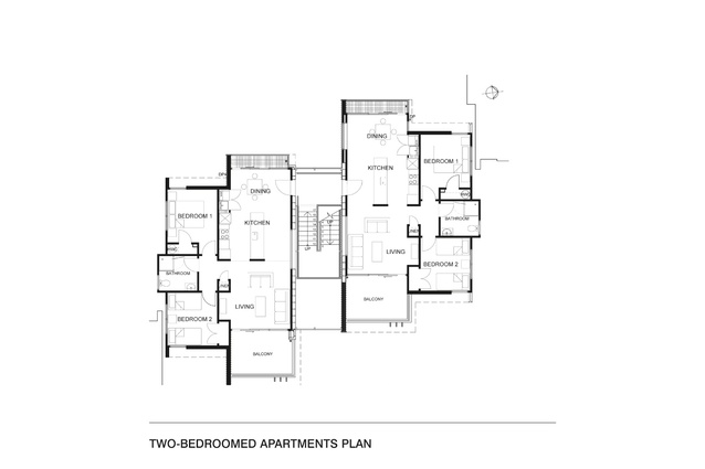
DGSE’s brief was to design two, three and four-bedroomed units, which fitted well into the urban context and which were ‘safe, secure, durable, healthy and affordable’. They came up with three different typologies, resulting in: five three-bedroomed townhouses; three modules each containing six two-bedroomed apartments, linked in pairs by centrally glazed stairwells; and five two-storeyed, four-bedroomed houses of which four make up two duplexes and one is a stand-alone house.
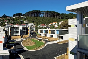
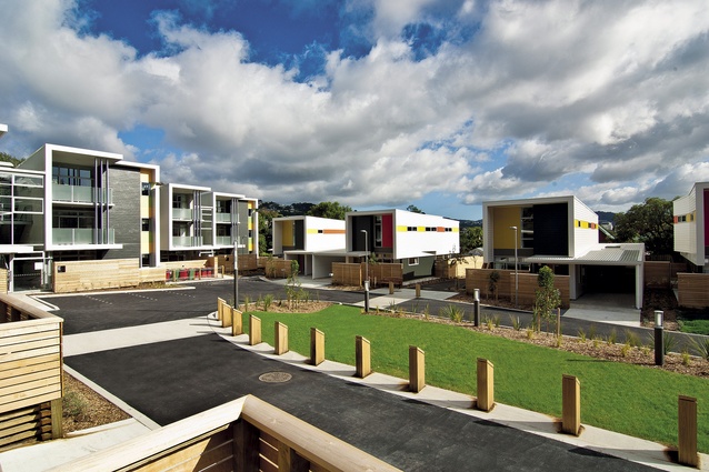
As you’d expect, optimum site density was critical on the 6,447m2 site and the architects worked within specific multi-housing guidelines laid out by WCC to ensure the solution is delivered good amenity, incorporating an open area facing north, good sunlight and views, whilst maintaining privacy for the tenants and public access.
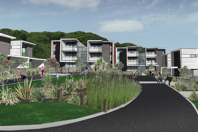
Circulation through the site, linking Owen Street through to Regent Street and neighbouring Carrara Park, was crucial; the site’s previous incarnation had ill-defined private areas and had made both the public and tenants feel uncomfortable. But defining the public and private areas was easily and inexpensively done; locating the housing around the edges of the site opened up the central area and provides tenants with an outlook. The houses back up to the boundaries with private rear yards, while the fronts are clearly defined with eucalyptus fencing, planting, screens and landscaping. The front yards of the townhouses are north facing.
You won’t be surprised to hear that the traffic engineers were very keen to add plenty of signage and arrows around an asphalt roadway that loops the central green area. Fortunately, the architects were keen for the actual design to ‘lead’ people so signage wasn’t needed. DGSE’s director Craig Roberts suggested that, “Once you’ve put a sign up, you take away the good idea of the design. When cars aren’t there during the daytime, the children play in the central space so drivers feel an inherent responsibility and, with all the houses overlooking the common communal area, it is effectively self-monitoring.”
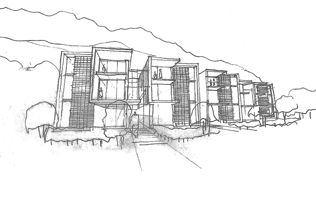
The apartments are linked by glazed units or ‘vertical streets’, incorporating entrances, stairwells, storage areas and access to the rear gardens. While breezeways would have been cheaper, the glazed units are safe and light-filled, and create opportunities for tenants to interact on the landings. They also work with the clip-on balconies to modulate the façades. The vertical streets are particularly successful; neither concealed nor anonymous, they break up the mass and add delight.
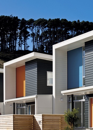
Contextually, the scheme really comes into its own because the scale has been formally broken down: de-institutionalising the aesthetic, which could so easily have shouted “social housing”, and creating a diversity of form, which, in turn, retains the grain of the neighbourhood. The architects have drawn on the proportions and patterns of the adjacent houses. “There is a pattern to the closely aligned density,” states Roberts. “House + 1m + house: we used that rhythm on the houses and the balconies use the same rhythm as the houses. We used a flat line across the roofs to get away from the mono-pitch, which morphed into folded plate.” This aesthetic cohesion has created diversity whilst knitting together the three different typologies.

Yes, that dreaded expression – value engineering – resulted in the deletion of a house planned for the south-western corner of the site but, fortunately, for the younger tenants in particular, there is now a landscaped hill to roll down and, for all ages, an orchard filled with fruit trees has been planted in the space. It would be great to have seen more investment in the central green area and the orchard but hopefully that will become ‘a project’ for Council and the residents somewhere down the line.
Again, WCC has honoured its commitment to post-occupancy evaluation, with independent assessors interviewing both the users and the tenants and, based on my understanding, any concerns raised are barely worth a mention here. At the end of the day, there is no one client on a scheme such as this; social housing is about designing for the community although I bet the individual tenants in this case must be mighty proud of their homes.
It would be wonderful to see the fantastic work that has gone into this project taken on board and incorporated into other affordable housing schemes around the country, and it would be even more rewarding to see it developed further into an architecture that feels distinctively as though it is of New Zealand. I asked the architect what he has learnt from this scheme: “Well, it’s Design 101 really; if you get that wrong, it will be wrong. The point is that we have the expertise in New Zealand to design good, affordable housing. We don’t need overseas examples; we just need to design for our own environment.” Amen!

