Quiet intellect: Lonely
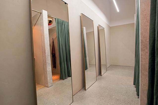
More than half of the adult population wears a bra but buying one can be an exercise in frustration. Having to squeeze oneself into a harshly-lit dressing room with badly-fitting curtains, poor ambience and even poorer service is a guaranteed way to sap both confidence and enjoyment.
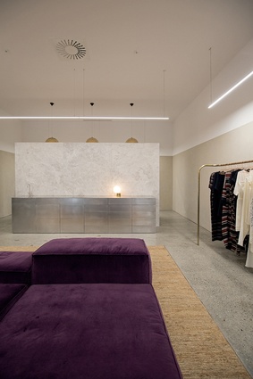
Kiwi fashion label Lonely is turning that on its head with its eponymous Ponsonby flagship store, where pared-back elegance and the carefully curated use of natural materials such as stone and salvaged timber have redefined the lingerie-buying experience. So much so, a second store, in Wellington’s Victoria Street, opened in late 2015. It’s a return to form for the Lonely brand, which started in the capital 11 years ago.

Auckland-based interior designer Rufus Knight was drafted in to develop both stores (recently winning a Designers Institute award for the Ponsonby site). He is a long-time friend of Lonely co-owner CEO Steve Ferguson and was closely aligned to Ferguson’s desire for a “nuanced, layered space that makes the customer feel good about themselves”.
“Both the Auckland and Wellington spaces focus on the customer and their experience. Confidence, privacy and warmth are essential,” says Knight.

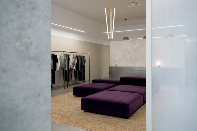
Double the size of the Ponsonby store, and with a 4.5m stud, the Wellington premises was previously home to clothing/homewares brand Superette. The intention, says Knight, was always for the capital branch to mirror its Ponsonby sibling – but with subtle differences that expand the vocabulary of what it means to be modern and romantic and to create a warm, intimate environment. “Lonely Wellington aims to capture the quiet intellect of our Capital. I also kept the hard surfaces and metal finishings to a minimum to suit the cooler climate there.”
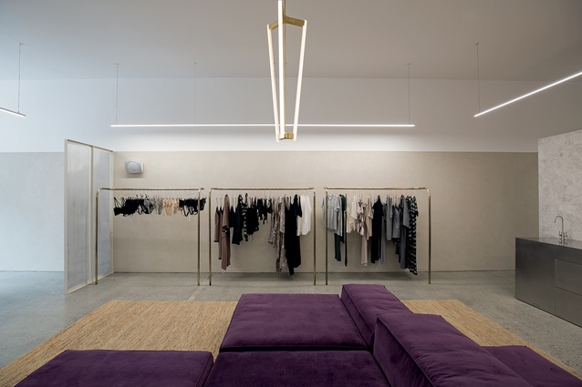
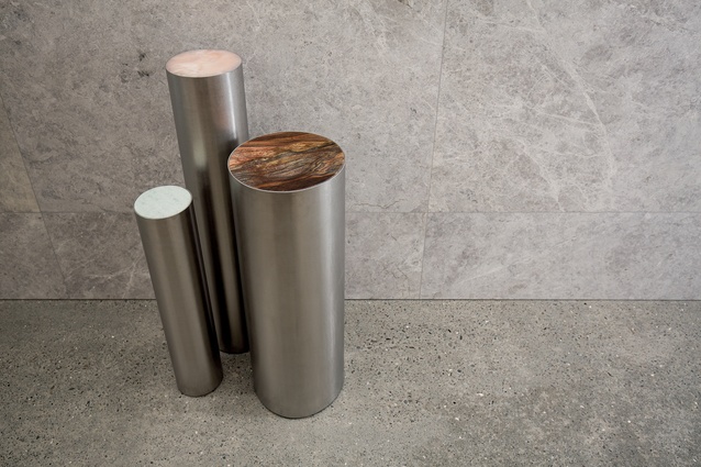
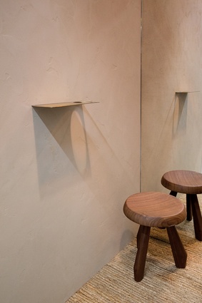
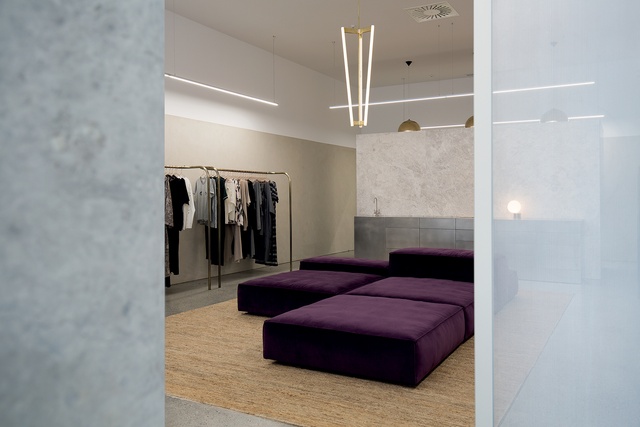
Working alongside architect Hamish Stirrat, Knight opted for a dichotomy between robust materials with a tactile finish, including handwoven jute, sandblasted Italian marble and rich purple velvet.
A key feature of both stores is the use of a solid stone panel in the entrance, which not only eliminates the ‘fishbowl’ effect but also creates a more relaxed salon area that feels like an elegant living room. But the use of stone comes with a caveat: “Having 50m2 of stone can be a bit oppressive, so we’ve added different layers to soften the experience.”
That includes the purple velvet sectional sofa, made by Italian manufacturer Living Divani and imported by Studio Italia. This is where the point of sale occurs (using concealed EFTPOS terminals) and was chosen for its sculptural quality. “It’s a strangely elegant piece that creates warmth and provides a strong counterpoint to the harder materials.”
So, too, the 5m x 3.5m rug which Knight commissioned from Nodi Handmade Rugs. Creative director/founder Olivia Smith says the undyed jute floor covering was handmade in northern India. “The brief was to create something raw and natural,” says Smith. “Steve and Rufus loved that we deal in natural fibres and that everything is handmade. It’s a fine balance to create something that’s refined but still handmade.”

Two of the most striking design features include the central pendant light, by London-based designer Michael Anastassiades, and the free-standing brass clothing rails. Seeking a more feminine, European feel, Knight was initially unable to find craftsmen to create the bespoke rails. “Even though it looked possible from a 3D perspective, everyone I approached said it wasn’t feasible to shape brass in this way.”
Undeterred, Knight eventually contacted Robinson Interiors, who he’d previously worked with during his five years at Fearon Hay. “They’d done this kind of thing for luxury yacht interiors many times. It was worth persevering, because the end product provides a much more interesting perspective than just using standard racks.”
Adding another layer of difficulty was the fact that Knight was based in Antwerp, Belgium, for all of the conceptual planning period. Working for well-known contemporary architecture firm Vincent Van Duysen, he spent days designing fit-outs for the Alexander Wang flagship London store and evenings organising logistics for the Lonely Wellington store.
He returned to New Zealand just in time to co-ordinate the fit-out. Robinson Interiors, who provided the Ponsonby store’s cabinetry and joinery, prefabricated the pieces while contractors in Wellington completed the assembly.
Knight, who started his own business in 2014, is now working on a second Lonely store in Auckland, but admits he doesn’t want to be pigeonholed as a retail designer. “I’m currently focusing on a number of national and international retail fit-outs and have also started work on a 15-storey, 150-apartment development in Auckland.”
The day we speak, Knight had just completed part of New Zealand’s pavilion at this year’s Venice Bienniale. “My role was to design the hosting spaces where patrons, sponsors and foreign delegates will meet while visiting the New Zealand venue’s Future Islands exhibition. I’m proud to have been able to lend my design aesthetic to this project.”

